Okay, so we all like Tea. But some of us also like coffee. And some of us REALLY like GOOD coffee.
I am one of said humans, and for this very reason I LOVE the Boston Tea Partychain. For those of you not in the West, you’ll just have to trust me. They do what they do and they do it good.
And look how pretty it is.
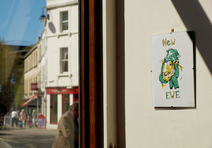
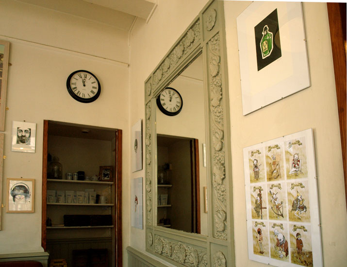
So I was pretty delighted when I was doodling away in it’s Bath branch some time ago, and was approached and asked if I’d like to exhibit work for a bit. Pretty neat eh?
So for the month of May, I have adorned the walls of Bath’s bit of Boston with silkscreen prints, etchings, risographs, digital works and any other number of bits and pieces I like to make.
So tell all your friends, go grab a coffee (because it really is good) and surround yourself with oddities and nice things for a bit.
And then buy them too. That would be great. Thanks.
So a handful of friends and I decided to make a pretty thing.
You know, cause we’re in third year and have nothing better to do or anything…
But it seems a shame not to make use of the ace University facilities available to us while we’re lucky enough to be here. Especially given that they are, available FOR FREE (3 grand a year free anyway. Well, it’s better than 9.) so we gathered together a little proposal to send out to our fellow image makers on the course.
We wanted to make a collaborative work of illustrations and imagery based on the brief we set. A short, publication that showcases the talent that Bath Spa is about to unleash on the world. We decided to keep it simple, keep it open to interpretation and keep it relevant.
And what could be more relevant than the present? So we asked people to volunteer a simple image in two colours (black and blue) based on their own, personal response to the Right Here, Right Now. We wanted to keep it simple so could spend a bit of time reproducing on the dual-colour Risograph printer in our studio. A cheap and cheerful zine that captures the very essence of 2014’s graduation image makers.
So here’s my design. My personal Right Here, Right Now: A third year on the brink of graduation:
Unfortunately, the project took something of an acceleration which leaves me unable to currently show you the finished product. Turns out, our tutors thought it was a kind of neat project too, so encouraged us to put a wiggle on and get it done in line with a second year study trip to New York so they could take it with them to drop in on US professionals and studios. This is, obviously pretty cool, but it meant we had to finish it in under a week. We managed to get the kindly artwork donations of 12 classmates so it’s a tight little compendium, but the styles are all really varied and I think it looks ace overall. We literally got done binding it with minutes to spare before handing it over to be whisked away over the atlantic, but we’re well in line to produce a few more so photographic evidence will be kicking about soon with any luck.
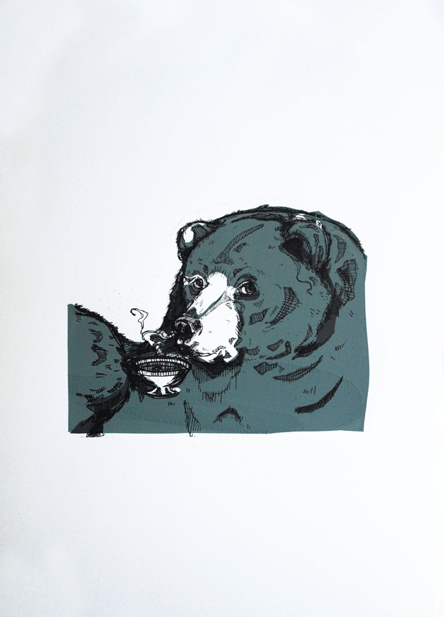
Ok now, I want you o stand up, turn around and get out, and the rest of us can appreciate how disgusting they are via the means of my little zine, Bears: Don’t Like ’em! This came about last Easter, and since then has been a consistently strong seller at arts fairs and conventions, to men, women and bear haters everywhere. And actually, one or two intrigued bear lovers too.
Having witnessed it’s popularity, I thought I’d bring it to life with a little splash of colour and returned to my usual haunt, the print rooms, to create these three sets of limited edition screen prints from the zine.
And a fox in a tie. That one was really just for giggles though.
And thus begins the mammoth job that is the catch up posts from the past term. I’m not sure exactly when it happened, but life definitely got frighteningly busy over the past 3 months and, as a result, my little interweb based snippets of work became a little sparse. For those of you that noticed and, more to the point, those of you that cared, I apologise for this, get on my little, metaphorical, digital knees and beg your forgiveness.
You know, in the spirit of Christmas and all that.
Not that I have any Seasonal based works for you, because I’VE BEEN BUSY. So Uni work it is.
So let’s kick start with a bit of printmaking shall we? For no other reason than it makes me happy. And I’m in charge.
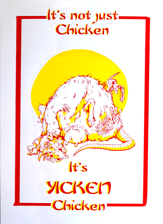
The brief was…well just that. Very simply to create a screen printed poster selling our favorite fast food restaurant.
This is all very well and good, except I happen to be a proud, longstanding member of the societal subculture of “students who cook” and, therefore have something of an aversion to fast food. Actually, that’s putting it quite lightly. What I mean is, generally and on the whole, I really bloody hate it.
“Not to worry!” My tutor insisted, “You may employ a use of irony!”
So I did. I employed a use of irony. Actually, I employed a really bloody heavy use of irony and drew, what probably turned out to be the single, most disturbing thing that’s ever been dredged from the depths of my skull, in the name of promoting Yicken, a Chinese take out back where I grew up. You know the kind: greasy walls, tiled floors, an inescapable use of that classic yellow and red colour scheme that desperately attempts to suggest some element of culture.
Actually, if I’m entirely honest, as far as nasty Chinese’s go, Yicken isn’t the worst. It just happens to have a heinously playful name that I thought might be handy in the creation of the poster.
There it is. A vile, possibility regarding the identification of the mystery meat found in that greasy tub of yours.
So, having had a good ol’ rant at the state of my print that was my exhibition piece, let’s now focus on how great our Exhibition actually was.
A gigantic congratulations to everyone who just completed Year One of Graphic Communication at Bathspa University! As the exhibition wasn’t graded, not everyone felt it was necessary to submit any work, but for those of us that did I think it was a brilliant compendium of different approaches that boasted, not only a lot of talent, but a lot of ideas and conceptual wealth.
As the brief was SO very open (1912…that’s it) there was naturally a very large selection of works on display. Everything from publications to prints to animations to textiles. And the varying ways in which people chose to take the brief was also wonderfully broad. I’ll document here now some of my favourite works as well as some of the less crap photos I managed to take with my very limited photography skills. This is far from everything that was on show, but I’ll try to use what I’ve got to communicate quite what an enormous range of work was on display.
Prints
Arthur Webb: ScreenPrint about the Piltdown Man Hoax
Obviously, a lot of people chose to make use of the print rooms once the third year rush had ended. But to my surprise this didn’t just manifest itself in screen printing, which tends to be the most popular. There was a whole lot of linocuts too, all on different topics and with different strengths. It made for a really great display of variation, as well as assuring me that I’m not the only one with a fondess for printmaking!
I’m also relieved to say that, while it definitely wasn’t up to my standard, people still seemed interested in my Bram Stoker print. It received very nice comments from one or two onlookers too, and while I still was disappointed by the result, hearing nice words did pick me up a lot I must confess!
Kirsty Stanley: Linocut Prints about the first parachute jump by Albert Berry.David Gordon: One event from each of the 100 years between 1912 and now.
There was also a lot to be said for the ways in which people were using the printmaking. David’s piece was a real stroke of time-consuming ingenuity, in which he screen printed his photographic images in CYMK. This produced a full spectrum of colour, in the same way it does through your inkjet printer, but done via screen printing. It’s turned out looking completely amazing, although I will say, he nearly killed himself doing it. The boy has real dedication to his art and I can’t express my respect for him highly enough. He never would have stood for a shitty print like mine, let me tell you!
David Gordon: Screen Print using CYMK colours!
Digital Prints
Ah the digital print, or Giclee as they’re known to those who want lots of money for it, but don’t want to have to put in the same level of effort required of you in direct contact printmaking. Don’t let that sound like a put down though, there were some beautiful images made and printed in the exhibition, and I and many others would be proud to own them, and would be even prouder to have done them!
Elhora Powell: Illustrated narrative of the 1912 collapse of the Quing Dynasty. Bea Baranowska: Handmade Scout badge board
Textiles
There’s a common misconception that in order to be considered graphics, something must have been made via the computer. Allow my classmates to put this one to rest.
Bea Baranowska: The Scouts began in 1912.Emily Hunter: Screenprint onto canvass documenting the 1912 introduction of the chilli heat scale.
Publications
My favourite. The books and zines. This is only the tiniest example of what was on show, they ranged from professionally printed newspapers and information packs about pig racing, to hand bound print collections, narratives about personal responses to the brief and themed dot to dot books. It was quite an impressive array!
The Publication TableThomas Goldsworthy: Olympic Games 1912 NewspaperThomas Goldsworthy: Olympic Games 1912 NewspaperMatt Stewart -Tribe: Scotts Expedition LinoPrint bookLucy Harper: Hand drawn story of her Great GrandparentsLucy Harper: Hand drawn story of her Great Grandparents
Animations
And Macs. All Art schools have them, and like a pair of perky boobs on spring break, they love getting them out. This exhibition was no exception, it was Macs galore, and all bursting with newly created animations, films and videos.
…
Nipples.
Macs set up with all the animations people made. Because it’s just not an art-uni without Macs.Rhianne Farrell: Handmade stop-start animation about key events of 1912Carl Godfrey: Animation about the Japanese gift of 1000 Cherry Blossom Trees to America
Flogging Stuff!
Well you know me, I love a good stall. And I made sure I wheedled one into this exhibition too! Luckily, everyone else got involved too and brought along prints and books and anything else they’d made in the year. All together, it made for a pretty impressive display of work. Well done us!
Selling work from the past year.Beer+awesome drawing=:DPrints,zines,books,Tick…
So yeah, all in all a great event really that received some really complimentary comments from those that went. I would like to say a huge thank you to three people in particular: Tom Goldsworthy, Carl Godfrey and Ciara Caldwell-Cleave who were in charge of all the publicity and organising of the event. They completely made it what it was, went out of their way to make display animations, organise free beer, made cakes and 1912 ice cubes (made sense at the time) as well as compiling little free compilations of all of the work on display for us to take home, which really was a lovely little touch. Yeah okay, their cheekiness may have got us in trouble with the second years a little bit, but hey, what’s a bit of casual rivalry amongst years eh? Antics like that is totally what this institutionalised education is all about, and the long and short of it is that they made the event.
Free catalogues of everyone’s work!
Cheers guys, I hope since then you’ve had a good old relax, put your feet up and cracked open a cold one.
I’m back with a new post! Yes I know it’s terribly late, I am oh-so-sorry, but you see, there was a dragon.
No?
Not buying it?
Yeah well that’s because it’s a lie. There was no dragon, I’ve just been rubbish (again) and have failed at bringing you any kind of news in favour of sleeping. However, those lazy days are now gone! Banished! And I hereby solemnly swear to be much, much better at this blog fandango. Frealz.
So here it goes. Last time I did a post, I was just about to embark on a big old silly printing experiment that did, in the true nature of experimentation, fail horrendously. Yes, you heard, printing finally turned on me. Screen Printing as well, that dirty dog. After all the nice things I said about it. Needless to say, it put me a little bit (a lot) down in the dumps, I don’t like doing bad work. Especially not bad prints.
But such is the nature of trying new things and not leaving yourself enough time to properly get to grips with it.
Basically what happened, was that I wanted to do a print for the End of Year Show, and my tutor talked me into doing it GIANT (A1), as opposed to the comfort zone of A6-A3 size range I tend to aim for, less than a week before the exhibition was due to open. Actually, now that I think about it, this is the same tutor who was to blame for the up-all-night-due-to-lack-of-preparation-2-page-comic shebang. Must investigate the possibility of a single-handed conspiracy against me there.
But I digress, “a big print…ha!” you may claim, “doesn’t sound like such a big deal to me!”
Well, metaphorical voice of imaginary rhetoric reader, you’re right, you wouldn’t think a big print WOULD be such a nightmare, however this one decided it would be due to the following limitations.
I only had one screen. This meant that, in order to achieve the 3 colour print I was aiming for, I had to only expose ONE layer onto the screen (due to time limitations) – the most complex one was naturally the best choice, but this meant the starting two had to be hand cut newsprint cut outs which I would have to use as stencils with the blank screen, then expose the 3rd layer on afterwards. I hate cutting newsprint. It’s delicate and awkward and a pain in the arse to transport. I especially hate cutting newsprint when the newsprint itself is bigger than A1 and I only have an A3 cutting mat and, due to the end-of-year-run-down-of-materials, comparatively blunt utensils.
I also couldn’t afford, due to the end-of-year-run-down-of-funds, to digitally scan and print my exposable design onto a giant acetate in order to expose it, so it had to be hand traced from the original sketch, using special ink (FROM A POT WITH A BRUSH! Not even pens) onto a cheaper, transparent, special-ink-from-a-pot friendly material. This ate one full day of my already very tight schedule.
Due to the size of the print and, by comparison, the size of me, I was encouraged not to print the organic way; hand+squeegie=lovely print, but instead to use THE ARM. Now this was really where my downfall lay. In theory, THE ARM is a great idea. It’s a bit mechanical arm that holds the big squeegees and spreads the ink over large surface areas my own little limbs would struggle to cover. All I had to do was push the handle of THE ARM along with the correct pressure to get a nice, flat, even coverage.
Unfortunately, as I only had, in the end, one day in which I could print, I didn’t really get the time necessary to be able to master the art of THE ARM. In fact, I think it’s fair to say I was actually pretty shit at it. I’m not sure if it was due to my size and weight (or lack thereof) but I just couldn’t seem to put enough pressure on the damn thing to get an even coverage of ink. I tried thousands of variants of amounts of ink, I tried adjusting the bed, adjusting the screen, the suction, I tried more paint in the mix, more solution, harder squeegees, softer squeegees, literally everything I could in the very limited timescale I had.
But in the end, with time ticking by, I had to just go for it. And 3 colours, 5 prints, about 60 newsprint tests and a grump to end all grumps later, was left with a pretty damn substandard print as a result.
Muchos Disappointingos.
As you can see, the colour is not at all flat and the black’s not come through at all clearly. I think had the lines been printed perfectly, it may have tied any issues with the stenciled colour together. Might even have looked better, given the grimy nature of the subject matter. But unfortunately the lines are just as problematic as the other two colours. Which really meant the image lost out in areas of detail like these.
The brief for the exhibition was 1912: Go make something! So I chose to focus on the death of Bram Stoker; author of Dracula, theatre owner and all-round pretty clever guy. From here, I subsequently, invented an “alternative reality” in which Dracula‘s success above all his other works was attributed to the fact that it was not from Stoker’s imagination, but based on true events. I wanted to suggest that his death in 1912, officially regarded as “a series of strokes” was actually caused via the paranormal attack of a vampire.
I chose to do it in the form of a single image narrative. This was actually a bit of a leap for me who is, as you may be aware from my other work (and if you’re not I think you’d better have a look in the shop don’t you?) predominantly a sequential art sort of gal. This whole, summarising in one image was quite the challenge, which is why it was so disappointing to have overcome one hurdle to fail at another.
Anyway, It’s big, it’s a print and you can see what it is, so in many ways, I achieved what I set out to. It’s just a shame the craft is so poor. But we live, we learn and sometimes, we screw up screen printing.
I think that’s definitely what Sinatra was singing about in That’s Life: Screen printing giant images of deceased writers.
What an epiphany.
B
x
Poor Ink coverage could have looked ghostly and haunting, had the black been a little crisper.
This post will be an attempt to correct these wrong-doing by bringing you a little snippet of creativity from the life of University.
You know, that place I spend 80% of my time. The reason I live here. That one.
Doesn’t even involve photocopiers.
So, we’ve been working on two, comparatively short projects that, although required separate outcomes, held a common theme and were (presumably) designed to feed off of each other to an extent. In short, we started with an object that we were then to expand on and extend into an environment of our chosing. (There were many more restrictions than that, but we won’t get into that just now.)
Naturally, me being me, I chose a COMPLETELY terrifying wooden mask of a human face and, naturally, me being me, decided to create a completely terrifying wooden creature to wear it.
In a nutshell. Give or take a bit of research.
Our outcomes were to be a sequential narrative, for which we had to convey this sense of movement in 9 panels (something I think my all night comic-making-athon may have put me in good stead for), and a soundless animation of 15 seconds or more. Simples.
It’s been, for the most part, good fun. The Animation comes first in the saga of the weird Tree Creature. It’s jerky, it’s rushed, it’s wibbly and just generally a bit crap and so, totally not worth the amount of time sunk into it’s creation. But the more I watch those meager little 24 seconds, the more I love it. Like a really ugly kitten. Or a child who just can’t get his head around potty training.It’s my first ever start stop animation and so I feel I’m entitled to a bit of forgiving in terms of the craft. It’s made by my own fair hands and therefore, by default, I’ll love it always. If only as a milestone in my creative journey.
And even if it does leave a little poo on the proverbial carpet every time I watch it.
My static image sequence, while still rushed and far from perfect, had the advantage of being a practice I was familiar with. In an attempt to communicate this driving theme of the mask’s wooden texture, I made the (pretty foolish to be honest) decision to linocut my sequence in three colours which, due to the restrictions of the process and size of my lino, added a simple bleakness to the images and lost a lot of potential detail. As I’ve said, just a little too often about my work before, they’re not the greatest feat of printmaking known to man, but time played a restricting factor that forced the simplification of imagery down to the point to see here.
While I loathe to consider them a direct sequel to the animation (due to my own personal gripes regarding the film industry), they could be considered to continue the narrative previously explored, and therefore should really be seen second. You know, seeing as they were offered as a joint brief and all.
I might consider them a spin-off. Maybe.
Originally I’d planned to bind them into a concertina book, sandwiched between a hard front and back cover. I have two prints of each image, so it’s something I could still well do, but actually, in terms of the movement between image to image as a sequence, the simple grid of 9 works rather well. They break up well into columns of 3 and I think that adds a nice pace to the movement that could easily be lost in the transition into a bound document. There’s a certain stillness to the images that I’d worry would be compromised to an extent if they were to be viewed in one, continuous line. As much as I love books and book binding.
And I do.
So there’s a little taste of what a Bath Spa student has to offer. Wooden Creeps and wibbly frames. Top-Notch talent only in that school doncha know.
Bugger, I was hoping to keep this post short so my flatmate doesn’t laugh at the cyber-typing-diarohea from which I suffer, but I seem to have had another attack.
I promise not to ramble on for this one. I’ll just deliver the goods and set you on your way. But CHECK OUT how many prints I have!!
Everything I've made in the past few months. It covered the entirety of my floor!
Magpies and Robots! Quick, A6 lino-cuts I made on the last day of Uni before Easter! Printed on a vast array of second hand papers.
I couldn't afford real print paper...so they're on coloured card and metallics.
Not even half of them! Hopefully you can see where I've played around with ink levels during the print process to get different effects. All 100% unique!
Okay, enough of this print making mania now. I’ve gone on about it long enough. Time to get obsessed with something new. Hhmmm…typography next?
So I thought I’d log the concluding stage of our printmaking workshops, seeing as I documented the other two so thoroughly. It’s a shame in a way to end on this one as, out of the three of them, it was the one I connected with the least. This is partly due to the fact I didn’t really allow myself enough time to think about my outcome as in-depth as I had for etch and lino, and partly just due to the fact that I find Letter Press just a smidgen too fiddly.
I know, I know. I’m being a bit of a hypocrite and general spoil-sport, but I just can’t really get behind the reasons to engage with letter-press. The outcomes can be truly beautiful, I admit that, but I’m just so aware how easy it would be to create such pieces in a fraction of the time via digital means. And with so much more freedom. I feel so bound by letter-press, firstly by the fact you’re so limited to what font you happen to have available in your inventory, in what specific sizes and that’s supposing that some cheeky arse hasn’t nicked one or two letters (as is usually the case when you’re using a shared press, such as that at uni). And that’s even before we factor in the other variables such as all the right leading sticks being left in the right place, there being enough clamps etc etc etc
THEN, SUPPOSING all that is, indeed in order, you have to painstakingly put the bloody thing together. Letter by letter, line by line. I truly take my hat off to all those poor folk to whom this was a career back in the days of pre digital print. They truly must have had the patience of saints.
But I digress, I don’t think it helped matters any that I’m not overly fond of my outcome. It was rushed, unplanned and generally a little dull, but it is the conclusion to my Henri de Toulouse Lautrec collection, so deserves a mention.
As my lino had gone down so well, I decided to theme the letter-press along a similar bent. For my lino, I’d focused on Lautrec’s alcoholism and fondness for absinthe, and it was through the research for this that I’d stumbled upon the recipe for his famed cocktail. Well, I say cocktail. I think what I actually mean is lethal concoction. One part Absinthe to one part Cognac. That’s it. A 50/50 blend of undiluted spirit, shaken together into a glorious, liver-failure inducing solution that Lautrec refered to as Le Tremblement De Terre: Earthquake to you and me. So called as it was (understandably) assured to shake you up and make you fall over.
So, with this new information to hand, I decided to describe Lautrec, via the press, as Monsieur Tremblement De Terre. See, see what I did there. I put “mister” in front of it. In French. Like a clever person.
It’s hard being this cultured, it really is.
But this is where I met my downfall. Drunk on my own genius, I decided to attempt to echo the effect of the beverage within the type. This started with the typeface itself, where I set ‘Monsieur’ in one font, all one size (I can’t even remember which font that was now, sorry that’s awful) but then jiggled the rest of it about a bit with different letter sizes. The concept here was to create a contrast within the sentence that alluded to Lautrec’s lifestyle change of aristocratic upbringing, to the bohemian life he led within the Moulin Rouge. (Something I then reinforced with the colours: black fading to absinthe green.)
As if this wasn’t a pain in the arse enough (because where’s the fun in making things easy for yourself?) I then decided the piece just didn’t say “off your tits on potentially lethal levels of alcohol” enough, so sought to reconstruct this by setting the letters at different levels and generally making a mess.
Experimenting with layering the print over itself
So really, it’s my own fault I had such a nightmare with letter-press. This kind of mindless artistic-ness is easy enough on photoshop, but let’s stop to consider what letter-press was actually invented for, for a minute. Had I done that at the time, I probably would have realised how difficult I was about to make things for myself. Letter press once served a very legitimate purpose. To print multiple copies of multiple straight lines of legible text.
Everything about my print is fighting that purpose, and as a result it just doesn’t work. I’ll admit that, I learnt a very valuable lesson. I guess that’s what I find frustrating to an extend. I do not like being restricted, to any degree on any topic. If I want to make something messy and complex, I want the freedom to be able to fulfil that purpose, not be restricted by the natural boundaries of a process.
I mean, true, I did actually get around it. But I know the piece would have been stronger had I conceded and worked with the limitations of the press, not against it.
But I guess though that is part of the charm to old print processes. They could be considered, by and large, redundant, but it’s the level of skill and patience required to master them that has kept them alive. People are desperate to prove their worth in a world where everyone has the potential to be an “artist”, and for many that is done simply by showing that their ability would have been acknowledged to just the same extent in a time where creativity was just that little bit pickier.
Had I paused for a minute to think, I hope I would have come to a conclusion that lead to a different outcome. But my stubborn nature coupled with a shortage of time has led to my discovering something quite different. I don’t enjoy letter-press particularly, but I feel that I’ve learned the secret to any form of print making is an element of forward planning. Concept can get you far under ordinary circumstances, but when relying on processes of the past you must use your head and prepare. Mistakes and accidents can be beautiful, but they are not talent nor skill. If you are to become a craftsman at printmaking, then you must respect the process for the process and work with it.
And at a time when artists like Tracey Emin are being officially titled “Professor of Drawing”, I feel like any process that makes you use a bit of the old brain capacity can’t really be a bad thing.
I’ve finally gotten around to digitalerising (it’s a word) the second and third stage in our Print Making Workshop at Uni. Yeah sure, technically it finished weeks ago, but I’ve been busy. Besides, good things come to those who wait and other such justifying clichés.
So First up was Lino Cut time. Now I’ve had bad experiences with Lino Cut in the past, in that I was forced to give it a go as part of our GCSE Landscapes project in art class. Bear in mind, this was in a school where the facilities were not geared up to cope with the ambition of print making. I don’t know if you’ve ever tried to cut out a seascape from a chunk of lino with an old craft knife and the point of a compass (I shit you not) but it is not a creatively invigorating experience. I suppose it was character building to an extent, and it gave me a new appreciation for my health given the worryingly high chance of contracting Tetanus or losing digits, but I can’t really say it was an artistic high point. Needless to say, the project was swiftly abandoned when it became obvious (both to me and my teacher) that is was going to look shit.
As a result, I’ve been stubbornly against Lino Cut ever since, turning my nose up at it in my Foundation in favour of screen print and other seducingly exotic and more health friendly forms of image making.
So this was not one I was looking forward to. But, like a good student, I purchased my strip of lino and haphazardly scribbled out a design. I decided not to make my distaste too obvious by ignoring the possibilities of colour, but equally wanted to keep the process to a minimum so I could be done with it quickly, and found 3 colours to be a decent compromise.
Now, I’m a fan of print making. I love screen printing and I couldn’t be much happier with my first attempt at etching earlier this year, but I had just assumed that this love was to forever be reserved for the more elaborate and high-tech forms of print, and Lino just wouldn’t cut the mustard. Let me tell you now, I will one hundred percent eat my proverbial hat. I will eat it with my face smeared in proverbial egg.
Lino Cut and I have worked out our differences and decided to give our relationship another shot. It’s on the provision that never again do I attempt it without the appropriate materials, but that’s the great thing about mistakes; you learn a big, fat, hand bleeding lessons from them and use said lessons to make improvements.
I love my Lino outcomes. They’re bright and fun and were easy to produce. I found the process enjoyable from beginning to end, discovering the gouging of the lino to be pleasantly therapeutic and indisputably pleasing when all went to plan, and the inking of the plate was just as quick. A quick wipe of chosen colour onto the stone, a few seconds rolling it out into a thin, tacky consistency and you’re ready to (rock and) roll straight onto the lino. Whatever you’ve cut out remains clear, only the spaces left behind catch the ink and then you can begin your process of layering colour over colour, gradually removing sections of plate until an image has built up. It’s at this point that you can give yourself a big old pat on the back for successfully accessing the appropriate side of the brain that deals in spacial awareness.
There’s even a mini press for the mechanically obsessed such as myself. It’s not as big as the Etching beastie, but it’s Becky sized and still creaks in that endearing tone of the past, when processes like this were a necessity, not just a novelty.
3 Colour, 2 Stage Lino Cut. Green on white, black on green.4 Colours, 3 Stage Lino cut. Yellow on white, green on yellow, back on green.
I enjoyed it so much, I shelled out for a bit more paper in order to have a few more outcomes. When I made this decision, I’d already cut out my first layer, so some of my prints consist of 3 colours, some 4. Either way, I’m proud of the results and am really happy I approached it with an open mind rather than stuck to my original convictions.
For those who are interested, the image is an absinthe bottle as it was Toulouse Lautrec’s beverage of choice. I attempted to echo the stunted shape of Lautrec, due to his deformity, in the bottle and used the hat to reinforce this.
Alright, maybe not the best print in the world, but damn good fun and an important learning curve I reckon!