Kidding Around: Work for Picturebooks

I want this post to do two things.

A) share some things I’ve made recently

B) Muse a little bit about things. I just feel like we never talk anymore. The blogosphere can be a lonely place.

So first up, here are some pieces I’ve been working on this past week. They’re not projects as such, simply drawings and characters I’ve had kicking about in my head for a while. Glorified doodles.

A Koala is Not a Bear

Bears aren't good petsWashing  Day

Night Shift

If anyone is familiar with the work I’ve been making over the past few years, you may have noticed a shift in the nature of some of the more recent bits. (If you have, seriously big old kudos heading your way! I owe you a cookie.)

Firstly, I think the art is beginning to be a little more consistent. That battle I’d been having before and right the way through university to develop a “style” is finally being won. And, while I thought that would feel stifling or limiting when I did eventually settle into it, it’s actually feeling pretty happy. I feel a bit safer almost. Comfortable. Yet I’m also confident with it, because I know that other styles and ways of working to me are possible should a given brief call for it.

Secondly I think my characterisation has been coming together into a different direction recently. The work I make is usually figurative in some manner, but I’ve definitely been inspired in recent months to approach this a little differently when it comes to transcribing the characters I’ve seen/ invented onto the page.

The reason for these changes, I think, it simply that life has changed. As it does.

Making pictures is, like any form of creativity or visual media. It’s a snapshot of your life; a representation of the way you see the world, the things you know and the lessons you’ve learned at any given point in your existence. Mine has changed dramatically over the past nine months and is, now, once again on the verge of changing again.

Firstly, university and the life and structure I had while I was there, ended. My friends moved away, the rigorous and consistent marking system ceased and regular access to tutors, mentors and facilities went with it. Since then, I moved back in with my partner and invested in one of those full time job deals, working as a designer in children’s publishing.

I can’t put into words how much I have learned. Nine months in the exact field I had wanted to be in (albeit a slightly left of field job) taught me more about myself, my work and (dare I say it)  the market that governs it all, than three years of formal university education even touched on. And now, as my contract with the publishers finally winds up to a conclusion and I prepare to push on into that expansive gulf of possibility, instability and fear that everyone else met with some time ago, I have never felt more confident.

Somehow, it turns out, working a full time job and having the time to devote to your work torn out form under your feet, made me even more determined to find the time to devote time to my work. I draw more now than I think I ever have and every image feels like it has a real purpose or audience. I’m no longer jumping through hoops and making work for marks, but making work for me and it feels easier than it every has.

That’s not to say I begrudge uni anything. I loved being at school, but it’s only now that I realise how much of it I wasted worrying about making the right work instead of just making the work that works!

The job I’ve had has been doing all the background research for me, and is one of the reasons I’ve loved it so much. I love the world of picture book publishing and, actually, I really loved being a designer. But as the contract nears its end and the job winds up, I feel like it’s time to get it together and start approaching the industry from a different direction. The right direction. I am an illustrator at heart, I always was. Now I’ve had the good fortune to be afforded an insight into how to be the best illustrator I can be. I’ve seen behind the scenes, I’ve got to grips with the structure of it all and I know for sure it’s publishing I want to work in.

So, nerve wracking as it is, let’s give it a go. Let’s make pictures. After all, the worst case scenario is that it doesn’t work out. To me, that is a thousand times better than wondering “what if.”

Print Workshop Three: The Letter Press Experience

So I thought I’d log the concluding stage of our printmaking workshops, seeing as I documented the other two so thoroughly. It’s a shame in a way to end on this one as, out of the three of them, it was the one I connected with the least. This is partly due to the fact I didn’t really allow myself enough time to think about my outcome as in-depth as I had for etch and lino, and partly just due to the fact that I find Letter Press just a smidgen too fiddly.

I know, I know. I’m being a bit of a hypocrite and general spoil-sport, but I just can’t really get behind the reasons to engage with letter-press. The outcomes can be truly beautiful, I admit that, but I’m just so aware how easy it would be to create such pieces in a fraction of the time via digital means. And with so much more freedom. I feel so bound by letter-press, firstly by the fact you’re so limited to what font you happen to have available in your inventory, in what specific sizes and that’s supposing that some cheeky arse hasn’t nicked one or two letters (as is usually the case when you’re using a shared press, such as that at uni). And that’s even before we factor in the other variables such as all the right leading sticks being left in the right place, there being enough clamps etc etc etc

THEN, SUPPOSING all that is, indeed in order, you have to painstakingly put the bloody thing together. Letter by letter, line by line. I truly take my hat off to all those poor folk to whom this was a career back in the days of pre digital print. They truly must have had the patience of saints.

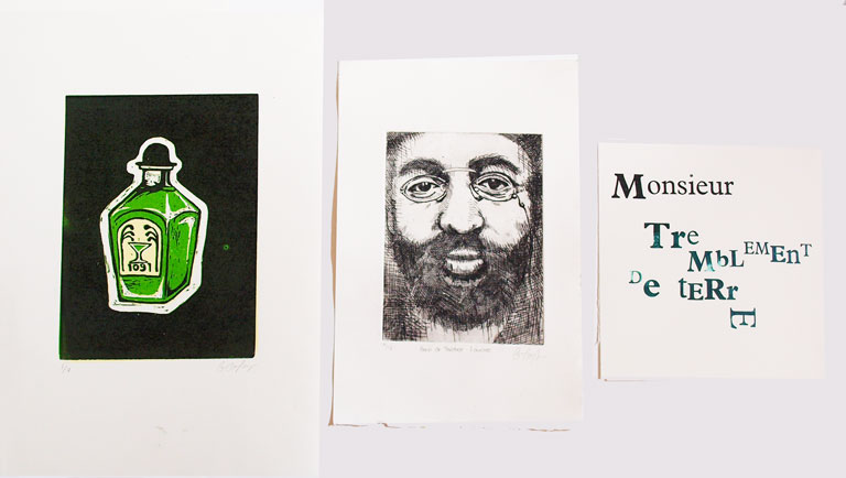
But I digress, I don’t think it helped matters any that I’m not overly fond of my outcome. It was rushed, unplanned and generally a little dull, but it is the conclusion to my Henri de Toulouse Lautrec collection, so deserves a mention.

As my lino had gone down so well, I decided to theme the letter-press along a similar bent. For my lino, I’d focused on Lautrec’s alcoholism and fondness for absinthe, and it was through the research for this that I’d stumbled upon the recipe for his famed cocktail. Well, I say cocktail. I think what I actually mean is lethal concoction. One part Absinthe to one part Cognac. That’s it. A 50/50 blend of undiluted spirit, shaken together into a glorious, liver-failure inducing solution that Lautrec refered to as Le Tremblement De Terre: Earthquake to you and me. So called as it was (understandably) assured to shake you up and make you fall over.

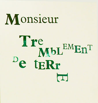
So, with this new information to hand, I decided to describe Lautrec, via the press, as Monsieur Tremblement De Terre. See, see what I did there. I put “mister”  in front of it. In French. Like a clever person.

It’s hard being this cultured, it really is.

But this is where I met my downfall. Drunk on my own genius, I decided to attempt to echo the effect of the beverage within the type. This started with the typeface itself, where I set ‘Monsieur’  in one font, all one size (I can’t even remember which font that was now, sorry that’s awful) but then jiggled the rest of it about a bit with different letter sizes. The concept here was to create a contrast within the sentence that alluded to Lautrec’s lifestyle change of aristocratic upbringing, to the bohemian life he led within the Moulin Rouge. (Something I then reinforced with the colours: black fading to absinthe green.)

As if this wasn’t a pain in the arse enough (because where’s the fun in making things easy for yourself?) I then decided the piece just didn’t say “off your tits on potentially lethal levels of alcohol” enough, so sought to reconstruct this by setting the letters at different levels and generally making a mess.

Experimenting with layering the print over itself

So really, it’s my own fault I had such a nightmare with letter-press. This kind of mindless artistic-ness is easy enough on photoshop, but let’s stop to consider what letter-press was actually invented for, for a minute. Had I done that at the time, I probably would have realised how difficult I was about to make things for myself. Letter press once served a very legitimate purpose. To print multiple copies of multiple straight lines of legible text.

Everything about my print is fighting that purpose, and as a result it just doesn’t work. I’ll admit that, I learnt a very valuable lesson. I guess that’s what I find frustrating to an extend. I do not like being restricted, to any degree on any topic. If I want to make something messy and complex, I want the freedom to be able to fulfil that purpose, not be restricted by the natural boundaries of a process.

I mean, true, I did actually get around it. But I know the piece would have been stronger had I conceded and worked with the limitations of the press, not against it.

But I guess though that is part of the charm to old print processes. They could be considered, by and large, redundant, but it’s the level of skill and patience required to master them that has kept them alive. People are desperate to prove their worth in a world where everyone has the potential to be an “artist”, and for many that is done simply by showing that their ability would have been acknowledged to just the same extent in a time where creativity was just that little bit pickier.

Had I paused for a minute to think, I hope I would have come to a conclusion that lead to a different outcome. But my stubborn nature coupled with a shortage of time has led to my discovering something quite different. I don’t enjoy letter-press particularly, but I feel that I’ve learned the secret to any form of print making is an element of forward planning. Concept can get you far under ordinary circumstances, but when relying on processes of the past you must use your head and prepare. Mistakes and accidents can be beautiful, but they are not talent nor skill. If you are to become a craftsman at printmaking, then you must respect the process for the process and work with it.

And at a time when artists like Tracey Emin are being officially titled “Professor of Drawing”, I feel like any process that makes you use a bit of the old brain capacity can’t really be a bad thing.

B

x

Print Workshop Two: Return of the Lino

I’ve finally gotten around to digitalerising (it’s a word) the second and third stage in our Print Making Workshop at Uni. Yeah sure, technically it finished weeks ago, but I’ve been busy. Besides, good things come to those who wait and other such justifying clichés.

So First up was Lino Cut time. Now I’ve had bad experiences with Lino Cut in the past, in that I was forced to give it a go as part of our GCSE Landscapes project in art class. Bear in mind, this was in a school where the facilities were not geared up to cope with the ambition of print making. I don’t know if you’ve ever tried to cut out a seascape from a chunk of lino with an old craft knife and the point of a compass (I shit you not) but it is not a creatively invigorating experience. I suppose it was character building to an extent, and it gave me a new appreciation for my health given the worryingly high chance of contracting Tetanus or losing digits, but I can’t really say it was an artistic high point. Needless to say, the project was swiftly abandoned when it became obvious (both to me and my teacher) that is was going to look shit.

As a result, I’ve been stubbornly against Lino Cut ever since, turning my nose up at it in my Foundation in favour of screen print and other seducingly exotic and more health friendly forms of image making.

So this was not one I was looking forward to. But, like a good student, I purchased my strip of lino and haphazardly scribbled out  a design. I decided not to make my distaste too obvious by ignoring the possibilities of colour, but equally wanted to keep the process to a minimum so I could be done with it quickly, and found 3 colours to be a decent compromise.

Now, I’m a fan of print making. I love screen printing and I couldn’t be much happier with my first attempt at etching earlier this year, but I had just assumed that this love was to forever be reserved for the more elaborate and high-tech forms of print, and Lino just wouldn’t cut the mustard. Let me tell you now, I will one hundred percent eat my proverbial hat. I will eat it with my face smeared in proverbial egg.

Lino Cut and I have worked out our differences and decided to give our relationship another shot. It’s on the provision that never again do I attempt it without the appropriate materials, but that’s the great thing about mistakes; you learn a big, fat, hand bleeding lessons from them and use said lessons to make improvements.

I love my Lino outcomes. They’re bright and fun and were easy to produce. I found the process enjoyable from beginning to end, discovering the gouging of the lino to be pleasantly therapeutic and indisputably pleasing when all went to plan, and the inking of the plate was just as quick. A quick wipe of chosen colour onto the stone, a few seconds rolling it out into a thin, tacky consistency and you’re ready to (rock and) roll straight onto the lino. Whatever you’ve cut out remains clear, only the spaces left behind catch the ink and then you can begin your process of layering colour over colour, gradually removing sections of plate until an image has built up. It’s at this point that you can give yourself a big old pat on the back for successfully accessing the appropriate side of the brain that deals in spacial awareness.

There’s even a mini press for the mechanically obsessed such as myself. It’s not as big as the Etching beastie, but it’s Becky sized and still creaks in that endearing tone of the past, when processes like this were a necessity, not just a novelty.

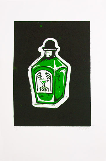
3 Colour, 2 Stage Lino Cut. Green on white, black on green.
4 Colours, 3 Stage Lino cut. Yellow on white, green on yellow, back on green.

I enjoyed it so much, I shelled out for a bit more paper in order to have a few more outcomes. When I made this decision, I’d already cut out my first layer, so some of my prints consist of 3 colours, some 4. Either way, I’m proud of the results and am really happy I approached it with an open mind rather than stuck to my original convictions.

For those who are interested, the image is an absinthe bottle as it was Toulouse Lautrec’s beverage of choice. I attempted to echo the stunted shape of Lautrec, due to his deformity, in the bottle and used the hat to reinforce this.

Alright, maybe not the best print in the world, but damn good fun and an important learning curve I reckon!

B

x

Etching Workshop: Episode Two

Long ago, on a blog post far, far away there was a sneaky peek at my etching plate for my current print workshop. It was brown, it was murky and it was waxy. But today I bring you news of an entirely different nature. Yes friends, today my etching plate is a shining, silver creature, a proud showcase of acid bitten channels and far, far too much time spent wiping, cleaning and  polishing.

Basically, it levelled up.

With the power of science, it was baptised in acid, which bit through those little scratchy lines of mine creating ditches in the metal in which the ink catches in the printing process. Which is pretty rad, let’s be honest. I mean that’s pretty hardcore, cartoon style acid right there, to munch it’s way through a sheet of metal. I mean, that’s like Who Framed Roger Rabbit stuff. But real. (Please bear in mind I haven’t had any contact with science lessons now in 6 years. Acid is a great novelty to me. As are bunsen burners.)

   Once the dangerous bit has been done, the next step is cleaning off all the wax so that the plate is left all polished and shiny with some new dents in it. Once all that prep’s been done, it’s time for the science lab to step aside so that we can get our art on. And this is, of course, the messy bit.

 Unlike my nice, clean buddy screen print, etching is one of those demanding little buggers who requires the use of oil based ink. This is, in my experience, a bit of a dick because it has the ability to get LITERALLY EVERYWHERE, and tends to make a habit of doing so (there’s a chance this is actually just down to my own incompetence of course.)

 So we start by spreading the ink over the plate with a little cardboard scraper, followed by blotting it into the grooves so that it catches. Then you wipe it all off again. It does feel like a thankless task, given that  you’ve literally just put it on there, but it does get pleasing as you reveal the inked up lines underneath; a little hint at how your resulting print may look.

  And when you’re all ready to go, you get to play with this guy. He’s a laugh.

  The plate get’s laid on the board, with your dampened paper laid over the top, then held in place by the mad heavy, and even madder expensive, blankets. Then you turn that giant, beautiful, victorian wheel and revel in the sheer mechanical mastery of it all (…actually that might just be for people like me, who harbour an adoration for early 1900’s mechanical devices.)

This rolls the board through the rollers that flattens your print plate to the paper and comes out the other side a brand, spankin’ new print. Brought into this world by your own bare hands. (With the help of a bit of acid and fuck off massive bit of steampunk technology.)

And thus we have print!

I’ve done a fair few of them now, practicing with how much ink to wipe away, the effect when the ink is left on the plate less ink, more ink etc so hopefully by the time I’m finished I’ll be a little etching master.

It’s a thoroughly enjoyable process resulting in beautiful, and oddly atmospheric, images. Alright so maybe it isn’t entirely practical for multiple book illustrations or anything like that, but for one of prints, or a series of prints, it’s more than adequate. And I’m so pleased that finally in my artistic education I’ve been introduced to it.

As I said in my last post, it’s oddly satisfying knowing that the process itself has changed so little from it’s conception. After all this time, it still has a place in the world. Even if that place is just the hearts and studios of artists and art students.

Well, for now, while I’m lucky enough to have access to facilities and machines like this, that’s good enough for me. And I fully intend to embrace it.

The Plate vs the Print

B

x

Snappy Snaps in Photography

So…I totally did a thing.

To be more precise, I rented out a manual camera (a Pentax K1000 for those that are interested) and I learned how to use it (sort of ).

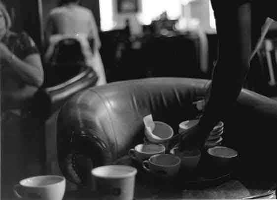
My aim was to have two photos, one set up and one observed, that translated an example of a figure’s relationship with their environment. Now I know in the world of le blog it’s a little unheard of, but I do have very limited experience with cameras. Yeah I have one, and I can take and image and shove it up on the computer screen (then subsequently Photoshop THE SHIT out of it), but in terms of really understanding how to use a camera like a tool, I’m about as experienced as a spoon. And at least a spoon has the excuse of not having any hands.

So hopefully you won’t judge me too harshly when I say that it was a pretty new experience for me. And I honestly was taken a little aback by the difference between a digital and manual photography. As you would expect, I found myself planning every tiny detail to such a high degree, and paying so much more attention to the composition of each image. I really found myself engaging in the creating of an image, much more so than I ever have before with a camera and it completely changed my view of using photography as an art form.

In short, I learned that to take good photos, you have to think about it. Go Figure.

Then, of course, you have the following process of converting your 35mm film into negatives and creating your contact sheet, judging exposure times, filter strengths, exposing, checking, adjusting, checking again, dodging, burning and all the other laborious steps that go into creating an authentic, manual camera experience.

It was long, it was dark and it was, at times, quite repetitive. But I’m really fond of my resulting images. They are mine: from beginning to end and for the first time, I could look on at a set of photographs in the same way I look at a drawing, painting or print.

That’s not to say I ever doubted that photography was an art form. It’s just that I had never engaged with it in the same way I have with other forms of image making. I’m very far from being a good, or even half way decent photographer, but I think it’s a really good start.

Like I find with a lot of things, I really did have to understand the bare bones before I could truly appreciate the process.

So is this the way forward for me? Hell no. It was long. REALLY long. I’m well and truly sticking with my digital for the most part, but I feel like I’ve gained a new-found respect for the little guy, and anyone who knows how to use him.

Well done Uni. You taught me a thing.

And hopefully that comes across in the resulting photographs.

Like with anything, the screen can never quite get across the subtleties of the image, so you’ll just have to trust me when I say that they are actually quite nice. Promise.

B

x

Etching Workshop: Episode One

I’m pleased to announce that once more they’ve allowed me into the print rooms, on the condition that I don’t get too excited (okay, that’s a lie. Although there’s a danger it might be necessary.)

This time my play date is with the foreign exchange student of etching. I’ve never done it before; dabbled in a little bit of very rushed dry-point in the last week of my Foundation FMP, but never gone the whole hog with the acid shebang.

So far I’m getting on with it just fine. As with all forms of printing the first, setting up bits aren’t really the most enjoyable but they’ve not been too labor intensive and, as arty as it sounds, I’m really liking the total disregard for modern technology. It’s oddly pleasing that in the hundreds of years that etching has been a print form, it’s changed so little. Almost feels a bit like a “well if it ain’t broke…” sort of deal, although I’m  sure there’s plenty of pragmatic people who would challenge me otherwise.

I’ve gone with a hard ground (as I’m but a wee beginner) and singed it a few days ago. Today I finished scratching into it, which was the most relieving surprise when I think back to my dry-point on perspex days. Wax is a total gem in comparison, none of that teeth on edge nonsense, just lovely lovely, soft, waxy goodness. Easy peasy.

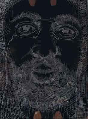
Our brief is simply to do a simple portrait of an artist we admire. No funny business.

So I’ve abliged with an image of Henri de Tolouse Lautrec. He’s a bit of a favourite of mine, not even because of his work but literally just because I find his life so fascinating. I went with a sharp close up so I could get in all the details of his trademark glasses. Plus he has a bit of a wonderful face to draw. Somehow very French (no onions or berrets though.)

So there it is. The wonky eye was genuinely his face by the way, that’s not jut me doing a bad drawing.

It’s nerve wracking knowing how different it will look printed, when it’s not only put back into positive, but reversed too. I’ve been fighting the urge to photoshop it and see how it’s likely to look, but I’ll be good and won’t spoil the surprise.

Just wish me luck!

B

x

UPDATE: Okay, I caved. I photoshopped it. I now have a pretty good idea of where it’s going. I’m not going to put it up though. Wouldn’t want anymore cheeky monkeys to see it before it’s properly done!

What’s this? You’ve actually DONE Something at University???

Hands up if you want to see what I’ve been working on at Uni so far?

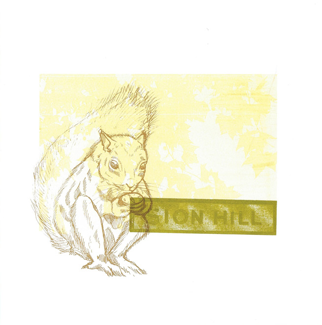
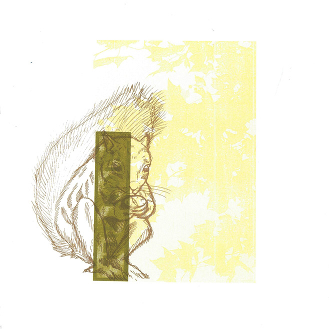
 Screen Printing Induction Tuesdays ended today with the completion of my first set of prints as a Bath Spa student.

They’re not the most complex or intricate works in the world, but I’ve been out of the game for a little while and they served pretty well as some basic experiments to get me back into the swing of things.

I decided not to mix my own ink in the end and instead made use of the left over pots people hadn’t finished in the print room. The choice of colour was an attempt to echo the yellows of Bath stone while suggesting the giant park and golf course I walk through on my daily route with green.

The prints are made up of 3-4 elements: Two hand rendered parts (the squirrel and text) and two photographs (the leaves taken in Royal Victoria Park and the Sion Hill sign at the top of the road).

I made a total of 12 prints, all a little bit different as I was playing with layout and inks as I went. They’re all hand printed onto Imagine Print paper at 28x28cm.

Not bad as testers, now let the real work commence.

B

x