So I was in the middle of combating my mistrust of art galleries.
I was doing it in the laziest way possible, don’t get me wrong, by only attending events of illustrative relevance, but I was still doing it.
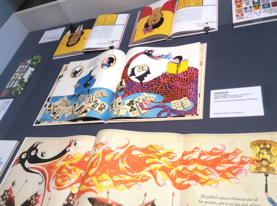
Having spent the early afternoon in a whirlwind tour of the contemporary illustration scene, by way of the AOI World Illustration Awards at Somerset House, I decided to kick it up a notch with an exhibit that cost real life pennies. Commitment ahoy! This big spender headed to the House of Illustration.
Safe bet? Yeah definitely but whatever, I was still paying to look at walls so I consider it a victory.


So, I am in love with the House of Illustration. Tucked behind the bustle of Kings Cross, if you can fight your way through the Potter-ites to find it, do it. Not only does it have a tiny yet really nice little shop of all things illustration, (I forget I have no use for postcards every time I enter) it also regularly holds events, talks and lectures by some of the industry’s finest. I’ve many a fond memory of various events in those walls held by editorial artists, to kids book creators, comics artists and beyond, all of which have been top quality. It’s genuinely a great place to get yo’self an education in all things drawn so if you’ve not already, do head it up.

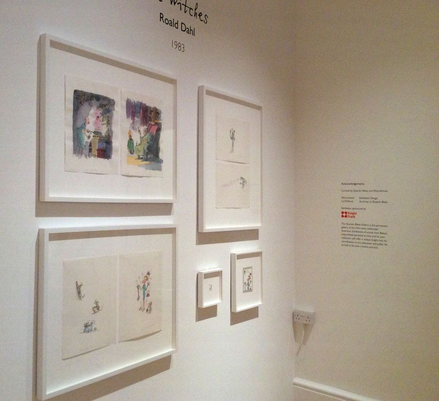
What made this venue a great counterpart to the AOI exhibition, is that the HOI not only champions the contemporary, but regularly pays great homage to the history of illustration. It didn’t let me down on my visit either, where, on paying my affordably £7.00 ticket price, I was treated to a charming, unexpected exhibition of Quentin Blake originals.
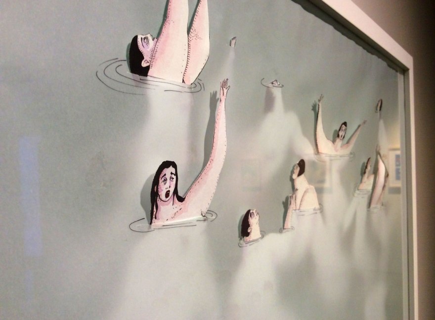
I suppose it’s not that surprising, given that this goliath of British children’s illustration IS the founder, but even so the short and sweet collection was a bit of a delight. Seven Kinds of Magic, is a collection of Blake pieces in which he approaches themes of surrealism and magic. In all honesty, Blake’s work doesn’t tickle my fancy on too frequent a basis, but it’s truly impossible to deny the life and charm of his scrawled characters and bonkers scenarios. I also firmly believe that any insight into the workings of a practitioner and acknowledgement of how they approach a given subject is all of great relevance. Especially when they have been rather a large part of your childhood experience of pictures. And especially when they are so joyfully mad.
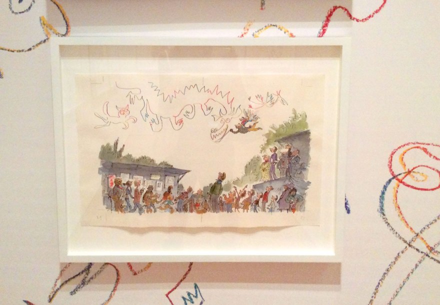

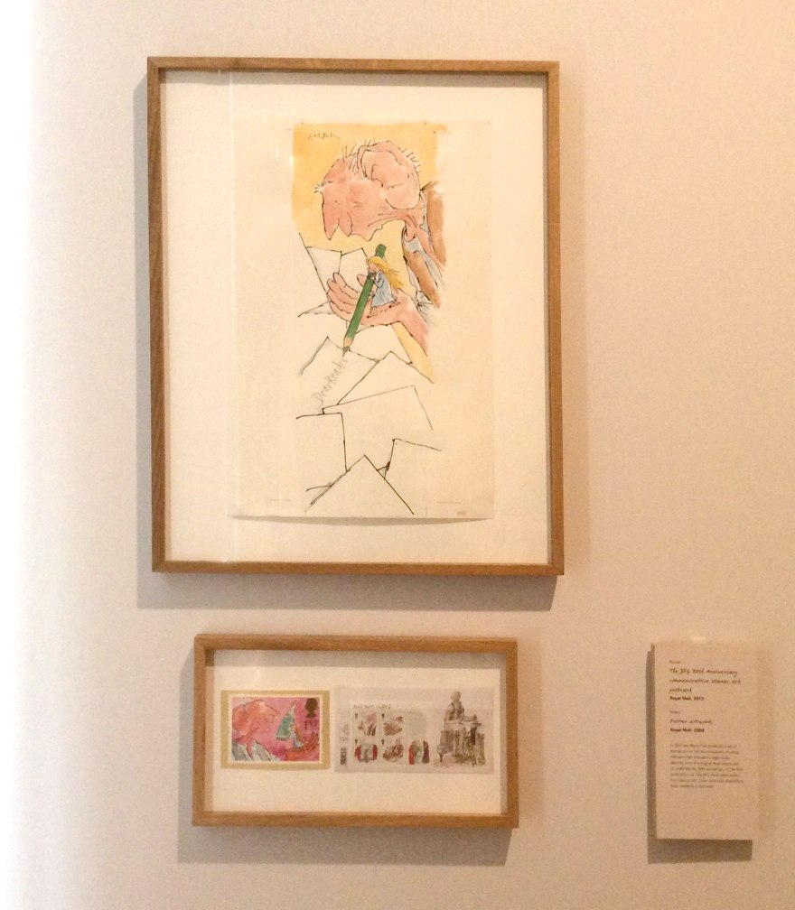
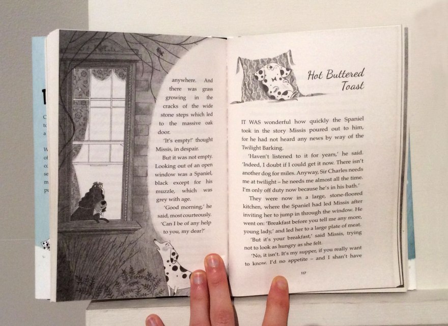
On top of this emporium of scribbled musings, another small room housed yet more Blake magic, this time in lieu of the BFG‘s contemporary comeback. Having spent many a sleepless night, terrified I would be consumed by an unfriendly giant (well, what’s any British childhood without a bit of Dahl related trauma?) this did result in a pang of nostalgic excitement. 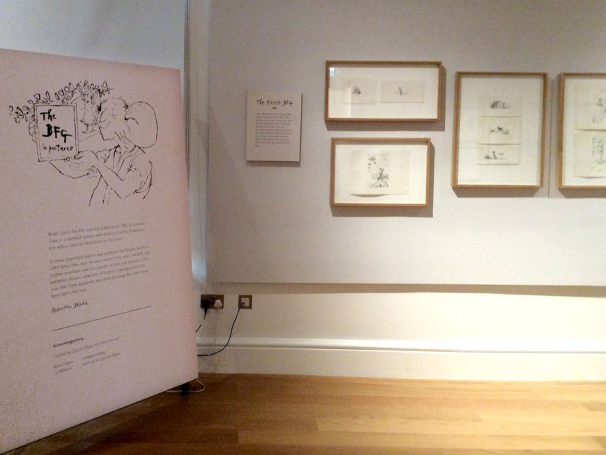
This small collection housed originals from the book, as well as previously unseen images that were cut from the end product. A sneak peek into the production and alternative results of something we’ve all become so familiar with. I’m not the kind of gal who is hugely fussed by the idea of seeing ‘The Original’. For me, if illustrations were made for a book, those printed pages in their intended context ARE the real versions. Authenticity of ink on a page matters not in my eyes, BUT new images I’ve not seen before? Illustrator interpretations of scenes I was previously left to imagine myself? Well that is something worth taking a peek at.

And it is a bit of a joy, even on a wall. It’s around until October, so if you were/are/could be a fan of the book, you really should stop in.
BUT, these surprise delights from an illustration wizard were not actually what had drawn me to the HOI that sunny, August afternoon.
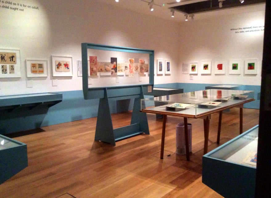
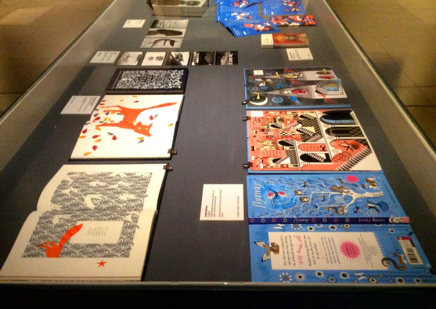
Instead an exhibition of Soviet children’s books, the aptly named A New Childhood had caught my interest hook, line and sinker.

You offer me a chance to compare story, illustration style and subject of historical children’s books to that of the contemporary, I’m there. (#booknerd) You invite me to take a look at the picture books of another culture, particularly those in a time of historical poignancy I’m THERE. You invite me to observe the impact of political unrest on the children’s book market I am ALL OVER THERE. And you appease my love of classic, European and Russian design, casually throw out names like El Lissitzky and charge me less than a tenner? My friend, you got yo’self a date.
It was one of those events that made me sad I wasn’t still in education and having to write a dissertation any time soon. I was mortified the taking of pictures was forbidden, it was a fabulous collection of incredible design work. Stylised illustration in glorious synergy with typography that screamed history.
Given it’s historical relevance, it’s not surprising that the arrangement of the exhibition felt like a classical museum format. The glass topped tables and large, formal information cards gave the collection a treasured, ‘getting cultured’ vibe that took me back to being a kid in a museum. That knowledge that you were, in NO WAY going to EVER be trusted to touch such relics. It’s so strange then, to imagine the pre and post revolution children of Russia, pouring over this very collection I stared at through four inch thick glass, in their beds and with their parents; in the same, slouched manner you see kids on beanbags in Waterstones, sinking into Charlie and Lola with the corners folded in and their imaginations racing.
I understand, and in this case totally appreciated, the serious tone of such a valuable collection being treated with this respect. I liked that I felt I was in a museum. I felt I was being taught. I felt I was really Getting History, but it was so apparent how many millions of miles away from the real world of kids books it was. I wasn’t a reader here, I was an observer.
Yeah okay, the fact I can’t read Russian probably had something to do with that too, I can’t deny it.
And I learned a lot. Aside from the joy I found in discovering the artistic impact of the curious rules of such a strict regime; the banning of all things folklore, the mistrust of anthropomorphism and the, almost comical differences this appears to have with our contemporary, Western picture book climate, I learned facts. I followed the roots of contemporary illustration, the way style and content spread throughout nations, the impact such poignant work has on my current market. The transition of design. The movement of character. It was a delight to see and compare where things came from, to where they are. And, importantly as always; context. Society changes, and the creative output moves too.
To ban fantasy, to encourage production, function and mechanism and place importance on becoming USEFUL adults, is a far cry from the values explored in plenty of picture books today. Such a no-nonsense regime had to drill function into young minds. I suppose for many, it’s brainwashing. To remove a child’s imaginative capability by way of focusing on the reality. The list of banned, damaging or unsuitable children’s output then, seems so obscure to us now.
But that obscurity to our society, is of course where the lesson lies. Call it brainwashing if you will, but children’s books do shape minds, which, in turn, shape people.
We may not like to consider it brainwashing now, perhaps because the societal scenario is not nearly so extreme, perhaps because one political body is not perceived to be outwardly in charge of the entire output, perhaps, and most importantly, because we don’t disagree with the topics of discussion. Either way, we must always be aware that picture books are significant in shaping thoughts, societal codes and values. All works of fiction, media and art in all their forms, impact directly on the belief system of a person.
I don’t think this is necessarily negative. This is how cultures are formed. We have to define and express shared values to an extent, in order to co-exist without pandemonium. Without getting too pretentious, children’s books, along with all other entertaining consumables, help to define the core of societies.

A New Childhood was a brilliant collection of texts spanning across a foreign period of revolution. It, as all museums do, celebrated and examined a point in history, be it within or outside of our cultural code of conduct. It was an extreme reminder that context is everything and to always be aware of the power of judgements communicated in all media; specifically those intended for the young. First impressions, after all, can be hard to renegotiate.
The House of Illustration is a good place for picture loving yet gallery-wary people like me to explore these, white-walled environments. It takes things I love, like illustration; imagery designed for a purpose, for a brief, for a text and displays it out of it’s original context. The intent is to perhaps elevate it to something more cultured than it is? To remove the dirty, money aspect, and witness the creation as an example of higher art? It’s a mark of true acceptance of commercial artists, once looked down on by the community of higher artists, into the realms of something greater.
I appreciate the notion, because I (obviously) appreciate the illustrator. I think they SHOULD be appreciated. I do think they should get credit for the work they do. Cover artists of novels should have their name on their work, and picture book artists should be acknowledged as co-authors. In my, humble opinion, that is.
Where I think I fall away from the idea of an exhibition space, is that I don’t view it as any more valuable. I don’t like looking at things on a wall or displayed on a grey floor. I still don’t really rate the experience, even after the array of, frankly, phenomenal collections I experienced. I suppose I personally, don’t really feel it does the illustrator that many favours.
I like to see things, not in their original state, not to appreciate solely the mark on the page or the craftmanship of the line (although there’s no doubt it can be sensationally impressive) in a blank environment where all that matters is its existence. I’m more excited by it In situ. I want to see an illustration next to the text it was made for. I want to see the design of the spread as a whole and how that designer has impacted on the illustration. I want to see the results of every stage of production working their respective magic to create the final output. Arguably of course, that’s why it’s important to see the illustration alone, in a case; to truly experience how it’s placement has changed. That’s why I’ll continue to check out places like this, to get a rounded experience of what illustration is, why it is more than simply drawing.
But don’t expect me to be as excited. I still prefer my pictures printed in pages, tangible, touchable, smellable. Interacting with spine and paper stock and text in the musty library, in the messy play room, in the classroom that smells like pencil shavings.
This is my kind of illustration, and my kind of design. I loved my visit to the HOI, it was an enlightening and beautiful museum and I know I’ll return. Thanks for trying to appease my inner gallery lover, but if you need me, I’ll be on the floor, elbows deep in a beanbag.


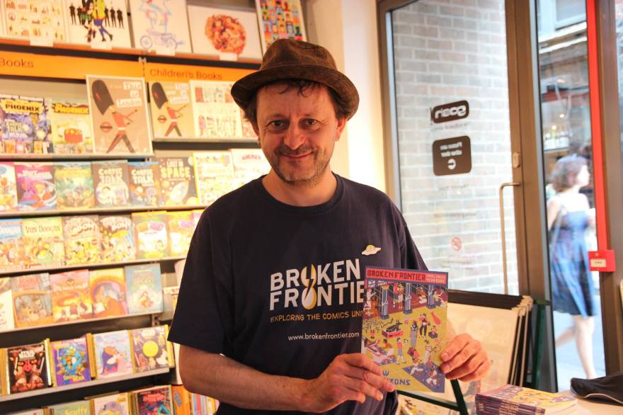


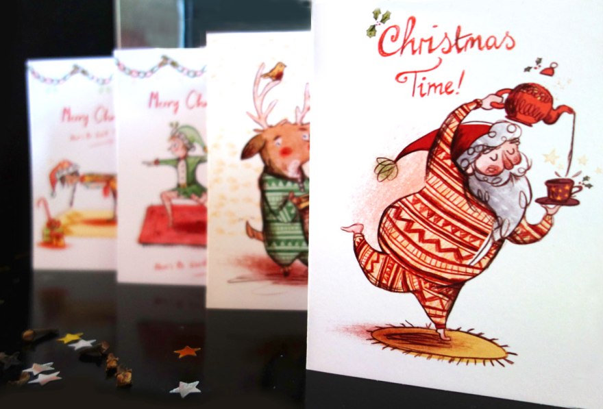
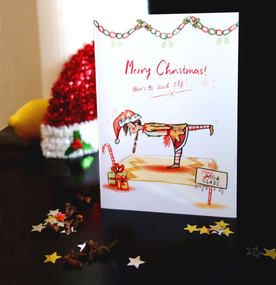
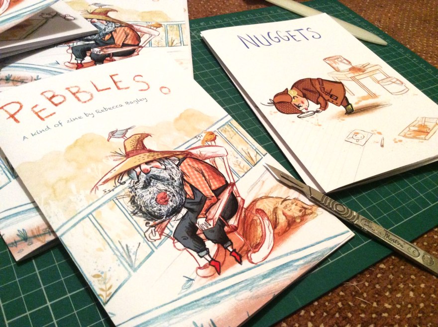
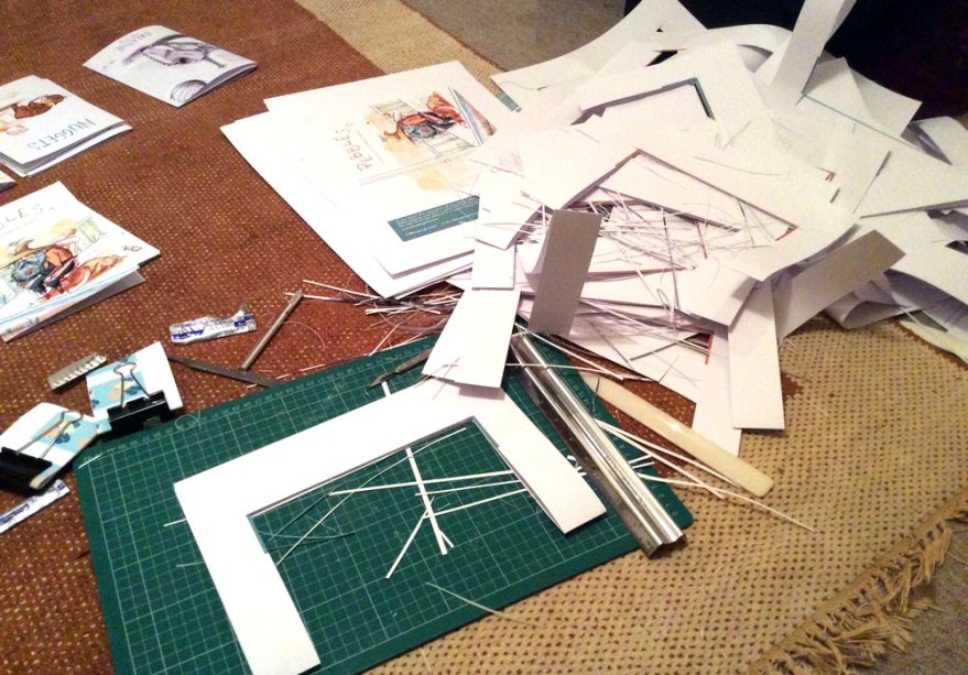
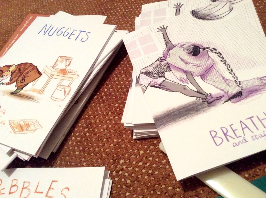
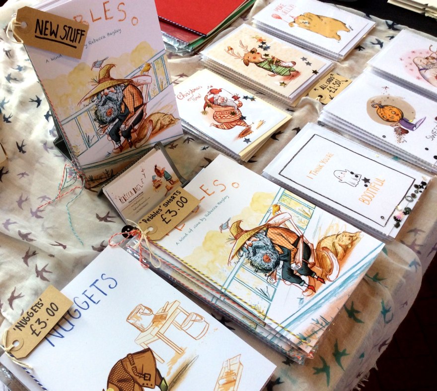
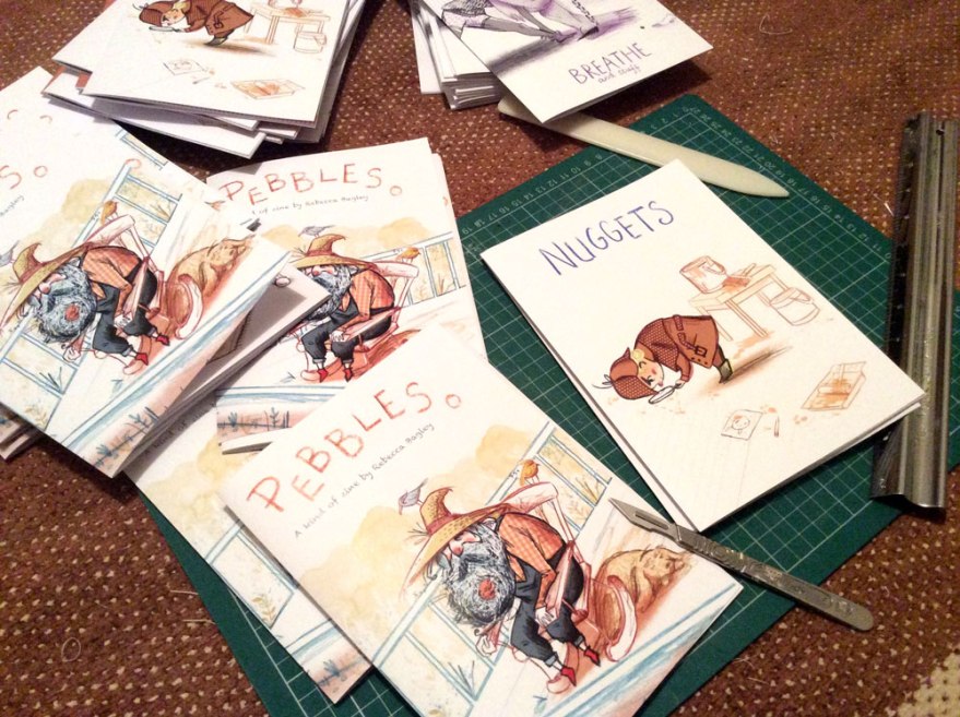
 This year saw me amass my first 1000 followers on both instagram AND twitter! So I held some giveaways of greetings cards, zines and comics to thank everyone accordingly.


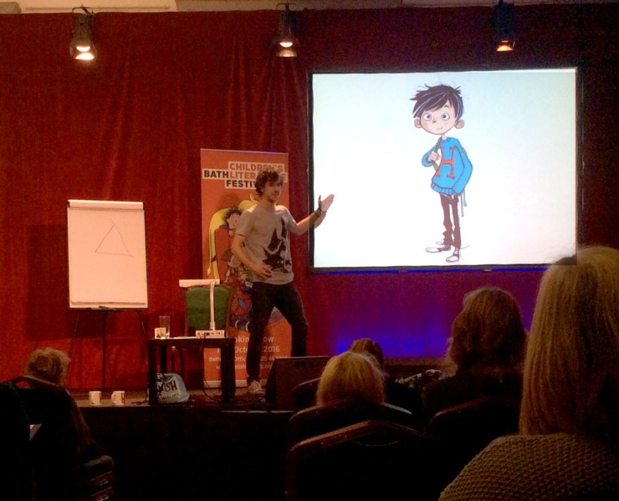
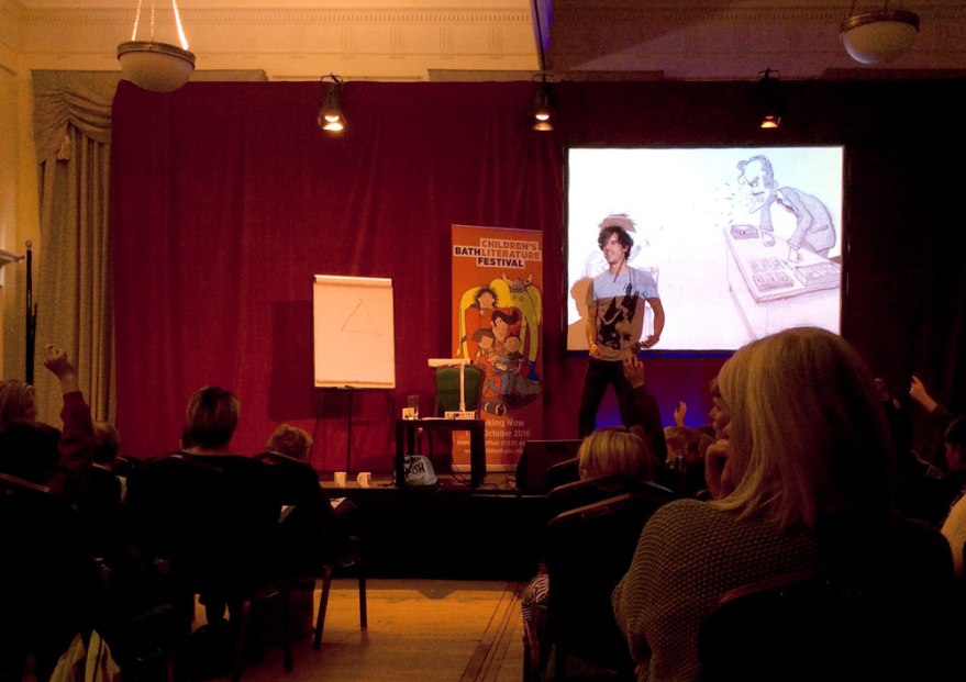 But humbleness aside, Littler did a stonking job of holding the stage, even without his extrovert counterpart. If his flawless live drawing wasn’t magic enough, the interaction with the audience had every kid grinning to ear to ear. Given the rare opportunity to command the hand of a professional illustrator, the creative, imaginative and frankly weird suggestions of the kids were flying as the audience created their own adventurous character for Littler to illustrate.


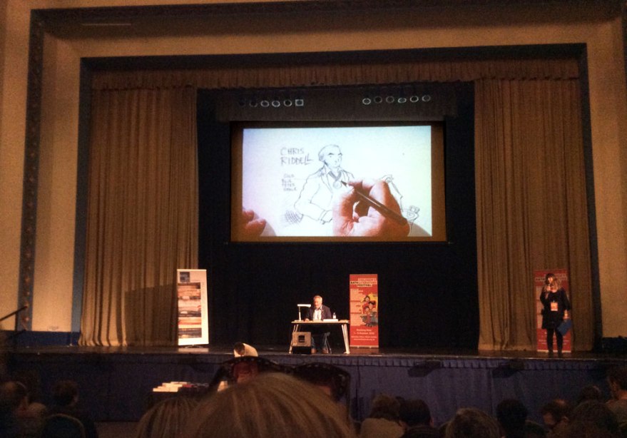 Hosted in the festivals most grand venue, it was strange to see the small figure of a single man, his projector and a sketch pad in the middle of such a large stage (even if he does have a medal.) But the second that man’s pen touches paper, he becomes the size of mountains.


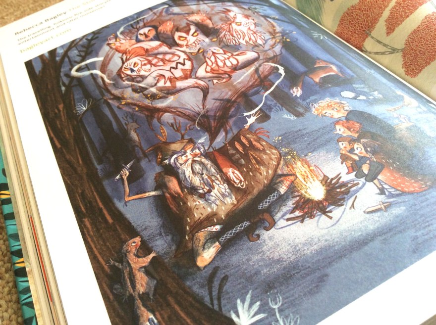


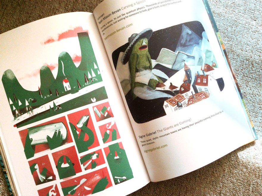 My favourite part of any anthology is discovering all those new names and talents to pop into the inspiration memory bank. This collection is bulging with them, it’s going to be a busy evening ahead, finding them all on twitter!


 Author: Elli Woollard
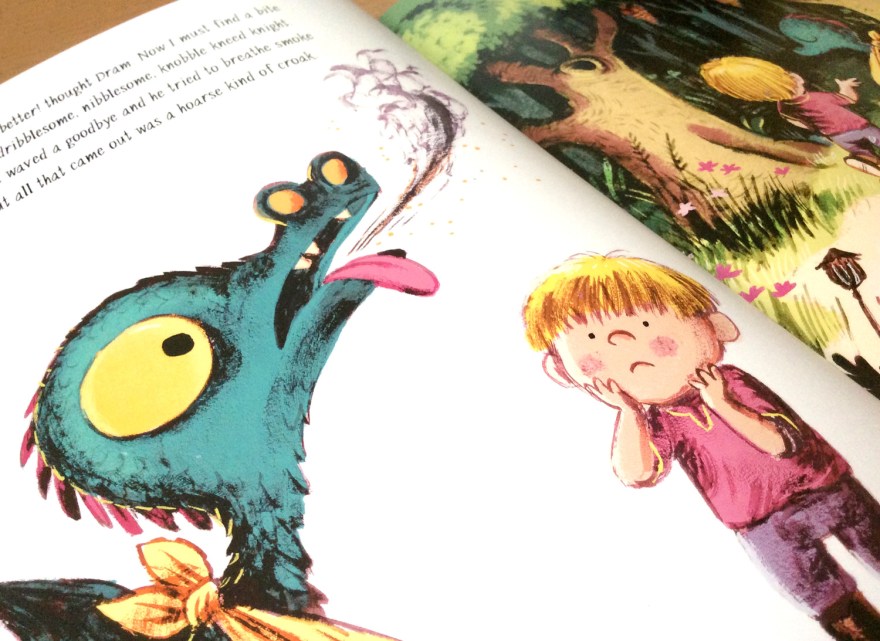
 In a beautifully drawn and tastefully coloured sequential spread, our little chap is blown off course. Frankly, I defy any human with a beating heart not to express even the tiniest of concerned, cooing syllables here. Davies captures such peril in the wide eyes of the reptilian baby, there just isn’t a homosapien alive whose heartstrings are sturdy enough to withstand a good tug. It’s a perfect Attenborough moment. Yeah sure, the bloodstained and ruthless lion has been out for an afternoon’s killing, but look how FLUFFY the babies are!


 And it’s true, his interpretation of the characters make this tale. Adorable with a capital ‘A’, I demand plushy merchandise of the innocent duo (I am DESPERATE to hug this dragon!) The pair are subject to a good number of emotions as they build and reveal their, unknowingly forbidden, friendship and even with he simplest of facial details, Davies creates the full, emotional spectrum with precision. For a story all about the value and strength of relationships, empathy and compassion,