
So I thought I’d log the concluding stage of our printmaking workshops, seeing as I documented the other two so thoroughly. It’s a shame in a way to end on this one as, out of the three of them, it was the one I connected with the least. This is partly due to the fact I didn’t really allow myself enough time to think about my outcome as in-depth as I had for etch and lino, and partly just due to the fact that I find Letter Press just a smidgen too fiddly.

I know, I know. I’m being a bit of a hypocrite and general spoil-sport, but I just can’t really get behind the reasons to engage with letter-press. The outcomes can be truly beautiful, I admit that, but I’m just so aware how easy it would be to create such pieces in a fraction of the time via digital means. And with so much more freedom. I feel so bound by letter-press, firstly by the fact you’re so limited to what font you happen to have available in your inventory, in what specific sizes and that’s supposing that some cheeky arse hasn’t nicked one or two letters (as is usually the case when you’re using a shared press, such as that at uni). And that’s even before we factor in the other variables such as all the right leading sticks being left in the right place, there being enough clamps etc etc etc

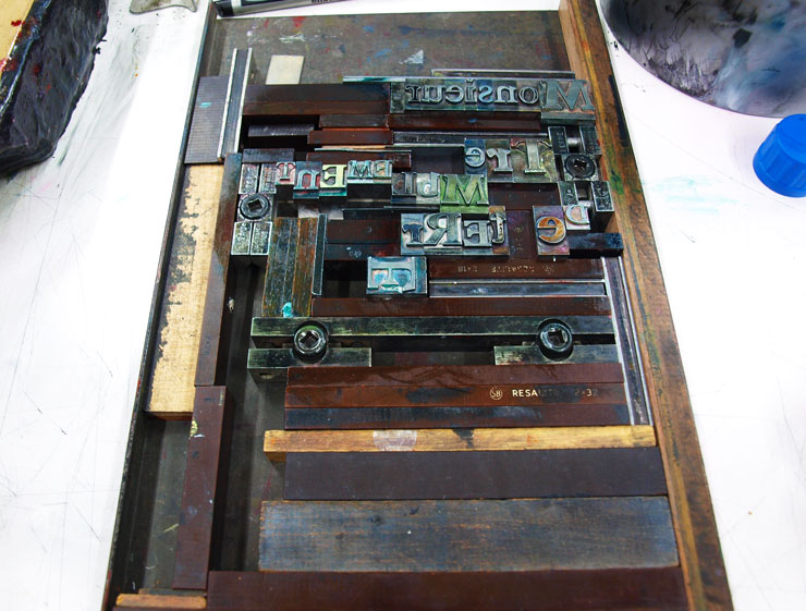
THEN, SUPPOSING all that is, indeed in order, you have to painstakingly put the bloody thing together. Letter by letter, line by line. I truly take my hat off to all those poor folk to whom this was a career back in the days of pre digital print. They truly must have had the patience of saints.
But I digress, I don’t think it helped matters any that I’m not overly fond of my outcome. It was rushed, unplanned and generally a little dull, but it is the conclusion to my Henri de Toulouse Lautrec collection, so deserves a mention.
As my lino had gone down so well, I decided to theme the letter-press along a similar bent. For my lino, I’d focused on Lautrec’s alcoholism and fondness for absinthe, and it was through the research for this that I’d stumbled upon the recipe for his famed cocktail. Well, I say cocktail. I think what I actually mean is lethal concoction. One part Absinthe to one part Cognac. That’s it. A 50/50 blend of undiluted spirit, shaken together into a glorious, liver-failure inducing solution that Lautrec refered to as Le Tremblement De Terre: Earthquake to you and me. So called as it was (understandably) assured to shake you up and make you fall over.
So, with this new information to hand, I decided to describe Lautrec, via the press, as Monsieur Tremblement De Terre. See, see what I did there. I put “mister” in front of it. In French. Like a clever person.
It’s hard being this cultured, it really is.

But this is where I met my downfall. Drunk on my own genius, I decided to attempt to echo the effect of the beverage within the type. This started with the typeface itself, where I set ‘Monsieur’ in one font, all one size (I can’t even remember which font that was now, sorry that’s awful) but then jiggled the rest of it about a bit with different letter sizes. The concept here was to create a contrast within the sentence that alluded to Lautrec’s lifestyle change of aristocratic upbringing, to the bohemian life he led within the Moulin Rouge. (Something I then reinforced with the colours: black fading to absinthe green.)
As if this wasn’t a pain in the arse enough (because where’s the fun in making things easy for yourself?) I then decided the piece just didn’t say “off your tits on potentially lethal levels of alcohol” enough, so sought to reconstruct this by setting the letters at different levels and generally making a mess.


So really, it’s my own fault I had such a nightmare with letter-press. This kind of mindless artistic-ness is easy enough on photoshop, but let’s stop to consider what letter-press was actually invented for, for a minute. Had I done that at the time, I probably would have realised how difficult I was about to make things for myself. Letter press once served a very legitimate purpose. To print multiple copies of multiple straight lines of legible text.
Everything about my print is fighting that purpose, and as a result it just doesn’t work. I’ll admit that, I learnt a very valuable lesson. I guess that’s what I find frustrating to an extend. I do not like being restricted, to any degree on any topic. If I want to make something messy and complex, I want the freedom to be able to fulfil that purpose, not be restricted by the natural boundaries of a process.
I mean, true, I did actually get around it. But I know the piece would have been stronger had I conceded and worked with the limitations of the press, not against it.
But I guess though that is part of the charm to old print processes. They could be considered, by and large, redundant, but it’s the level of skill and patience required to master them that has kept them alive. People are desperate to prove their worth in a world where everyone has the potential to be an “artist”, and for many that is done simply by showing that their ability would have been acknowledged to just the same extent in a time where creativity was just that little bit pickier.

Had I paused for a minute to think, I hope I would have come to a conclusion that lead to a different outcome. But my stubborn nature coupled with a shortage of time has led to my discovering something quite different. I don’t enjoy letter-press particularly, but I feel that I’ve learned the secret to any form of print making is an element of forward planning. Concept can get you far under ordinary circumstances, but when relying on processes of the past you must use your head and prepare. Mistakes and accidents can be beautiful, but they are not talent nor skill. If you are to become a craftsman at printmaking, then you must respect the process for the process and work with it.
And at a time when artists like Tracey Emin are being officially titled “Professor of Drawing”, I feel like any process that makes you use a bit of the old brain capacity can’t really be a bad thing.
B
x
