Enough Grumbling, it’s time for Elation! It’s the 1912 Celebration!

So, having had a good ol’ rant at the state of my print that was my exhibition piece, let’s now focus on how great our Exhibition actually was.

A gigantic congratulations to everyone who just completed Year One of Graphic Communication at Bathspa University! As the exhibition wasn’t graded, not everyone felt it was necessary to submit any work, but for those of us that did I think it was a brilliant compendium of different approaches that boasted, not only a lot of talent, but a lot of ideas and conceptual wealth.

As the brief was SO very open (1912…that’s it) there was naturally a very large selection of works on display. Everything from publications to prints to animations to textiles. And the varying ways in which people chose to take the brief was also wonderfully broad. I’ll document here now some of my favourite works as well as some of the less crap photos I managed to take with my very limited photography skills. This is far from everything that was on show, but I’ll try to use what I’ve got to communicate quite what an enormous range of work was on display.

Prints

Arthur Webb: ScreenPrint about the Piltdown Man Hoax

Obviously, a lot of people chose to make use of the print rooms once the third year rush had ended. But to my surprise this didn’t just manifest itself in screen printing, which tends to be the most popular. There was a whole lot of linocuts too, all on different topics and with different strengths. It made for a really great display of variation, as well as assuring me that I’m not the only one with a fondess for printmaking!

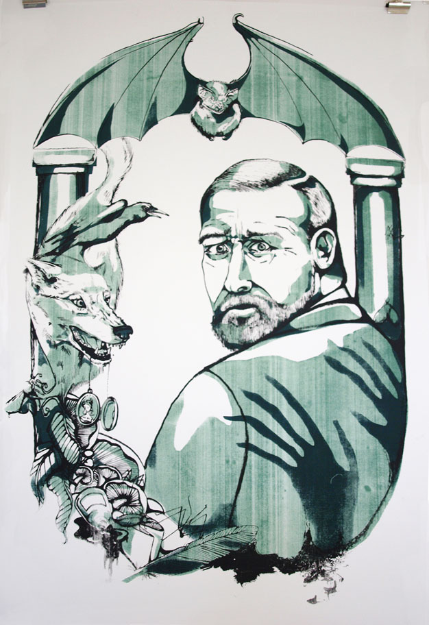
I’m also relieved to say that, while it definitely wasn’t up to my standard, people still seemed interested in my Bram Stoker print. It received very nice comments from one or two onlookers too, and while I still was disappointed by the result, hearing nice words did pick me up a lot I must confess!

Kirsty Stanley: Linocut Prints about the first parachute jump by Albert Berry.
David Gordon: One event from each of the 100 years between 1912 and now.

There was also a lot to be said for the ways in which people were using the printmaking. David’s piece was a real stroke of time-consuming ingenuity, in which he screen printed his photographic images in CYMK. This produced a full spectrum of colour, in the same way it does through your inkjet printer, but done via  screen printing. It’s turned out looking completely amazing, although I will say, he nearly killed himself doing it. The boy has real dedication to his art and I can’t express my respect for him highly enough. He never would have stood for a shitty print like mine, let me tell you!

David Gordon: Screen Print using CYMK colours!

Digital Prints

Ah the digital print, or Giclee as they’re known to those who want lots of money for it, but don’t want to have to put in the same level of effort required of you in direct contact printmaking. Don’t let that sound like a put down though, there were some beautiful images made and printed in the exhibition, and I and many others would be proud to own them, and would be even prouder to have done them!

Elhora Powell: Illustrated narrative of the 1912 collapse of the Quing Dynasty.
Bea Baranowska: Handmade Scout badge board

Textiles

There’s a common misconception that in order to be considered graphics, something must have been made via the computer. Allow my classmates to put this one to rest.

Bea Baranowska: The Scouts began in 1912.
Emily Hunter: Screenprint onto canvass documenting the 1912 introduction of the chilli heat scale.

Publications

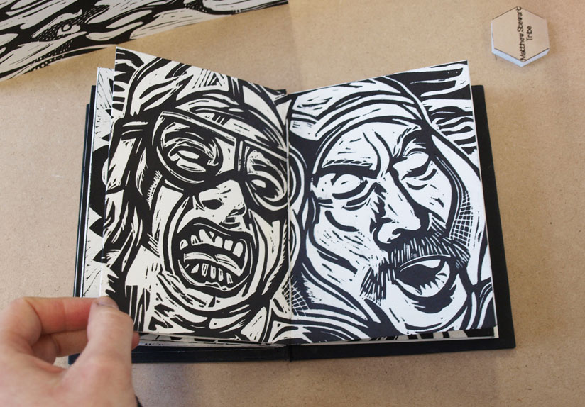
My favourite. The books and zines. This is only the tiniest example of what was on show, they ranged from professionally printed newspapers and information packs about pig racing, to hand bound print collections, narratives about personal responses to the brief and themed dot to dot books. It was quite an impressive array!

The Publication Table
Thomas Goldsworthy: Olympic Games 1912 Newspaper
Matt Stewart -Tribe: Scotts Expedition LinoPrint book
Lucy Harper: Hand drawn story of her Great Grandparents

Animations

And Macs. All Art schools have them, and like a pair of perky boobs on spring break, they love getting them out. This exhibition was no exception, it was Macs galore, and all bursting with newly created animations, films and videos.

Nipples.

Macs set up with all the animations people made. Because it’s just not an art-uni without Macs.
Rhianne Farrell: Handmade stop-start animation about key events of 1912
Carl Godfrey: Animation about the Japanese gift of 1000 Cherry Blossom Trees to America

Flogging Stuff!

Well you know me, I love a good stall. And I made sure I wheedled one into this exhibition too! Luckily, everyone else got involved too and brought along prints and books and anything else they’d made in the year. All together, it made for a pretty impressive display of work. Well done us!

Selling work from the past year.
Beer+awesome drawing=:D
Prints,zines,books,Tick…

So yeah, all in all a great event really that received some really complimentary comments from those that went. I would like to say a huge thank you to three people in particular: Tom Goldsworthy, Carl Godfrey and Ciara Caldwell-Cleave who were in charge of all the publicity and organising of the event. They completely made it what it was, went out of their way to make display animations, organise free beer, made cakes and 1912 ice cubes (made sense at the time) as well as compiling little free compilations of all of the work on display for us to take home, which really was a lovely little touch. Yeah okay, their cheekiness may have got us in trouble with the second years a little bit, but hey, what’s a bit of casual rivalry amongst years eh? Antics like that is totally what this institutionalised education is all about, and the long and short of it is that they made the event.

Free catalogues of everyone’s work!

Cheers guys, I hope since then you’ve had a good old relax, put your feet up and cracked open a cold one.

B

x

Better Late than Never: When Ambition bites you in the Bum

I’m back with a new post! Yes I know it’s terribly late, I am oh-so-sorry, but you see, there was a dragon.

No?

Not buying it?

Yeah well that’s because it’s a lie. There was no dragon, I’ve just been rubbish (again) and have failed at bringing you any kind of news in favour of sleeping. However, those lazy days are now gone! Banished! And I hereby solemnly swear to be much, much better at this blog fandango. Frealz.

So here it goes. Last time I did a post, I was just about to embark on a big old silly printing experiment that did, in the true nature of experimentation, fail horrendously. Yes, you heard, printing finally turned on me. Screen Printing as well, that dirty dog. After all the nice things I said about it. Needless to say, it put me a little bit (a lot) down in the dumps, I don’t like doing bad work. Especially not bad prints.

But such is the nature of trying new things and not leaving yourself enough time to properly get to grips with it.

Basically what happened, was that I wanted to do a print for the End of Year Show, and my tutor talked me into doing it GIANT (A1), as opposed to the comfort zone of A6-A3 size range I tend to aim for, less than a week before the exhibition was due to open. Actually, now that I think about it, this is the same tutor who was to blame for the up-all-night-due-to-lack-of-preparation-2-page-comic shebang. Must investigate the possibility of a single-handed conspiracy against me there.

But I digress, “a big print…ha!” you may claim, “doesn’t sound like such a big deal to me!”

Well, metaphorical voice of imaginary rhetoric reader, you’re right, you wouldn’t think a big print WOULD be such a nightmare, however this one decided it would be due to the following limitations.

  1. I only had one screen. This meant that, in order to achieve the 3 colour print I was aiming for, I had to only expose ONE layer onto the screen (due to time limitations) – the most complex one was naturally the best choice, but this meant the starting two had to be hand cut newsprint cut outs which I would have to use as stencils with the blank screen, then expose the 3rd layer on afterwards. I hate cutting newsprint. It’s delicate and awkward and a pain in the arse to transport. I especially hate cutting newsprint when the newsprint itself is bigger than A1 and I only have an A3 cutting mat and, due to the end-of-year-run-down-of-materials, comparatively blunt utensils.
  2. I also couldn’t afford, due to the end-of-year-run-down-of-funds, to digitally scan and print my exposable design onto a giant acetate in order to expose it, so it had to be hand traced from the original sketch, using special ink (FROM A POT WITH A BRUSH! Not even pens) onto a cheaper, transparent, special-ink-from-a-pot friendly material. This ate one full day of my already very tight schedule.
  3. Due to the size of the print and, by comparison, the size of me, I was encouraged not to print the organic way; hand+squeegie=lovely print, but instead to use THE ARM. Now this was really where my downfall lay. In theory, THE ARM is a great idea. It’s a bit mechanical arm that holds the big squeegees and spreads the ink over large surface areas my own little limbs would struggle to cover. All I had to do was push the handle of THE ARM along with the correct pressure to get a nice, flat, even coverage.

Unfortunately, as I only had, in the end, one day in which I could print, I didn’t really get the time necessary to be able to master the art of THE ARM. In fact, I think it’s fair to say I was actually pretty shit at it. I’m not sure if it was due to my size and weight (or lack thereof) but I just couldn’t seem to put enough pressure on the damn thing to get an even coverage of ink. I tried thousands of variants of amounts of ink, I tried adjusting the bed, adjusting the screen, the suction, I tried more paint in the mix, more solution, harder squeegees, softer squeegees, literally everything I could in the very limited timescale I had.

But in the end, with time ticking by, I had to just go for it. And 3 colours, 5 prints, about 60 newsprint tests and a grump to end all grumps later, was left with a pretty damn substandard print as a result.

Muchos Disappointingos.

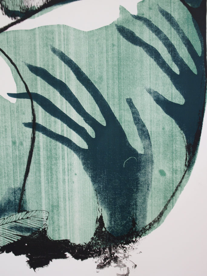
As you can see, the colour is not at all flat and the black’s not come through at all clearly. I think had the lines been printed perfectly, it may have tied any issues with the stenciled colour together. Might even have looked better, given the grimy nature of the subject matter. But unfortunately the lines are just as problematic as the other two colours. Which really meant the image lost out in areas of detail like these.

The brief for the exhibition was 1912: Go make something! So I chose to focus on the death of Bram Stoker; author of Dracula, theatre owner and all-round pretty clever guy. From here, I subsequently, invented an “alternative reality” in which Dracula‘s success above all his other works was attributed to the fact that it was not from Stoker’s imagination, but based on true events. I wanted to suggest that his death in 1912, officially regarded as “a series of strokes” was actually caused via the paranormal attack of a vampire.

I chose to do it in the form of a single image narrative. This was actually a bit of a leap for me who is, as you may be aware from my other work (and if you’re not I think you’d better have a look in the shop don’t you?) predominantly a sequential art sort of gal. This whole, summarising in one image was quite the challenge, which is why it was so disappointing to have overcome one hurdle to fail at another.

Anyway, It’s big, it’s a print and you can see what it is, so in many ways, I achieved what I set out to. It’s just a shame the craft is so poor. But we live, we learn and sometimes, we screw up screen printing.

I think that’s definitely what Sinatra was singing about in That’s Life: Screen printing giant images of deceased writers.

What an epiphany.

B

x

Poor Ink coverage could have looked ghostly and haunting, had the black been a little crisper.