Exhibition in The Boston Tea Party!

Okay, so we all like Tea. But some of us also like coffee. And some of us REALLY like GOOD coffee.

I am one of said humans, and for this very reason I LOVE the Boston Tea Party chain. For those of you not in the West, you’ll just have to trust me. They do what they do and they do it good.

And look how pretty it is.

BostonBath

So I was pretty delighted when I was doodling away in it’s Bath branch some time ago, and was approached and asked if I’d like to exhibit work for a bit. Pretty neat eh?

So for the month of May, I have adorned the walls of Bath’s bit of Boston with silkscreen prints, etchings, risographs, digital works and any other number of bits and pieces I like to make.

BostonBath2


silkscreen_Boston2


silkscreen_Boston


Bear_dada_Boston

BostonBath3


Boston_art


So tell all your friends, go grab a coffee (because it really is good) and surround yourself with oddities and nice things for a bit.

And then buy them too.  That would be great. Thanks.

A Very important Post and Definitely NOT any kind of Procrastination

Want to see a thing?

I’ve actually been sitting on this one for a while, but thought, as I desperately do NOT want to get involved with my summer project, I’d go ahead and load it up for your viewing pleasure.

It’s not procrastination okay? I’m providing a service.

yeah, alright.

But those of you who have been with me for a while, will remember when I actually DID my university work and didn’t simply ignore it in favour of baked goods and birthday presents. One such example of this was one of my last illustration projects in which I produced a set of sequential linocut prints (to be found hiding here).

In the end, they were presented on a board in a simple layout. I had wanted the images themselves to do the work in terms of communicating the story without the distraction of any further, novel presentation.

But you know me, why make one set of prints when you can do TWO?

And since this project, the duplicate prints had just been sitting about in tissue, getting a little bored and generally feeling a little abandoned (I don’t know that they did feel this way. I never asked them, but it seems like a plausible emotion for an inanimate object to have.)

And that was how they stayed, sad and forgotten.

BUT THEN I had to move out! And suddenly there was a whole wealth of jobs and thing that I really, really, desperately did NOT want to do. And suddenly I couldn’t take the fact they were so, very forgotten. They didn’t deserve such a fate, it was really, really important that I get out all my book binding equipment and allow the little prints the glory they were owed!

And that decision DEFINITELY wasn’t procrastination. The Prints were in NEED! It HAD to be taken care of immediately, and all those silly, little things on the to do list, things like packing and locating various vital documents and repairing any damage in the room I may, conceivably be charged for, could all just wait while I took care of the really important stuff.

I take the welfare of my work very seriously.

So I did a wee bit of book binding. A concertina book, so when you stretch the whole thing out, you can still view the images in sequence, and the story is not lost or interrupted by the physical act of page turning.

The Prints travel down, like a hanging.

I wanted the book as a product to communicate all the research I’d done for the project and adhere to the thematic choices I’d made when designing the prints. It had centred around this wooden mask and I wanted the element of natural to come across, hence my decision to use earthy tones and loosely knotted rope for the belly band.

The choice of title had been a factor I laboured over, probably more than I should. In the end, I had decided on Knots for three reasons. Firstly, as the theme of wood had been such a strong factor in the creation of the project, it refers to the knots you get in the bark of a tree. A lot of my supporting sketchbook had been drawings of these and woodgrains, so it seemed very appropriate. Secondly, the story had to convey an element of home, something I had dealt with by showing our little character flying off to find home in an airship very reminiscent of an old galleon, the captains of which would measure a distance in knots. And thirdly, the object I had been asked to base my story around had been a mask, two images of which show the creature untying the string knots of, in order to remove it and fashion it into the figurehead for his journey.

It’s a one off, firstly as I only had one more copy of the prints to use, and secondly because it took me so frickin’ long . But it’s got quite a nice, handmade feel to it. Quite different from the heavily photoshopped stuff I usually crack out.

It’s nice to have a change sometimes.

Definitely time well spent.

B

x

Sometimes at Uni, I do things FOR Uni!

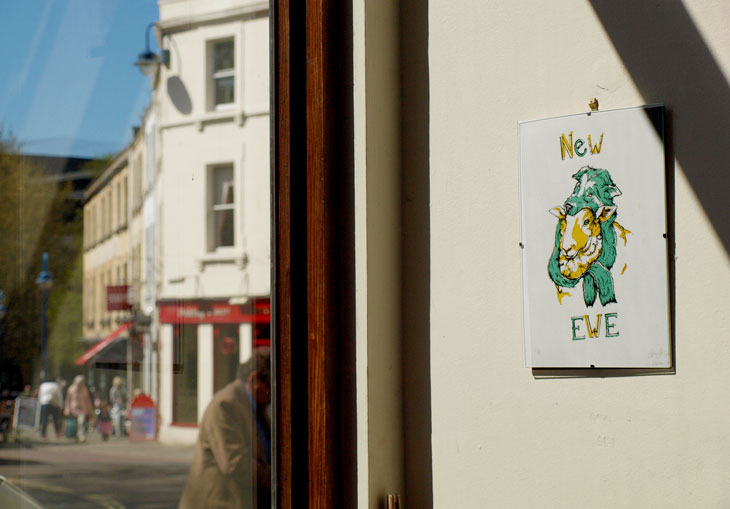
In light of the exciting developments that have been taking place outside of the university environment (things like Comiket, my review and MY NEW SHOP WHICH I JUST DON’T THINK I’VE GONE ON ABOUT ENOUGH), I’ve done an excellent job at neglecting the work I’ve been doing within the big, ol’, yellow institution.

This post will be an attempt to correct these wrong-doing by bringing you a little snippet of creativity from the life of University.

You know, that place I spend 80% of my time. The reason I live here. That one.

Doesn’t even involve photocopiers.

So, we’ve been working on two, comparatively short projects that, although required separate outcomes, held a common theme and were (presumably) designed to feed off of each other to an extent. In short, we started with an object that we were then to expand on and extend into an environment of our chosing. (There were many more restrictions than that, but we won’t get into that just now.)

Naturally, me being me, I chose a COMPLETELY terrifying wooden mask of a human face and, naturally, me being me, decided to create a completely terrifying wooden creature to wear it.

In a nutshell. Give or take a bit of research.

Our outcomes were to be a sequential narrative, for which we had to convey this sense of movement in 9 panels (something I think my all night comic-making-athon may have put me in good stead for), and a soundless animation of 15 seconds or more. Simples.

It’s been, for the most part, good fun. The Animation comes first in the saga of the weird Tree Creature. It’s jerky, it’s rushed, it’s wibbly and just generally a bit crap and so, totally not worth the amount of time sunk into it’s creation. But the more I watch those meager little 24 seconds, the more I love it. Like a really ugly kitten. Or a child who just can’t get his head around potty training.It’s my first ever start stop animation and so I feel I’m entitled to a bit of forgiving in terms of the craft. It’s made by my own fair hands and therefore, by default, I’ll love it always. If only as a milestone in my creative journey.

And even if it does leave a little poo on the proverbial carpet every time I watch it.

My static image sequence, while still rushed and far from perfect, had the advantage of being a practice I was familiar with. In an attempt to communicate this driving theme of the mask’s wooden texture, I made the (pretty foolish to be honest) decision to linocut my sequence in three colours which, due to the restrictions of the process and size of my lino, added a simple bleakness to the images and lost a lot of potential detail. As I’ve said, just a little too often about my work before, they’re not the greatest feat of printmaking known to man, but time played a restricting factor that forced the simplification of imagery down to the point to see here.

While I loathe to consider them a direct sequel to the animation (due to my own personal gripes regarding the film industry), they could be considered to continue the narrative previously explored, and therefore should really be seen second. You know, seeing as they were offered as a joint brief and all.

I might consider them a spin-off. Maybe.

Originally I’d planned to bind them into a concertina book, sandwiched between a hard front and back cover. I have two prints of each image, so it’s something I could still well do, but actually, in terms of the movement between image to image as a sequence, the simple grid of 9 works rather well. They break up well into columns of 3 and I think that adds a nice pace to the movement that could easily be lost in the transition into a bound document. There’s a certain stillness to the images that I’d worry would be compromised to an extent if they were to be viewed in one, continuous line. As much as I love books and book binding.

And I do.

So there’s a little taste of what a Bath Spa student has to offer. Wooden Creeps and wibbly frames. Top-Notch talent only in that school doncha know.

Bugger, I was hoping to keep this post short so my flatmate doesn’t laugh at the cyber-typing-diarohea from which I suffer, but I seem to have had another attack.

Sorry about that fellas.

Over and Out.

B

My Life of Print!

I promise not to ramble on for this one. I’ll just deliver the goods and set you on your way. But CHECK OUT how many prints I have!!

Everything I've made in the past few months. It covered the entirety of my floor!


Magpies and Robots! Quick, A6 lino-cuts I made on the last day of Uni before Easter! Printed on a vast array of second hand papers.


I couldn't afford real print paper...so they're on coloured card and metallics.


Not even half of them! Hopefully you can see where I've played around with ink levels during the print process to get different effects. All 100% unique!

Okay, enough of this print making mania now. I’ve gone on about it long enough. Time to get obsessed with something new. Hhmmm…typography next?

B

x

Print Workshop Two: Return of the Lino

I’ve finally gotten around to digitalerising (it’s a word) the second and third stage in our Print Making Workshop at Uni. Yeah sure, technically it finished weeks ago, but I’ve been busy. Besides, good things come to those who wait and other such justifying clichés.

So First up was Lino Cut time. Now I’ve had bad experiences with Lino Cut in the past, in that I was forced to give it a go as part of our GCSE Landscapes project in art class. Bear in mind, this was in a school where the facilities were not geared up to cope with the ambition of print making. I don’t know if you’ve ever tried to cut out a seascape from a chunk of lino with an old craft knife and the point of a compass (I shit you not) but it is not a creatively invigorating experience. I suppose it was character building to an extent, and it gave me a new appreciation for my health given the worryingly high chance of contracting Tetanus or losing digits, but I can’t really say it was an artistic high point. Needless to say, the project was swiftly abandoned when it became obvious (both to me and my teacher) that is was going to look shit.

As a result, I’ve been stubbornly against Lino Cut ever since, turning my nose up at it in my Foundation in favour of screen print and other seducingly exotic and more health friendly forms of image making.

So this was not one I was looking forward to. But, like a good student, I purchased my strip of lino and haphazardly scribbled out  a design. I decided not to make my distaste too obvious by ignoring the possibilities of colour, but equally wanted to keep the process to a minimum so I could be done with it quickly, and found 3 colours to be a decent compromise.

Now, I’m a fan of print making. I love screen printing and I couldn’t be much happier with my first attempt at etching earlier this year, but I had just assumed that this love was to forever be reserved for the more elaborate and high-tech forms of print, and Lino just wouldn’t cut the mustard. Let me tell you now, I will one hundred percent eat my proverbial hat. I will eat it with my face smeared in proverbial egg.

Lino Cut and I have worked out our differences and decided to give our relationship another shot. It’s on the provision that never again do I attempt it without the appropriate materials, but that’s the great thing about mistakes; you learn a big, fat, hand bleeding lessons from them and use said lessons to make improvements.

I love my Lino outcomes. They’re bright and fun and were easy to produce. I found the process enjoyable from beginning to end, discovering the gouging of the lino to be pleasantly therapeutic and indisputably pleasing when all went to plan, and the inking of the plate was just as quick. A quick wipe of chosen colour onto the stone, a few seconds rolling it out into a thin, tacky consistency and you’re ready to (rock and) roll straight onto the lino. Whatever you’ve cut out remains clear, only the spaces left behind catch the ink and then you can begin your process of layering colour over colour, gradually removing sections of plate until an image has built up. It’s at this point that you can give yourself a big old pat on the back for successfully accessing the appropriate side of the brain that deals in spacial awareness.

There’s even a mini press for the mechanically obsessed such as myself. It’s not as big as the Etching beastie, but it’s Becky sized and still creaks in that endearing tone of the past, when processes like this were a necessity, not just a novelty.

3 Colour, 2 Stage Lino Cut. Green on white, black on green.
4 Colours, 3 Stage Lino cut. Yellow on white, green on yellow, back on green.

I enjoyed it so much, I shelled out for a bit more paper in order to have a few more outcomes. When I made this decision, I’d already cut out my first layer, so some of my prints consist of 3 colours, some 4. Either way, I’m proud of the results and am really happy I approached it with an open mind rather than stuck to my original convictions.

For those who are interested, the image is an absinthe bottle as it was Toulouse Lautrec’s beverage of choice. I attempted to echo the stunted shape of Lautrec, due to his deformity, in the bottle and used the hat to reinforce this.

Alright, maybe not the best print in the world, but damn good fun and an important learning curve I reckon!

B

x