And thus begins the mammoth job that is the catch up posts from the past term. I’m not sure exactly when it happened, but life definitely got frighteningly busy over the past 3 months and, as a result, my little interweb based snippets of work became a little sparse. For those of you that noticed and, more to the point, those of you that cared, I apologise for this, get on my little, metaphorical, digital knees and beg your forgiveness.
You know, in the spirit of Christmas and all that.
Not that I have any Seasonal based works for you, because I’VE BEEN BUSY. So Uni work it is.
So let’s kick start with a bit of printmaking shall we? For no other reason than it makes me happy. And I’m in charge.
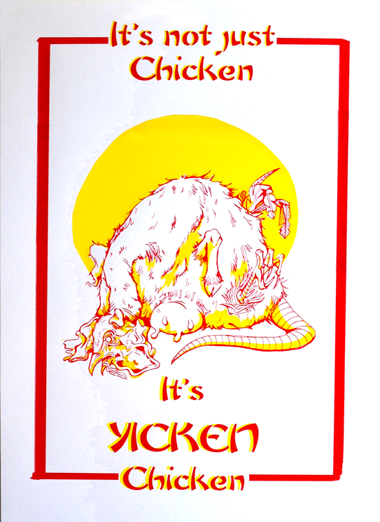
The brief was…well just that. Very simply to create a screen printed poster selling our favorite fast food restaurant.
This is all very well and good, except I happen to be a proud, longstanding member of the societal subculture of “students who cook” and, therefore have something of an aversion to fast food. Actually, that’s putting it quite lightly. What I mean is, generally and on the whole, I really bloody hate it.
“Not to worry!” My tutor insisted, “You may employ a use of irony!”
So I did. I employed a use of irony. Actually, I employed a really bloody heavy use of irony and drew, what probably turned out to be the single, most disturbing thing that’s ever been dredged from the depths of my skull, in the name of promoting Yicken, a Chinese take out back where I grew up. You know the kind: greasy walls, tiled floors, an inescapable use of that classic yellow and red colour scheme that desperately attempts to suggest some element of culture.
Actually, if I’m entirely honest, as far as nasty Chinese’s go, Yicken isn’t the worst. It just happens to have a heinously playful name that I thought might be handy in the creation of the poster.
There it is. A vile, possibility regarding the identification of the mystery meat found in that greasy tub of yours.
I’m back with a new post! Yes I know it’s terribly late, I am oh-so-sorry, but you see, there was a dragon.
No?
Not buying it?
Yeah well that’s because it’s a lie. There was no dragon, I’ve just been rubbish (again) and have failed at bringing you any kind of news in favour of sleeping. However, those lazy days are now gone! Banished! And I hereby solemnly swear to be much, much better at this blog fandango. Frealz.
So here it goes. Last time I did a post, I was just about to embark on a big old silly printing experiment that did, in the true nature of experimentation, fail horrendously. Yes, you heard, printing finally turned on me. Screen Printing as well, that dirty dog. After all the nice things I said about it. Needless to say, it put me a little bit (a lot) down in the dumps, I don’t like doing bad work. Especially not bad prints.
But such is the nature of trying new things and not leaving yourself enough time to properly get to grips with it.
Basically what happened, was that I wanted to do a print for the End of Year Show, and my tutor talked me into doing it GIANT (A1), as opposed to the comfort zone of A6-A3 size range I tend to aim for, less than a week before the exhibition was due to open. Actually, now that I think about it, this is the same tutor who was to blame for the up-all-night-due-to-lack-of-preparation-2-page-comic shebang. Must investigate the possibility of a single-handed conspiracy against me there.
But I digress, “a big print…ha!” you may claim, “doesn’t sound like such a big deal to me!”
Well, metaphorical voice of imaginary rhetoric reader, you’re right, you wouldn’t think a big print WOULD be such a nightmare, however this one decided it would be due to the following limitations.
I only had one screen. This meant that, in order to achieve the 3 colour print I was aiming for, I had to only expose ONE layer onto the screen (due to time limitations) – the most complex one was naturally the best choice, but this meant the starting two had to be hand cut newsprint cut outs which I would have to use as stencils with the blank screen, then expose the 3rd layer on afterwards. I hate cutting newsprint. It’s delicate and awkward and a pain in the arse to transport. I especially hate cutting newsprint when the newsprint itself is bigger than A1 and I only have an A3 cutting mat and, due to the end-of-year-run-down-of-materials, comparatively blunt utensils.
I also couldn’t afford, due to the end-of-year-run-down-of-funds, to digitally scan and print my exposable design onto a giant acetate in order to expose it, so it had to be hand traced from the original sketch, using special ink (FROM A POT WITH A BRUSH! Not even pens) onto a cheaper, transparent, special-ink-from-a-pot friendly material. This ate one full day of my already very tight schedule.
Due to the size of the print and, by comparison, the size of me, I was encouraged not to print the organic way; hand+squeegie=lovely print, but instead to use THE ARM. Now this was really where my downfall lay. In theory, THE ARM is a great idea. It’s a bit mechanical arm that holds the big squeegees and spreads the ink over large surface areas my own little limbs would struggle to cover. All I had to do was push the handle of THE ARM along with the correct pressure to get a nice, flat, even coverage.
Unfortunately, as I only had, in the end, one day in which I could print, I didn’t really get the time necessary to be able to master the art of THE ARM. In fact, I think it’s fair to say I was actually pretty shit at it. I’m not sure if it was due to my size and weight (or lack thereof) but I just couldn’t seem to put enough pressure on the damn thing to get an even coverage of ink. I tried thousands of variants of amounts of ink, I tried adjusting the bed, adjusting the screen, the suction, I tried more paint in the mix, more solution, harder squeegees, softer squeegees, literally everything I could in the very limited timescale I had.
But in the end, with time ticking by, I had to just go for it. And 3 colours, 5 prints, about 60 newsprint tests and a grump to end all grumps later, was left with a pretty damn substandard print as a result.
Muchos Disappointingos.
As you can see, the colour is not at all flat and the black’s not come through at all clearly. I think had the lines been printed perfectly, it may have tied any issues with the stenciled colour together. Might even have looked better, given the grimy nature of the subject matter. But unfortunately the lines are just as problematic as the other two colours. Which really meant the image lost out in areas of detail like these.
The brief for the exhibition was 1912: Go make something! So I chose to focus on the death of Bram Stoker; author of Dracula, theatre owner and all-round pretty clever guy. From here, I subsequently, invented an “alternative reality” in which Dracula‘s success above all his other works was attributed to the fact that it was not from Stoker’s imagination, but based on true events. I wanted to suggest that his death in 1912, officially regarded as “a series of strokes” was actually caused via the paranormal attack of a vampire.
I chose to do it in the form of a single image narrative. This was actually a bit of a leap for me who is, as you may be aware from my other work (and if you’re not I think you’d better have a look in the shop don’t you?) predominantly a sequential art sort of gal. This whole, summarising in one image was quite the challenge, which is why it was so disappointing to have overcome one hurdle to fail at another.
Anyway, It’s big, it’s a print and you can see what it is, so in many ways, I achieved what I set out to. It’s just a shame the craft is so poor. But we live, we learn and sometimes, we screw up screen printing.
I think that’s definitely what Sinatra was singing about in That’s Life: Screen printing giant images of deceased writers.
What an epiphany.
B
x
Poor Ink coverage could have looked ghostly and haunting, had the black been a little crisper.
Hands up if you want to see what I’ve been working on at Uni so far?
Screen Printing Induction Tuesdays ended today with the completion of my first set of prints as a Bath Spa student.
They’re not the most complex or intricate works in the world, but I’ve been out of the game for a little while and they served pretty well as some basic experiments to get me back into the swing of things.
I decided not to mix my own ink in the end and instead made use of the left over pots people hadn’t finished in the print room. The choice of colour was an attempt to echo the yellows of Bath stone while suggesting the giant park and golf course I walk through on my daily route with green.
The prints are made up of 3-4 elements: Two hand rendered parts (the squirrel and text) and two photographs (the leaves taken in Royal Victoria Park and the Sion Hill sign at the top of the road).
I made a total of 12 prints, all a little bit different as I was playing with layout and inks as I went. They’re all hand printed onto Imagine Print paper at 28x28cm.
Not bad as testers, now let the real work commence.

 There it is. A vile, possibility regarding the identification of the mystery meat found in that greasy tub of yours.


