Risographing within an Inch of your Life

So a handful of friends and I decided to make a pretty thing.

You know, cause we’re in third year and have nothing better to do or anything…

But it seems a shame not to make use of the ace University facilities available to us while we’re lucky enough to be here. Especially given that they are, available FOR FREE (3 grand a year free anyway. Well, it’s better than 9.) so we gathered together a little proposal to send out to our fellow image makers on the course.

We wanted to make a collaborative work of illustrations and  imagery based on the brief we set. A short, publication that showcases the talent that Bath Spa is about to unleash on the world. We decided to keep it simple, keep it open to interpretation and keep it relevant.

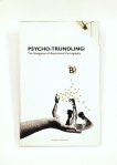
And what could be more relevant than the present? So we asked people to volunteer a simple image in two colours (black and blue) based on their own, personal response to the Right Here, Right Now.  We wanted to keep it simple so could spend a bit of time reproducing on the dual-colour Risograph printer in our studio. A cheap and cheerful zine that captures the very essence of 2014’s graduation image makers.

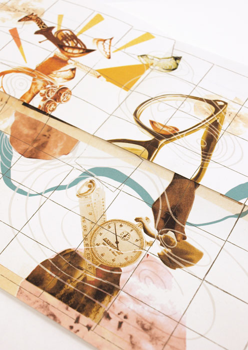
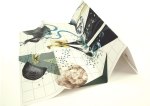
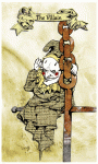
So here’s my design. My personal Right Here, Right Now: A third year on the brink of graduation:

Present1

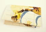
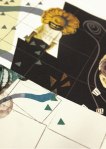
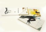
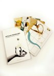
Unfortunately, the project took something of an acceleration which leaves me unable to currently show you the finished product. Turns out, our tutors thought it was a kind of neat project too, so encouraged us to put a wiggle on and get it done in line with a second year study trip to New York so they could take it with them to drop in on US professionals and studios. This is, obviously pretty cool, but it meant we had to finish it in under a week. We managed to get the kindly artwork donations of 12 classmates so it’s a tight little compendium, but the styles are all really varied and I think it looks ace overall. We literally got done binding it with minutes to spare before handing it over to be whisked away over the atlantic, but we’re well in line to produce a few more so photographic evidence will be kicking about soon with any luck.

Trust me though, it looked really cool.

Seriously.

The Ambiguity Project: Look What You Made!!

It took a while and it was stressful and incomprehensibly confusing at times but, the concluding chapter of the Ambiguity Project has finally been written. And I figure, as it was all your hard work that made it, it’s only really fair that I offer you the chance to  a little gander.Maps in Their Slip Case

All those broad and insightful answers you sent, emailed, told and wrote to me have been gradually forming this project for a while now. The character portraits they formed have taken on a number of attributes and aspirations and finally, in your deciding of the concluding question, you’ve shaped their journeys towards aspiration progression and digression.

As a result, the pieces have evolved from character portraits into the format of maps.

W: Positive Extrovert

X: Positive IntrovertY: Negative IntrovertZ: Negative Extrovert

The pieces as a whole communicate the desires, aspirations, fears, limits and goals of each character, based on the desires, aspirations, fears, limits and goals of every person that took part. map3

map10

The representations of map elements are extensions of your resulting answers, transforming the images into something of an artistically representative psychological landscape in which forests, desserts, mountains and rivers must be bridged and navigated as the theoretical characters endevour to achieve.

As the maps can be folded in any number of ways, new compositions and sequences are formed out of the ambiguous collage imagery, introducing the possibility of narrative-based interpretation and multiple routes through the artwork.

Based on your final answers and your choice to answer with positivity or negativity, I adapted the likely-hood of the journey’s success using the environmental features.

At times, rivers will be bridged or shattered, allowing navigation around the barriers so that the illustrations of goals can be accessed. At others, the folding will introduce increased forests and confusing, representing the journey becoming harder.map12

map17Basically, these are four artworks that beg to be played with and explored. Fold ’em up however you wish to reveal multiple artworks and new possibilities for stories.

Then, obviously, cause I can’t let things lie, I wanted to make a slip case to contain them.

The project dictated that it needed to have a binding jacket, so, as my results had extended out of the original book format intended, I used it as an excuse to design and display the cover.

I knew the artworks were complex and involving, so did not want to drown this in the cover design. Instead I opted for a simple, systematic looking result, inspired by the design of 1970’s psychological textbooks. I wanted the notions of progression towards goals to be represented by the idea of making your way from A to B, and knew that the suggestion of maps had to be present, hence the light inclusion of the forest elements, which doubles up nicely as directional arrows.

mapcover1mapBack

There’s a very real possibility that I did forgot to spell check.

If you find anything, do me a favour and just keep it to yourself okay?

Anyway, another project down.

Thank you so much to everyone that helped, I really hope that you appreciate the results.

Cheers

B

Second Year Frollicks! The End of Term Catch up Part 2: Card Deck

Anyone ever read/ watch Cardcaptors? Not to sound like a little fangirl, but it was pretty rad. No joke.

I bring it up only because it had some attractive examples of interesting, illustrated card decks, which happens to be the brief of my most recent illustration project, which I am lovingly bringing to you today as part two of the Second Year Catch Up sesh.

We were asked to create a set of nine cards in the style of Edward Gorey’s Fantod deck of alternative Tarot. And my eyes immediately turned into little dollar bill signs, as this was in November, just prior to Comiket. And card decks are a pretty sell-able deal.

I turned to my interests in media theory for inspiration, choosing to illustrate Vladmir Propp’s theory of set character types. With creepy puppets. Because if a project of mine needs one thing, it’s definitely an air of macabre. (There was research and reasoning to back this up by the way, but, who am I kidding? You don’t care about that! You’re probably going to sneak past the text, straight to the pictures anyway, you cheeky little blog ninja.)

So here it is, The Propp-Up Theatre Deck.

the-deck

So we have The fist 7 from Propp’s character theory (I chose to omit the Father as a separate character, merging him with the Dispatcher as is often the case with folklore anyway.) Then made up the full nine with the Bottler and Punchman, the traditional workers of the Punch an Judy show.

the-collectionWe had to design the nine cards themselves, then a back for them as well as a Key Guide to reading them, tarot style. I went a step further (in the name of making moolah) and turned my key into a small booklet with information about the concept as well as the cards themselves, as well as handprinting candy bags to echo the punch and Judy, disturbing British seaside vibe.

key

key-inside

And did the punters at Comiket appreciate all the hardwork? Damn tootin they did! They were the first thing of mine to go and by the end of the day I only had about 2 sets left. Not bad for a school project/money making combo.PC168167

B

x

A Very important Post and Definitely NOT any kind of Procrastination

Want to see a thing?

I’ve actually been sitting on this one for a while, but thought, as I desperately do NOT want to get involved with my summer project, I’d go ahead and load it up for your viewing pleasure.

It’s not procrastination okay? I’m providing a service.

yeah, alright.

But those of you who have been with me for a while, will remember when I actually DID my university work and didn’t simply ignore it in favour of baked goods and birthday presents. One such example of this was one of my last illustration projects in which I produced a set of sequential linocut prints (to be found hiding here).

In the end, they were presented on a board in a simple layout. I had wanted the images themselves to do the work in terms of communicating the story without the distraction of any further, novel presentation.

But you know me, why make one set of prints when you can do TWO?

And since this project, the duplicate prints had just been sitting about in tissue, getting a little bored and generally feeling a little abandoned (I don’t know that they did feel this way. I never asked them, but it seems like a plausible emotion for an inanimate object to have.)

And that was how they stayed, sad and forgotten.

BUT THEN I had to move out! And suddenly there was a whole wealth of jobs and thing that I really, really, desperately did NOT want to do. And suddenly I couldn’t take the fact they were so, very forgotten. They didn’t deserve such a fate, it was really, really important that I get out all my book binding equipment and allow the little prints the glory they were owed!

And that decision DEFINITELY wasn’t procrastination. The Prints were in NEED! It HAD to be taken care of immediately, and all those silly, little things on the to do list, things like packing and locating various vital documents and repairing any damage in the room I may, conceivably be charged for, could all just wait while I took care of the really important stuff.

I take the welfare of my work very seriously.

So I did a wee bit of book binding. A concertina book, so when you stretch the whole thing out, you can still view the images in sequence, and the story is not lost or interrupted by the physical act of page turning.

The Prints travel down, like a hanging.

I wanted the book as a product to communicate all the research I’d done for the project and adhere to the thematic choices I’d made when designing the prints. It had centred around this wooden mask and I wanted the element of natural to come across, hence my decision to use earthy tones and loosely knotted rope for the belly band.

The choice of title had been a factor I laboured over, probably more than I should. In the end, I had decided on Knots for three reasons. Firstly, as the theme of wood had been such a strong factor in the creation of the project, it refers to the knots you get in the bark of a tree. A lot of my supporting sketchbook had been drawings of these and woodgrains, so it seemed very appropriate. Secondly, the story had to convey an element of home, something I had dealt with by showing our little character flying off to find home in an airship very reminiscent of an old galleon, the captains of which would measure a distance in knots. And thirdly, the object I had been asked to base my story around had been a mask, two images of which show the creature untying the string knots of, in order to remove it and fashion it into the figurehead for his journey.

It’s a one off, firstly as I only had one more copy of the prints to use, and secondly because it took me so frickin’ long . But it’s got quite a nice, handmade feel to it. Quite different from the heavily photoshopped stuff I usually crack out.

It’s nice to have a change sometimes.

Definitely time well spent.

B

x

Doing Birthdays Correc-e-tolly Part I

I like birthdays. Not really my own, I’ve grown a little tired of that one over the past 22 years. It’s always on the same day, SOOOoo unoriginal. But I like the birthdays of those nearest and dearest because it’s one of those occasions where it’s acceptable for me to force my work, baked good and other forms of general handmade nonsense on people and they HAVE to pretend to be grateful. This year has been no exception to this rule, and I dread to think of the amount of hours I’ve clocked up in the past eight months crafting nonsensical felt characters, photoshopping bizarre and often totally inappropriate cards and drawing and printing over ambitious comic books.

Yes the number of people on this earth who have been subjected to some kind of Bagley-Original has risen quite dramatically over the past few months, and with the onset of my kid sisters birthday recently, I decided that there was no call to stop now!
It’s always a little frightening when the people you remember being small enough to fit in the kitchen sink like it was yesterday, suddenly turn around and announce they’ve decided to be fifteen now. I actually find it disturbing to the point that it’s a little bit rude, but she decided to do it anyway. And luckily for me, Rhianna (yes, yes, like the singer except she actually manages to spell it right) is in possession of a similarly questionable take on the idea of “being grown up” to my own. In that you shouldn’t really do it because it’s boring.

So in the spirit of our shared view on the legitimacy of adulthood, and the fact that this is the first time I’ve been home for her, rather inconsiderately placed summer birthday, for quite some years, I decided to make a bit of a fuss and theme it like an Alice in Wonderland Tea Party.

Considering it was only really me taking care of the birthday business, as my parents had to work on the day, it turned into a comparatively elaborate affair, and as such the retelling will be done in two parts. For now we’ll just have a little chat about the present I made her: The Doormouse’s Hints and Tips for Life; A tiny, leather-bound charm on a necklace containing numerous questionable facts and general helpful nonsense for life.

Key and Lock Necklace found in a Charity Shop.

I gave it to her by tying helpful, directional luggage tags (“Follow Me”, “This Way”, “Just a Little Further” etc) to a long length of string that ran all around the house, in and out of doorways, along banisters and finally into the kitchen where the tea party was arranged, and finally into the sugar bowl where it was hidden.

This was then placed in the sugar pot for her to find.

Made from handmade paper, faux leather, a gold marker, left over cogs from Tick and a lot of glue.

Happy Birthday Nan! May this little gift serve you well throughout the adventure you’re about to embark on. Next stop Sixteen, when the tips for life start taking a bit of a different bent.

But for now, just enjoy the fun of nonsense and all the creativity that comes with it. And don’t forget to clean behind your ears.

Love from your Big Sister.

x