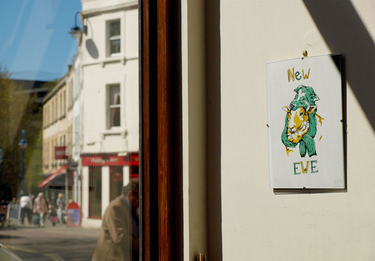
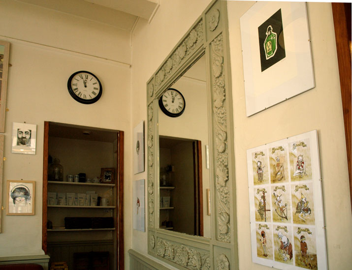
Okay, so we all like Tea. But some of us also like coffee. And some of us REALLY like GOOD coffee.
I am one of said humans, and for this very reason I LOVE the Boston Tea Partychain. For those of you not in the West, you’ll just have to trust me. They do what they do and they do it good.
And look how pretty it is.
So I was pretty delighted when I was doodling away in it’s Bath branch some time ago, and was approached and asked if I’d like to exhibit work for a bit. Pretty neat eh?
So for the month of May, I have adorned the walls of Bath’s bit of Boston with silkscreen prints, etchings, risographs, digital works and any other number of bits and pieces I like to make.
So tell all your friends, go grab a coffee (because it really is good) and surround yourself with oddities and nice things for a bit.
And then buy them too. That would be great. Thanks.
So a handful of friends and I decided to make a pretty thing.
You know, cause we’re in third year and have nothing better to do or anything…
But it seems a shame not to make use of the ace University facilities available to us while we’re lucky enough to be here. Especially given that they are, available FOR FREE (3 grand a year free anyway. Well, it’s better than 9.) so we gathered together a little proposal to send out to our fellow image makers on the course.
We wanted to make a collaborative work of illustrations and imagery based on the brief we set. A short, publication that showcases the talent that Bath Spa is about to unleash on the world. We decided to keep it simple, keep it open to interpretation and keep it relevant.
And what could be more relevant than the present? So we asked people to volunteer a simple image in two colours (black and blue) based on their own, personal response to the Right Here, Right Now. We wanted to keep it simple so could spend a bit of time reproducing on the dual-colour Risograph printer in our studio. A cheap and cheerful zine that captures the very essence of 2014’s graduation image makers.
So here’s my design. My personal Right Here, Right Now: A third year on the brink of graduation:
Unfortunately, the project took something of an acceleration which leaves me unable to currently show you the finished product. Turns out, our tutors thought it was a kind of neat project too, so encouraged us to put a wiggle on and get it done in line with a second year study trip to New York so they could take it with them to drop in on US professionals and studios. This is, obviously pretty cool, but it meant we had to finish it in under a week. We managed to get the kindly artwork donations of 12 classmates so it’s a tight little compendium, but the styles are all really varied and I think it looks ace overall. We literally got done binding it with minutes to spare before handing it over to be whisked away over the atlantic, but we’re well in line to produce a few more so photographic evidence will be kicking about soon with any luck.
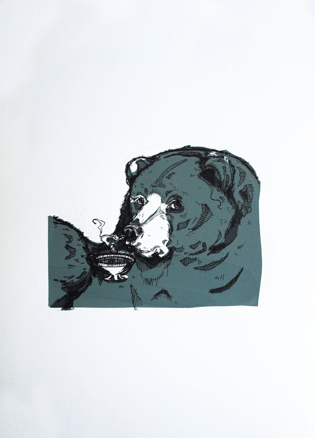
Ok now, I want you o stand up, turn around and get out, and the rest of us can appreciate how disgusting they are via the means of my little zine, Bears: Don’t Like ’em! This came about last Easter, and since then has been a consistently strong seller at arts fairs and conventions, to men, women and bear haters everywhere. And actually, one or two intrigued bear lovers too.
Having witnessed it’s popularity, I thought I’d bring it to life with a little splash of colour and returned to my usual haunt, the print rooms, to create these three sets of limited edition screen prints from the zine.
And a fox in a tie. That one was really just for giggles though.
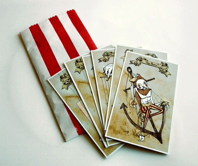
Anyone ever read/ watch Cardcaptors? Not to sound like a little fangirl, but it was pretty rad. No joke.
I bring it up only because it had some attractive examples of interesting, illustrated card decks, which happens to be the brief of my most recent illustration project, which I am lovingly bringing to you today as part two of the Second Year Catch Up sesh.
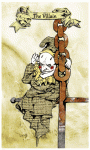
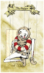
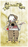
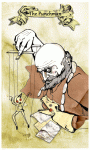
We were asked to create a set of nine cards in the style of Edward Gorey’s Fantod deck of alternative Tarot. And my eyes immediately turned into little dollar bill signs, as this was in November, just prior to Comiket. And card decks are a pretty sell-able deal.
I turned to my interests in media theory for inspiration, choosing to illustrate Vladmir Propp’s theory of set character types. With creepy puppets. Because if a project of mine needs one thing, it’s definitely an air of macabre. (There was research and reasoning to back this up by the way, but, who am I kidding? You don’t care about that! You’re probably going to sneak past the text, straight to the pictures anyway, you cheeky little blog ninja.)
So here it is, The Propp-Up Theatre Deck.
So we have The fist 7 from Propp’s character theory (I chose to omit the Father as a separate character, merging him with the Dispatcher as is often the case with folklore anyway.) Then made up the full nine with the Bottler and Punchman, the traditional workers of the Punch an Judy show.
We had to design the nine cards themselves, then a back for them as well as a Key Guide to reading them, tarot style. I went a step further (in the name of making moolah) and turned my key into a small booklet with information about the concept as well as the cards themselves, as well as handprinting candy bags to echo the punch and Judy, disturbing British seaside vibe.
And did the punters at Comiket appreciate all the hardwork? Damn tootin they did! They were the first thing of mine to go and by the end of the day I only had about 2 sets left. Not bad for a school project/money making combo.
And thus begins the mammoth job that is the catch up posts from the past term. I’m not sure exactly when it happened, but life definitely got frighteningly busy over the past 3 months and, as a result, my little interweb based snippets of work became a little sparse. For those of you that noticed and, more to the point, those of you that cared, I apologise for this, get on my little, metaphorical, digital knees and beg your forgiveness.
You know, in the spirit of Christmas and all that.
Not that I have any Seasonal based works for you, because I’VE BEEN BUSY. So Uni work it is.
So let’s kick start with a bit of printmaking shall we? For no other reason than it makes me happy. And I’m in charge.
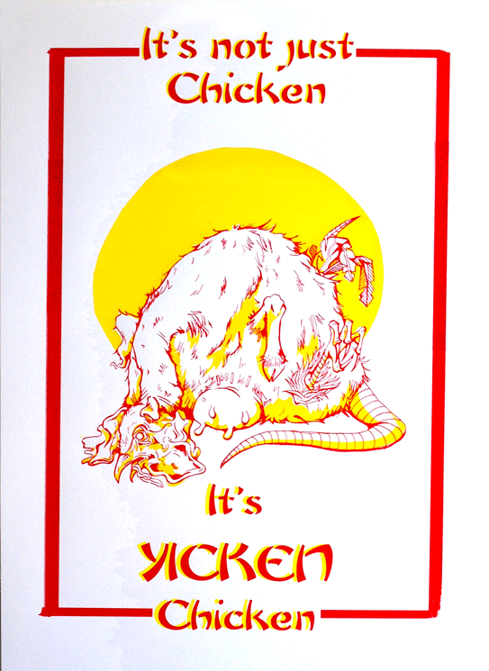
The brief was…well just that. Very simply to create a screen printed poster selling our favorite fast food restaurant.
This is all very well and good, except I happen to be a proud, longstanding member of the societal subculture of “students who cook” and, therefore have something of an aversion to fast food. Actually, that’s putting it quite lightly. What I mean is, generally and on the whole, I really bloody hate it.
“Not to worry!” My tutor insisted, “You may employ a use of irony!”
So I did. I employed a use of irony. Actually, I employed a really bloody heavy use of irony and drew, what probably turned out to be the single, most disturbing thing that’s ever been dredged from the depths of my skull, in the name of promoting Yicken, a Chinese take out back where I grew up. You know the kind: greasy walls, tiled floors, an inescapable use of that classic yellow and red colour scheme that desperately attempts to suggest some element of culture.
Actually, if I’m entirely honest, as far as nasty Chinese’s go, Yicken isn’t the worst. It just happens to have a heinously playful name that I thought might be handy in the creation of the poster.
There it is. A vile, possibility regarding the identification of the mystery meat found in that greasy tub of yours.
I’ve actually been sitting on this one for a while, but thought, as I desperately do NOT want to get involved with my summer project, I’d go ahead and load it up for your viewing pleasure.
It’s not procrastination okay? I’m providing a service.
…
yeah, alright.
But those of you who have been with me for a while, will remember when I actually DID my university work and didn’t simply ignore it in favour of baked goods and birthday presents. One such example of this was one of my last illustration projects in which I produced a set of sequential linocut prints (to be found hiding here).
In the end, they were presented on a board in a simple layout. I had wanted the images themselves to do the work in terms of communicating the story without the distraction of any further, novel presentation.
But you know me, why make one set of prints when you can do TWO?
And since this project, the duplicate prints had just been sitting about in tissue, getting a little bored and generally feeling a little abandoned (I don’t know that they did feel this way. I never asked them, but it seems like a plausible emotion for an inanimate object to have.)
And that was how they stayed, sad and forgotten.
BUT THEN I had to move out! And suddenly there was a whole wealth of jobs and thing that I really, really, desperately did NOT want to do. And suddenly I couldn’t take the fact they were so, very forgotten. They didn’t deserve such a fate, it was really, really important that I get out all my book binding equipment and allow the little prints the glory they were owed!
And that decision DEFINITELY wasn’t procrastination. The Prints were in NEED! It HAD to be taken care of immediately, and all those silly, little things on the to do list, things like packing and locating various vital documents and repairing any damage in the room I may, conceivably be charged for, could all just wait while I took care of the really important stuff.
I take the welfare of my work very seriously.
So I did a wee bit of book binding. A concertina book, so when you stretch the whole thing out, you can still view the images in sequence, and the story is not lost or interrupted by the physical act of page turning.
The Prints travel down, like a hanging.
I wanted the book as a product to communicate all the research I’d done for the project and adhere to the thematic choices I’d made when designing the prints. It had centred around this wooden mask and I wanted the element of natural to come across, hence my decision to use earthy tones and loosely knotted rope for the belly band.
The choice of title had been a factor I laboured over, probably more than I should. In the end, I had decided on Knots for three reasons. Firstly, as the theme of wood had been such a strong factor in the creation of the project, it refers to the knots you get in the bark of a tree. A lot of my supporting sketchbook had been drawings of these and woodgrains, so it seemed very appropriate. Secondly, the story had to convey an element of home, something I had dealt with by showing our little character flying off to find home in an airship very reminiscent of an old galleon, the captains of which would measure a distance in knots. And thirdly, the object I had been asked to base my story around had been a mask, two images of which show the creature untying the string knots of, in order to remove it and fashion it into the figurehead for his journey.
It’s a one off, firstly as I only had one more copy of the prints to use, and secondly because it took me so frickin’ long . But it’s got quite a nice, handmade feel to it. Quite different from the heavily photoshopped stuff I usually crack out.
Yeah alright, so it’s been an age since my last post. And I have actually been busy too, which is doubly annoying because I’ve actually had bloggables to share with you, and simply haven’t done it due to extreme laziness/business/general heat-envoked fatigue.
So let’s go back an age or two when I was a good blogger and pick up from there shall we?
So, I was lucky enough to get myself a spot at the International Alternative Press Festival on Sunday 5th and have to say, it was a bit of a blast.
As usual for these little graphic gatherings, I met some truly awesome people, had some bat-shit mad conversations and generally flogged a whole load of my stuff.
It wasn’t as manic as Comiket, but given that it was a Sunday and during that mad thing that was the ‘Lympiks (sorry but did you SEE the boxing?? It was frickin’ AWESOME) that was only to be expected.
Once more, the free zine Tele was back on display and finding it’s way into the pockets of just about everyone!
Prints galore!
I was selling the usual: Tick, Rumble and all the zines as well as a selection of limited edition linocut and screen prints. The Sock Creatures once more made an appearance and did so well, I’m sorry to say I don’t even have photos of most of them! They were flying off the stall like mad. Only three remain with me so I’ll have to get sewing in anticipation of the next one!
And they weren’t the only addition to my ever-growing repertoire of textiles. Due to the success of the sock animals at previous events, I’ve recently been knocking up a new line of fuzzy cute things: The Felties. They made their debut on the stall at the IAPF and did pretty well too!
The Felties were met with just as much popularity so will definitely be making appearances at future conventions. Each one is entirely unique, but there’s enough madness in my noggin to sustain a good few designs I reckon!
So, surrounded by incredible examples of storytelling, I had a pretty ace time, met some totally weird and wonderful people and made a little money while I was at it. It’s at these things that I tend to be reminded how great my life can be!
If you have never been to an independent/small press comiket I suggest you get on the internet and find out when your nearest one is. They really are a brilliant laugh and I can guarantee you’ll find some kind of gem hidden in one of the stalls.
Plus then you can buy a sock animal. Don’t pretend you’re not tempted.
I’m back with a new post! Yes I know it’s terribly late, I am oh-so-sorry, but you see, there was a dragon.
No?
Not buying it?
Yeah well that’s because it’s a lie. There was no dragon, I’ve just been rubbish (again) and have failed at bringing you any kind of news in favour of sleeping. However, those lazy days are now gone! Banished! And I hereby solemnly swear to be much, much better at this blog fandango. Frealz.
So here it goes. Last time I did a post, I was just about to embark on a big old silly printing experiment that did, in the true nature of experimentation, fail horrendously. Yes, you heard, printing finally turned on me. Screen Printing as well, that dirty dog. After all the nice things I said about it. Needless to say, it put me a little bit (a lot) down in the dumps, I don’t like doing bad work. Especially not bad prints.
But such is the nature of trying new things and not leaving yourself enough time to properly get to grips with it.
Basically what happened, was that I wanted to do a print for the End of Year Show, and my tutor talked me into doing it GIANT (A1), as opposed to the comfort zone of A6-A3 size range I tend to aim for, less than a week before the exhibition was due to open. Actually, now that I think about it, this is the same tutor who was to blame for the up-all-night-due-to-lack-of-preparation-2-page-comic shebang. Must investigate the possibility of a single-handed conspiracy against me there.
But I digress, “a big print…ha!” you may claim, “doesn’t sound like such a big deal to me!”
Well, metaphorical voice of imaginary rhetoric reader, you’re right, you wouldn’t think a big print WOULD be such a nightmare, however this one decided it would be due to the following limitations.
I only had one screen. This meant that, in order to achieve the 3 colour print I was aiming for, I had to only expose ONE layer onto the screen (due to time limitations) – the most complex one was naturally the best choice, but this meant the starting two had to be hand cut newsprint cut outs which I would have to use as stencils with the blank screen, then expose the 3rd layer on afterwards. I hate cutting newsprint. It’s delicate and awkward and a pain in the arse to transport. I especially hate cutting newsprint when the newsprint itself is bigger than A1 and I only have an A3 cutting mat and, due to the end-of-year-run-down-of-materials, comparatively blunt utensils.
I also couldn’t afford, due to the end-of-year-run-down-of-funds, to digitally scan and print my exposable design onto a giant acetate in order to expose it, so it had to be hand traced from the original sketch, using special ink (FROM A POT WITH A BRUSH! Not even pens) onto a cheaper, transparent, special-ink-from-a-pot friendly material. This ate one full day of my already very tight schedule.
Due to the size of the print and, by comparison, the size of me, I was encouraged not to print the organic way; hand+squeegie=lovely print, but instead to use THE ARM. Now this was really where my downfall lay. In theory, THE ARM is a great idea. It’s a bit mechanical arm that holds the big squeegees and spreads the ink over large surface areas my own little limbs would struggle to cover. All I had to do was push the handle of THE ARM along with the correct pressure to get a nice, flat, even coverage.
Unfortunately, as I only had, in the end, one day in which I could print, I didn’t really get the time necessary to be able to master the art of THE ARM. In fact, I think it’s fair to say I was actually pretty shit at it. I’m not sure if it was due to my size and weight (or lack thereof) but I just couldn’t seem to put enough pressure on the damn thing to get an even coverage of ink. I tried thousands of variants of amounts of ink, I tried adjusting the bed, adjusting the screen, the suction, I tried more paint in the mix, more solution, harder squeegees, softer squeegees, literally everything I could in the very limited timescale I had.
But in the end, with time ticking by, I had to just go for it. And 3 colours, 5 prints, about 60 newsprint tests and a grump to end all grumps later, was left with a pretty damn substandard print as a result.
Muchos Disappointingos.
As you can see, the colour is not at all flat and the black’s not come through at all clearly. I think had the lines been printed perfectly, it may have tied any issues with the stenciled colour together. Might even have looked better, given the grimy nature of the subject matter. But unfortunately the lines are just as problematic as the other two colours. Which really meant the image lost out in areas of detail like these.
The brief for the exhibition was 1912: Go make something! So I chose to focus on the death of Bram Stoker; author of Dracula, theatre owner and all-round pretty clever guy. From here, I subsequently, invented an “alternative reality” in which Dracula‘s success above all his other works was attributed to the fact that it was not from Stoker’s imagination, but based on true events. I wanted to suggest that his death in 1912, officially regarded as “a series of strokes” was actually caused via the paranormal attack of a vampire.
I chose to do it in the form of a single image narrative. This was actually a bit of a leap for me who is, as you may be aware from my other work (and if you’re not I think you’d better have a look in the shop don’t you?) predominantly a sequential art sort of gal. This whole, summarising in one image was quite the challenge, which is why it was so disappointing to have overcome one hurdle to fail at another.
Anyway, It’s big, it’s a print and you can see what it is, so in many ways, I achieved what I set out to. It’s just a shame the craft is so poor. But we live, we learn and sometimes, we screw up screen printing.
I think that’s definitely what Sinatra was singing about in That’s Life: Screen printing giant images of deceased writers.
What an epiphany.
B
x
Poor Ink coverage could have looked ghostly and haunting, had the black been a little crisper.
This post will be an attempt to correct these wrong-doing by bringing you a little snippet of creativity from the life of University.
You know, that place I spend 80% of my time. The reason I live here. That one.
Doesn’t even involve photocopiers.
So, we’ve been working on two, comparatively short projects that, although required separate outcomes, held a common theme and were (presumably) designed to feed off of each other to an extent. In short, we started with an object that we were then to expand on and extend into an environment of our chosing. (There were many more restrictions than that, but we won’t get into that just now.)
Naturally, me being me, I chose a COMPLETELY terrifying wooden mask of a human face and, naturally, me being me, decided to create a completely terrifying wooden creature to wear it.
In a nutshell. Give or take a bit of research.
Our outcomes were to be a sequential narrative, for which we had to convey this sense of movement in 9 panels (something I think my all night comic-making-athon may have put me in good stead for), and a soundless animation of 15 seconds or more. Simples.
It’s been, for the most part, good fun. The Animation comes first in the saga of the weird Tree Creature. It’s jerky, it’s rushed, it’s wibbly and just generally a bit crap and so, totally not worth the amount of time sunk into it’s creation. But the more I watch those meager little 24 seconds, the more I love it. Like a really ugly kitten. Or a child who just can’t get his head around potty training.It’s my first ever start stop animation and so I feel I’m entitled to a bit of forgiving in terms of the craft. It’s made by my own fair hands and therefore, by default, I’ll love it always. If only as a milestone in my creative journey.
And even if it does leave a little poo on the proverbial carpet every time I watch it.
My static image sequence, while still rushed and far from perfect, had the advantage of being a practice I was familiar with. In an attempt to communicate this driving theme of the mask’s wooden texture, I made the (pretty foolish to be honest) decision to linocut my sequence in three colours which, due to the restrictions of the process and size of my lino, added a simple bleakness to the images and lost a lot of potential detail. As I’ve said, just a little too often about my work before, they’re not the greatest feat of printmaking known to man, but time played a restricting factor that forced the simplification of imagery down to the point to see here.
While I loathe to consider them a direct sequel to the animation (due to my own personal gripes regarding the film industry), they could be considered to continue the narrative previously explored, and therefore should really be seen second. You know, seeing as they were offered as a joint brief and all.
I might consider them a spin-off. Maybe.
Originally I’d planned to bind them into a concertina book, sandwiched between a hard front and back cover. I have two prints of each image, so it’s something I could still well do, but actually, in terms of the movement between image to image as a sequence, the simple grid of 9 works rather well. They break up well into columns of 3 and I think that adds a nice pace to the movement that could easily be lost in the transition into a bound document. There’s a certain stillness to the images that I’d worry would be compromised to an extent if they were to be viewed in one, continuous line. As much as I love books and book binding.
And I do.
So there’s a little taste of what a Bath Spa student has to offer. Wooden Creeps and wibbly frames. Top-Notch talent only in that school doncha know.
Bugger, I was hoping to keep this post short so my flatmate doesn’t laugh at the cyber-typing-diarohea from which I suffer, but I seem to have had another attack.
I promise not to ramble on for this one. I’ll just deliver the goods and set you on your way. But CHECK OUT how many prints I have!!
Everything I've made in the past few months. It covered the entirety of my floor!
Magpies and Robots! Quick, A6 lino-cuts I made on the last day of Uni before Easter! Printed on a vast array of second hand papers.
I couldn't afford real print paper...so they're on coloured card and metallics.
Not even half of them! Hopefully you can see where I've played around with ink levels during the print process to get different effects. All 100% unique!
Okay, enough of this print making mania now. I’ve gone on about it long enough. Time to get obsessed with something new. Hhmmm…typography next?