So a handful of friends and I decided to make a pretty thing.
You know, cause we’re in third year and have nothing better to do or anything…
But it seems a shame not to make use of the ace University facilities available to us while we’re lucky enough to be here. Especially given that they are, available FOR FREE (3 grand a year free anyway. Well, it’s better than 9.) so we gathered together a little proposal to send out to our fellow image makers on the course.
We wanted to make a collaborative work of illustrations and imagery based on the brief we set. A short, publication that showcases the talent that Bath Spa is about to unleash on the world. We decided to keep it simple, keep it open to interpretation and keep it relevant.
And what could be more relevant than the present? So we asked people to volunteer a simple image in two colours (black and blue) based on their own, personal response to the Right Here, Right Now. We wanted to keep it simple so could spend a bit of time reproducing on the dual-colour Risograph printer in our studio. A cheap and cheerful zine that captures the very essence of 2014’s graduation image makers.
So here’s my design. My personal Right Here, Right Now: A third year on the brink of graduation:
Unfortunately, the project took something of an acceleration which leaves me unable to currently show you the finished product. Turns out, our tutors thought it was a kind of neat project too, so encouraged us to put a wiggle on and get it done in line with a second year study trip to New York so they could take it with them to drop in on US professionals and studios. This is, obviously pretty cool, but it meant we had to finish it in under a week. We managed to get the kindly artwork donations of 12 classmates so it’s a tight little compendium, but the styles are all really varied and I think it looks ace overall. We literally got done binding it with minutes to spare before handing it over to be whisked away over the atlantic, but we’re well in line to produce a few more so photographic evidence will be kicking about soon with any luck.
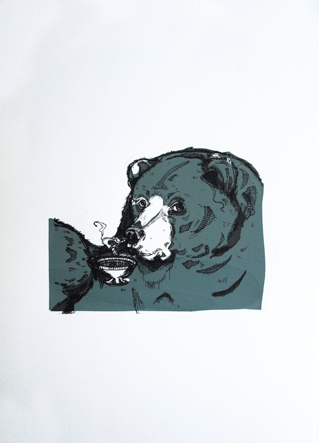
Ok now, I want you o stand up, turn around and get out, and the rest of us can appreciate how disgusting they are via the means of my little zine, Bears: Don’t Like ’em! This came about last Easter, and since then has been a consistently strong seller at arts fairs and conventions, to men, women and bear haters everywhere. And actually, one or two intrigued bear lovers too.
Having witnessed it’s popularity, I thought I’d bring it to life with a little splash of colour and returned to my usual haunt, the print rooms, to create these three sets of limited edition screen prints from the zine.
And a fox in a tie. That one was really just for giggles though.
And thus begins the mammoth job that is the catch up posts from the past term. I’m not sure exactly when it happened, but life definitely got frighteningly busy over the past 3 months and, as a result, my little interweb based snippets of work became a little sparse. For those of you that noticed and, more to the point, those of you that cared, I apologise for this, get on my little, metaphorical, digital knees and beg your forgiveness.
You know, in the spirit of Christmas and all that.
Not that I have any Seasonal based works for you, because I’VE BEEN BUSY. So Uni work it is.
So let’s kick start with a bit of printmaking shall we? For no other reason than it makes me happy. And I’m in charge.
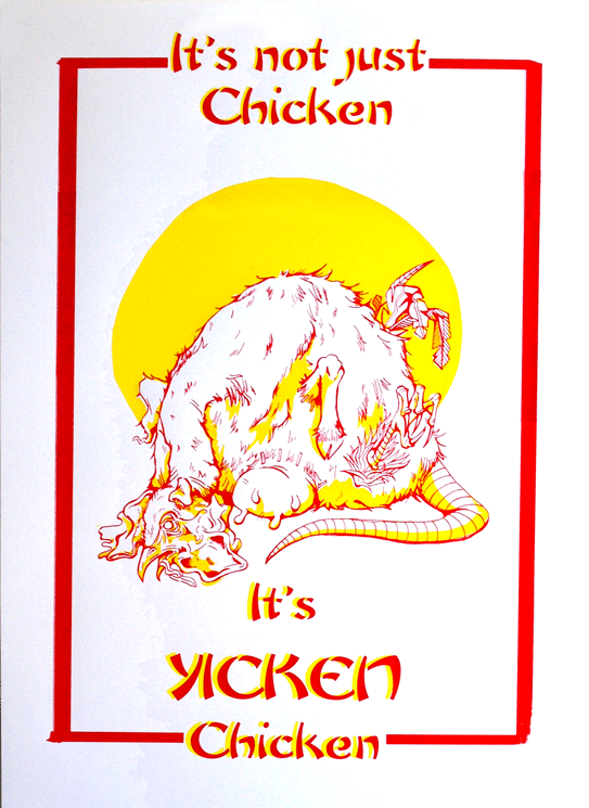
The brief was…well just that. Very simply to create a screen printed poster selling our favorite fast food restaurant.
This is all very well and good, except I happen to be a proud, longstanding member of the societal subculture of “students who cook” and, therefore have something of an aversion to fast food. Actually, that’s putting it quite lightly. What I mean is, generally and on the whole, I really bloody hate it.
“Not to worry!” My tutor insisted, “You may employ a use of irony!”
So I did. I employed a use of irony. Actually, I employed a really bloody heavy use of irony and drew, what probably turned out to be the single, most disturbing thing that’s ever been dredged from the depths of my skull, in the name of promoting Yicken, a Chinese take out back where I grew up. You know the kind: greasy walls, tiled floors, an inescapable use of that classic yellow and red colour scheme that desperately attempts to suggest some element of culture.
Actually, if I’m entirely honest, as far as nasty Chinese’s go, Yicken isn’t the worst. It just happens to have a heinously playful name that I thought might be handy in the creation of the poster.
There it is. A vile, possibility regarding the identification of the mystery meat found in that greasy tub of yours.
I’ve actually been sitting on this one for a while, but thought, as I desperately do NOT want to get involved with my summer project, I’d go ahead and load it up for your viewing pleasure.
It’s not procrastination okay? I’m providing a service.
…
yeah, alright.
But those of you who have been with me for a while, will remember when I actually DID my university work and didn’t simply ignore it in favour of baked goods and birthday presents. One such example of this was one of my last illustration projects in which I produced a set of sequential linocut prints (to be found hiding here).
In the end, they were presented on a board in a simple layout. I had wanted the images themselves to do the work in terms of communicating the story without the distraction of any further, novel presentation.
But you know me, why make one set of prints when you can do TWO?
And since this project, the duplicate prints had just been sitting about in tissue, getting a little bored and generally feeling a little abandoned (I don’t know that they did feel this way. I never asked them, but it seems like a plausible emotion for an inanimate object to have.)
And that was how they stayed, sad and forgotten.
BUT THEN I had to move out! And suddenly there was a whole wealth of jobs and thing that I really, really, desperately did NOT want to do. And suddenly I couldn’t take the fact they were so, very forgotten. They didn’t deserve such a fate, it was really, really important that I get out all my book binding equipment and allow the little prints the glory they were owed!
And that decision DEFINITELY wasn’t procrastination. The Prints were in NEED! It HAD to be taken care of immediately, and all those silly, little things on the to do list, things like packing and locating various vital documents and repairing any damage in the room I may, conceivably be charged for, could all just wait while I took care of the really important stuff.
I take the welfare of my work very seriously.
So I did a wee bit of book binding. A concertina book, so when you stretch the whole thing out, you can still view the images in sequence, and the story is not lost or interrupted by the physical act of page turning.
The Prints travel down, like a hanging.
I wanted the book as a product to communicate all the research I’d done for the project and adhere to the thematic choices I’d made when designing the prints. It had centred around this wooden mask and I wanted the element of natural to come across, hence my decision to use earthy tones and loosely knotted rope for the belly band.
The choice of title had been a factor I laboured over, probably more than I should. In the end, I had decided on Knots for three reasons. Firstly, as the theme of wood had been such a strong factor in the creation of the project, it refers to the knots you get in the bark of a tree. A lot of my supporting sketchbook had been drawings of these and woodgrains, so it seemed very appropriate. Secondly, the story had to convey an element of home, something I had dealt with by showing our little character flying off to find home in an airship very reminiscent of an old galleon, the captains of which would measure a distance in knots. And thirdly, the object I had been asked to base my story around had been a mask, two images of which show the creature untying the string knots of, in order to remove it and fashion it into the figurehead for his journey.
It’s a one off, firstly as I only had one more copy of the prints to use, and secondly because it took me so frickin’ long . But it’s got quite a nice, handmade feel to it. Quite different from the heavily photoshopped stuff I usually crack out.
So, having had a good ol’ rant at the state of my print that was my exhibition piece, let’s now focus on how great our Exhibition actually was.
A gigantic congratulations to everyone who just completed Year One of Graphic Communication at Bathspa University! As the exhibition wasn’t graded, not everyone felt it was necessary to submit any work, but for those of us that did I think it was a brilliant compendium of different approaches that boasted, not only a lot of talent, but a lot of ideas and conceptual wealth.
As the brief was SO very open (1912…that’s it) there was naturally a very large selection of works on display. Everything from publications to prints to animations to textiles. And the varying ways in which people chose to take the brief was also wonderfully broad. I’ll document here now some of my favourite works as well as some of the less crap photos I managed to take with my very limited photography skills. This is far from everything that was on show, but I’ll try to use what I’ve got to communicate quite what an enormous range of work was on display.
Prints
Arthur Webb: ScreenPrint about the Piltdown Man Hoax
Obviously, a lot of people chose to make use of the print rooms once the third year rush had ended. But to my surprise this didn’t just manifest itself in screen printing, which tends to be the most popular. There was a whole lot of linocuts too, all on different topics and with different strengths. It made for a really great display of variation, as well as assuring me that I’m not the only one with a fondess for printmaking!
I’m also relieved to say that, while it definitely wasn’t up to my standard, people still seemed interested in my Bram Stoker print. It received very nice comments from one or two onlookers too, and while I still was disappointed by the result, hearing nice words did pick me up a lot I must confess!
Kirsty Stanley: Linocut Prints about the first parachute jump by Albert Berry.David Gordon: One event from each of the 100 years between 1912 and now.
There was also a lot to be said for the ways in which people were using the printmaking. David’s piece was a real stroke of time-consuming ingenuity, in which he screen printed his photographic images in CYMK. This produced a full spectrum of colour, in the same way it does through your inkjet printer, but done via screen printing. It’s turned out looking completely amazing, although I will say, he nearly killed himself doing it. The boy has real dedication to his art and I can’t express my respect for him highly enough. He never would have stood for a shitty print like mine, let me tell you!
David Gordon: Screen Print using CYMK colours!
Digital Prints
Ah the digital print, or Giclee as they’re known to those who want lots of money for it, but don’t want to have to put in the same level of effort required of you in direct contact printmaking. Don’t let that sound like a put down though, there were some beautiful images made and printed in the exhibition, and I and many others would be proud to own them, and would be even prouder to have done them!
Elhora Powell: Illustrated narrative of the 1912 collapse of the Quing Dynasty. Bea Baranowska: Handmade Scout badge board
Textiles
There’s a common misconception that in order to be considered graphics, something must have been made via the computer. Allow my classmates to put this one to rest.
Bea Baranowska: The Scouts began in 1912.Emily Hunter: Screenprint onto canvass documenting the 1912 introduction of the chilli heat scale.
Publications
My favourite. The books and zines. This is only the tiniest example of what was on show, they ranged from professionally printed newspapers and information packs about pig racing, to hand bound print collections, narratives about personal responses to the brief and themed dot to dot books. It was quite an impressive array!
The Publication TableThomas Goldsworthy: Olympic Games 1912 NewspaperThomas Goldsworthy: Olympic Games 1912 NewspaperMatt Stewart -Tribe: Scotts Expedition LinoPrint bookLucy Harper: Hand drawn story of her Great GrandparentsLucy Harper: Hand drawn story of her Great Grandparents
Animations
And Macs. All Art schools have them, and like a pair of perky boobs on spring break, they love getting them out. This exhibition was no exception, it was Macs galore, and all bursting with newly created animations, films and videos.
…
Nipples.
Macs set up with all the animations people made. Because it’s just not an art-uni without Macs.Rhianne Farrell: Handmade stop-start animation about key events of 1912Carl Godfrey: Animation about the Japanese gift of 1000 Cherry Blossom Trees to America
Flogging Stuff!
Well you know me, I love a good stall. And I made sure I wheedled one into this exhibition too! Luckily, everyone else got involved too and brought along prints and books and anything else they’d made in the year. All together, it made for a pretty impressive display of work. Well done us!
Selling work from the past year.Beer+awesome drawing=:DPrints,zines,books,Tick…
So yeah, all in all a great event really that received some really complimentary comments from those that went. I would like to say a huge thank you to three people in particular: Tom Goldsworthy, Carl Godfrey and Ciara Caldwell-Cleave who were in charge of all the publicity and organising of the event. They completely made it what it was, went out of their way to make display animations, organise free beer, made cakes and 1912 ice cubes (made sense at the time) as well as compiling little free compilations of all of the work on display for us to take home, which really was a lovely little touch. Yeah okay, their cheekiness may have got us in trouble with the second years a little bit, but hey, what’s a bit of casual rivalry amongst years eh? Antics like that is totally what this institutionalised education is all about, and the long and short of it is that they made the event.
Free catalogues of everyone’s work!
Cheers guys, I hope since then you’ve had a good old relax, put your feet up and cracked open a cold one.