Some Drawings for More Stories

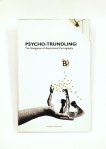
I’ve been working on a few drawings to go in the  Children & Young Adult Fiction Anthology for this year’s MA Creative Writing graduates at Bath Spa University. The Anthology’s titled Where the Wild Words Are and displays cheeky snippets ad extracts from each of the novels written by this years Graduates. I was lucky enough to devise illustrations for three of the stories, all of which are Young Adult extracts with a darker tone.

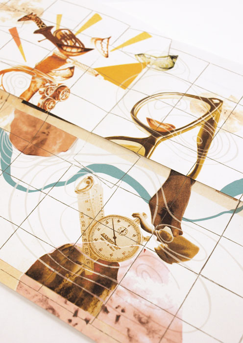
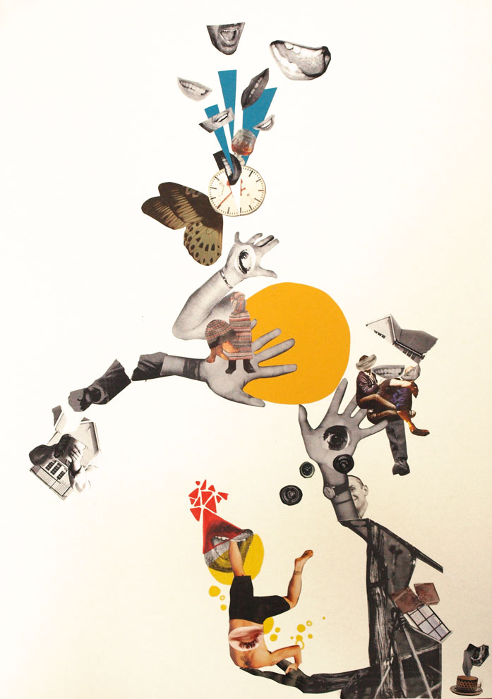
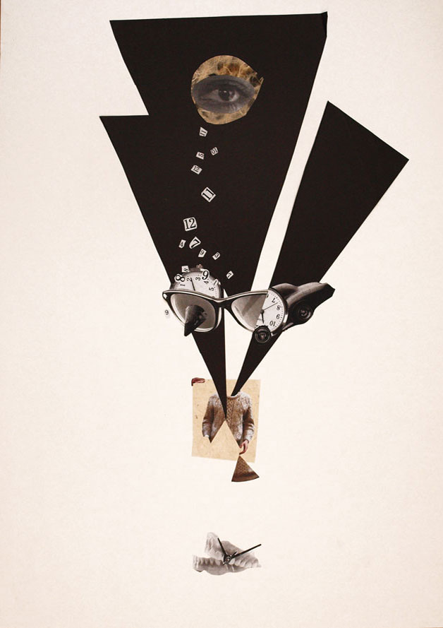
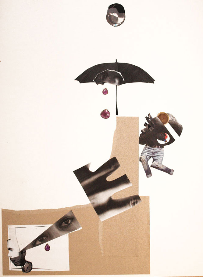
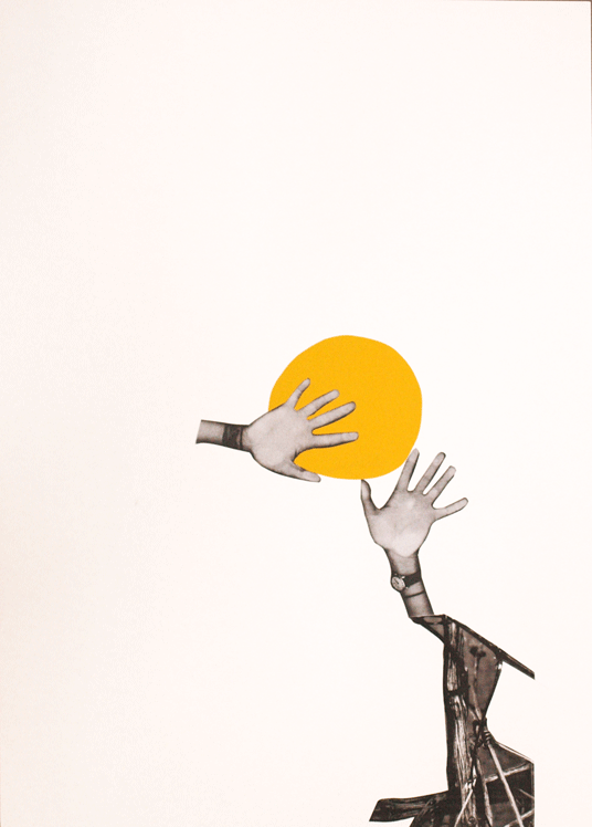
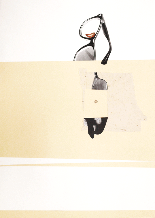
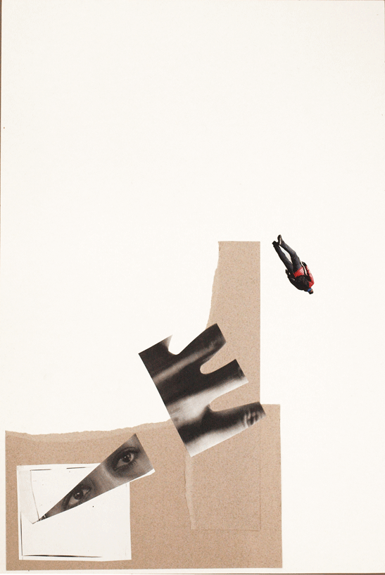
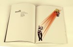
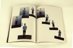
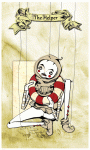
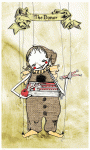
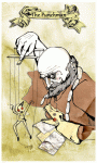
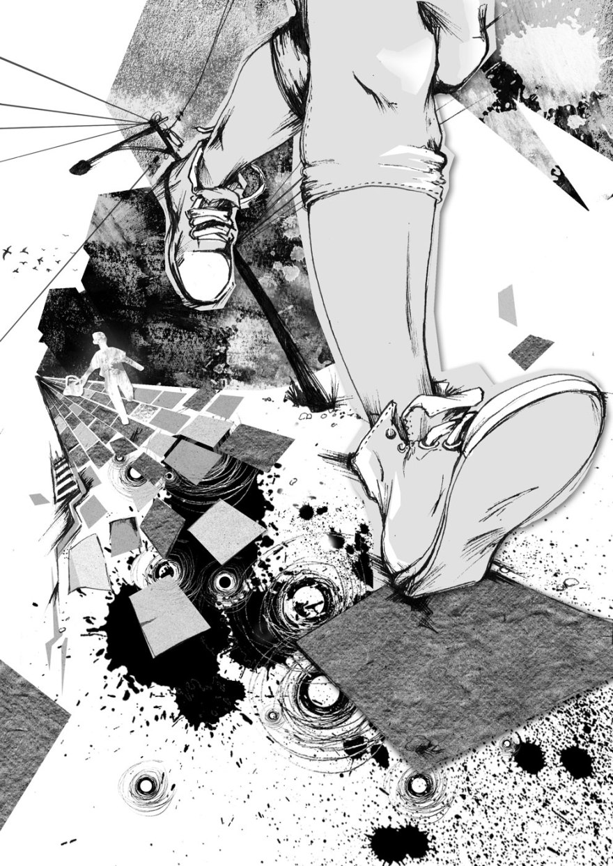
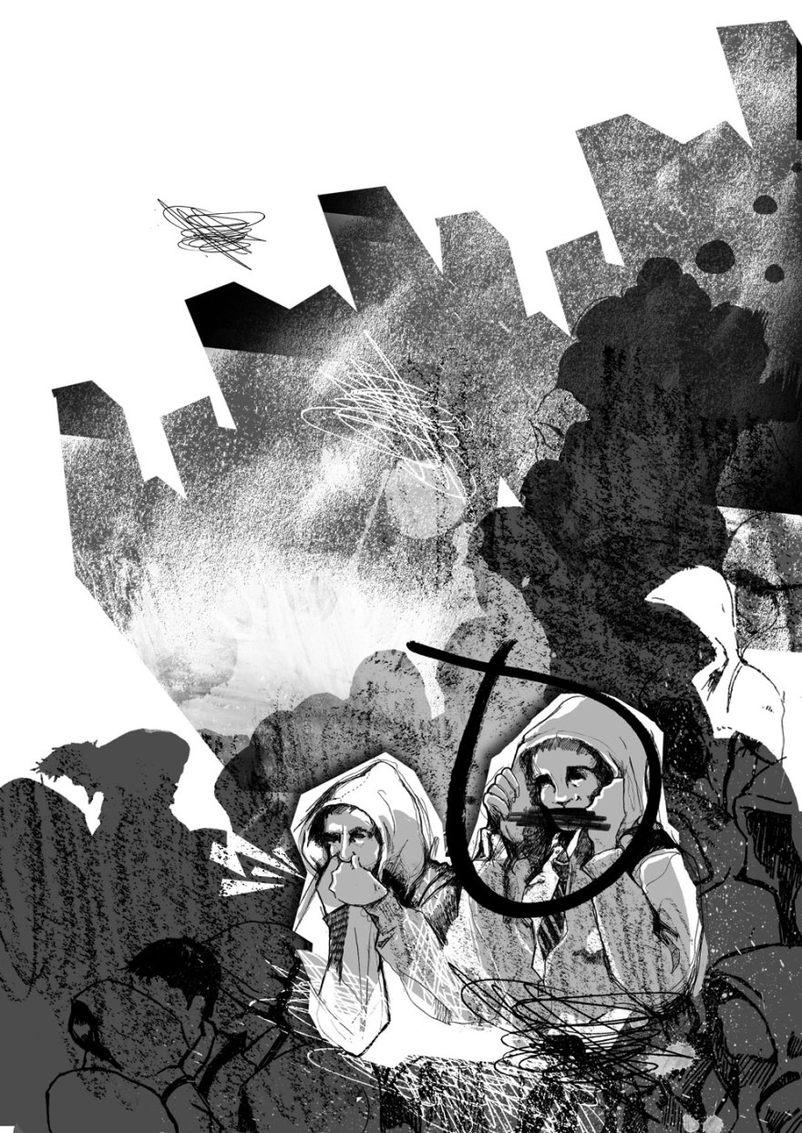
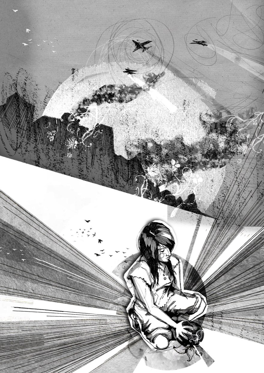
I wanted to depict the extracts given without preventing any imaginative interpretation on the part of the reader, avoiding visual repetitions of the, already very powerful, writing. Instead I teased out familiar motifs and visuals from the written extract and assembled them to make suggestions about the rest of the story, encouraging further interest in the rest of the book. Although somewhat literal in conjunction with the text, the images are intended as conceptual signifiers of the direction of the story.

Although I felt the inclusion of the characters was important, I tried not to give too much visual information away here either, either abstracting their faces or simply turning them away so that they’re not fully visible and recognisable.

After all, I don’t want to remove the readers ability to make visual interpretations, reading is about imagining! Plus I don’t see why I should be the one to do all the work.

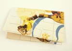
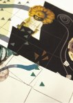
So here’s what I got. Three pictures, for three stories by three, remarkably talented writers.
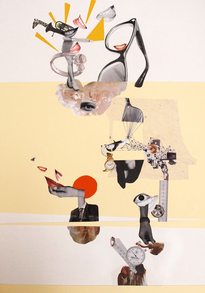
OtherWorld

Written by Lucinda Murray
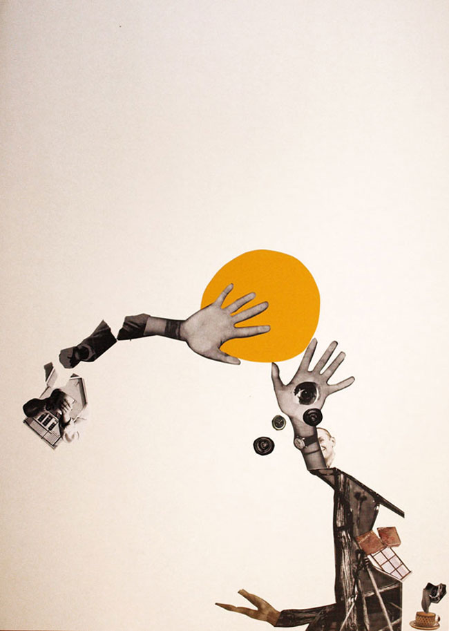
A tale in which a dark, magical undercurrent lurks beneath an urban city. The extract reveals the moment this world awakens from it's long dormancy.
A tale in which a dark, magical undercurrent lurks beneath an urban city. The extract reveals the moment this world awakens from it’s long dormancy.   


Trev

Written by Val Mote

A teenage boy witnesses a murder, yet is unable to confess to what he has seen. The extract details the strict rules of gangdom in an urban school and the necessity to keep your head down and your hood up.
A contemporary teenager witnesses a murder, yet is unable to confess to what he has seen. The extract details the strict rules of gangdom in an urban school and the necessity to keep your mouth shut and your hood up.


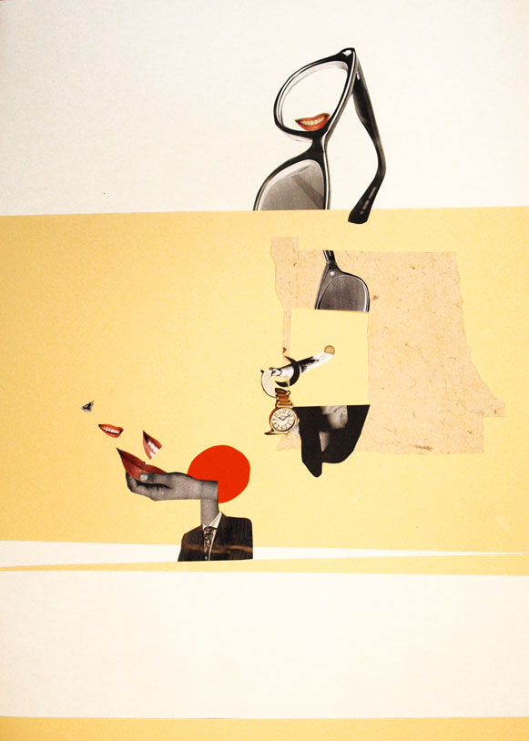
The Light in Our Hands

Written by Sarah Waterstone

A fantasy dystopian love story set in a war in the near future, the extract details the moment at which the protagonist is caught in the attack that changes her life and the world.
A fantasy dystopian love story set in a war in the near future. The extract details the split second moment at which the protagonist is caught in the attack that changes both her life and the world.

The Anthology goes to print sometime over the next few months and contains a plethora of talent and imagination from the students of the MA. The extracts and synopses for these, as well as many, many others had an enormous amount to offer and I hope my interpretations of their work are as valued by the authors as their stories were by me.

Look forward to it all put together now!

The Ambiguity Project: Look What You Made!!

It took a while and it was stressful and incomprehensibly confusing at times but, the concluding chapter of the Ambiguity Project has finally been written. And I figure, as it was all your hard work that made it, it’s only really fair that I offer you the chance to  a little gander.Maps in Their Slip Case

All those broad and insightful answers you sent, emailed, told and wrote to me have been gradually forming this project for a while now. The character portraits they formed have taken on a number of attributes and aspirations and finally, in your deciding of the concluding question, you’ve shaped their journeys towards aspiration progression and digression.

As a result, the pieces have evolved from character portraits into the format of maps.

W: Positive Extrovert

X: Positive IntrovertY: Negative IntrovertZ: Negative Extrovert

The pieces as a whole communicate the desires, aspirations, fears, limits and goals of each character, based on the desires, aspirations, fears, limits and goals of every person that took part. map3

map10

The representations of map elements are extensions of your resulting answers, transforming the images into something of an artistically representative psychological landscape in which forests, desserts, mountains and rivers must be bridged and navigated as the theoretical characters endevour to achieve.

As the maps can be folded in any number of ways, new compositions and sequences are formed out of the ambiguous collage imagery, introducing the possibility of narrative-based interpretation and multiple routes through the artwork.

Based on your final answers and your choice to answer with positivity or negativity, I adapted the likely-hood of the journey’s success using the environmental features.

At times, rivers will be bridged or shattered, allowing navigation around the barriers so that the illustrations of goals can be accessed. At others, the folding will introduce increased forests and confusing, representing the journey becoming harder.map12

map17Basically, these are four artworks that beg to be played with and explored. Fold ’em up however you wish to reveal multiple artworks and new possibilities for stories.

Then, obviously, cause I can’t let things lie, I wanted to make a slip case to contain them.

The project dictated that it needed to have a binding jacket, so, as my results had extended out of the original book format intended, I used it as an excuse to design and display the cover.

I knew the artworks were complex and involving, so did not want to drown this in the cover design. Instead I opted for a simple, systematic looking result, inspired by the design of 1970’s psychological textbooks. I wanted the notions of progression towards goals to be represented by the idea of making your way from A to B, and knew that the suggestion of maps had to be present, hence the light inclusion of the forest elements, which doubles up nicely as directional arrows.

mapcover1mapBack

There’s a very real possibility that I did forgot to spell check.

If you find anything, do me a favour and just keep it to yourself okay?

Anyway, another project down.

Thank you so much to everyone that helped, I really hope that you appreciate the results.

Cheers

B

The Ambiguity Project: Layer Three

We are now 3/4 of the way through the journey that is the Ambiguity Project. Thanks so much for getting involved, it’s been great to have so many people interested in helping out and I really hope you’ve been enjoying the results.

Another question asked, another layer formed, the collages and (as a result) the characters are really taking shape now, so here’s what we have so far:

I asked you, WHAT IS YOUR GREATEST PRIORITY?

W: Positive Extrovert. Their priorities are to have fun and enjoy the moment, burying their head in the sand to some extent when faced with problems.
W: Positive Extrovert. Their priorities are to have fun and enjoy the moment, burying their head in the sand to some extent when faced with problems. Small term goals, like keeping their feet warm are fine, but larger questions remain ignored.
X: A positive Introvert. Their priorities are to work towards achieving love and happiness. Reflective and self questioning they're not afraid to make changes to get to their goals.
X: A positive Introvert. Their priorities are to work towards achieving love, fun and happiness. Reflective and self questioning they’re not afraid to make changes to get to their goals.
Y: Negative introvert. They prioritise happiness and making an impact on the world but suffer low confidence. They worry life will pass them by having not achieved their goals.
Z: Negative extrovert. They prioritise their family and the welfare of others yet begrudge this fact. They feel held back by their sense of responsibility yet do nothing to change their scenario.

So, for our final concluding layer, I would like to put it to you people to answer ONE of the following two questions:

DEFINE YOUR PERSONAL SUCCESS?

DEFINE YOUR PERSONAL FAILURE?

The Ambiguity Project Layer TWO!

Okay so the project is underway and the collages are beginning to evolve. For those a wee bit lost, a full description is here.

So far, here’s how we’re looking:

W
W: Positive Extrovert; Would change: Taking life at home for granted; having more time; their blinds; their bum and better coffee made at Uni
X
X: Positive Introvert; Would Change: Last Night, would make people nicer to each other; would make others smile more; being a sloth.
Y
Y: Negative introvert; Would Change: Their future, Time to pass slower, more hours in the day, The speed of passing time, How long it took to decide what they wanted to do.
Z
Z: Negative Extrovert; Would change: The frequency other people think of others; summer all year round, their wardrobe, finance, change narcissism to compassion

Most of the answers worked pretty well together as a lot of them were about time and the passing of it. What was fun, was making these similar answers fit with the positive, negative character types as defined previously.

CROP
“I’d like more time.”
"I'd like more hours in the day and for time to pass slower" "I regret how long it took me to decide what I wanted to do"
“I’d like more hours in the day and for time to pass slower”
“I regret how long it took me to decide what I wanted to do”

A thousand thank you’s to all of you getting into the spirit and lending your answers.

So, the next question that will form the next stage:

WHAT IS YOUR GREATEST PRIORITY?

I look forward to getting your answers, either on here, twitter or direct to me at bagley.becky@gmail.com

The Ambiguity Project

I’ve started a thing.

I asked a control group of people (mainly third year university students at the University of Bath Spa…go figure…) three simple yet remarkably ambiguous questions for them to answer as they wished.

1. WHAT DO YOU GET UP FOR IN THE MORNING?

2. WHAT ARE YOUR LIMITATIONS?

3. WHAT IS YOUR GOAL


I received a lot, a lot of varied answers. These results have now formed the first stage of a set of four collaged images to represent a set of character sheets.

So Far our cast consists of W,X,Y and Z: An extrovert positive character, and introvert positive character, and introvert negative character and an extrovert negative character; each one captured in an abstract collage.

They look like this:

W: Positive Extrovert
X: Positive Introvert
Y: Negative introvert
Z: Negative Extrovert

Every day or so I’ll be asking a new, ambiguous question. Each answer I receive will be randomly attributed to each character and represented on their collage, forming further details and fleshing out the set until they become formed characters in the form of abstract collages.

The idea is, my control over the growth of these characters and development of the images is diminished and YOUR (yes, that’s right, YOU) will directly influence the artwork. Each stage will be posted right here so you can keep an eye on your handywork.

So, the Next question is:

WHAT ONE THING WOULD YOU CHANGE?

Submit answers either in the comments box, or email me at bagley.becky@gmail.com.

You can also tell me via twitter, all answers are welcome.

Let’s get this show on the road!

B


Illustrating Science: The joy of pseudo diagrams (fig. 2)

This is Lucy.

Lucy's feedback

And this is Carl.

Carl's Brain

They like to do things. Things like moving. They’re especially good at intentional moving, unconsciously.

This was Lucy, once.

Lucy's egg legThen I got my hands on her.

And This is Proprioception.

(A project from last Christmas.)

This is Proprioception

propbook5

Inspired by the ingenuity of the pseudo-educational comedy, Look Around You, Proprioception was a mock 70’s educational manual in which I took a real life bit of, really damn interesting, biology and explained it using entirely non scientific methods. Because I am an illustrator, so cutting things up makes more sense to me than the deeply fascinating intricacies of real life biology.

FeedbackThe pseudo diagrams were designed to portray the importance of this fascinatingly vital sixth sense, so inherent in our bodies most people have never even considered a life without it (and in fact there are only 6 known cases of people having a complete lack. This is a really cool video about one man’s battle.)

The “text book” had fold out elements to reveal new tasks that got people thinking about the impact of Proprioception in their own life.

Opening page 1Opening page 2I wanted to draw people’s attention to it’s vitality to our functioning everyday and used tasks and design choices to create a style reminiscent of an 70’s school textbook/instruction manual with a playful, modern twist.

Carl dancingProprioception allows us to understand our own body’s position in relation to itself without consciously considering where each limb is. It’s why when you close your eyes, you know where both your hands are. It’s super neat and super vital and I wanted people to understand that fact using simple collage techniques and fun imagery to demonstrate the incomprehensible struggle that would be living without it.

Plus it gave me an excuse to cut up my friends faces for a few months.

Seriously, I was picking Carls head out of my carpet for weeks.

Illustrating science: The joy of pseudo diagrams (fig 1)

Hands up if you want to learn a totally amazing fact?What about something entirely controversial?

Or even just utterly trivial?

And who wants to learn them through the medium of…TYPOGRAPHY!? …no?

Well if you raised your hands to any of them you are a fool, because I can’t see you and that was very clearly a rhetorical request. So you can sit down, behave and have all three.

This was a short uni brief: 3 posters to work as a set and detail three facts that fit the above criteria.

The conception of the carbon that makes up all living things.
The atoms that form most of your body’s cells were created in the explosion of a star.
The lifespan of our cells, built from this carbon.
The maximum number of times your body’s cells can multiply and divide before they deteriorate and die.
The life form that housed the carbon is gone, yet the atoms continue.
In reality, the afterlife is nothing more than the continued existence of atoms after the death of the cell they once formed.

So here they are, three posters about the passage of time and our simple, biological place in it. An amazing beginning to the journey of carbon atoms, a trivial definition of our cells’ lifespan and the true, if not hard to swallow fact that we are nothing more beautiful than a temporary home for ongoing carbon.
Some may see this as a dark concept. I think it’s an utterly beautiful one, although the project itself is not one of my favourites.

Still, either way it’s all pretty interesting

Second Year Frollicks! The End of Term Catch up Part 2: Card Deck

Anyone ever read/ watch Cardcaptors? Not to sound like a little fangirl, but it was pretty rad. No joke.

I bring it up only because it had some attractive examples of interesting, illustrated card decks, which happens to be the brief of my most recent illustration project, which I am lovingly bringing to you today as part two of the Second Year Catch Up sesh.

We were asked to create a set of nine cards in the style of Edward Gorey’s Fantod deck of alternative Tarot. And my eyes immediately turned into little dollar bill signs, as this was in November, just prior to Comiket. And card decks are a pretty sell-able deal.

I turned to my interests in media theory for inspiration, choosing to illustrate Vladmir Propp’s theory of set character types. With creepy puppets. Because if a project of mine needs one thing, it’s definitely an air of macabre. (There was research and reasoning to back this up by the way, but, who am I kidding? You don’t care about that! You’re probably going to sneak past the text, straight to the pictures anyway, you cheeky little blog ninja.)

So here it is, The Propp-Up Theatre Deck.

the-deck

So we have The fist 7 from Propp’s character theory (I chose to omit the Father as a separate character, merging him with the Dispatcher as is often the case with folklore anyway.) Then made up the full nine with the Bottler and Punchman, the traditional workers of the Punch an Judy show.

the-collectionWe had to design the nine cards themselves, then a back for them as well as a Key Guide to reading them, tarot style. I went a step further (in the name of making moolah) and turned my key into a small booklet with information about the concept as well as the cards themselves, as well as handprinting candy bags to echo the punch and Judy, disturbing British seaside vibe.

key

key-inside

And did the punters at Comiket appreciate all the hardwork? Damn tootin they did! They were the first thing of mine to go and by the end of the day I only had about 2 sets left. Not bad for a school project/money making combo.PC168167

B

x

Second Year Frollicks! The End of Term Catch up Part 1: Chickens.

And thus begins the mammoth job that is the catch up posts from the past term. I’m not sure exactly when it happened, but life definitely got frighteningly busy over the past 3 months and, as a result, my little interweb based snippets of work became a little sparse. For those of you that noticed and, more to the point, those of you that cared, I apologise for this, get on my little, metaphorical, digital knees and beg your forgiveness.

You know, in the spirit of Christmas and all that.

Not that I have any Seasonal based works for you, because I’VE BEEN BUSY. So Uni work it is.

So let’s kick start with a bit of printmaking shall we? For no other reason than it makes me happy. And I’m in charge.

The brief was…well just that. Very simply to create a screen printed poster selling our favorite fast food restaurant.

This is all very well and good, except I happen to be a proud, longstanding member of  the societal subculture of “students who cook” and, therefore have something of an aversion to fast food. Actually, that’s putting it quite lightly. What I mean is, generally and on the whole, I really bloody hate it.

“Not to worry!” My tutor insisted, “You may employ a use of irony!”

So I did. I employed a use of irony. Actually, I employed a really bloody heavy use of irony and drew, what probably turned out to be the single, most disturbing thing that’s ever been dredged from the depths of my skull, in the name of promoting Yicken, a Chinese take out back where I grew up. You know the kind: greasy walls, tiled floors, an inescapable use of that classic yellow and red colour scheme that desperately attempts to suggest some element of culture.

Actually, if I’m entirely honest, as far as nasty Chinese’s go, Yicken isn’t the worst. It just happens to have a heinously playful name that I thought might be handy in the creation of the poster.

yickenThere it is. A vile, possibility regarding the identification of the mystery meat found in that greasy tub of yours.

Don’t be so Graphic…

Did you know I was actually studying a Graphics course?

I ask, only because you would, under no uncertain terms, be forgiven for thinking I was an illustration student. I think it’s something to do with the total lack of organisation, adoration for comics and drawing…”things” and my total inability to draw straight lines.

And The fact that I’m not sure I’ve mentioned the word “grid” once since setting this site up over a year ago.

Well I am. It’s a mixed course admittedly, and there is certainly a heavy emphasis on image making and illustration too, but I wanted to, very quickly, dispel any myths that I am no good for anything but the world of the wibbly.

The current project is all about layout. And I’m finding it a challenge and a half. Here is the, incredibly ugly, induction timetable for first years to my University.

Yes we are actually an arts and design school. The irony is not lost on me.

See, this what happens when you leave all the admin to the Humanities Campus.

But I digress, we’re currently taking part in a series of short exercises in redesigning the above ugly thing, into something considerably less ugly using a set of strict restrictions and rules (One typeface only, one colour only 3 type size only etc). Just to clarify, this is by no means a practice of making something “beautiful” in the traditional sense. This is about creating order, making structure and making use of positive and negative space, type weight, type size and a hell of a lot of Swiss inspired graphical magic.

So, so far these are  how I’ve gone about getting my Bauhaus on. Don’t worry about the text. This is about the overall effect of the page, the information itself is borderline irrelevant.

      Mmmmm…delicious, gridded neatness.

I have a whole bunch of these, with tweaks here and changes there. Things most people wouldn’t notice in the slightest. It’s got to the stage of adjusting it pixel by pixel in a worrying display of Design Induced OCD.

I wanted to chat about these, I suppose just to remind everyone that us people-creatures don’t have to be pigeon holed as much as we often are. Yes I know it’s all in the same sort of area of design and creativity, but I am just one little person who happens to define herself as an illustrator of sorts. That it what I love, how I make a little moolah, and what I devote a lot of time to. But there is always room in my little noggin for different things. Things that require me to think differently and consider how I see things differently, and I think it’s pretty cool that we have the capacity to do these different things at the same time. I think that I, like so many others, can lose sight of that when life gets busy and sink back into the comfort of what I know I can do.

But I’m really starting to get into these little layout majigs. They’re challenging for a messy art bug like me, and I’ve definitely not cracked it yet, but with every new design I make, I see new promise and get joy from the structure of it all. The Organisation is SO pleasing.

I’ve literally gone from a fanatic of this:

Dave Mckean; Wolves in the Walls. A STUNNING book.

To This:

Joseph Muller Brockmann: Swiss magic

Seriously!

THIS:

Shaun Tan. Cool guy and badass illustrator.

TO THIS!!:

Jan Tschichold

Learning is fun 🙂

B

x