Catch up! Illustrating heroism for the London Museum

Continuing with my, long coming, round up of my illustrated shenanigans before the end of the year, I wanted to end with a little insight into what was arguably my favourite project of 2016.

Since joining forces with my wonderful agent towards the end of last year, I’ve been working on a number of projects within the field of publishing. Jodie (aka, SuperAgent) is a literary agent, so specialises in the field of kid book illustration, which is my unquestionable passion. So that works quite well. The only down side of the scenario, is that everything moves SO SLOWLY! I’m desperate to share all the odds and ends I’ve been up to, but have been totally sworn to secrecy by the lords of the Publishing World.

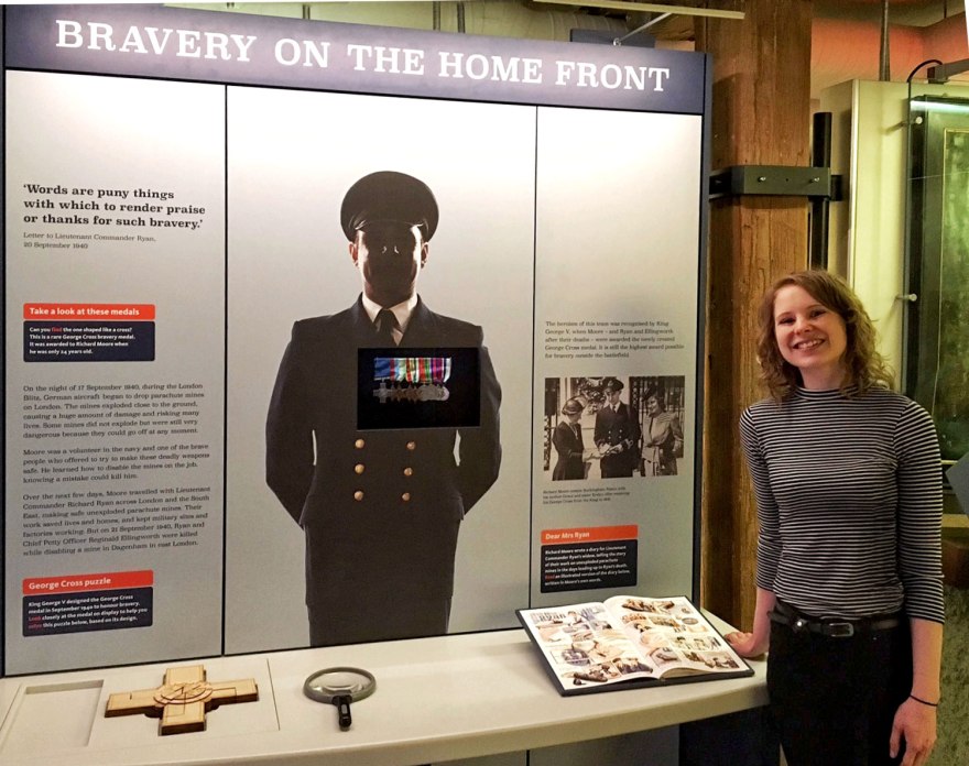
That was, until Summer this year, when Jodie was thrown a total curveball of a job. The London Museum had been donated a medal by the family of a wonderfully brave member of the bomb disposal unit in the early 1940s. The curators at the LM wanted to display it in a new part of their wartime exhibit in their Docklands site. Along with the medal, the family had letters, photos and journal entries from the man himself, Mr Richard Moore.

In an ongoing attempt to reach out to all ages, the Museum were after a comic illustrator to translate the transcript of the journal into a short, quickly absorbed, illustrated story. The journal was so rich with detail and powerfully human, they feared the full effect of Moore’s experience would be lost if it were to be displayed as text. We all know attention spans are short these days . Furthermore, they wanted it done and dusted within a couple of months! Finally a quickfire job!

Aware of my past flirtings with the comics scene, Jodie sent them my comic portfolio and BAM! Back into the comics fray I did go!

And WHAT a fab experience it was! It was unbelievably humbling to be trusted with a gig like this, not only because it was the first time my comic work has gone pro, but also for the richness of the subject matter!
dmr411

It’s always a challenge to take a long piece of writing and edit it down into manageable chunks, LET ALONE when you have to factor in imagery. But then to have the added pressure of capturing the bravery, fear and reality of a REAL man in such extreme situations is a whole other ball game. I’m always moved, grateful and, actually – a touch surprised, when anyone wants my illustrations to represent their work in some manner, but to be trusted with a part of a real person’s history is utterly humbling.

dmr4
In the research stages, I drew directly from photographs to get a loose idea of facial structure of the men. Then I could later work from these drawings, developing the faces in my drawing style.

dmr9

I started by tackling the words. I knew I wanted Moore himself to narrate and therefore the text in the comic should come directly from the journal. I took the bulk of the narrative and broke it into sections, removing any scenes that didn’t move the story along, while trying to keep in as much detail and life as I could from Moore’s entries. Small, human details were important to maintain the relationships of the disposal unit, but some experiences felt repetitive, especially regarding the number of bombs they units disarmed.

dmr2

This was a pretty nerve wracking task. I felt entirely impertinent, erasing anything at all, but the guys at the Museum were supportive and honest. They provided me with as much historical material as they could (they’re very clever, knowledgeable chaps you know)  and after a few meetings, we had the bulk of the narrative sorted.

dmr3

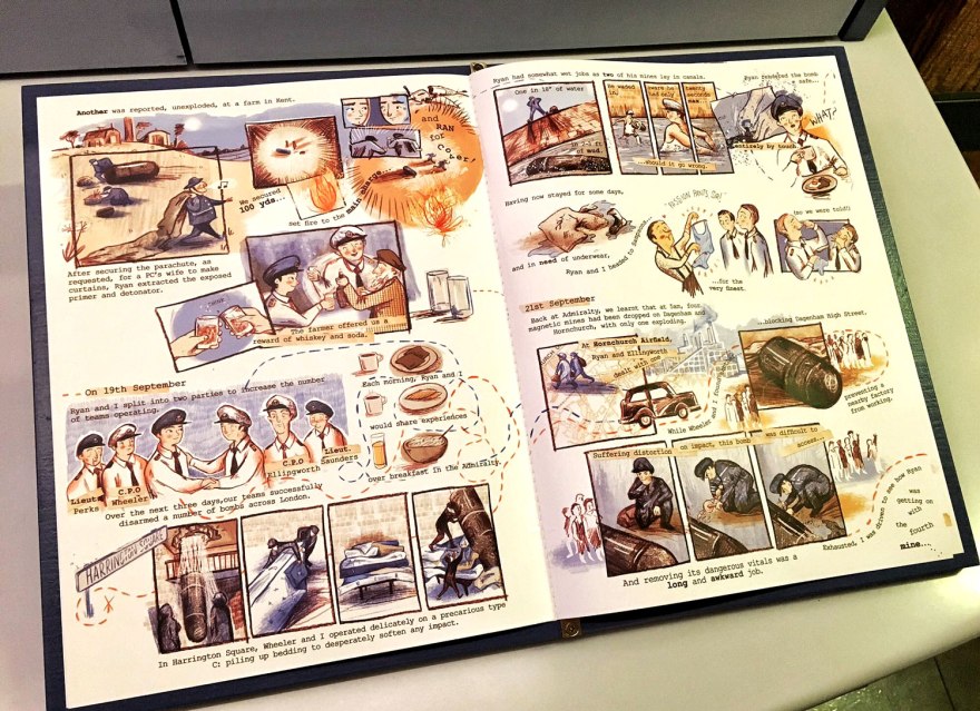
I’d wanted to book end the comic with one of Moore’s original letters to the wife of his friend and mentor. Not only does this frame the 6 page story nicely, adding come comfortable closure, but it really emphasises the relationship between the two men – a vital component of the journal.

Once this structure was developed, I started to work out how to split this narrative over the six page limit the Museum had stipulated. This is my favourite part of making comics, because I think the flow of a narrative is the most vital part of telling a story and holding an audience. I changed the structure for the final two pages to highlight the chaos of the events, where previously the artwork had fit within a fairly straightforward grid format.

This is also where I develop any motifs, graphical cues or repeated visual themes that might help in the telling of the story.

dmr8
The final artwork is beginning to develop based on my many, many drafts!
dmr13
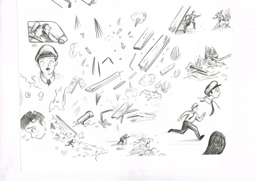
Original sketches from the final spread. I like to draw all over everything then arrange the composition on screen in a digital collage.


dmr172
Draft of the first page.

Once I’d worked and reworked the storyboard into it’s finished – yet still loose and ugly -state, I could focus on characters, artwork and colours. I like to work with a limited palette, and allow the colours to communicate the mood, adjusting the dominant colour based on the events in the story.
dmr12
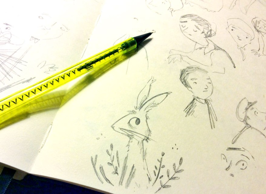
I drew pages and pages of faces to get the characters right. Taking breaks to draw rabbits. Obviously.

dmr15

Interestingly, while I’m an illustrator, the illustration component of a project like this is probably the fastest part. I think visual storytelling is so much more than the image itself.

dmr155
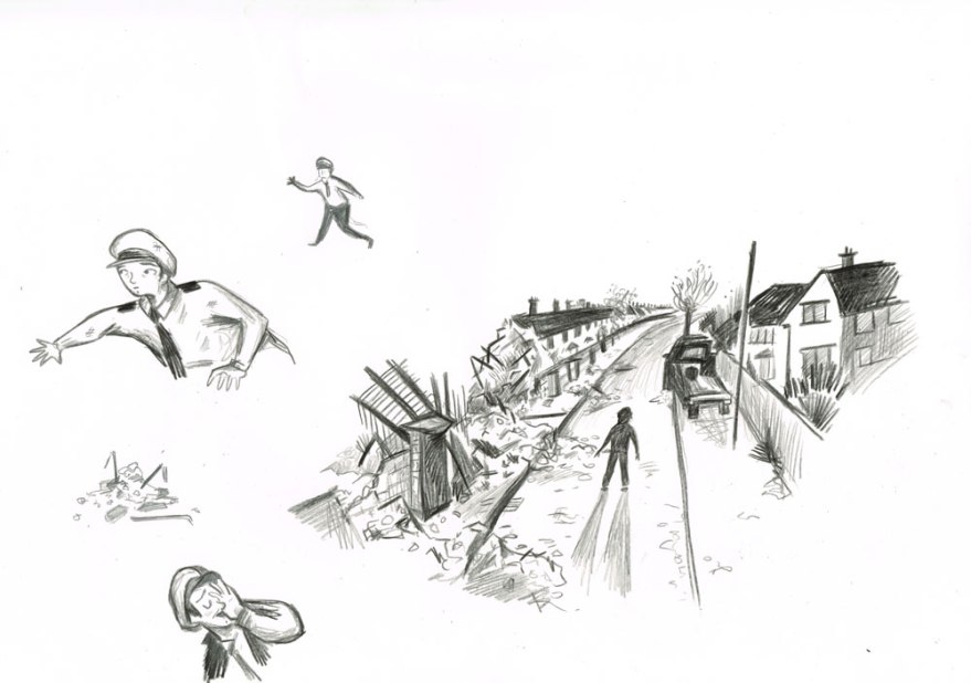
Draft prior to real characterisation…

dmr16

dmr41g2
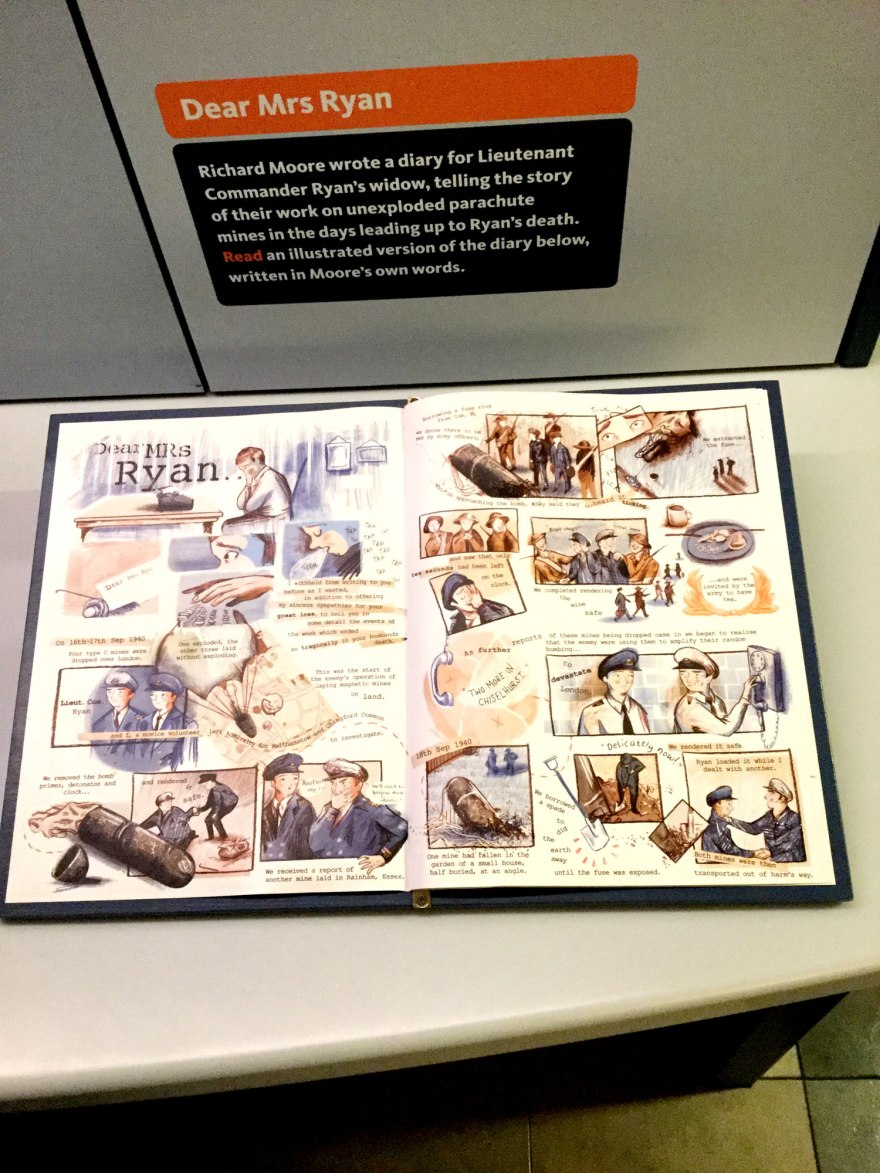
The final page.

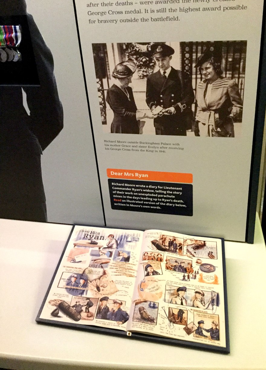
The George Cross exhibition opened in September.
dmr5
The photo above my comic is the real Richard Moore receiving the medal. So there’s no leeway on my characterisation!
dmr412
The medal sits in a glass display unit in the wall.

There’s a lot of reasons why this project is close to my heart. It’s my first comic to have been written for use in a professional context, it was my first attempt at a biographical piece and it was written on a tight deadline.
dmr7

But more than all of these things, it marks a really interesting transition of the nature of learning material. We all have seen the rise in popularity in comics, with small press talent and events rising up to challenge the big guns of Marvel, DC and the like, but for a prolific, historical museum to turn to the graphic novel, really marks a widespread understanding of the communication potential of the format. And I’m proud to have been a teeny, tiny piece of this movement.

The Story of the George Cross is a permanent part of the Museum’s Docklands site. The press release for the opening is here.
dmr10

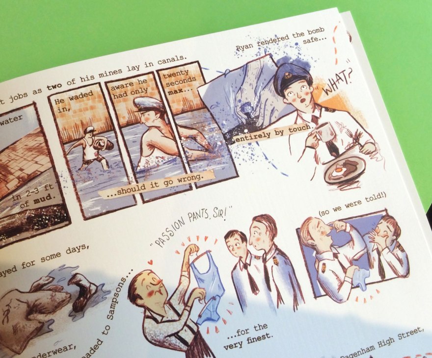
For more of an insight into my working process on the work, check out this wonderful review and interview about the work with the brilliant Broken Frontier comics community site.

And if you do HAPPEN to be in East London with a spare minute or two, do have a look. Richard Moore’s story is a magnificent example of true heroism in times of incomprehensible difficulty. Regardless of my involvement with the project, he deserves a slice of your time. His story puts an awful lot into perspective and I am humbled to have been privy to his words.

All images of The comic Dear Mrs Ryan belong to the Museum of London. All shots behind the scenes are property of Rebecca Bagley.
Photographs taken by Rebecca Bagley, Jodie Hodges and Andy Oliver. Cheers for everything guys.

Catch up! Eds, Ads and Drawing for money

Right so, along with being completely and utterly inspired, by the publishing talents, I also did some things this past few months that, dare I say it, actually generated a bit of revenue.

Turns out drawing for money is actually a thing. Weird.

While the publishing and book work is ever ongoing and I’m DYING to share, unfortunately I’ve been sworn to secrecy that end. Luckily, lots of little, much faster jobs have been floating around which I CAN let you in on. KEEP YOUR EYES PEELED FOR FURTHER ANNOUNCEMENTS!

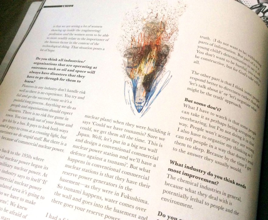
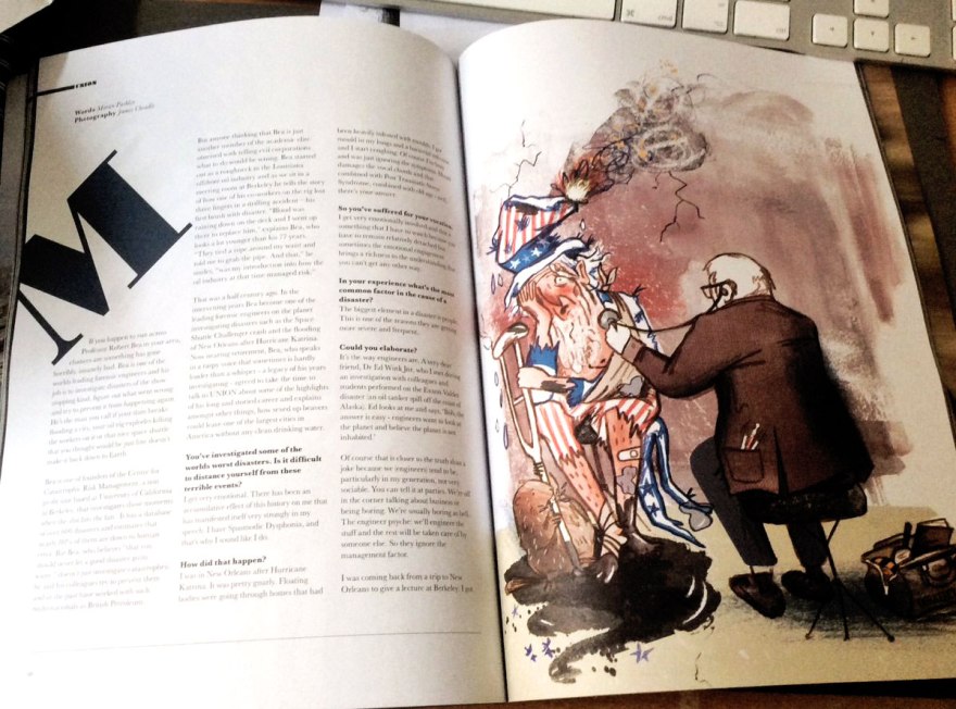
For now though, I popped back into the field of editorial illustration for a bit recently, providing more work for Union Features Magazine. Yet another fab issue is now out in the world and I suggest you have a look.

union4

This time, I was lucky enough to attend the launch party and actually meet the geniuses behind the mag, of which all thee issues to date have been sublime. I’m chuffed to be their one and only illustrator and am happy to report they are as great in person as their work (I mean that too, it’s definitely not just the crates of Sailor Jerry present at the launch talking.)union3

union2

It’s nice working on Union, because it offers such a different kind of subject matter from my usual. Ordinarily sitting pretty in the picture book bracket, I love to see my simple, child friendly style tackling the harder matter of a men’s lifestyle magazine! It’s challenging trying to marry the two, but it’s also a lot of fun and I like to think it still works. union

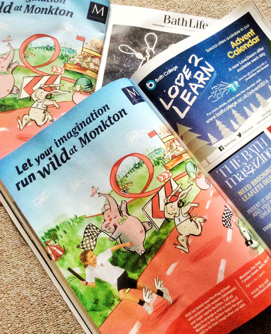
Then, for something quite different, October to November also saw a little flirt with the world of Advertising. I was contacted by the Icehouse, a talented bunch of designer folk who had a campaign to work on for a new pre-prep department that was opening in Monkton School. They needed some illustrations to work with their campaign, which I was more than happy to supply. Quite apart from anything else, their office had a nice garden and they made me really good coffee.

I’ve worked on three images, which are now beginning to surface as the campaign goes live.I’ve found two of them sitting in the pages of magazines (a double page spread in one which was most pleasing!) and I was also shown the flyer design, which I think really makes the most of the drawings.

fullsizerendermonkton2

I can’t wait to see them all three in situ. Walking around the city has become pretty exciting, just in case I see another ad! Having been so heavily occupied with publishing, I hadn’t considered pursuing advertising illustration but I’ve been pleasantly surprised by the whole experience. Working with the design team was a joy, and finding the finished campaign, all dolled up by the designers and nestled in glossies has been a real kick.

fullsizerender-3
In one day I found TWO local magazines whose recent issues contained the ad!

fullsizerender-2fullsizerender

Also, and this is mega sad, I LOVE seeing my work printed on different papers. Every magazine has a different stock and it all alters the look of the work.

I should stop now before I admit anything else really lame.

I have no shame.

NEW Etsy Store and Christmas SALE!

So, having truly ingratiated myself with social media this year or so, with full on love affair with Twitter, increased and growing commitment to facebook and more recently a shiny, new Instagram, I have FINALLY opened an Etsy store!

Having rekindled my love of taking part in conventions and arts fairs again in October, I’m getting digital with it, with the grand opening of my new shop! Woot woot!

fest8

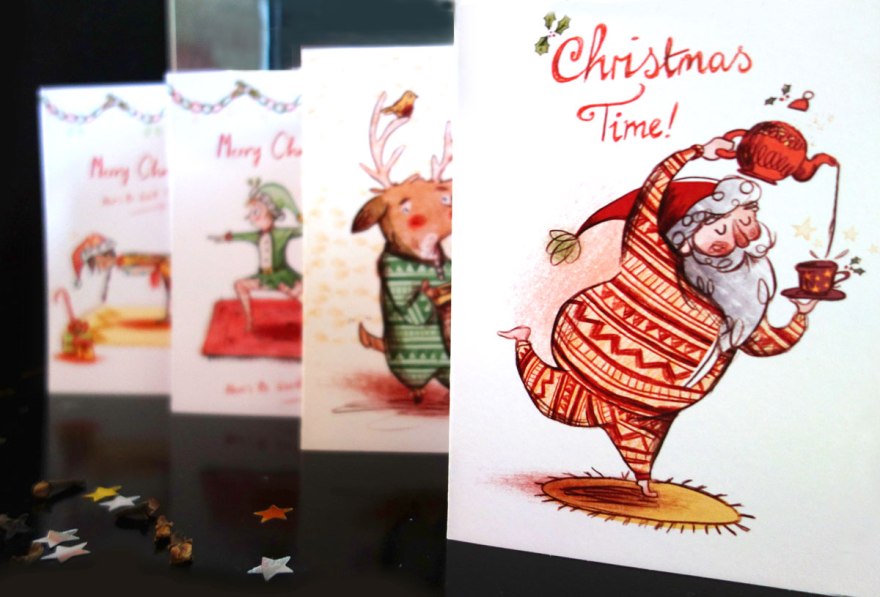
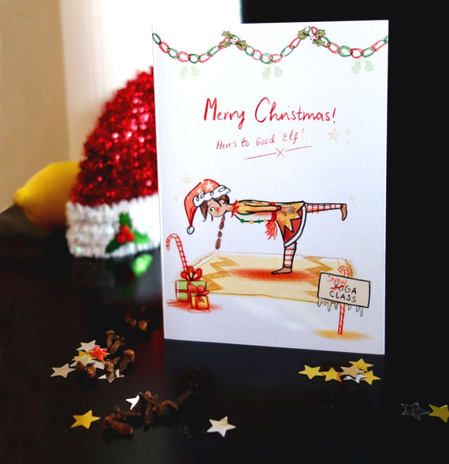
I plan to sell all number of printed, illustrated things, primarily prints, cards and zines so keep your eyes peeled for fresh new doodles! Also, if you have requests for prints from my website portfolio, don’t hesitate to get in touch and I’ll see what I can do.

In keeping with this exciting news AND the fact that it’s that generous time of year I though it only fair to run a Celebratory SALE! I’m selling my Christmas Cards off for just £1 with first class shipping on all items in store right up until Christmas!

card-collection-2

elfcard2-2elfcard1

If you, like me, have left things shamefully late, get involved and pick up some neat new bits and pieces!

My Store is BagleyArt, so stop over and say hello!

card-collection


Utter Nonsense! The Cheltenham Illustration Awards 2016

Those of you who are kind enough to connect with me on the old Facebook, will know that I recently had the honour of being picked to be included in the 2016 Cheltenham Illustration Awards, hosted by The University of Gloucestershire!

That’s pretty neat eh?

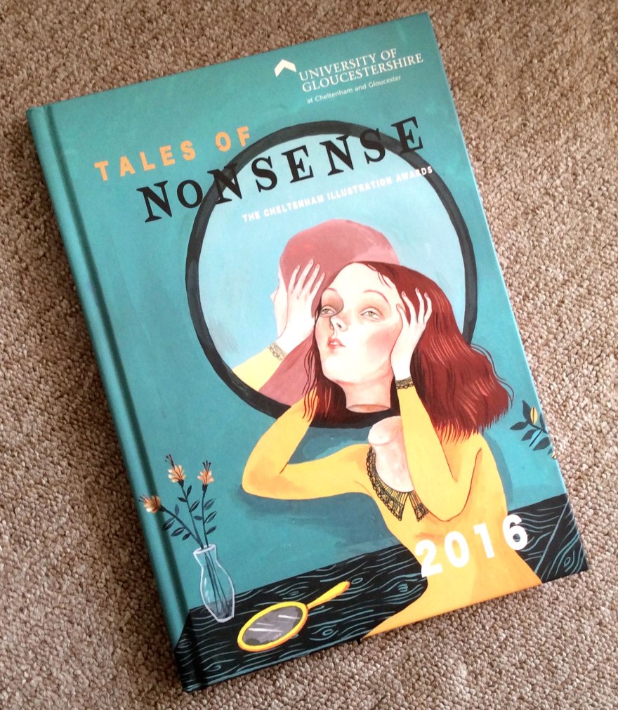
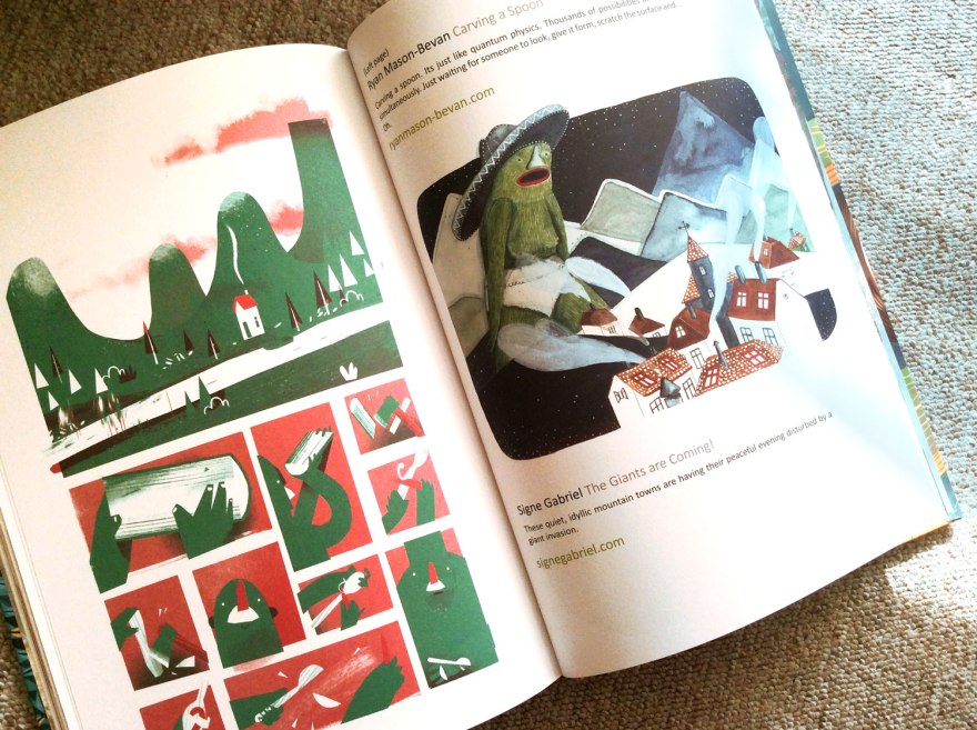
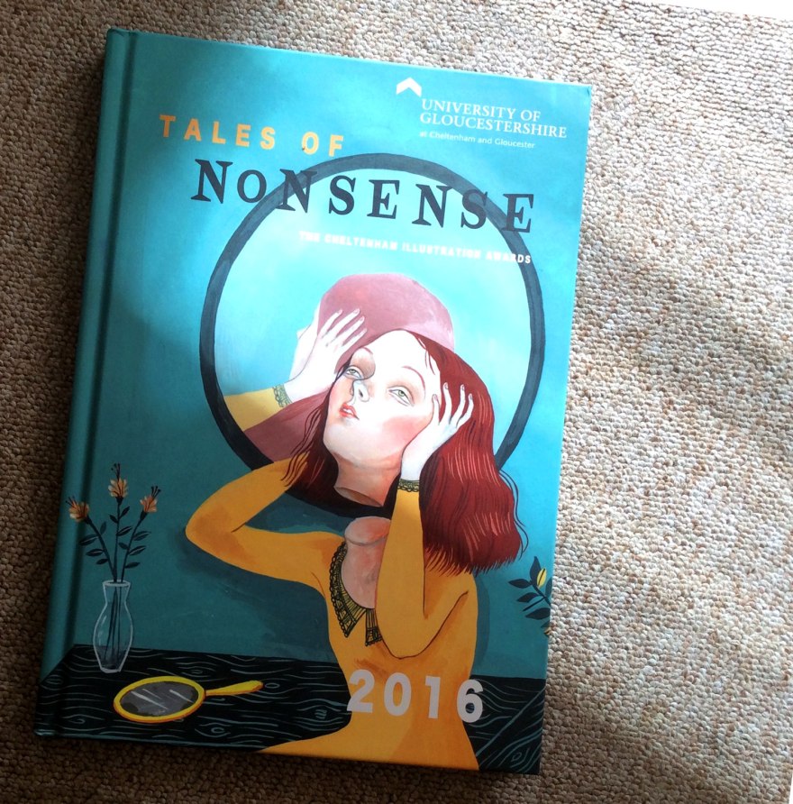
What’s EVEN NEATER, is that is week I received by magic of the good old postie, a copy of the Award’s 2016 Anthology of my very own! Woop woop!

chelt9

As you can see, it’s a beautiful (classy hard back!) compendium of incredible talent, both students and established folk. On taking a look inside, I have been genuinely blown away by the incredible work of all of those listed, and am even prouder to have been picked to display alongside them.

chelt4
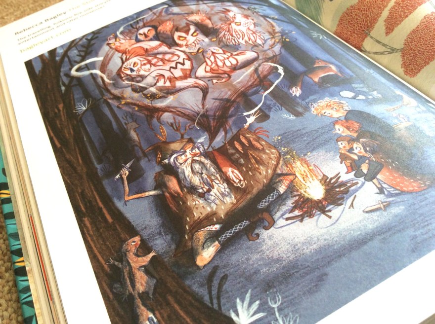
My little example of nonsense as it appears inside this beautiful collection.

chelt2chelt3


It’s always a wonderful thing to see your work in print, but I was genuinely impressed at the quality of this lovely book; both in content and in print. It was a lovely surprise to have been selected and even lovelier to have such a wonderful present out of it!

chelt8

chelt5
I also spied some familiar names! This guy (Stephen Collins) is a brilliant talent in the world of comics. Look him up!

chelt6


chelt7

chelt1My favourite part of any anthology is discovering all those new names and talents to pop into the inspiration memory bank. This collection is bulging with them, it’s going to be a busy evening ahead, finding them all on twitter!
To find out more about the Cheltenham Illustration Awards, do check out their website and blog.

To enquire about this beautiful anthology and maybe even grab one of your own, contact eevans@glos.ac.uk

chelt10

Working for the MAG(azine)

Hello All!

Just an update on a few things I’ve been up to. Firstly, this week an editorial of mine has appeared in the very slick and informative Wisconsin based lifestyle magazine, Isthmus. I have never been to Wisconsin, but it sounds like a pretty fun place. There’s a whole lot of neat arty things going on (and some delicious food if Isthmus is anything to go by!) and I had the pleasure of doodling a little piece to go alongside an article about ‘Play Clubs’.

Never heard of them? Neither had I, go right on ahead and check the article out online (it’s looking real swanky in print too!)

Isthmus_mag
Play Clubs editorial for Isthmus Magazine

Secondly, and this time a little closer to home, another editorial of mine has been doing the rounds in issue two of Union magazine. For those of you who’ve not yet been introduced, Union is a very nice newcomer to the scene of men’s lifestyle mags. It’s a fascinating mix of journalism and sharp, classy photography and I HIGHLY recommend you find a copy. If nothing else for the production values, the use of spot-UV on the cover is just TASTY.

My piece for this one was a little more grown up and serious than my usual fare, but was certainly a ball to make, and a fascinating article to work to. Go right on ahead and check out this little gem, it’s produced by a team with a real passion to bring journalism back to the forefront of men’s mags, and it really does the job with class.

Union_02.jpg
Editorial re Russian Rambos in Union Magazine

And Finally, in the world of drawing things and pretending it’s a real job, I have some super great news!

Getting back to my comic book roots, I’ve been making a few shorties recently that have been featuring on my site. Things like this and this and this.

These little fables have not gone unnoticed by those clever and observant folk at Broken Frontier, who’s passion and commitment to finding and championing the best new talent contemporary comics have to offer, still continues to astound me.

In a new feature, begun 2015, the team have picked 6 promising small press comic makers to hone in on and expose for the talent they really are. Last years bastions boast an impressive list from the shores of the UK and I highly suggest you take a peek here.

However, while their work continues to grow from strength to strength, it comes to our attention that is, in fact, now 2016. The new batch have just been released and, guess who is apparently a talent to watch this year?

Well it’s only bloomin’ yours truly isn’t it!

Check out the full collection of marvelous storytellers (and me!) here and why BF claim we may well be worthy of keeping an eye on this year.

And before my ego grows too big to fathom, I would also just like to thank the Broken Frontier team for having such faith in the things I make. I will absolutely do my best not to let you down, so keep your eyes glued to the site for odds and sods and let’s have a productive 2016!

Over and OUT

x

What I’ve been up to

Hello everyone!

Just thought I’d share a few links to new places that are talking about my work at the moment!

Firstly, I’ve had a mention and lovely little interview featured in this month’s Frrresh magazine. This is a great little monthly, digital number that is a complete goldmine of new and up and coming talent and I highly suggest you check it out. There’s a fantastic mix of works in every issue and it really is a ‘something for everyone’ kind of deal.

View issue 33, in which I feature here, and thanks again to the lovely people behind the scenes who kick-started my Christmas season with this little inclusion!


Next up, I was contacted a short time ago by Thortful, a new, very handy greetings card website, devoted to championing good artists through their high quality prints. They have a fab range going on at the moment, including some really quirky little designs and I highly suggest you take a peek at the cards on offer.

They were good enough to invite me to be one of their featured artists for their launch so if you browse their impressive library, you’ll find a few little tidbits from me hidden among the plethora of good stuff on show.

It’s a great service for that mad Christmas rush, quick and handy with a really neat little app you can download for easy access (you know, for those times when you’re out and suddenly remembered that you definitely forgot someone far too important to have forgotten.)

Their blog is also a great place to discover a little more about the artists involved, and if you’d like to check out my interview (and I think you should.) go ahead and take a peek, here.

One final note, just to say too that there’s plenty of new work of mine on the portfolio sections of this website so do stop by and browse through my children and teen works.

I hope you’re all beginning to get festive and I’ll be uploading this years Christmas Creations soon!

Happy December everyone!