Bagley Book Club- The Dragon and the Nibblesome Knight review

nibblesome_02
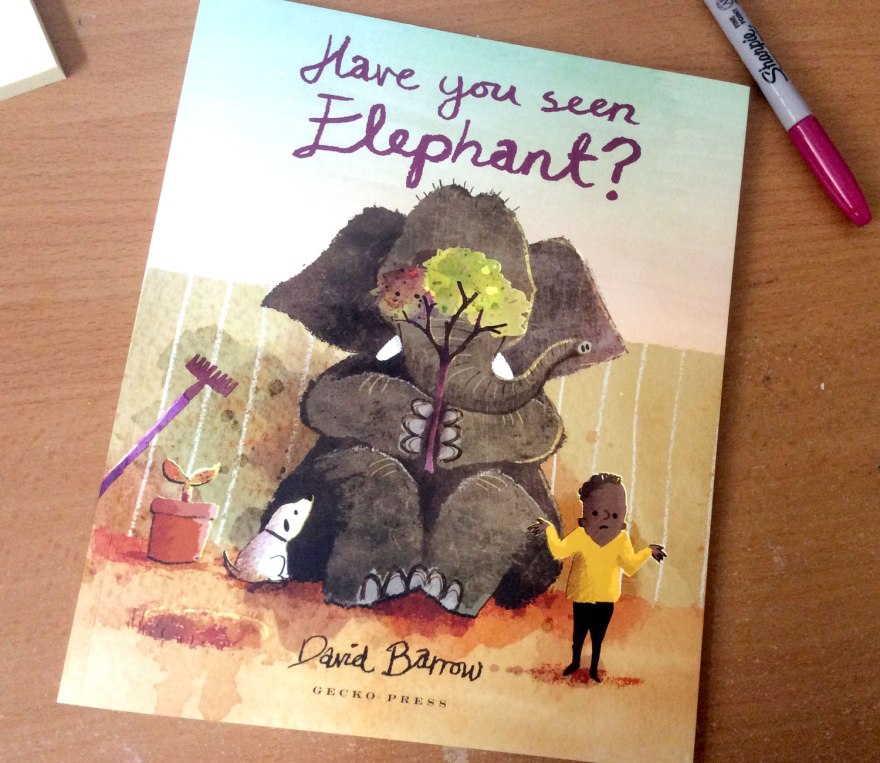
Author: Elli Woollard

Illustrator: Benji Davies

Publisher: Macmillan

It’s a corker this week from wordsmith Elli Woollard and the ever brilliant Benji Davies. I picked this number up at the Power of Pictures panel event at Foyles in London a week or so back, so it only seemed fair to rock it into the spotlight, while I’ve still got Davies’s insight fresh in the old noodle.

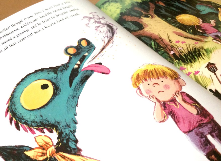
A tried and tested formula, The Dragon and the Nibblesome Knight is a tale of  surprising and unlikely friendships. Sent on a fledgling flight to gobble a knight of his very own, we are led by Dram, the utterly fearsome-less and totally huggable wee dragon, into the heart of a storm.

nibblesome_04

nibblesome_01
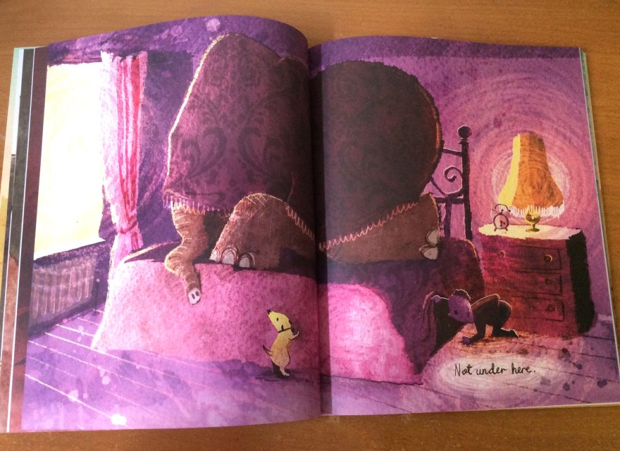
In a beautifully drawn and tastefully coloured sequential spread, our little chap is blown off course. Frankly, I defy any human with a beating heart not to express even the tiniest of concerned, cooing syllables here. Davies captures such peril in the wide eyes of the reptilian baby, there just isn’t a homosapien alive whose heartstrings are sturdy enough to withstand a good tug. It’s a perfect Attenborough moment. Yeah sure, the bloodstained and ruthless lion has been out for an afternoon’s killing, but look how FLUFFY the babies are!

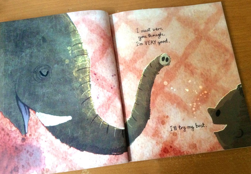
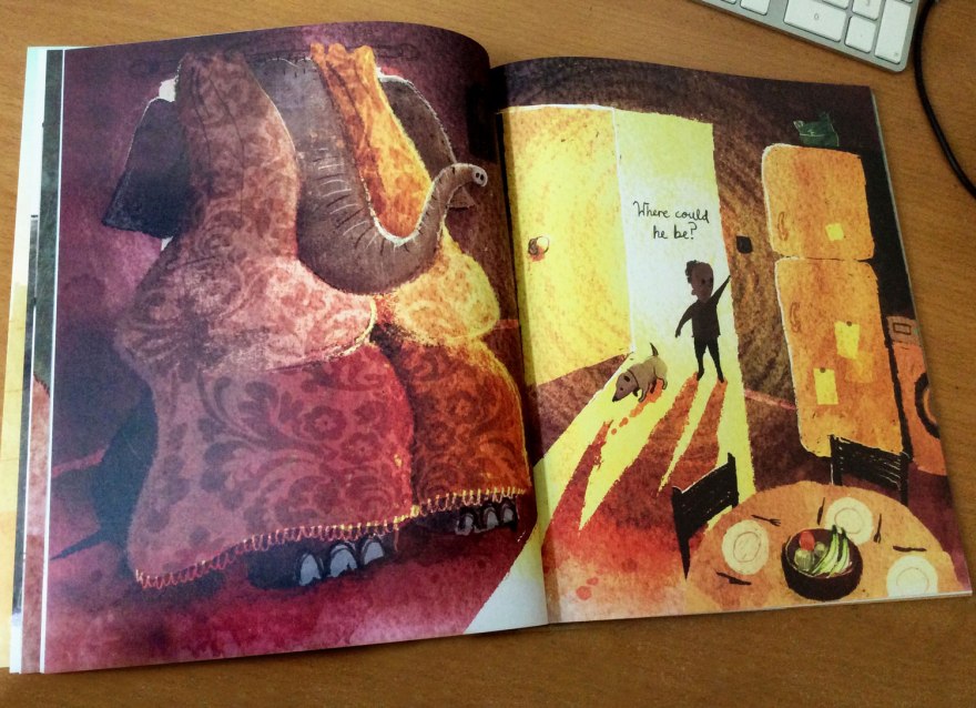
Humorously mistaking the beast for a duck, our compassionate (and equally adorable) knight James discovers the disheveled castaway in a pond. The pair grow a bond as James nurses his unknown foe back to health through  Woollard’s charming and lyrical story.

nibblesome_05

So he took off his armour and said with a grin,

‘I’m coming to help you’ and he waded right in.

nibblesome_06

Known for her witty poetry, it’s no surprise that Woollard’s text is such a delight. Free from any hint of forced rhymes or lyrical-cheese, the text flows from page to page with a real smoothness, wit and charm.

One of my pet peeves in children’s books, is a poorly paced tale. Often confined to strict page counts of 32 or 40 pages, there’s sometimes a feeling of being desperately hurtled by the words through the story to reach the conclusion before the page count cuts it short. If so inclined, illustrator s then have to desperately compensate with enough additional narrative to halt the reader for a bit; a decision I’m not at all adverse to, might I add. As highlighted many times, pictures SHOULD have their own tale to tell, it’s the key magic of a picturebook to contain a duel narrative. But equally, no matter how fine the artist, it won’t ever fully patch up the holes of a lacking author.

nibblesome_09

But THIS is where the Nibblesome Knight really shines. Both Woollard and Davies are in full control of the flow of the narrative. Davies’s pictures are a brilliant partner to Wollards’s poetry prowess, with enough characterisation, heart and little environmental joys in every image to give them depth, yet without so many additional details that derail the reader from the pace of the story.

nibblesome_14

The poem is so smooth and funny, it’s only right that the illustrations work with it to maintain the swing of the lyric, and Davies has done so masterfully in this example.

nibblesome_13
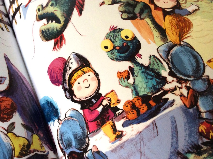
And it’s true, his interpretation of the characters make this tale. Adorable with a capital ‘A’, I demand plushy merchandise of the innocent duo (I am DESPERATE to hug this dragon!) The pair are subject to a good number of emotions as they build and reveal their, unknowingly forbidden, friendship and even with he simplest of facial details, Davies creates the full, emotional spectrum with precision. For a story all about the value and strength of relationships, empathy and compassion, characterisation and humanisation were key and Davies nailed. it.

nibblesome_07nibblesome_11nibblesome_08

‘Come to the woods and I’ll fetch you some honey.

It makes a good medicine, all soothing and runny.’

It’s worth saying too, how strong the artwork in general is. The palette is bright and full of life yet without being nudged into the realms of gaudy. The scratchy ink marks are loose and organic looking, yet clearly drawn with clear precision. The depth of the painterly lines give this tale a much more shadowed darkness than Benjies previous works and it works brilliantly in the Ye Olde world of knights and Dragons.

nibblesome_12

The classic narrative ends as it should; happily ever after. Predictable? Yes, but who on earth cares. As far as children’s stories go, this is a solid, classic example. It breaks no boundaries, it holds few surprises but it’s charmingly written, witty and funny and the characters are endearing and beautiful. The world is consistent and the imagery is breathtaking and it’s another brilliant example of the ‘classical reworked in a contemporary world’ kinda deal. It’s definitely worth a look, but don’t be surprised if you explode into a mass of whimpering, gooey “Awwwww”.

It is inevitable.

nibblesome_15


Book Club Review – Footpath Flowers

swf_cvr01

Author: JonArno Lawson

Illustrator: Sydney Smith

Publisher: Walker Books

Those of you who have touched base on this blog before, may remember my comparatively recent, tentative steps into social media and the resulting fun I was having finding my feet on Twitter. Well this weeks review is a refreshing wildcard, courtesy of this digital exploration. Basically I won a thing! Horray!

Yep the Gods of the internet randomiser were kind to me, and have landed me (via the very good -incredibly generous- people at the review site; PictureBooksBlogger) today’s lovely little number from Jon Arno Lawson and Sydney Smith; Footpath Flowers.

I was delighted to win, having spied the quirky, inked artwork somewhere on the web before and found then that I was immediately drawn to it’s comic-book esque format.

swf_inn07

A keen observer and participant of both the indie comic and picture book scenes myself, I’m always intrigued to see the style of comics that make it into the hands of the mainstream UK publishers. In recent years comics have well and truly risen from niche market or weekly funnies, right up to the ranks of ‘established art form’ and I’m delighted to see how often they’re now employed within the children’s market to tell all manner of stories; not simply those featuring pants and tights.

swf_cvr02

Sidewalk Flowers is a perfect tale to utalise the format of sequential art. Wordless and serene, the book follows a simple journey of a girl and her father. Narration without the fall back of words is no mean feat, yet the simplicity of the tale allows the little nuances and characterisation of Smith’s artwork to really shine, bringing the subtle beauty of Lawson’s tale to life.

swf_inn02

During their stroll, as Dad goes about his business, we see our own Little Red Riding Hood gathering flowers and weeds from all the available avenues of the city setting, distributing them as she deems fit.

swf_inn04

It feels wonderfully reminiscent of my own, and – no doubt – many other, past and present, childhoods; gathering sticks on walks with the family and finding hidden games and treasures in between the act of walking. It captures that childlike focus on the minutia and their, often surprising attentiveness to their surroundings.

swf_inn09


The joy of this childhood freedom is highlighted by the father, who is unaware of his daughter’s growing treasure trove and little acts of kindness; he sees only the tasks at hand – caught up in the world of adult errands and the day to day.


swf_inn03

Smith’s art is beautiful. Full stop.

Told from the eye level of our keen-eyed protagonist, the story captures the land of a child’s city through cropped compositions. We don’t know what dad is up to particularly – that’s just boring adult stuff, the real joy is way below eye level.

swf_inn05

This monotone, city setting is a stunning visual juxtaposition to the wild garden Little Red builds as she unearths her surprising bouquet from all around her. The urban palette of black and white with the splash of vibrancy from our little gardener’s jacket begins to fill with the whole inky, spectrum as the bouquet grows and the innocent delight of childhood generosity is distributed around the city.

swf_inn08
The joy of giving breathes life into the monotone city.
swf_inn10
Lucky recipients of the wild flowers of Red’s gatherings. The joy of giving has spread into a full colour world by the time she returns to her own, warm garden.

Now I’ve said it before that I am in no way adverse to the use of digital means in creating children’s books; and art in general. However, I am more than happy to admit that there is something refreshing in Smith’s seemingly unedited art style. Ordinarily a fan of collage and texture, here is nothing but ink, and the scanned traces of the watercolour blotting paper beneath it. It has a traditional charm as a result and feels almost vintage; perhaps in part due to the subject matter causing me to reminisce so much about my own errand-adventures!

swf_ends
The story is enclosed by a set of beautiful, garden end papers.

Either way, it’s a good reminder of the increasingly artistically-inclusive picture book market. Both traditional and contemporary approaches to art are finding their way into our children’s hands, offering more and more of a comprehensive understanding of imagery. For little eyes still making sense of things, this access to such a expansive and varied gallery within the bookshelf seems pretty exciting to me.

Print is dead? Give over.

But the joy of this book, certainly for me, isn’t as shallow as pretty pictures. As ever in picturebooks, the narrative within the image is the battery of it all and Sidewalk Flowers is a beautiful celebration of discovering just that: the narratives and hidden joys found within the little things.

swf_inn06

For little kids it’s a reaffirmation of the world’s hidden games, and for us, older kids, it’s a reminder to stay observant. Errands are boring. But they don’t have to be, I for one would like to spread a little bit of colour.

swf_inn11


Book Club Review – Never Tickle a Tiger


Welcome back to book Club! And by book club, I mean let’s-all-listen-to-what-I-have-to-say Club!

With books!

But seriously, if anyone has any comments on any of these reviews, be it agreements, disagreements, analyses of their own, or criticisms of my thoughts, I’d really, seriously love to hear them. You can leave a comment below, or you’re welcome to contact me via email, twitter or facebook.

tigertickle_cvr01

Author: Pamela Buchart

Illustrator: Marc Boutavant

Publisher: Bloomsbury


So, this time we have the colourful cautionary tale from Pamela Buchart and Marc Boutavant: Never Tickle a Tiger. I’m really not trying to play favourites here, but this is yet another gem brought to you buy Bloomsbury. Hat’s off to those guys who have been really busting out a cracking number of great titles in the past few years that are clearly right up my street! I promise to diversify more in the future, but this one really does need a mention!

A charming and vibrant cautionary tale, Never Tickle a Tiger opens with our introduction to Izzy; a fidgeting, wiggling, jiggling little girl who just CAN’T sit still! Warned and chided by jut about everybody around her, Izzy is that well-meaning but incomprehensibly over excitable little person we are ALL only too familiar with.

tigertickle_inn11

Her character is brilliantly identifiable to children and parents alike, brought to life with Buchart’s lyrical and whimsical writing style.

Cascading lists of alliterative, onomatopoeic adverbs capture the bounding lightness of our little protagonist, the text and images dotted around the page in an erratic layout that brings movement and life to the spread.

tigertickle_inn09

tigertickle_inn13

So what’s a girl to do when she simply can NOT sit still, no matter how many times she’s told? The story explores the angel and devil complex in near-on every kid’s head. The trained desire to be good and do as you’re told, VS the often much stronger curious NEED to explore the scenario in question yourself, learning your own lessons – for better or for worse – first hand. Because would it REALLY be so bad…to tickle a tiger…?

tigertickle_inn08

What’s so wrong with fidgeting anyway?

The page design of the pivotal moment is inspired. Short, snappy lines of text and sequential images capture and build Izzy’s sneaky, creeping movement to the forbidden enclosure, only to stop it dead with one full spread on her arrival.

tigertickle_inn07tigertickle_inn06

Boutavant’s illustration here is perfect. The drama of discovery is communicated through the uncharacteristically bare enclosure, the focus being on the majestic, sleeping beast within. Izzy is poised mid-movement in a comically ‘rabbit in headlight’ pose as she gazes up, feather in hand at the forbidden tiger.

tigertickle_inn01

As in all good cautionary tales, the fallout from Izzy’s failure to heed her warnings is rewarded with a hilarious domino effect of chaos; throwing the entire zoo into utter disarray.  The pull out, quadruple spread format here echoes the expansive explosion of madness and offers a great bit of novelty tactility and you open out the full extent of Izzy’s mistake.

tigertickle_inn04tigertickle_inn03

The vibrancy of character we’ve come to expect from Boutavant’s work really emphasises the fun of this bright and whimsical tale. Although less neon in palette than previous illustrations we’ve known him for, each animal in the zoo has a real attitude and life that compliments and enhances the madness.

tigertickle_inn05tigertickle_inn12tigertickle_inn02

Their reactions to Izzy’s unquenchable curiosity are delightfully humorous and  cheeky details such as a little, hidden hedgehog give every scene a little added magic, independent of the main story.

tigertickle_inn10
Small and adorable, find the hedgehog adds an additional game to the reading experience.

Ultimately, Never Tickle a Tiger is a great bit of fun. I love Buchart’s lyrical text and the life and hart it brings to such simple narrative format and Boutavant’s bright and playful illustrations really capture the sense of quirky madness. A brilliant cautionary tale for all those little Izzys thinking of embarking on some tiger tickling any time soon.

… not that they’ll listen anyway, of course.


Book Club Review – Have you seen Elephant?

seenelephant_cvr_05

Author & Illustrator: David Barrow

Publisher: Gecko Press


I happened across this little number while meandering through the web on an unrelated mission. I was drawn in to the, seemingly quite small, release by the curious nature of Barrow’s illustrations. He too has joined the ranks of the dirty digital army, utalising thick and organic looking textures and splatters into a digital landscape.

seenelephant_cvr01

As I’ve said in previous posts, purists flying the flag of ‘authenticity’ may scoff at this process, but let’s get real. The results are still beautiful and times have changed. FOR THE BETTER.

The illustrative possibilities are endless with the mouse at your fingertips, and I think Barrow has done a cracking job of proving that the digital pencil case is more than capable of capturing the heart, charm and ‘happy accidents’ (however contrived) of any paintbox.

seenelephant_inn11

In it’s entirety, Have you seen Elephant is a story about finding elephant. Job done.

‘Would you like to play hide and seek?’

In the enigmatic manner we expect and embrace from children’s tales, Barrow makes no attempts to establish or formulate the origins of our curious playmate’s visit. And rightly so, the logic and reason behind why or how is joyfully irrelevant. This is about a game, be it real or imaginary…or even somewhere in the middle.

All that matters is that we, alongside our un-named seeker, have been very kindly invited to play in the very first spread. So who are we to decline?

seenelephant_inn04

Singing to the same tune as the talented  and oh so trendy Klassen et al, Barrow’s approach to narrative is one of ‘less is more’. The short narrative follows a classically simple procedure as our seeker explores room to room of his house, hunting desperately for the cunning elephant, eluded by the creature’s hide-and-seek prowess.

‘Not under here…’

As ever, the richness of humor is what keeps this simplicity fresh, and Barrow keeps the hand-scrawled text sparse, instead building our little character’s personality visually, with the pleasing offset of image against word.

Offering a delightful frustration for readers, the incompetence of our seeking protagonist is developed through his mutterings of clueless asides, establishing his oblivion to the, very clearly positioned, elephant in the room.

seenelephant_inn03
Our dear little seeker searches in entertainingly improbable places. There’s a really innocent charm about searching for a large elephant in a small plant pot. Not sure I could get away with it though.

The addition of a silent, clued in mutt, the classic device of the underappreciated sidekick, emphasises our protagonist’s inability even more, boosting the funnies through a little sub narrative for the keen eyed reader to decipher. Similarly, the latter introduction of animals, hidden in the minutia of the environment deliver more seeking opportunities for readers.

seenelephant_inno5

‘I can’t find elephant’

I would have loved to have seen this quality developed further, with background creatures and interactions turning each page into it’s own game of hide and seek. As it stands, a lot of the spreads push the less is more approach a little too far, with only the base components of our hider and seeker and simple environmental touches.

For me, this dilutes the humor of the search when little more other than the core joke is offered from spread to spread, again and again.

seenelephant_inn10
The invitation spread is a favourite of mine. I love the little, background  suggestions of family life that set the scene perfectly, while offering snippets of detail about our seeker’s life.

seenelephant_inn06

That said, the art IS beautiful. Those textures bring a coarse, accidentally-on-purpose mess to the environments and an inspiring set of sunset colour palettes that don’t fail to delight as every page turn reveals a new one.

While the palettes are vibrant, the simplicity of content in every spread create a quietness that carries through the book. Environmental calmness is not at all a bad thing, although here there’s almost an overarching feeling of darkness within the artwork that seems to lean towards lonesome.

seenelephant_inn08seenelephant_inn01

The scenes feel quiet, almost a tad morose and there’s a suggested lack of interest from our seekers family in him or his activities. Heavy lighting in the artwork create dark, almost sinister shadow work which, while beautiful, seem to extract the ‘fun’ from the game.

Even the opening invitation from the elephant, drawn with a   very close positioning of elephant’s face as he warns us ‘[he’s] very good’, does have an almost cautionary air to it.

seenelephant_inn09

‘I must warn you though, I’m VERY good.’

Don’t get me wrong, I’m in no way against a darker quirk in children’s books.

My position is that children are pretty hardy and more than capable of deciphering and enjoying more ‘grown up’ looking art styles, a bracket in which I would place Barrow’s work .My only concern in the context of this book, is that I can’t tell if it’s supposed to feel quite so lonely or if the heavy colours and sombre emptiness are simply a slight misjudgement.

seenelephant_inn07

Either way, it is still a joy to look at. And any sense of the macabre are certainly circumvented by the book’s delightful close. Elephant is a gracious playmate and and the tale remains a great example of good, clean fun of children’s games.

seenelephant_inn02

Perhaps if you were desperate to attribute a deeper moral to the tale, you could expand on the lonesome family unit. The lack of human companionship that drives you towards animals.

You could spend your time getting caught up in the perception of elephant’s surprising, opening boast that ‘[he] is very good’. You could assert not to judge a book by it’s cover, that even thought he is large, perhaps he IS good at hiding.

You could say a lot of things.

You, know. If you wanted to.

Personally, I wouldn’t trouble yourself with it. For me I can’t find Elephant is most enjoyable when seen as exactly what it should be. A  good bit of old fashioned, nonsensical fun.

And isn’t that what being a kid is about?

Book Club Review – Kiss it Better

bearkiss_cvr_03

Author: Smriti Prasadam-Halls

Illustrator: Sarah Massini

Publisher: Bloomsbury


I think it’s important to begin here by noting that a book with the word ‘kiss’ in the titles, adorned with hearts and cuddly bears is not my usual choice when browsing the shelves of the kids section.

It’s pretty fair to say I am not the saccharine type, and tend to learn towards picture books that come with a sense of quirk, adventure, humour or, dare I say it, even a touch of darkness?

That said, I was drawn to this one initially by the beautiful, elegantly drawn characters on the cover. The quality finish on the thick, textured paperback, coupled with the tasteful touch of the title foil, made it feel like a product of real quality when I then came to pick it up. I was sold on the cover, and began to flick through it.

bearkiss_inn10

Kiss it Better is exactly book you expect it to be. Classically inoffensive, tender, loving and heart warming throughout, its what I tend to think of as the perfect grandparent book. Prasadam-Hall’s cutesy poem, champions the power of  family and love in conquering the day to day perils of young childhood in a series uplifting and feel-good couplets. From bruises and bumps to the fears of leaving mum and the playground gates, Prasadam-Halls  captures a number of common fears for little ones, reassuring readers that strength and comfort is always found the family unit.

bearkiss_inn01bearkiss_inn08

Geared up towards the 2-4 age bracket, I think Prasadam-Halls does a great job at tackling the most relevant problems for children of this age, taking the first steps towards independence. Personally, I’m not quite sold on the use of poetry, catching one or two slightly forced rhymes that, for me push the limits of sweetness just a little too far into the diabetic danger zone. It’s, naturally, a thing of taste, but I can’t help but think of the parents reading this one at bedtimes, and feel it could be something of a one sided relationship. Completely relevant for the child, yet potentially not quite such a pleasure for the adult of the bedtime routine.

But of course, heartwarming tales of reassurance ARE most necessary for children who do worry, and Kiss it Better  does a great job at preemptively tackling young-perils with Mumma bear’s aresenal of types of kisses for every occasion.

bearkiss_inn07

Its also important to note that, while a touch on the ‘safe’ end of things, I enjoy this book. I really enjoy it, for the very same reasons I picked it up that afternoon in that bookshop in Bath, against all my cynicism.

Massini’s illustrations are utterly delightful. Her anthropomorphised characters are charmingly animated protagonists, filled with character. Their faces are simple, yet so elegantly drawn that they effortlessly communicate all the genuine love of Prasadam-Halls’s tale. In a book where the poem gives nothing away as to the character specifics, Massini’s interpretations seem to perfectly capture the heart of the story.

bearkiss_inn04

Their charmingly vintage wardrobe and soft palette gives a real personality to the book that elevates it visually to something a little more interesting than classical cuteness. Or I’m just a sucker for a bear in a hat.

bearkiss_inn02

Similarly, texture and rough painterly marks give the images a real depth and bite that set them aside from the more classical, painterly illustrations you may associate with a traditional children’s book. The rough and ready touches add a quirky, offbeat life to the pages and the clearly considered-to-look-unconsidered scatterings of hearts bring it all together into an image that’s contemporary while still drawing from suitably, classic influences, all in the soft, pastel palette.

The location of our story are also moved along within the visuals, as we follow our family from the fairy tale, forested home, to the schoolyard to family holidays away at the beach. This seems a really strong visual device for the book, not only to allow for Massini to emphasise her retro styling (these bears know how to ROCK that rockabilly bathing suit look) but more importantly to allow the strength of the family unit to shine. Childhood woes can appear anywhere, but wherever they may be, a kiss from Mum, a hug from Dad or a bit of generosity from your sister will save the day.

bearkiss_inn06bearkiss_inn05

On top of the strength of the illustrations, I think the design overall is equally well executed, with a good combination of full page imagery interspersed with spot, sequential images. The flow of the book is kept well without pages becoming too samey and the fluid layout of the text gives creates a real movement in the reading that carries you through the poem with ease and grace.

bearkiss_inn09

Sure, Kiss it Better may not be my cup of tea entirely, but it’s a beautiful and heart warming read without a doubt. The prefect ‘safe’ book for the picture book traditionalists and romantics among us, this title knows it’s audience and I think the dependence on family values is something we can all appreciate.

bearkiss_inn03

While there are increasing numbers of boundary-pushing, quirky and, dare I say, post modernist picture books gracing the contemporary market, I think it’s really important that more classic, uplifting reads like this one remain on our shelves. The world of the picture book market is vibrant and versatile and it’s vital it continues to offer something for every taste. Especially when the quality it this high.

Well I’m suitably warm and fuzzy, who’s for a hug?


Book Club Review- The Princess and the Giant

Welcome everyone, to the very first of a BRAND NEW series to the blog! Woop Woop!

I make no secrets of the fact I am an ENORMOUS picture book nerd. I draw write, read, study and live them and you’re either lucky or lying if you say you’ve ever attempted a conversation with me and I’ve not slipped off into the realms of an illustration related ramble. My bookshelves are booming with all things pictures, so I’ve decided to introduce to the blog a new series of reviews based around the contents of my studio! Welcome to the Bagley Book Club, kick starting this week with The Princess and the Giant.

I mentioned in my last post, that I recently attended a very lovely book event in London, hosted by the indie publishers, Nosy Crow. Here I purchased a (signed, natch) copy of the next installment of the Princess and the.. Series. And yeah okay, I am cheating a little here, as the talk did allow insight into the creation of the book, but it’s my first review so I trust you all to forgive me.

warbie_5Author: Caryl Hart

Illustrator: Sarah Warburton

Publisher: Nosy Crow


So, let’s get to it! Following two already successful titles in the series, The Princess and the Giant sings to the same, whimsical tune. Our feisty, heroine princess – suitably cute, of course- is ever strong, albeit less comically obnoxious than that of the Princess and the Presents title, yet still brimming with life and charm. Her stoic determination to quell the furiously, grumbling giant above them using the home comforts of her own night time routine is bloomin’ adorable, offset with a hefty dose of humor and feist for a pleasingly full-bodied tale.

BR_inn_02

The fearsome, yet not really so monstrous, giant’s ferocious, tired tantrums are no doubt a familiar tale to countless parents and can only to be conquered by pragmatic Princess Sophie’s application of all the proper elements of bedtime. Empathetic and stubborn, her repeated efforts to comfort the frustrated beast are depicted through rich spreads that all conceal extra layers of visual delight.

BR_inn_08
Cracking pajamas.


BR_inn_04

In conjunction with endearing, curious characters, Hart’s poetry is frankly, a delight. It seems to me that rhymes in kids’ books fell out of fashion for a while, I would guess due to the eye-roll inducing forced couplets that had become oh-too familiar. But this looks set to change as Hart, and an increasing number of writers like her, have proved that they’re more than capable of restoring rhyme back into the limelight. The poetic trick is particularly relevant to the fairy tale setting, drawing on conventions and speaking in the language of all that lovely, sweet and wholesome tradition!

BR_inn_05

BR_inn_01
Warburton’s varied of composition keeps every spread fresh and intriguing. I love this crop of the soldiers as we view the world at Sophie’s level.

Who am I kidding? Modern readers are more demanding than that! Kids books got smart and one dimensional, conventional tales just won’t cut it. Been there, done that, worn the somewhat tatty t-shirt.

Instead, Hart and Warburton expertly exploit the classic, folklore elements to subvert all the expectations into a fresh and funny result. Hart’s assertion that princesses should all ride bikes, and kings and queens would, naturally, perform the simple daily tasks of making porridge and chopping wood, ensures that any preconceived ideas of grandia are well and truly usurped by a more down to earth, accessible breed of royalty.

BR_inn_03BR_inn_07

Hats (and crowns!) off too to Warburton, whose ability to take Hart’s quickest of throw away lines and develop them into full blown sub-narratives breathes fresh, secondary stories into every spread. From humorous costume choices of the fluffy, cable knit clad ‘villain’ of the tale to the casual, checked-shirt donning Queen, Warburton takes the written cues and creates full, delightfully quirky characters that add depth and even more personality to the tale. The growth of the mouse butler from one line into an expressive and visually essential sidekick seems an ingenious touch that adds further narrative to every page for children, parents and enthusiast (AKA-nerds like me) to get lost in. The days of illustration’s role being limited to repeating the hard work of the text are well and truly over. Contemporary practitioners speak in their own voice that operates alongside that of the author, and the results seem to only be getting richer.

BR_inn_06
Warburton’s beautifully hand rendered type also adds a comic-style movement and fun to split spreads.

BR_cvr_03

Let’s face it, the quality of kids books in recent years has been leaping into entirely new realms. From insane print quality values (may the designers among us take a moment to drool over the delicate cover foil here) to cunning split narratives that speak to the big-uns just as much as the little-uns, Warburton and Hart are far from sole talents in pioneering this comically subversive, contemporary and reactionary tone. But what they’ve done, they’ve done pretty darn well. No doubt with careful guidance from Nosy Crow, the Princess and the… series has been a delight and the empathetic Princess Sophie and her devotion to bedtime is another champion of this popular breed of contemporary fairy tale.