Catch up! Children’s Literature Festival

So, it’s that time of year again when the winter has silently snuck up on us like a seasonal ninja and we’re caught, rabbit in headlights, totally unprepared for the looming new year. Perhaps it’s the hovering threat of ‘resolutions’ in the back of my mind, or perhaps it’s the fact that I swear it was August less than a month ago, but either way it’s around now I need to take a break, breathe and look over where on EARTH the second half of the year has gone.

The next few posts will be a few snapshots of how my 2016 has developed. I can’t promise I’ve learned loads, but I can promise I drew some things.

September – Children’s Literature Festival

Don’t hate me, but I LOVE Autumn. Yes it cold, yes the days stat getting shorter but I am a sadist and love that I get my city to myself again when the kids go back to school.

Haha suckers, I finished AGES ago.

But September and October are especially lovely because it’s when the Bath Children’s Literature Festival rolls around. Which I love.

bath

Although I didn’t get to see as much as usual (due to, ironically, having too much work to do in the field of Children’s Literature) I did manage to score two wonderful talks by a couple of heroes from the field.

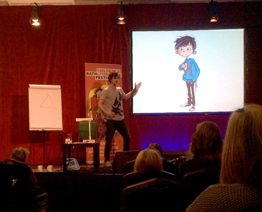
Those of you familiar with Hamish and the World Stoppers by the unapologetically British author Danny Wallace will be familiar with the creative magic of Jamie Littler. His characters are full of subtle details and nuances that are the perfect visual vehicle for Wallace’s tone and the book, in my opinion, is enriched ten fold by his interpretation of its time altering world.

Not that he’d tell you that. I tell you, a more modest talent you will not find.

littlerhamish

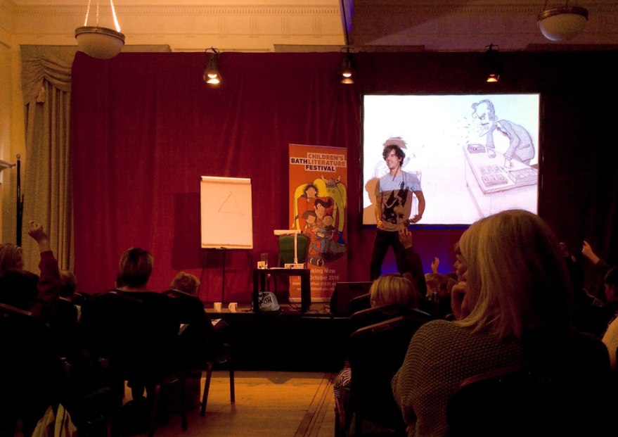
littlertriangleBut humbleness aside, Littler did a stonking job of holding the stage, even without his extrovert counterpart. If his flawless live drawing wasn’t magic enough, the interaction with the audience had every kid grinning to ear to ear. Given the rare opportunity to command the hand of a professional illustrator, the creative, imaginative and frankly weird suggestions of the kids were flying as the audience created their own adventurous character for Littler to illustrate.

littler draw.jpeg

Part drawing, part storytelling, part comedy act and part workshop; this talk was inventive and a lot of fun. So really, pretty much everything kid lit should be.

littlersleep

But if that wasn’t enough, I was also lucky enough to attend an event by the infamous Children’s Laureate Chris Riddell.

I’ll be honest, until fairly recently I didn’t really know what  Laureate was. But I was very excited that Riddell had kindly decided to bring his medal. And it was a very nice medal.

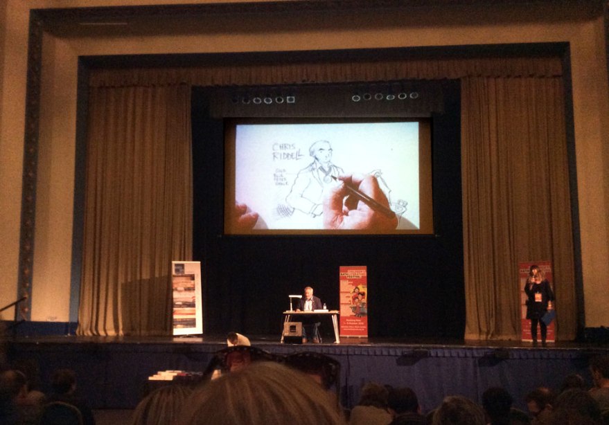
chrisridellticketchrisridellmedalHosted in the festivals most grand venue, it was strange to see the small figure of a single man, his projector and a sketch pad in the middle of such a large stage (even if he does have a medal.) But the second that man’s pen touches paper, he becomes the size of mountains.

It comes as no surprise that the prolific Riddell can live draw like a champ, but his ability to ad lib to questions from the audience, while doing so is a thing to behold. Relaxed, funny and frankly, totally charming, performing apparently comes second nature to this guy. His answers to every question was insightful, elaborating on details of his life and artistic journey and expanding even the most simple of inquiry into an adventure worth drawing about. The added incentive of giving away the drawings he made to the questions he answered had kids jiggling in their seats with anticipation each time he reached for a card. The hall was completely silent, aside from the reactionary giggles. We were in the palm of his hand, and I have no shame in admitting it.

There are reasons some people get famous for what they do.

I think that’s enough said.


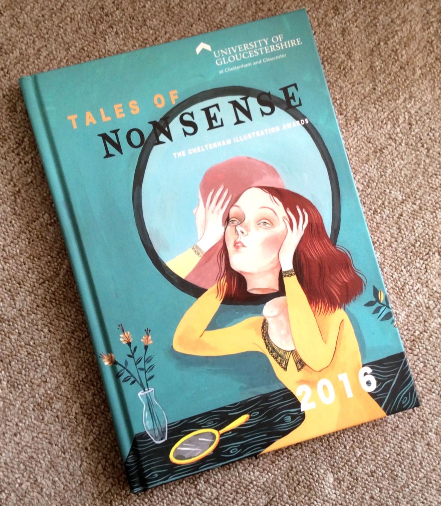
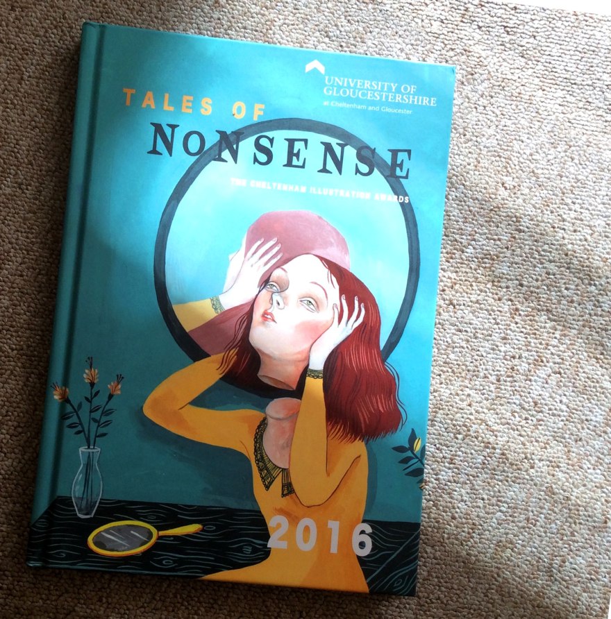
Utter Nonsense! The Cheltenham Illustration Awards 2016

Those of you who are kind enough to connect with me on the old Facebook, will know that I recently had the honour of being picked to be included in the 2016 Cheltenham Illustration Awards, hosted by The University of Gloucestershire!

That’s pretty neat eh?

What’s EVEN NEATER, is that is week I received by magic of the good old postie, a copy of the Award’s 2016 Anthology of my very own! Woop woop!

chelt9

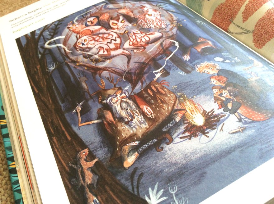
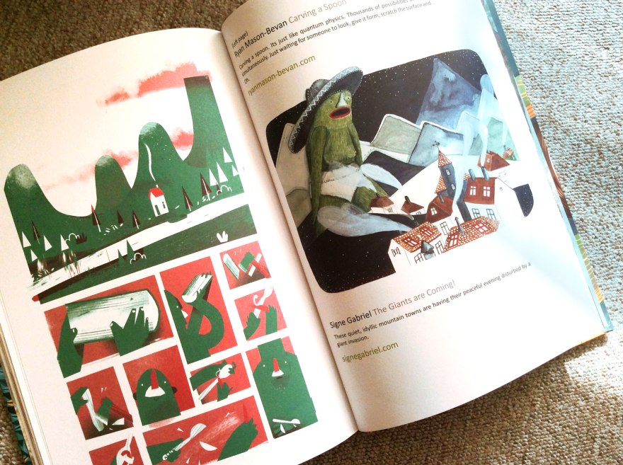
As you can see, it’s a beautiful (classy hard back!) compendium of incredible talent, both students and established folk. On taking a look inside, I have been genuinely blown away by the incredible work of all of those listed, and am even prouder to have been picked to display alongside them.

chelt4
My little example of nonsense as it appears inside this beautiful collection.

chelt2chelt3


It’s always a wonderful thing to see your work in print, but I was genuinely impressed at the quality of this lovely book; both in content and in print. It was a lovely surprise to have been selected and even lovelier to have such a wonderful present out of it!

chelt8

chelt5
I also spied some familiar names! This guy (Stephen Collins) is a brilliant talent in the world of comics. Look him up!

chelt6


chelt7

chelt1My favourite part of any anthology is discovering all those new names and talents to pop into the inspiration memory bank. This collection is bulging with them, it’s going to be a busy evening ahead, finding them all on twitter!

To find out more about the Cheltenham Illustration Awards, do check out their website and blog.

To enquire about this beautiful anthology and maybe even grab one of your own, contact eevans@glos.ac.uk

chelt10

The Exhibitionist Part Two: Yet another crack at galleries

So I was in the middle of combating my mistrust of art galleries.

I was doing it in the laziest way possible, don’t get me wrong, by only attending events of illustrative relevance, but I was still doing it.

Having spent the early afternoon in a whirlwind tour of the contemporary illustration scene, by way of the AOI World Illustration Awards at Somerset House, I decided to kick it up a notch with an exhibit that cost real life pennies. Commitment ahoy! This big spender headed to the House of Illustration.

Safe bet? Yeah definitely but whatever, I was still paying to look at walls so I consider it a victory.

hoi_02

hoi_01

So, I am in love with the House of Illustration. Tucked behind the bustle of Kings Cross, if you can fight your way through the Potter-ites to find it, do it. Not only does it have a tiny yet really nice little shop of all things illustration, (I forget I have no use for postcards every time I enter) it also regularly holds events, talks and lectures by some of the industry’s finest. I’ve many a fond memory of various events in those walls held by editorial artists, to kids book creators, comics artists and beyond, all of which have been top quality. It’s genuinely a great place to get yo’self an education in all things drawn so if you’ve not already, do head it up.

hoi_21

What made this venue a great counterpart to the AOI exhibition, is that the HOI not only champions the contemporary, but regularly pays great homage to the history of illustration. It didn’t let me down on my visit either, where, on paying my affordably £7.00 ticket price, I was treated to a charming, unexpected exhibition of Quentin Blake originals.

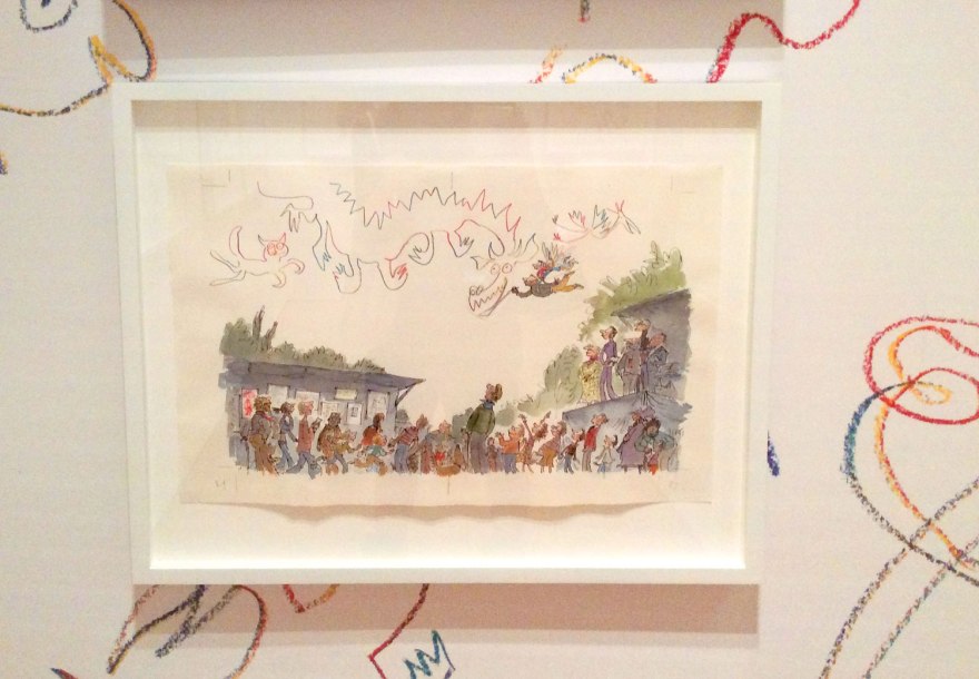
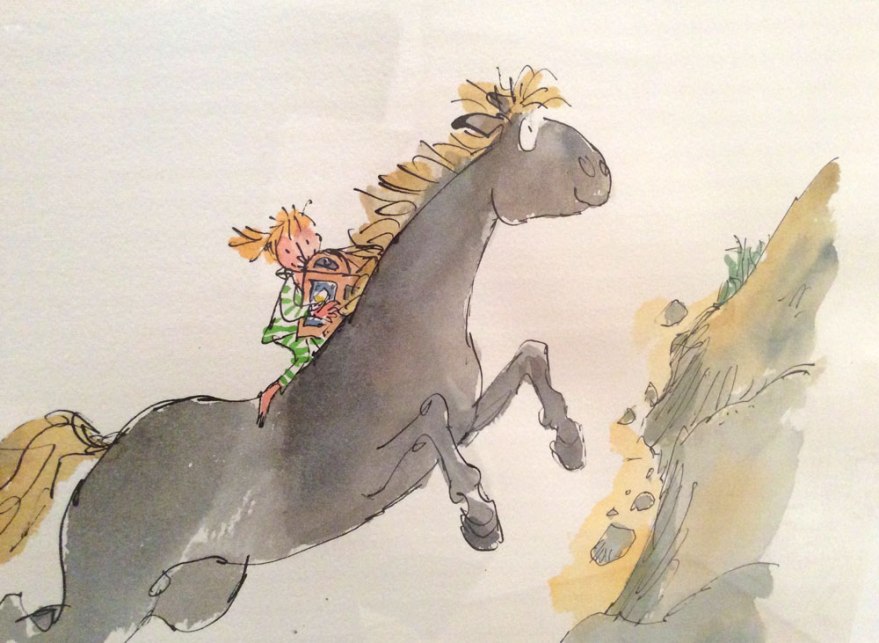
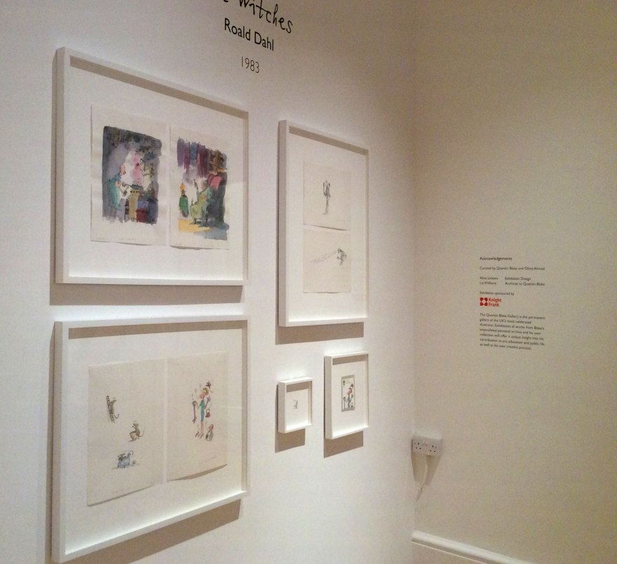
I suppose it’s not that surprising, given that this goliath of British children’s illustration IS the founder, but even so the short and sweet collection was a bit of a delight. Seven Kinds of Magic, is a collection of Blake pieces in which he approaches themes of surrealism and magic. In all honesty, Blake’s work doesn’t tickle my fancy on too frequent a basis, but it’s truly impossible to deny the life and charm of his scrawled characters and bonkers scenarios. I also firmly believe that any insight into the workings of a practitioner and acknowledgement of how they approach a given subject is all of great relevance. Especially when they have been rather a large part of your childhood experience of pictures. And especially when they are so joyfully mad.
hoi_07

hoi_10hoi_08

hoi_11

On top of this emporium of scribbled musings, another small room housed yet more Blake magic, this time in lieu of the BFG‘s contemporary comeback. Having spent many a sleepless night, terrified I would be consumed by an unfriendly giant (well, what’s any British childhood without a bit of Dahl related trauma?) this did result in a pang of nostalgic excitement. hoi_16
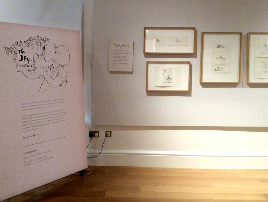
This small collection housed originals from the book, as well as previously unseen images that were cut from the end product. A sneak peek into the production and alternative results of something we’ve all become so familiar with. I’m not the kind of gal who is hugely fussed by the idea of seeing ‘The Original’. For me, if illustrations  were made for a book, those printed pages in their intended context ARE the real versions. Authenticity of ink on a page matters not in my eyes, BUT new images I’ve not seen before? Illustrator interpretations of scenes I was previously left to imagine myself? Well that is something worth taking a peek at.
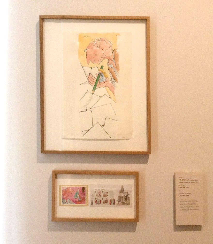
hoi_15hoi_14

And it is a bit of a joy, even on a wall. It’s around until October, so if you were/are/could be a fan of the book, you really should stop in.

BUT, these surprise delights from an illustration wizard were not actually what had drawn me to the HOI that sunny, August afternoon.

Instead an exhibition of Soviet children’s books, the aptly named A New Childhood had caught my interest hook, line and sinker.

hoi_03

You offer me a chance to compare story, illustration style and subject of historical children’s books to that of the contemporary, I’m there. (#booknerd) You invite me to take a look at the picture books of another culture, particularly those in a time of historical poignancy I’m THERE. You invite me to observe the impact of political unrest on the children’s book market I am ALL OVER THERE. And you appease my love of classic, European and Russian design, casually throw out names like El Lissitzky and charge me less than a tenner? My friend, you got yo’self a date.

It was one of those events that made me sad I wasn’t still in education and having to write a dissertation any time soon. I was mortified the taking of pictures was forbidden, it was a fabulous collection of incredible design work. Stylised illustration in glorious synergy with typography that screamed history.

Given it’s historical relevance, it’s not surprising that the arrangement of the exhibition felt like a classical museum format. The glass topped tables and large, formal information cards gave the collection a treasured, ‘getting cultured’ vibe that took me back to being a kid in a museum. That knowledge that you were, in NO WAY going to EVER be trusted to touch such relics. It’s so strange then, to imagine the pre and post revolution children of Russia, pouring over this very collection I stared at through four inch thick glass, in their beds and with their parents; in the same, slouched manner you see kids on beanbags in Waterstones, sinking into Charlie and Lola with the corners folded in and their imaginations racing.

I understand, and in this case totally appreciated, the serious tone of such a valuable collection being treated with this respect. I liked that I felt I was in a museum. I felt I was being taught. I felt I was really Getting History, but it was so apparent how many millions of miles away from the real world of kids books it was. I wasn’t a reader here, I was an observer.

Yeah okay, the fact I can’t read Russian probably had something to do with that too, I can’t deny it.
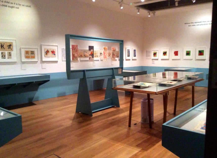
hoi_05

And I learned a lot. Aside from the joy I found in discovering the artistic impact of the curious rules of such a strict regime; the banning of all things folklore, the mistrust of anthropomorphism and the, almost comical differences this appears to have with our contemporary, Western picture book climate, I learned facts. I followed the roots of contemporary illustration, the way style and content spread throughout nations, the impact such poignant work has on my current market. The transition of design. The movement of character. It was a delight to see and compare where things came from, to where they are. And, importantly as always; context. Society changes, and the creative output moves too.

To ban fantasy, to encourage production, function and mechanism and place importance on becoming USEFUL adults, is a far cry from the values explored in plenty of picture books today. Such a no-nonsense regime had to drill function into young minds. I suppose for many, it’s brainwashing. To remove a child’s imaginative capability by way of focusing on the reality. The list of banned, damaging or unsuitable children’s output then, seems so obscure to us now.

But that obscurity to our society, is of course where the lesson lies. Call it brainwashing if you will, but children’s books do shape minds, which, in turn, shape people.

We may not like to consider it brainwashing now, perhaps because the societal scenario is not nearly so extreme, perhaps because one political body is not perceived to be outwardly in charge of the entire output, perhaps, and most importantly, because we don’t disagree with the topics of discussion. Either way, we must always be aware that picture books are significant in shaping thoughts, societal codes and values. All works of fiction, media and art in all  their forms, impact directly on the belief system of a person.

I don’t think this is necessarily negative. This is how cultures are formed. We have to define and express shared values to an extent, in order to co-exist without pandemonium. Without getting too pretentious, children’s books, along with all other entertaining consumables, help to define the core of societies.

hoi_04

A New Childhood was a brilliant collection of texts spanning across a foreign period of revolution. It, as all museums do, celebrated and examined a point in history, be it within or outside of our cultural code of conduct. It was an extreme reminder that context is everything and to always be aware of the power of judgements communicated in all media; specifically those intended for the young. First impressions, after all, can be hard to renegotiate.

The House of Illustration is a good place for picture loving yet gallery-wary people like me to explore these, white-walled environments. It takes things I love, like illustration; imagery designed for a purpose, for a brief, for a text and displays it out of it’s original context. The intent is to perhaps elevate it to something more cultured than it is? To remove the dirty, money aspect, and witness the creation as an example of higher art?  It’s a mark of true acceptance of commercial artists, once looked down on by the community of higher artists, into the realms of something greater.

I appreciate the notion, because I (obviously) appreciate the illustrator. I think they SHOULD be appreciated. I do think they should get credit for the work they do. Cover artists of novels should have their name on their work, and picture book artists should be acknowledged as co-authors. In my, humble opinion, that is.

Where I think I fall away from the idea of an exhibition space, is that I don’t view it as any more valuable. I don’t like looking at things on a wall or displayed on a grey floor. I still don’t really rate the experience, even after the array of, frankly, phenomenal collections I experienced. I suppose I personally, don’t really feel it does the illustrator that many favours.

I like to see things, not in their original state, not to appreciate solely the mark on the page or the craftmanship of the line (although there’s no doubt it can be sensationally impressive) in a blank environment where all that matters is its existence. I’m more excited by it In situ. I want to see an illustration next to the text it was made for. I want to see the design of the spread as a whole and how that designer has impacted on the illustration. I want to see the results of every stage of production working their respective magic to create the final output. Arguably of course, that’s why it’s important to see the illustration alone, in a case; to truly experience how it’s placement has changed. That’s why I’ll continue to check out places like this, to get a rounded experience of what illustration is, why it is more than simply drawing.

But don’t expect me to be as excited. I still prefer my pictures printed in pages, tangible, touchable, smellable. Interacting with spine and paper stock and text in the musty library, in the messy play room, in the classroom that smells like pencil shavings.

This is my kind of illustration, and my kind of design. I loved my visit to the HOI, it was an enlightening and beautiful museum and I know I’ll return. Thanks for trying to appease my inner gallery lover, but if you need me, I’ll be on the floor, elbows deep in a beanbag.
hoi_20


The Exhibitionist Part One: Another crack at galleries

I’ve said it once, I’ll say it again. I don’t really like art galleries. Sorry.

I am just not the kind of “artist” who feels at home in white walled spaces. They feel contrived to me, simply rooms full of art stuff, created for the sake of art stuff. They just feel a bit…I suppose pointless; an exercise in self indulgence in it’s purest form. Sorry, that’s the designer and commercial artist in me, but I’m just not comfortable there. Give me a comfortable chair, give me a library, a bookshelf, a store front, a magazine. Give me a space that has it’s own purpose, adorned perhaps with relevant, beautiful things and that’s quite a different matter. But art displayed just as art? I struggle.

But I was in London, I had time to kill and I had a plan. Time to try again. To make friends with the gallery, the home of aesthetic culture. The home of ART.

So I did.

Let’s not get carried away or anything, I started small. I decided on two locations of contemporary illustration. Illustration is my passion. Illustration usually has a brief. Illustration is safe.

Baby Steps.

So I hit up the AOI World illustration Awards, currently on display in Somerset house. I do actually love this venue so already we were in a good place.

And it was free. Winner.

aoi_01

I have to say, there was a lot of great talent to explore there. And by that, I mean there was a lot of book illustration and drawings that look like things 🙂

aoi_16

The exhibit was probably what I’d consider the perfect size, two and a bit, uncluttered rooms of nicely spaced work, one central strip of glass cabinets. Easy and digestible and not at all so large it dragged. It wasn’t overwhelming, it didn’t make my heart sink and it didn’t remind me I am a failure of an “artist” for getting bored in an environment I should, by association, consider home.

aoi_02

The work all had a chance to breathe, which felt relevant in a collection like this, because everything on display HAD been created for a purpose, be it a book, an advert, a poster or jacket; it meant you could take each item in and consider it in the context for which it was made. I like a bit of snappy analysis of a work’s strengths. I think this is my downfall with fine art. I can’t assess it because I don’t understand why it’s been made.

Sorry, I’ll stop moaning.

aoi_10aoi_05

For a collection of contemporary illustration, the AOI exhibit was a really nice one. It reminded me of Pick Me Up back in the day, before it got a bit tired (the last few years have not impressed me so much- I WILL STOP MOANING NOW) and I noted a good few new gems to keep an eye on, as well as simply enjoying the work of those I already admire. Yes, I noted the works of many already adorn my shelves.

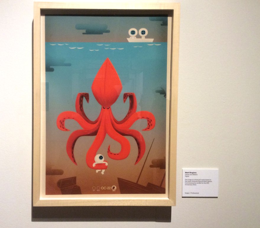
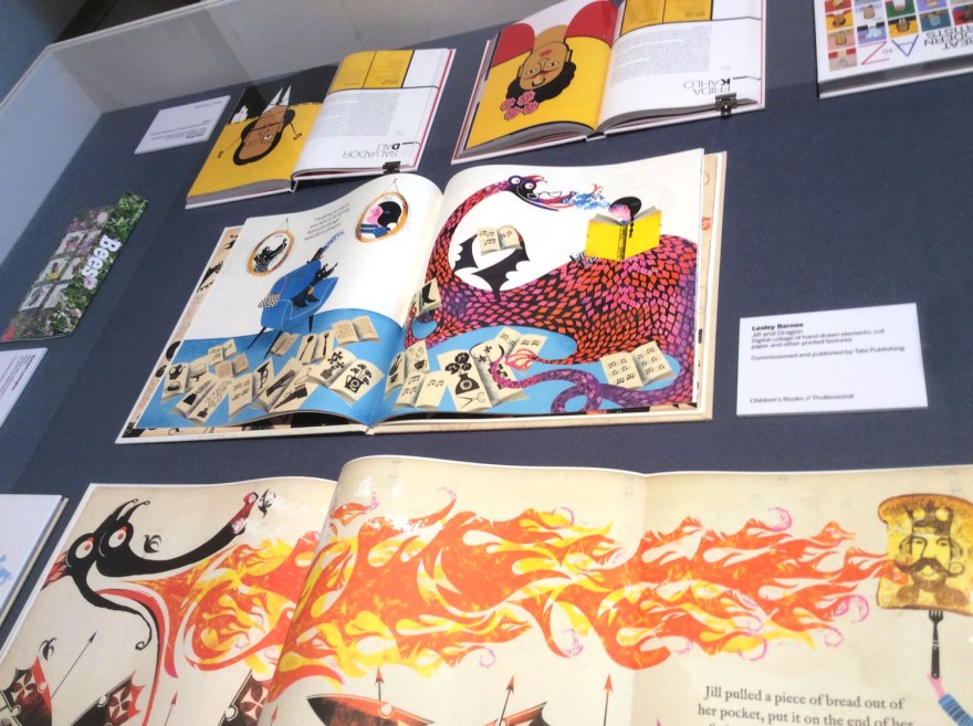
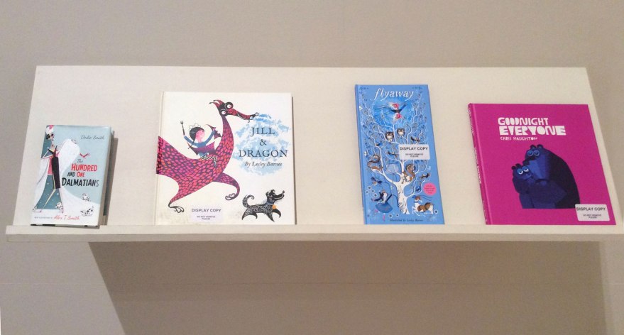
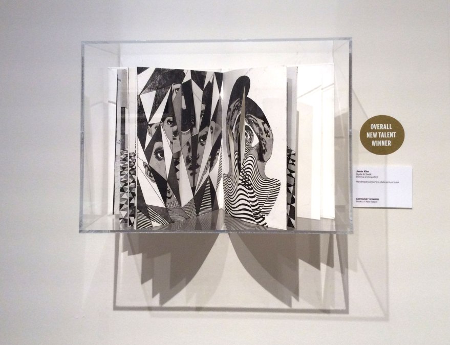
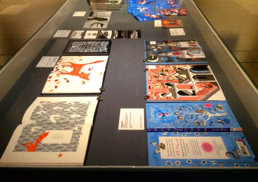
I know it’s a bit of a cop out in my exploration of galleries, but the highlights for me were mainly book and design based illustration. Big talents like John Burton showed up and the lovely works of the brilliant Lesley Barnes, Alex T Smith and Chris Haughton were as  enjoyable as ever, both in browsing and poster forms.

aoi_11aoi_18aoi_08

aoi_09

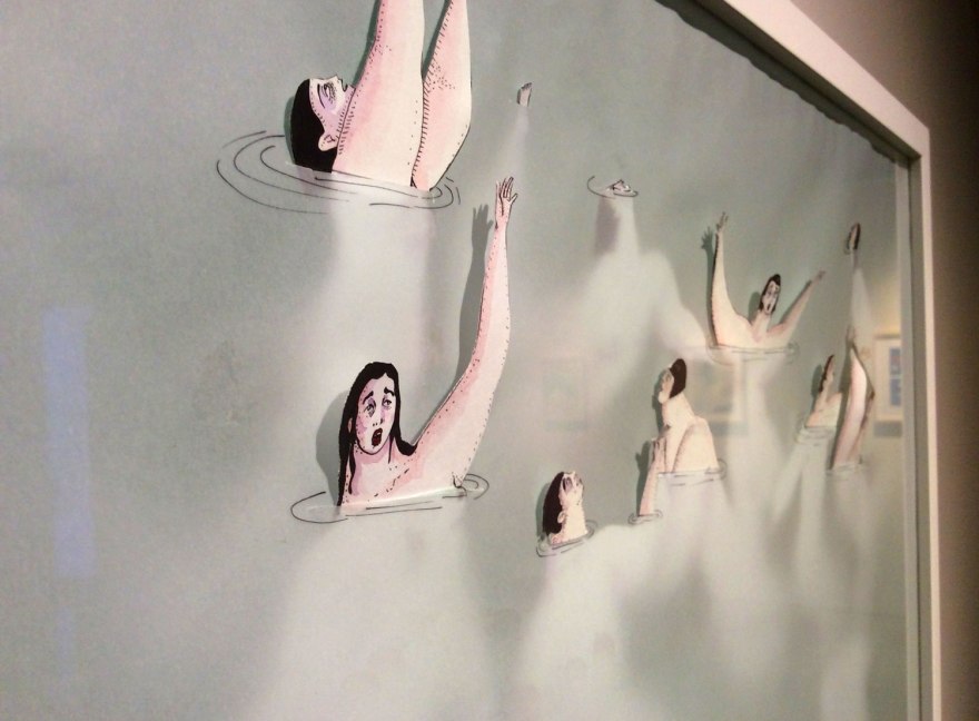
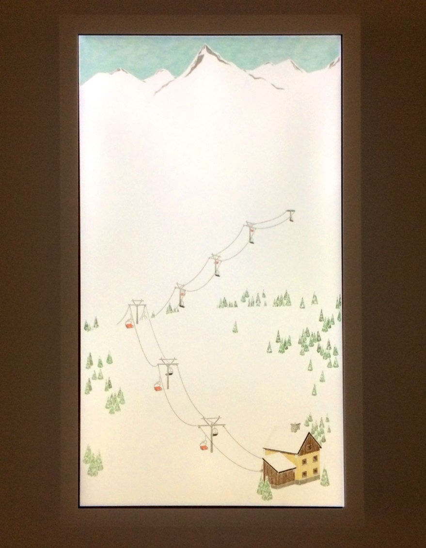
I actually liked the repetitive set up of the show a lot, in which the same pieces were encased on walls, in cabinets and on shelves. It gave it a ‘catering for all’ kind of vibe; the work in it’s raw form, the work as a ‘work of art’ and the work in the context of other work next to it. Each variant allowed the illustration to speak in a new context.

With the book being the best one. Obviously.

aoi_07aoi_13aoi_15aoi_17

I liked a lot of the work on display, both by the known and the unknown. I can’t say I think it was a broad collection in terms of the style of work, which did surprise me given that is was a collection from all over the world. Even across cultures and geography, a lot of the drawing styles, use of shapes, colour spoke in a similar language; but realistically I suppose it was unlikely to be anything else. This exhibition was always meant to be a snapshot of contemporary illustration which, like anything, is at the mercy of fashion. With so much exchanging of cultures, information and products through the magic of the internet, I suppose it’s very reasonable that fashions are less confined by borders than ever before. It was a shot of the trendy world of illustration in the here and now. And I, personally, really liked it!

aoi_06aoi_14aoi_12

If you are hankering for a bit of tasty, picture based joy and are in the area, I would suggest checking it out. It won’t take your whole afternoon, it won’t cost the earth and it likely will inspire you, even just that teeniest bit to go and make some nice things. Or at least look at them.

aoi_03

Hat’s off to you Somerset House, the AOI and all your contributers. The awards were well deserved, there was very little that I felt fell short of acclaim; naturally not all to my personal taste, but I suppose that is, in part, the joy of the visual arts.

And I really do appreciate, support and have enjoyed the hard work from those working to champion the humble illustrator. There’s an awful lot of talent on this earth and events like this do their bit to try and push those, often fresh faced, creators into the limelight they really do deserve.

So, was I cultured yet? I decided I wasn’t. I’d really enjoyed my speedy mosey through the contemporary illustration scene, but it wasn’t quite enough. Onward to part two of my afternoon exhibitioning…


Bagley Book Club- The Dragon and the Nibblesome Knight review

nibblesome_02Author: Elli Woollard

Illustrator: Benji Davies

Publisher: Macmillan

It’s a corker this week from wordsmith Elli Woollard and the ever brilliant Benji Davies. I picked this number up at the Power of Pictures panel event at Foyles in London a week or so back, so it only seemed fair to rock it into the spotlight, while I’ve still got Davies’s insight fresh in the old noodle.

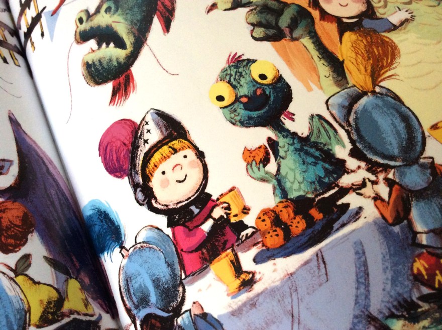
A tried and tested formula, The Dragon and the Nibblesome Knight is a tale of  surprising and unlikely friendships. Sent on a fledgling flight to gobble a knight of his very own, we are led by Dram, the utterly fearsome-less and totally huggable wee dragon, into the heart of a storm.

nibblesome_04

nibblesome_01In a beautifully drawn and tastefully coloured sequential spread, our little chap is blown off course. Frankly, I defy any human with a beating heart not to express even the tiniest of concerned, cooing syllables here. Davies captures such peril in the wide eyes of the reptilian baby, there just isn’t a homosapien alive whose heartstrings are sturdy enough to withstand a good tug. It’s a perfect Attenborough moment. Yeah sure, the bloodstained and ruthless lion has been out for an afternoon’s killing, but look how FLUFFY the babies are!

Humorously mistaking the beast for a duck, our compassionate (and equally adorable) knight James discovers the disheveled castaway in a pond. The pair grow a bond as James nurses his unknown foe back to health through  Woollard’s charming and lyrical story.

nibblesome_05

So he took off his armour and said with a grin,

‘I’m coming to help you’ and he waded right in.

nibblesome_06

Known for her witty poetry, it’s no surprise that Woollard’s text is such a delight. Free from any hint of forced rhymes or lyrical-cheese, the text flows from page to page with a real smoothness, wit and charm.

One of my pet peeves in children’s books, is a poorly paced tale. Often confined to strict page counts of 32 or 40 pages, there’s sometimes a feeling of being desperately hurtled by the words through the story to reach the conclusion before the page count cuts it short. If so inclined, illustrator s then have to desperately compensate with enough additional narrative to halt the reader for a bit; a decision I’m not at all adverse to, might I add. As highlighted many times, pictures SHOULD have their own tale to tell, it’s the key magic of a picturebook to contain a duel narrative. But equally, no matter how fine the artist, it won’t ever fully patch up the holes of a lacking author.

nibblesome_09

But THIS is where the Nibblesome Knight really shines. Both Woollard and Davies are in full control of the flow of the narrative. Davies’s pictures are a brilliant partner to Wollards’s poetry prowess, with enough characterisation, heart and little environmental joys in every image to give them depth, yet without so many additional details that derail the reader from the pace of the story.

nibblesome_14

The poem is so smooth and funny, it’s only right that the illustrations work with it to maintain the swing of the lyric, and Davies has done so masterfully in this example.

nibblesome_13And it’s true, his interpretation of the characters make this tale. Adorable with a capital ‘A’, I demand plushy merchandise of the innocent duo (I am DESPERATE to hug this dragon!) The pair are subject to a good number of emotions as they build and reveal their, unknowingly forbidden, friendship and even with he simplest of facial details, Davies creates the full, emotional spectrum with precision. For a story all about the value and strength of relationships, empathy and compassion, characterisation and humanisation were key and Davies nailed. it.
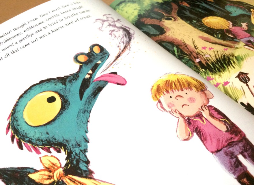
nibblesome_07nibblesome_11nibblesome_08

‘Come to the woods and I’ll fetch you some honey.

It makes a good medicine, all soothing and runny.’

It’s worth saying too, how strong the artwork in general is. The palette is bright and full of life yet without being nudged into the realms of gaudy. The scratchy ink marks are loose and organic looking, yet clearly drawn with clear precision. The depth of the painterly lines give this tale a much more shadowed darkness than Benjies previous works and it works brilliantly in the Ye Olde world of knights and Dragons.

nibblesome_12

The classic narrative ends as it should; happily ever after. Predictable? Yes, but who on earth cares. As far as children’s stories go, this is a solid, classic example. It breaks no boundaries, it holds few surprises but it’s charmingly written, witty and funny and the characters are endearing and beautiful. The world is consistent and the imagery is breathtaking and it’s another brilliant example of the ‘classical reworked in a contemporary world’ kinda deal. It’s definitely worth a look, but don’t be surprised if you explode into a mass of whimpering, gooey “Awwwww”.

It is inevitable.

nibblesome_15


The power of pictures was strong in these ones…

This week, I took a trip to the capital again. It was for illustrative purposes though so it doesn’t count as a holiday.

As we all know, the best kind of procrastination is the kind we can pretend is work 🙂

So this, definitely-work-related trip involved spending many, MANY hours in laughably enormous London bookshops (for work. Of course.)

I will say, central London definitely doesn’t do things by halves. The Picadilly Waterstones has become a frequent haunt for me on recent visits and still has yet to fail to astound me with its vastness, it is simply a Goliath! I get serious thigh burn every visit from just meandering from section to section (because, you know, book shop work out right? I ain’t usin’ no lift!)

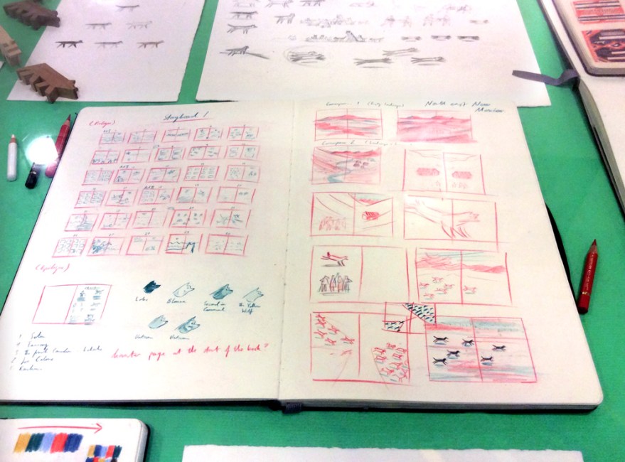
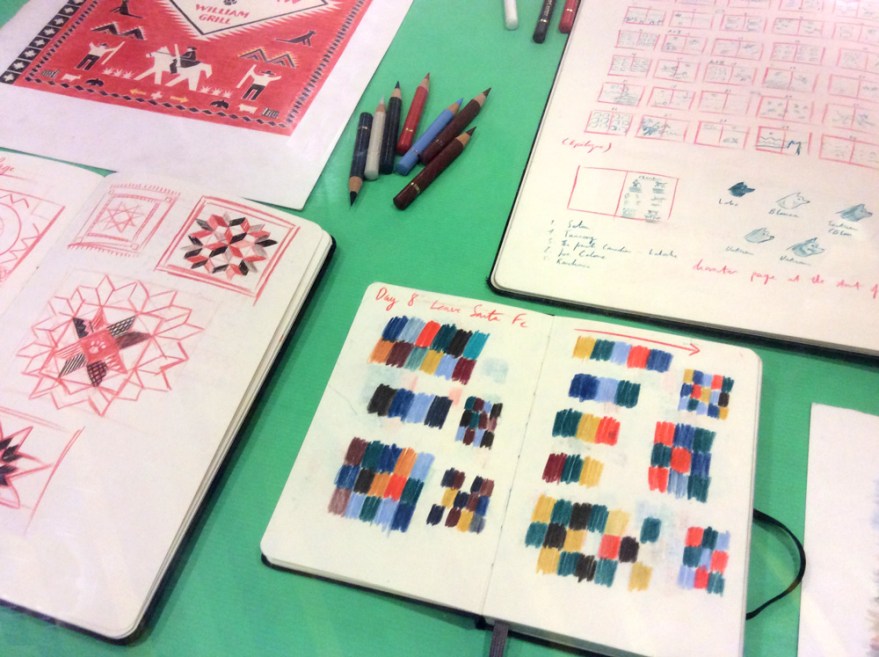
The reason I thought I’d mention this week’s visit to this literary colloseum, was because of a current, lovely little surprise I’d happened across that I think needs a little shout out. Naturally, my feet had auto-piloted to the children’s floor (not department, floor. A WHOLE FLOOR) where I discovered the most beautifully displayed arrangement of sketchbook and back up work from Nobrow’s ever talented, William Grill.

will_gril_01

will_gril_02

Now on his second publication with Flying Eye, Grill’s backup work astounded me by it’s sheer elegance. I’m not really a gallery guy, I don’t think illustration should be kept on white walls or in glass cases, but this small collection, was just enough and was displayed perfectly to give insight into the adoration of drawing that’s so apparent in his books, without any pretension or grandia. Grill’s doodlings and planning were methodical and detailed, speaking with the same delicacy as his finished penciled books and is painfully neat and organised.

will_gril_03

If the exhibit hadn’t been so carefully designed; the tools of his trade and collected samples of inspiration scattered amongst his working pages, I’d probably have had some kind of breakdown at the lacking visual power of my own, heinous behind-the-scenes. But I digress, if you are in the area (or lost/ following a trail of thread in the labyrinthine bookshop) I highly recommend checking out these snippets of genius. It will make you sick with envy, but such is the nature of Nobrow’s artistic catalogue.

will_gril_05

So, having spent several hours browsing, drooling and drawing a yak in a hat in Waterstones, I thought it was probably the wise move for my wallet to move on.  So I did. Right into multistory bookshop numero deux: Foyles. Which actually brings us to the main purpose of my London exercise in bookstore-navigation.

The good people Foyles had been illustrator collecting, and kindly (and reasonably, at only a mere £5 per ticket!) thrown together a lineup of top quality talent for a panel discussion event: The Power of Pictures. It was little wonder that the event was packed up to the rafters with an all start cast of Benji Davies, Jean Jullien, Marion Deuchars and Oliver Jeffers. Those of you who are familiar with the works of these contemporary picture book giants, will understand what a fab mix of approaches this panel represented and there was no way I was going to miss out on this, simply because I happen to live three hours away. Oh no.

POP_01

I’ve attended a lot of talks and lectures from talents within the arts, and panel events are by far the most successful in my opinion. Lectures can easily fall into an overview of one career, which while interesting on a personal level, they can fail to get into the meat of what is IS to make successful commercial art.

Yet this event did just that. Featuring talents from all over the spectrum of the, once shamefully named ‘commercial’ arts, these four powerhouses of creativity have all ended up in the field of picture books and each spoke with a unique voice (both visual and literal) that channels the experience of their past works.

Yes, of course the basics were covered. The topics of ‘style’ and the questions of best visual mediums; the digital means vs traditional debate, yet with a string of different opinions and experiences involved, The Power of Pictures was able to extend further than the realms of an ordinary lecture may allow.

“For me, it’s not so much a strategic decision, but more of a guttural reaction to what is suitable”

– Davies on artistic material

The insightful discussion branched into all aspects of the picture book field, from creation through the publishing process to the more practical aspects of the market and its constant progression. Each members’ approach to the field seemed to tether their visual styles to them and, in analysis of their thought process, they all offered insight into the vital hows and whys their work has reached the artistic notoriety that they all respectively have.

The art of storytelling has truly ceased to be about simply nice pictures to accompany authored words, and become about the artists’ personal approach to storytelling. Traditional artist, Jeffers insisted that book illustrators are trying to “buy immortality”, as it allows their own ideas to exist instead of working to illustrate a company’s brief in a manner akin to the fine artist. The, previously editorial, Deuchars saw all commercial arts as a form of selling, it was simply the content that changed: “…[ book illustration] is not selling a product; you’re selling a story,” And unsurprisingly, the very graphic Jullien spoke in the true voice of a designer, assessing any story as an exercise in “problem solving.”

POP_04

“Obviously you don’t have to illustrate the words.”- Deuchars

Clearly, there is no particular correct channel here, as all four approaches have lead to beautiful, successful children’s books; each with its own unique credit. What became clear was that all four artists did agree on one vital point: that their book work was in no way tailored to the audience in a way that compromised themselves. While there were little guidelines in creating for children (Davies’s shared anecdote of being encouraged by publishers to lose reality’s logical whale size for the sake of the story’s progression in his beautiful The Storm Whale) each member of the panel never felt they were trying to reach into an unfamiliar head space. Far from it. While their books are all enjoyed by children, none considered this a particular driver in the execution of such works. In fact, there was an agreement that it would be counterproductive to attempt to enter the mind of a child, as it brings restrictions to your readership.

“Writing stories for children, you really have to switch the left brain off.” – Deuchars

POP_02

Jeffers refuses to acknowledge his works as children’s books at all, instead plumping for the term ‘picture book’ so that there can be no division; he makes his books because he wants to, which differentiates such works from his previous commercial endeavors. Jullien too, asserted that to try and artificially enter the head space of a child would be to talk down to them, creating a dividing and inauthentic story, a point seconded by Davies.

It was , for me, Deuchars who hit the jackpot regarding this question of readership, with an assertion that stuck with me throughout the rest of the night. She claimed that in creating a story, the key is conveying emotion; and if that has been done correctly, the age of the viewer is irrelevant. As a constant analyser of my own visual narratives with a view to assess where their strengths and weaknesses may lie and why, I found myself unintentionally nodding along like a plastic bulldog in a shopping trolley. In my experience, social understanding and emotional empathy is something people almost always have a handle on, regardless of age, knowledge or experience. I believe that to tap into that IS to communicate, and in my practice I think I will always drive to do this as successfully as the current market’s dream team that sat before me.

From here, the discussion traveled through question’s of collaboration in storytelling and the pros, cons and preferences of working with authors and other creatives. The self-assured Oliver Jeffers seemingly adored the exclusivity of indulging in his own, unique creations, yet positively acknowledged the impact of working alongside a good editor. Often considered a lonely practice, analogies were flying as the illustrators attempted to verbalise their feelings towards collaboration. Davies likening it to creating a film in which “you have to play all the roles” and Deuchars, considered it the chemistry of a marriage. Jullien, as one might expect from a designer, wholly relished the practice of bouncing off of other practitioners as it “pushes [him] to forget [his] own uncertainties.”

“It takes the right people to show you the way”- Jullien

POP_06
My own rushed,half-baked attempts to capture my heroes, while wildly scrawling to capture their wisdom. Massive apologies to Benji Davies. You don’t really look like Brian Blessed.

The closing topic of the night, was another that seemed to bring unanimity to the diverse opinions of the panel. I was surprised and overjoyed, that it was a feeling that I had come to hold very strongly myself in critiquing my own work: that the designing of a character held the key to any story.

It sounds so self explanatory, yet in a sea of beautiful artists making beautiful books, it’s easy to forget the basics in lieu of making a more expansive, original or beautiful image. While many discussed elements of the panel’s practices had depended on individual preference, this really seemed to be a non negotiable. To have a character was to have a story. The team were all in agreement that they had labored over getting the look of their protagonists right. From Deuchars demandingly ‘drawing a bird doing yoga’ to ensure she had the movement right, to Davies laboring over each pixel to ensure the eyes were in exactly the right place, the look and feel of a character is the key to that vital emotional engagement. Jeffers and Jullien were in agreement that in removing facial details, character simplicity can bring you the freedom to create the emotions you need to evoke and I was reminded of Alexis Deacon’s similar assertions at masterclass event I attended a year or so ago.

“One Pixel makes ALL the difference.”- Davies

POP_03

Ultimately, I left London that night buzzing with inspiration. The panel had all shared their plethora of approaches to the same practice with honesty and analytical insight that I felt truly engaged in the life of picture book illustration. Each practitioner stepped to a different tune, yet each had developed a unique and curious visual distinction to call theirs.

“Illustration is about what you, the illustrator, choose to focus on.”- Jullien

Their paths had been carved from confidence in their own convictions and an understanding of their visual language. Instinct undoubtedly plays a role, but they had not simply drawn things to be pretty, instead analysing and laboring over what they had wanted their images to convey. The world of words is a separate beast to the language of pictures and the work of each of the panel artists is a perfect illustration of the vitality of combining the two with intelligence and intent. For me, Deuchars had summarised the secret to story telling in picture books with a comment on character, accurately asserting that ‘without a character you can make a beautiful book, but you don’t emotionally engage in the story.”

I thought back to Grill’s wonderful pencil landscapes in Waterstones, and had wanted to disagree. But while Grill’s landscapes ARE utterly beautiful, they are just that – beautiful imagery. It could be the biases and figurative subject of my own work talking, but for me, the work that sang in that glass cabinet (and indeed the pages of the finished article) were his working sketches of the dogs, his loose depictions of the people, his developments of the characters.

will_gril_04The landscapes were made MORE beautiful by the figure of a husky gazing out towards them, because suddenly, I was engaged. The involvement of character invites narrative to a scene; it asks for emotive understanding. Characters make a book a book. Without them, Grill’s could have been very attractive non-fiction. A quirky, historical workbook. With them, it is an engaging, contemporary retelling of historical tales.

Not that, I hasten to add, beautiful workbooks would be anything to sniff at, of course. Non-fiction in it’s original, un-narrated form is still a valued and important member of the bookshelf, but it is a separate beast from a story book. And it was just that: the passion for story books; for narratives and characters that packed out the Foyles auditorium with people from all around the country that evening.

POP_05
The obligatory book signing 🙂
POP_08
My new book adds Benji Davies to the list of illustrators whose signed works I own 🙂 Review will no doubt be on the way soon.
POP_07
I own signings by Jeffers and Davies, but noticing them on a quiet spell I nabbed Jullien and Deuchars to ask if they’d like to deface Davies’s book. They said they would 😀

Once more, I am reminded how wonderfully diverse this picture book bag is. All approaches are entirely different and equally valued. There is space and place for every kind of book these days and the vast shelves of these wondrous bookstores are brimming with talent and creative magic. You don’t have to draw the words. You don’t have to have words. There are no hard rules, aside from simply caring and investing in the subject.

POP_09
Deuchars magnificent approach to character development-make Bob do yoga, and Davies’s perfectly aligned eyes to capture the right expression

And the results are numerous, surprising and precious. There is emotion, there is character, there is always narrative. This week I have again been reminded of the real power of pictures. In all their glorious forms.


Book Club Review – Footpath Flowers

swf_cvr01

Author: JonArno Lawson

Illustrator: Sydney Smith

Publisher: Walker Books

Those of you who have touched base on this blog before, may remember my comparatively recent, tentative steps into social media and the resulting fun I was having finding my feet on Twitter. Well this weeks review is a refreshing wildcard, courtesy of this digital exploration. Basically I won a thing! Horray!
Yep the Gods of the internet randomiser were kind to me, and have landed me (via the very good -incredibly generous- people at the review site; PictureBooksBlogger) today’s lovely little number from Jon Arno Lawson and Sydney Smith; Footpath Flowers.

I was delighted to win, having spied the quirky, inked artwork somewhere on the web before and found then that I was immediately drawn to it’s comic-book esque format.

swf_inn07

A keen observer and participant of both the indie comic and picture book scenes myself, I’m always intrigued to see the style of comics that make it into the hands of the mainstream UK publishers. In recent years comics have well and truly risen from niche market or weekly funnies, right up to the ranks of ‘established art form’ and I’m delighted to see how often they’re now employed within the children’s market to tell all manner of stories; not simply those featuring pants and tights.

swf_cvr02

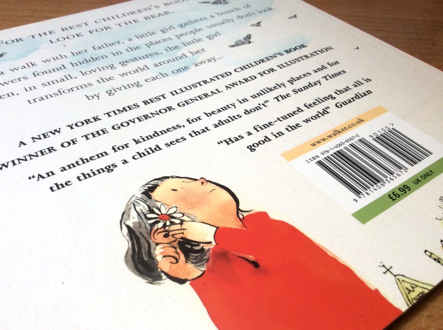
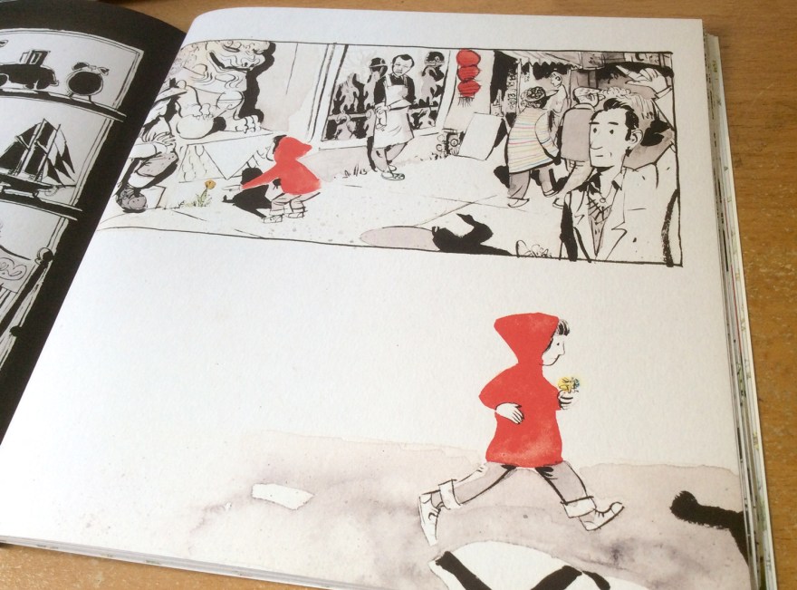
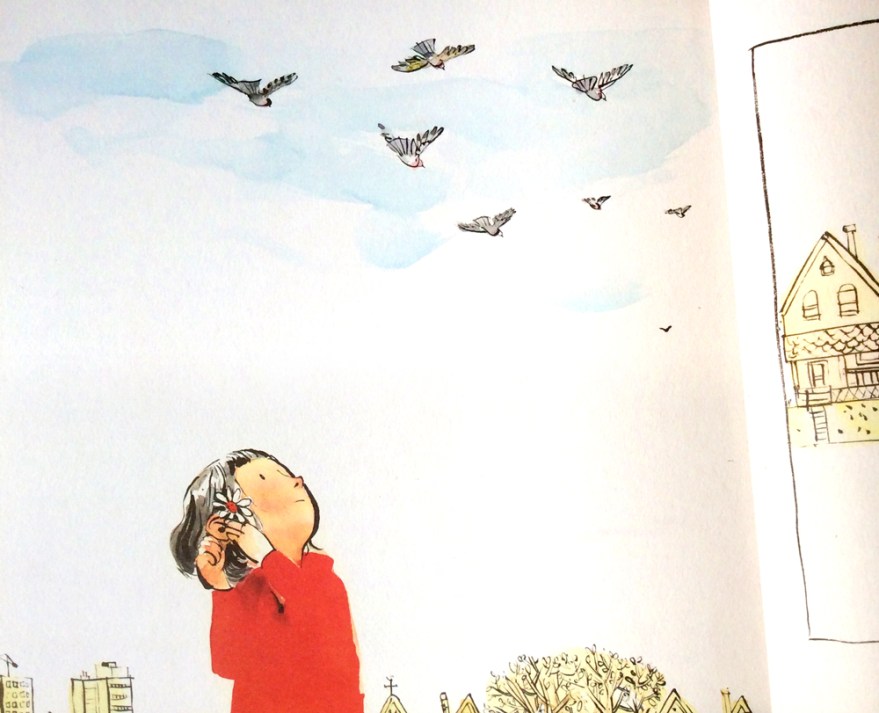
Sidewalk Flowers is a perfect tale to utalise the format of sequential art. Wordless and serene, the book follows a simple journey of a girl and her father. Narration without the fall back of words is no mean feat, yet the simplicity of the tale allows the little nuances and characterisation of Smith’s artwork to really shine, bringing the subtle beauty of Lawson’s tale to life.

swf_inn02

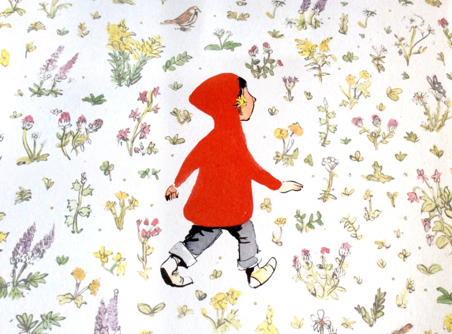
During their stroll, as Dad goes about his business, we see our own Little Red Riding Hood gathering flowers and weeds from all the available avenues of the city setting, distributing them as she deems fit.

swf_inn04

It feels wonderfully reminiscent of my own, and – no doubt – many other, past and present, childhoods; gathering sticks on walks with the family and finding hidden games and treasures in between the act of walking. It captures that childlike focus on the minutia and their, often surprising attentiveness to their surroundings.

swf_inn09


The joy of this childhood freedom is highlighted by the father, who is unaware of his daughter’s growing treasure trove and little acts of kindness; he sees only the tasks at hand – caught up in the world of adult errands and the day to day.


swf_inn03

Smith’s art is beautiful. Full stop.

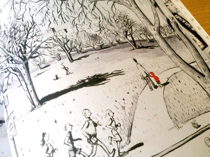
Told from the eye level of our keen-eyed protagonist, the story captures the land of a child’s city through cropped compositions. We don’t know what dad is up to particularly – that’s just boring adult stuff, the real joy is way below eye level.

swf_inn05

This monotone, city setting is a stunning visual juxtaposition to the wild garden Little Red builds as she unearths her surprising bouquet from all around her. The urban palette of black and white with the splash of vibrancy from our little gardener’s jacket begins to fill with the whole inky, spectrum as the bouquet grows and the innocent delight of childhood generosity is distributed around the city.

swf_inn08
The joy of giving breathes life into the monotone city.
swf_inn10
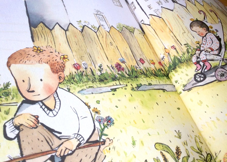
Lucky recipients of the wild flowers of Red’s gatherings. The joy of giving has spread into a full colour world by the time she returns to her own, warm garden.

Now I’ve said it before that I am in no way adverse to the use of digital means in creating children’s books; and art in general. However, I am more than happy to admit that there is something refreshing in Smith’s seemingly unedited art style. Ordinarily a fan of collage and texture, here is nothing but ink, and the scanned traces of the watercolour blotting paper beneath it. It has a traditional charm as a result and feels almost vintage; perhaps in part due to the subject matter causing me to reminisce so much about my own errand-adventures!

swf_ends
The story is enclosed by a set of beautiful, garden end papers.

Either way, it’s a good reminder of the increasingly artistically-inclusive picture book market. Both traditional and contemporary approaches to art are finding their way into our children’s hands, offering more and more of a comprehensive understanding of imagery. For little eyes still making sense of things, this access to such a expansive and varied gallery within the bookshelf seems pretty exciting to me.

Print is dead? Give over.

But the joy of this book, certainly for me, isn’t as shallow as pretty pictures. As ever in picturebooks, the narrative within the image is the battery of it all and Sidewalk Flowers is a beautiful celebration of discovering just that: the narratives and hidden joys found within the little things.

swf_inn06

For little kids it’s a reaffirmation of the world’s hidden games, and for us, older kids, it’s a reminder to stay observant. Errands are boring. But they don’t have to be, I for one would like to spread a little bit of colour.

swf_inn11


Book Club Review – Never Tickle a Tiger


Welcome back to book Club! And by book club, I mean let’s-all-listen-to-what-I-have-to-say Club!

With books!

But seriously, if anyone has any comments on any of these reviews, be it agreements, disagreements, analyses of their own, or criticisms of my thoughts, I’d really, seriously love to hear them. You can leave a comment below, or you’re welcome to contact me via email, twitter or facebook.

tigertickle_cvr01

Author: Pamela Buchart

Illustrator: Marc Boutavant

Publisher: Bloomsbury


So, this time we have the colourful cautionary tale from Pamela Buchart and Marc Boutavant: Never Tickle a Tiger. I’m really not trying to play favourites here, but this is yet another gem brought to you buy Bloomsbury. Hat’s off to those guys who have been really busting out a cracking number of great titles in the past few years that are clearly right up my street! I promise to diversify more in the future, but this one really does need a mention!

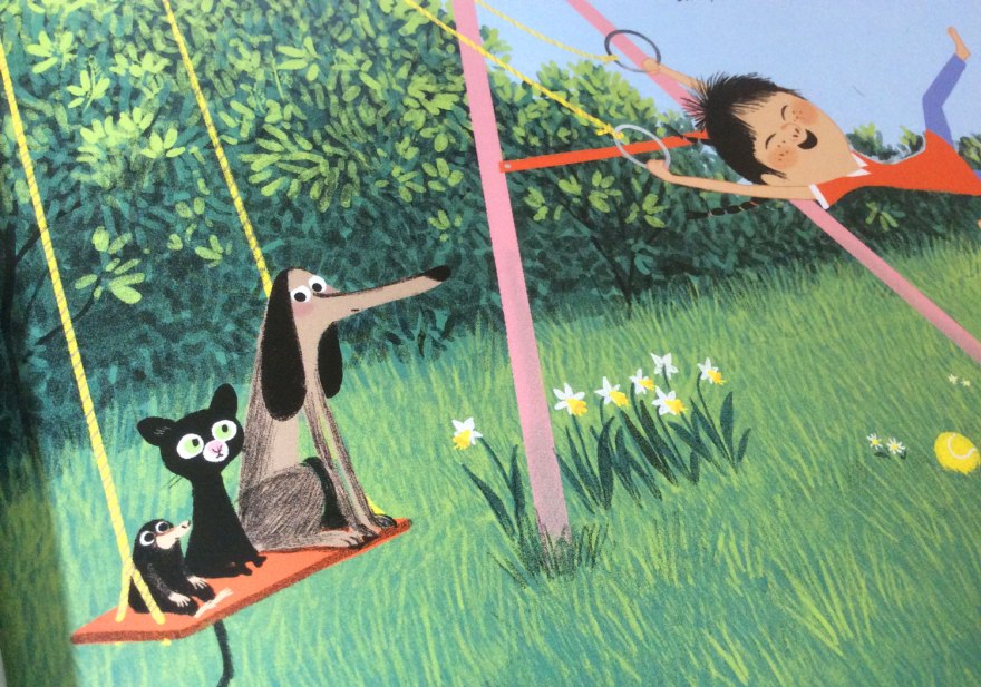
A charming and vibrant cautionary tale, Never Tickle a Tiger opens with our introduction to Izzy; a fidgeting, wiggling, jiggling little girl who just CAN’T sit still! Warned and chided by jut about everybody around her, Izzy is that well-meaning but incomprehensibly over excitable little person we are ALL only too familiar with.

tigertickle_inn11

Her character is brilliantly identifiable to children and parents alike, brought to life with Buchart’s lyrical and whimsical writing style.

Cascading lists of alliterative, onomatopoeic adverbs capture the bounding lightness of our little protagonist, the text and images dotted around the page in an erratic layout that brings movement and life to the spread.

tigertickle_inn09

tigertickle_inn13

So what’s a girl to do when she simply can NOT sit still, no matter how many times she’s told? The story explores the angel and devil complex in near-on every kid’s head. The trained desire to be good and do as you’re told, VS the often much stronger curious NEED to explore the scenario in question yourself, learning your own lessons – for better or for worse – first hand. Because would it REALLY be so bad…to tickle a tiger…?

tigertickle_inn08

What’s so wrong with fidgeting anyway?

The page design of the pivotal moment is inspired. Short, snappy lines of text and sequential images capture and build Izzy’s sneaky, creeping movement to the forbidden enclosure, only to stop it dead with one full spread on her arrival.

tigertickle_inn07tigertickle_inn06

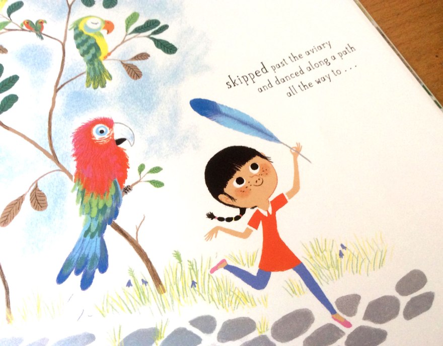
Boutavant’s illustration here is perfect. The drama of discovery is communicated through the uncharacteristically bare enclosure, the focus being on the majestic, sleeping beast within. Izzy is poised mid-movement in a comically ‘rabbit in headlight’ pose as she gazes up, feather in hand at the forbidden tiger.

tigertickle_inn01

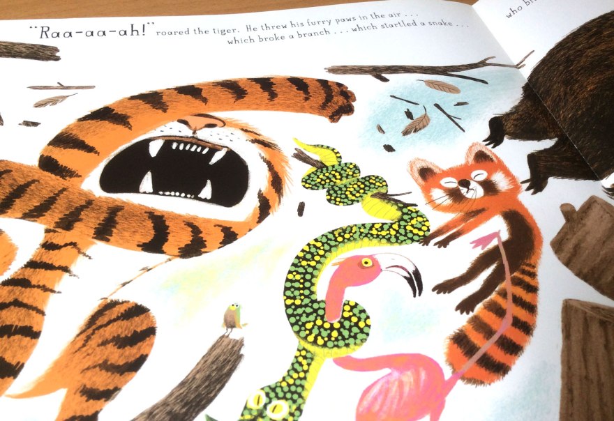
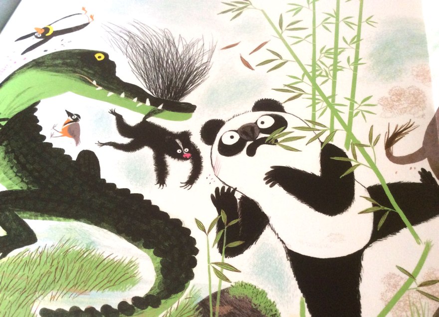
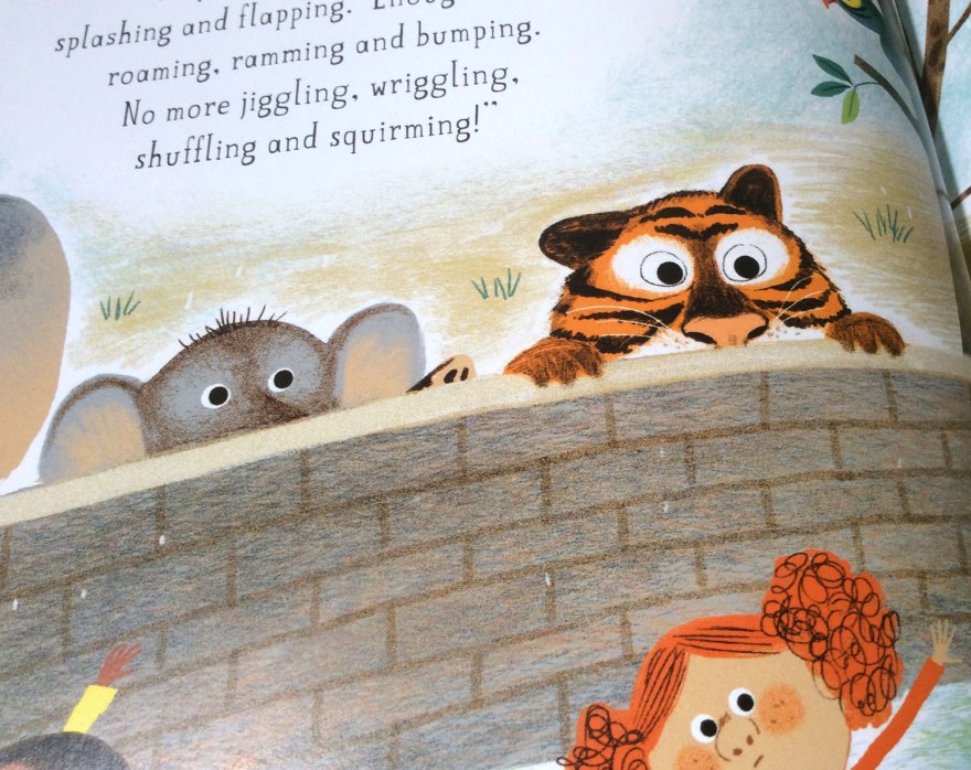
As in all good cautionary tales, the fallout from Izzy’s failure to heed her warnings is rewarded with a hilarious domino effect of chaos; throwing the entire zoo into utter disarray.  The pull out, quadruple spread format here echoes the expansive explosion of madness and offers a great bit of novelty tactility and you open out the full extent of Izzy’s mistake.

tigertickle_inn04tigertickle_inn03

The vibrancy of character we’ve come to expect from Boutavant’s work really emphasises the fun of this bright and whimsical tale. Although less neon in palette than previous illustrations we’ve known him for, each animal in the zoo has a real attitude and life that compliments and enhances the madness.

tigertickle_inn05tigertickle_inn12tigertickle_inn02

Their reactions to Izzy’s unquenchable curiosity are delightfully humorous and  cheeky details such as a little, hidden hedgehog give every scene a little added magic, independent of the main story.

tigertickle_inn10
Small and adorable, find the hedgehog adds an additional game to the reading experience.

Ultimately, Never Tickle a Tiger is a great bit of fun. I love Buchart’s lyrical text and the life and hart it brings to such simple narrative format and Boutavant’s bright and playful illustrations really capture the sense of quirky madness. A brilliant cautionary tale for all those little Izzys thinking of embarking on some tiger tickling any time soon.

… not that they’ll listen anyway, of course.


The Anatomy of a Piano: A historical dissection

Good news! I have friends!

Yes, after the sorry state of affairs that was being a little lone larry back in December of last year, things looked like they were getting pretty desperate. BUT NOT SO! Disparaging loneliness aside, I couldn’t deny how much I had enjoyed my little flirt with the universe of children’s theatre, and this week, I was offered (yes offered, by real-life friend people!) the chance to step back into the stalls in the Bath Egg for the curiously enigmatic The Anatomy of a Piano.

anatomy_piano_03

My favourite way to approach any piece of dramatic or performance media, is to do so with absolutely no preconceptions. If I can avoid it, I do no research and I enter with the glorious naivety of an open mind, before it can be sullied by any further knowledge or expectation. I think this approach is probably even more poignant for a children’s production. It’s my, uncompromisingly adult, attempt to revisit the limitless possibility of the imagination of a little one; exploring everything for the first time with no prior understanding of what it might or should be.

So, armed with nothing more than the title and the knowledge it had made a solid debut at the Edinburgh fringe, my companions and I settled with absolutely no understanding or expectation.

When I was a boy, I wanted to be a Space man.


While a bit of a veteran with children’s media, theatre is very much a new frontier for me. I honestly did not know what to expect, but I certainly think I was surprised by what I found. It was a performance, certainly. A wonderful performance from a remarkably talented pianist (go figure), Will Pickvance. But, as the boundaries between contemporary media continue to merge in increasingly surprising manners, it’s entirely unfair to think of The Anatomy of a Piano as mere recital. However brilliant a recital it may have been.

An educational piece? Yep, it certainly ticked that box, our one man band managed a concise tour through the historical landscape of the piano, from it’s earliest ancestry to more familiar ground, stopping off on the way to acknowledge the fathers of piano musical development as he did so. Accompanying the history were simply scrawled, projected slides and a biological script that introduced the title’s scientific dissection into the mix. A faux lesson in which historical development was explored through the anthropomorphism of the instrument.

anatomy_piano_01
Evolution. You know, in pianos and giraffes.

Unsurprisingly, the score was a sensational accompaniment, bringing each era to life with a rich journey through their musical trends and the key developments brought about by a small number of the most pioneering of composers. In caves.

Obviously.

But no, it wasn’t really a ‘history lesson via recital’ kind of deal either. Pickvance’s curious, autobiographical opening set the conversational tone that escaped the traditional educational shackles too. Confiding in the audience his young disappointment at Father Christmas’s inability to provide a spaceship as requested, Pickvance quickly formed a relationship with his audience, inviting the playful interactivity of audience participation. From counting down his attempted piano take off, to desperately trying to answer questions to the frustratingly teasing responses, The Anatomy of a Piano engaged children with the effortless humor and fun of your favourite, silly uncle.

I don’t like instructions.

But naturally, I couldn’t comment on the engaging, delivery prowess of Pickvance, without giving equal praise to his counterpart. With the guidance of the, self titled instruction manual, Pickvance accessed the piano’s wide range of audible possibility, creating the emotional and dramatic emphasis to the performance. From the building quibbles of the early take off, to an immediately understood representation of ice cream, the piano set every stage of our journey entirely through sound. I found it reminiscent of the televised version of Rayman Brigg’s The Snowman, in which the perfect score does to much of the talking.

But for all the musical talent, for all the engaging history, for all the cleverly devised musical drama, I think what struck me the most, was the entirely played down, simplistic and mature nature of the play.

I reckon it’s a common assumption that in order keep a child’s attention for 55 minutes, there’s a requirement for bright colours, over enthusiastic tones and bouncing presentation. The low budget charm of an empty stage, a man in a jacket and his upright piano seems a thousand miles away from the vibrant, Ceebeebies presentation you may expect.

anatomy_piano_02

Well, that and the piano disco at he end. But you can’t deny the magic of a closing piano disco. Who doesn’t want to go out with a bang?

But surprising or not, the delightfully mature and simple presentation was all that was needed. Admittedly there was a few minutes or so towards the middle when my fellow audience members started getting a little fidgety and I thought that perhaps the simplicity of the show may have run it’s course.

But I was entirely wrong. A little humour, a sing song to flawless music and the perfect touch of just enough ridicule of outdated yet familiar methods of teaching, and the kids were back in the palm of his hand. The littlest loved the silliness, entranced by the cunning, often comical use of piano to develop a sense of place, and their eagerness to participate. The bigger ones identified with observations of boring, forced piano lessons, threatening all the life the show had brought to the instrument and reveled in the off-beat, biological retelling of historical development.

I don’t how to classify The Anatomy of a Piano as anything other than pure performance. It was talent, it was humour, it was fun, it was learning. It was everything it should have been, whether I knew what that was or not.

Curious and simple, it’s a tale of love and talent and has absolutely convinced me that a piano is light years better than a spaceship.

Book Club Review – Have you seen Elephant?

seenelephant_cvr_05

Author & Illustrator: David Barrow

Publisher: Gecko Press


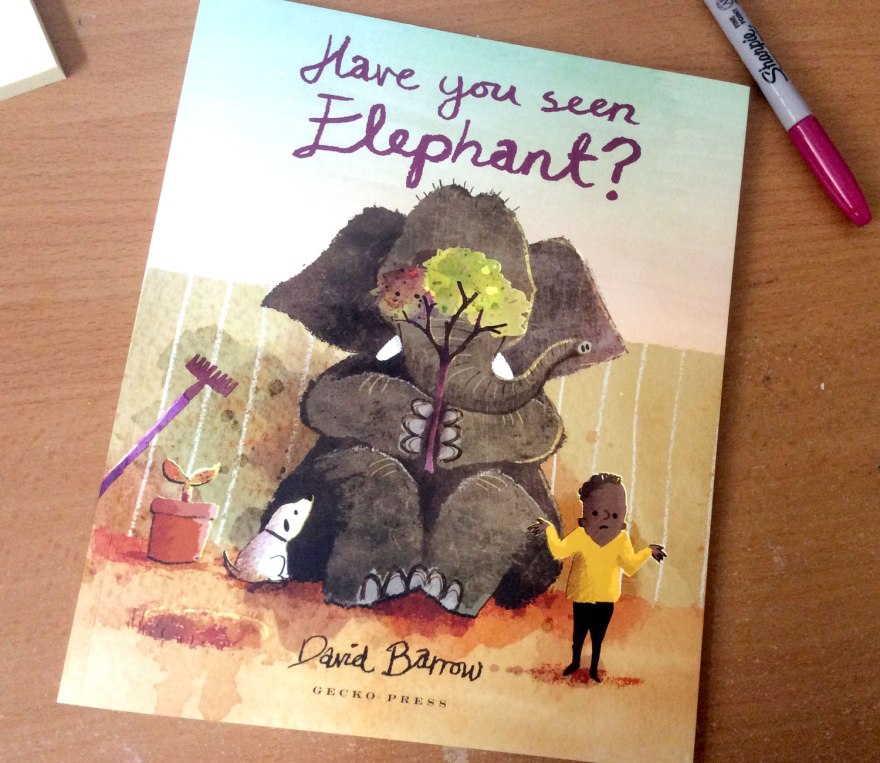
I happened across this little number while meandering through the web on an unrelated mission. I was drawn in to the, seemingly quite small, release by the curious nature of Barrow’s illustrations. He too has joined the ranks of the dirty digital army, utalising thick and organic looking textures and splatters into a digital landscape.

seenelephant_cvr01

As I’ve said in previous posts, purists flying the flag of ‘authenticity’ may scoff at this process, but let’s get real. The results are still beautiful and times have changed. FOR THE BETTER.

The illustrative possibilities are endless with the mouse at your fingertips, and I think Barrow has done a cracking job of proving that the digital pencil case is more than capable of capturing the heart, charm and ‘happy accidents’ (however contrived) of any paintbox.

seenelephant_inn11

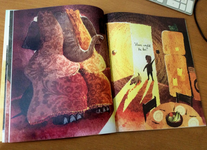
In it’s entirety, Have you seen Elephant is a story about finding elephant. Job done.

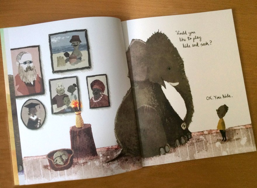
‘Would you like to play hide and seek?’

In the enigmatic manner we expect and embrace from children’s tales, Barrow makes no attempts to establish or formulate the origins of our curious playmate’s visit. And rightly so, the logic and reason behind why or how is joyfully irrelevant. This is about a game, be it real or imaginary…or even somewhere in the middle.

All that matters is that we, alongside our un-named seeker, have been very kindly invited to play in the very first spread. So who are we to decline?

seenelephant_inn04

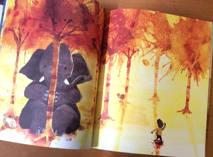
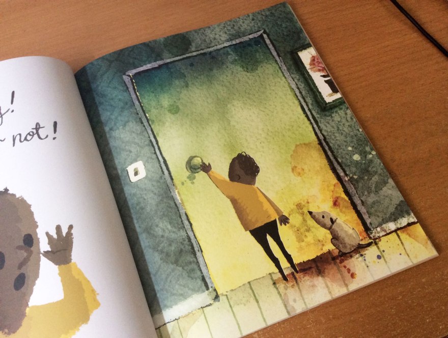
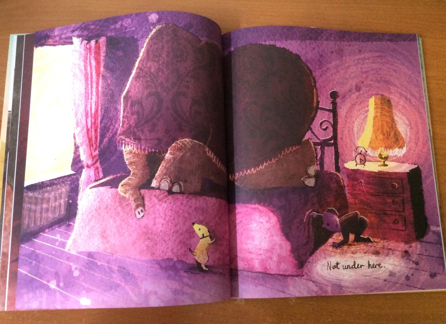
Singing to the same tune as the talented  and oh so trendy Klassen et al, Barrow’s approach to narrative is one of ‘less is more’. The short narrative follows a classically simple procedure as our seeker explores room to room of his house, hunting desperately for the cunning elephant, eluded by the creature’s hide-and-seek prowess.

‘Not under here…’

As ever, the richness of humor is what keeps this simplicity fresh, and Barrow keeps the hand-scrawled text sparse, instead building our little character’s personality visually, with the pleasing offset of image against word.

Offering a delightful frustration for readers, the incompetence of our seeking protagonist is developed through his mutterings of clueless asides, establishing his oblivion to the, very clearly positioned, elephant in the room.

seenelephant_inn03
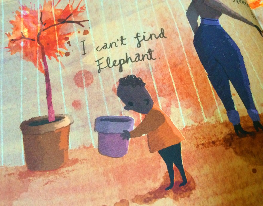
Our dear little seeker searches in entertainingly improbable places. There’s a really innocent charm about searching for a large elephant in a small plant pot. Not sure I could get away with it though.

The addition of a silent, clued in mutt, the classic device of the underappreciated sidekick, emphasises our protagonist’s inability even more, boosting the funnies through a little sub narrative for the keen eyed reader to decipher. Similarly, the latter introduction of animals, hidden in the minutia of the environment deliver more seeking opportunities for readers.

seenelephant_inno5

‘I can’t find elephant’

I would have loved to have seen this quality developed further, with background creatures and interactions turning each page into it’s own game of hide and seek. As it stands, a lot of the spreads push the less is more approach a little too far, with only the base components of our hider and seeker and simple environmental touches.

For me, this dilutes the humor of the search when little more other than the core joke is offered from spread to spread, again and again.

seenelephant_inn10
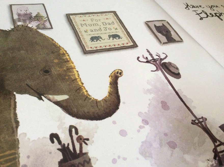
The invitation spread is a favourite of mine. I love the little, background  suggestions of family life that set the scene perfectly, while offering snippets of detail about our seeker’s life.

seenelephant_inn06

That said, the art IS beautiful. Those textures bring a coarse, accidentally-on-purpose mess to the environments and an inspiring set of sunset colour palettes that don’t fail to delight as every page turn reveals a new one.

While the palettes are vibrant, the simplicity of content in every spread create a quietness that carries through the book. Environmental calmness is not at all a bad thing, although here there’s almost an overarching feeling of darkness within the artwork that seems to lean towards lonesome.

seenelephant_inn08seenelephant_inn01

The scenes feel quiet, almost a tad morose and there’s a suggested lack of interest from our seekers family in him or his activities. Heavy lighting in the artwork create dark, almost sinister shadow work which, while beautiful, seem to extract the ‘fun’ from the game.

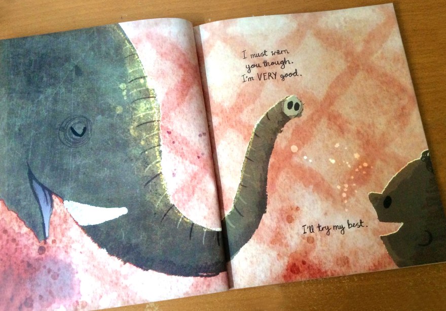
Even the opening invitation from the elephant, drawn with a   very close positioning of elephant’s face as he warns us ‘[he’s] very good’, does have an almost cautionary air to it.

seenelephant_inn09

‘I must warn you though, I’m VERY good.’

Don’t get me wrong, I’m in no way against a darker quirk in children’s books.

My position is that children are pretty hardy and more than capable of deciphering and enjoying more ‘grown up’ looking art styles, a bracket in which I would place Barrow’s work .My only concern in the context of this book, is that I can’t tell if it’s supposed to feel quite so lonely or if the heavy colours and sombre emptiness are simply a slight misjudgement.

seenelephant_inn07

Either way, it is still a joy to look at. And any sense of the macabre are certainly circumvented by the book’s delightful close. Elephant is a gracious playmate and and the tale remains a great example of good, clean fun of children’s games.

seenelephant_inn02

Perhaps if you were desperate to attribute a deeper moral to the tale, you could expand on the lonesome family unit. The lack of human companionship that drives you towards animals.

You could spend your time getting caught up in the perception of elephant’s surprising, opening boast that ‘[he] is very good’. You could assert not to judge a book by it’s cover, that even thought he is large, perhaps he IS good at hiding.

You could say a lot of things.

You, know. If you wanted to.

Personally, I wouldn’t trouble yourself with it. For me I can’t find Elephant is most enjoyable when seen as exactly what it should be. A  good bit of old fashioned, nonsensical fun.

And isn’t that what being a kid is about?