The Exhibitionist Part One: Another crack at galleries

I’ve said it once, I’ll say it again. I don’t really like art galleries. Sorry.

I am just not the kind of “artist” who feels at home in white walled spaces. They feel contrived to me, simply rooms full of art stuff, created for the sake of art stuff. They just feel a bit…I suppose pointless; an exercise in self indulgence in it’s purest form. Sorry, that’s the designer and commercial artist in me, but I’m just not comfortable there. Give me a comfortable chair, give me a library, a bookshelf, a store front, a magazine. Give me a space that has it’s own purpose, adorned perhaps with relevant, beautiful things and that’s quite a different matter. But art displayed just as art? I struggle.

But I was in London, I had time to kill and I had a plan. Time to try again. To make friends with the gallery, the home of aesthetic culture. The home of ART.

So I did.

Let’s not get carried away or anything, I started small. I decided on two locations of contemporary illustration. Illustration is my passion. Illustration usually has a brief. Illustration is safe.

Baby Steps.

So I hit up the AOI World illustration Awards, currently on display in Somerset house. I do actually love this venue so already we were in a good place.

And it was free. Winner.

aoi_01

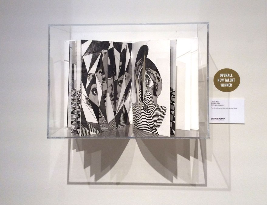
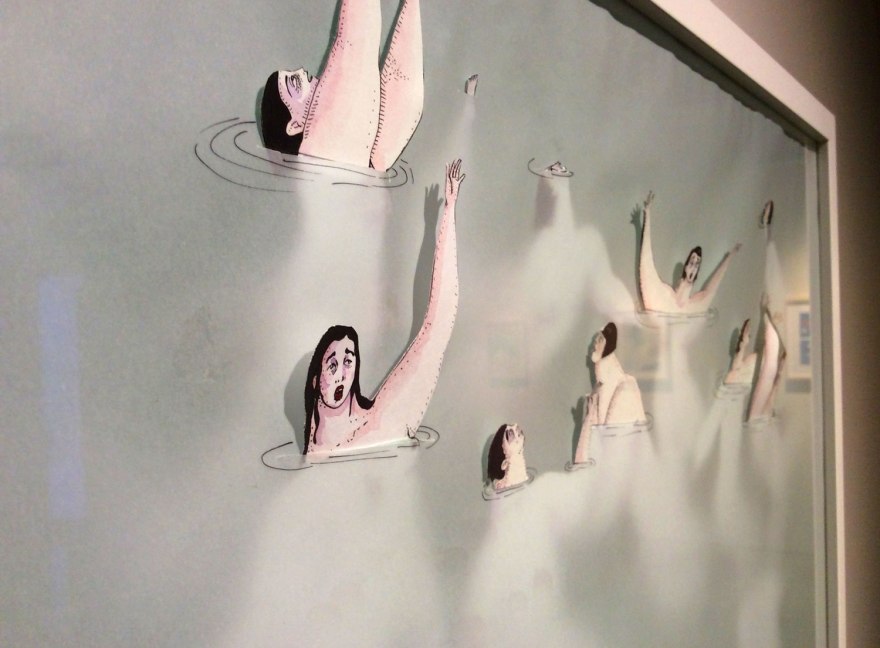
I have to say, there was a lot of great talent to explore there. And by that, I mean there was a lot of book illustration and drawings that look like things 🙂

aoi_16

The exhibit was probably what I’d consider the perfect size, two and a bit, uncluttered rooms of nicely spaced work, one central strip of glass cabinets. Easy and digestible and not at all so large it dragged. It wasn’t overwhelming, it didn’t make my heart sink and it didn’t remind me I am a failure of an “artist” for getting bored in an environment I should, by association, consider home.

aoi_02

The work all had a chance to breathe, which felt relevant in a collection like this, because everything on display HAD been created for a purpose, be it a book, an advert, a poster or jacket; it meant you could take each item in and consider it in the context for which it was made. I like a bit of snappy analysis of a work’s strengths. I think this is my downfall with fine art. I can’t assess it because I don’t understand why it’s been made.

Sorry, I’ll stop moaning.

aoi_10aoi_05

For a collection of contemporary illustration, the AOI exhibit was a really nice one. It reminded me of Pick Me Up back in the day, before it got a bit tired (the last few years have not impressed me so much- I WILL STOP MOANING NOW) and I noted a good few new gems to keep an eye on, as well as simply enjoying the work of those I already admire. Yes, I noted the works of many already adorn my shelves.

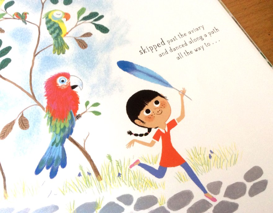
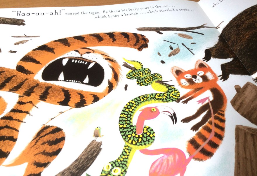
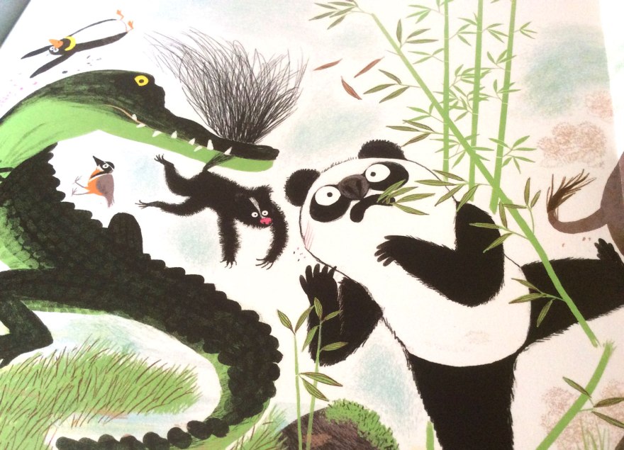
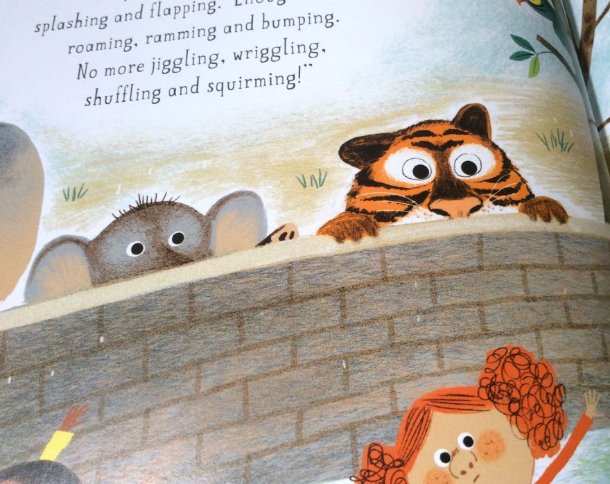
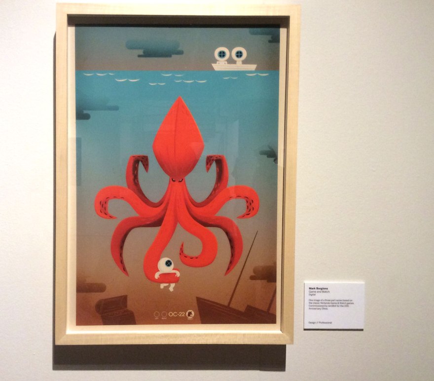
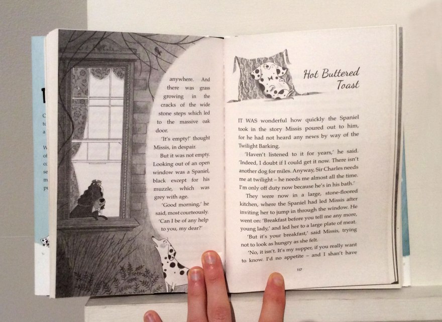
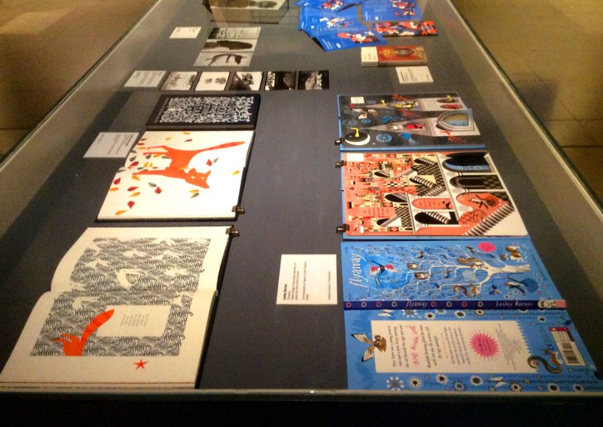
I know it’s a bit of a cop out in my exploration of galleries, but the highlights for me were mainly book and design based illustration. Big talents like John Burton showed up and the lovely works of the brilliant Lesley Barnes, Alex T Smith and Chris Haughton were as  enjoyable as ever, both in browsing and poster forms.

aoi_11aoi_18aoi_08

aoi_09

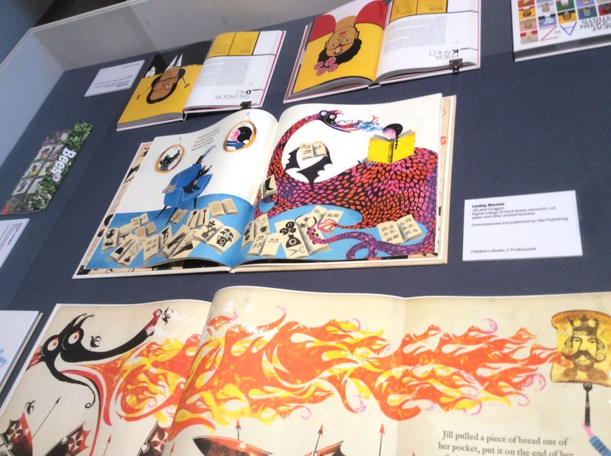
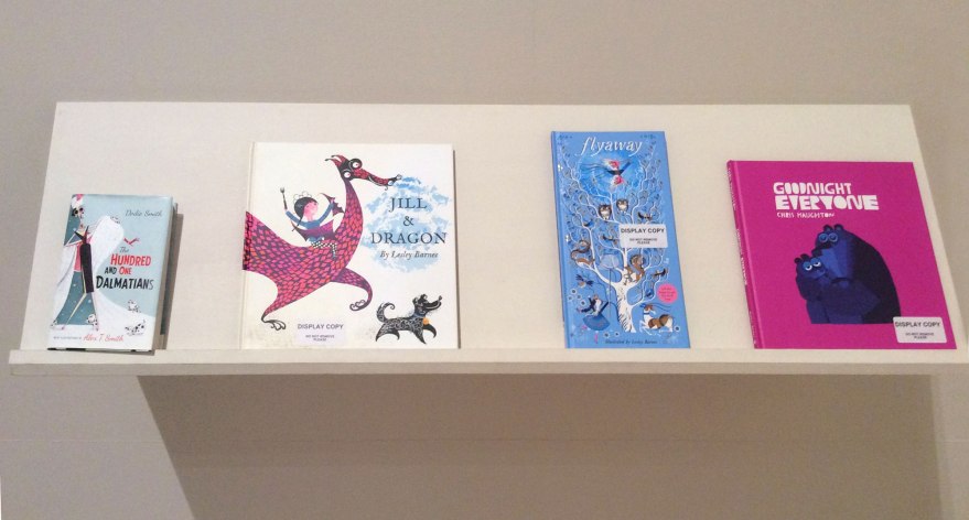
I actually liked the repetitive set up of the show a lot, in which the same pieces were encased on walls, in cabinets and on shelves. It gave it a ‘catering for all’ kind of vibe; the work in it’s raw form, the work as a ‘work of art’ and the work in the context of other work next to it. Each variant allowed the illustration to speak in a new context.

With the book being the best one. Obviously.

aoi_07aoi_13aoi_15aoi_17

I liked a lot of the work on display, both by the known and the unknown. I can’t say I think it was a broad collection in terms of the style of work, which did surprise me given that is was a collection from all over the world. Even across cultures and geography, a lot of the drawing styles, use of shapes, colour spoke in a similar language; but realistically I suppose it was unlikely to be anything else. This exhibition was always meant to be a snapshot of contemporary illustration which, like anything, is at the mercy of fashion. With so much exchanging of cultures, information and products through the magic of the internet, I suppose it’s very reasonable that fashions are less confined by borders than ever before. It was a shot of the trendy world of illustration in the here and now. And I, personally, really liked it!

aoi_06aoi_14aoi_12

If you are hankering for a bit of tasty, picture based joy and are in the area, I would suggest checking it out. It won’t take your whole afternoon, it won’t cost the earth and it likely will inspire you, even just that teeniest bit to go and make some nice things. Or at least look at them.

aoi_03

Hat’s off to you Somerset House, the AOI and all your contributers. The awards were well deserved, there was very little that I felt fell short of acclaim; naturally not all to my personal taste, but I suppose that is, in part, the joy of the visual arts.

And I really do appreciate, support and have enjoyed the hard work from those working to champion the humble illustrator. There’s an awful lot of talent on this earth and events like this do their bit to try and push those, often fresh faced, creators into the limelight they really do deserve.

So, was I cultured yet? I decided I wasn’t. I’d really enjoyed my speedy mosey through the contemporary illustration scene, but it wasn’t quite enough. Onward to part two of my afternoon exhibitioning…


Book Club Review – Never Tickle a Tiger


Welcome back to book Club! And by book club, I mean let’s-all-listen-to-what-I-have-to-say Club!

With books!

But seriously, if anyone has any comments on any of these reviews, be it agreements, disagreements, analyses of their own, or criticisms of my thoughts, I’d really, seriously love to hear them. You can leave a comment below, or you’re welcome to contact me via email, twitter or facebook.

tigertickle_cvr01

Author: Pamela Buchart

Illustrator: Marc Boutavant

Publisher: Bloomsbury


So, this time we have the colourful cautionary tale from Pamela Buchart and Marc Boutavant: Never Tickle a Tiger. I’m really not trying to play favourites here, but this is yet another gem brought to you buy Bloomsbury. Hat’s off to those guys who have been really busting out a cracking number of great titles in the past few years that are clearly right up my street! I promise to diversify more in the future, but this one really does need a mention!

A charming and vibrant cautionary tale, Never Tickle a Tiger opens with our introduction to Izzy; a fidgeting, wiggling, jiggling little girl who just CAN’T sit still! Warned and chided by jut about everybody around her, Izzy is that well-meaning but incomprehensibly over excitable little person we are ALL only too familiar with.

tigertickle_inn11

Her character is brilliantly identifiable to children and parents alike, brought to life with Buchart’s lyrical and whimsical writing style.

Cascading lists of alliterative, onomatopoeic adverbs capture the bounding lightness of our little protagonist, the text and images dotted around the page in an erratic layout that brings movement and life to the spread.

tigertickle_inn09

tigertickle_inn13

So what’s a girl to do when she simply can NOT sit still, no matter how many times she’s told? The story explores the angel and devil complex in near-on every kid’s head. The trained desire to be good and do as you’re told, VS the often much stronger curious NEED to explore the scenario in question yourself, learning your own lessons – for better or for worse – first hand. Because would it REALLY be so bad…to tickle a tiger…?

tigertickle_inn08

What’s so wrong with fidgeting anyway?

The page design of the pivotal moment is inspired. Short, snappy lines of text and sequential images capture and build Izzy’s sneaky, creeping movement to the forbidden enclosure, only to stop it dead with one full spread on her arrival.

tigertickle_inn07tigertickle_inn06

Boutavant’s illustration here is perfect. The drama of discovery is communicated through the uncharacteristically bare enclosure, the focus being on the majestic, sleeping beast within. Izzy is poised mid-movement in a comically ‘rabbit in headlight’ pose as she gazes up, feather in hand at the forbidden tiger.

tigertickle_inn01

As in all good cautionary tales, the fallout from Izzy’s failure to heed her warnings is rewarded with a hilarious domino effect of chaos; throwing the entire zoo into utter disarray.  The pull out, quadruple spread format here echoes the expansive explosion of madness and offers a great bit of novelty tactility and you open out the full extent of Izzy’s mistake.

tigertickle_inn04tigertickle_inn03

The vibrancy of character we’ve come to expect from Boutavant’s work really emphasises the fun of this bright and whimsical tale. Although less neon in palette than previous illustrations we’ve known him for, each animal in the zoo has a real attitude and life that compliments and enhances the madness.

tigertickle_inn05tigertickle_inn12tigertickle_inn02

Their reactions to Izzy’s unquenchable curiosity are delightfully humorous and  cheeky details such as a little, hidden hedgehog give every scene a little added magic, independent of the main story.

tigertickle_inn10
Small and adorable, find the hedgehog adds an additional game to the reading experience.

Ultimately, Never Tickle a Tiger is a great bit of fun. I love Buchart’s lyrical text and the life and hart it brings to such simple narrative format and Boutavant’s bright and playful illustrations really capture the sense of quirky madness. A brilliant cautionary tale for all those little Izzys thinking of embarking on some tiger tickling any time soon.

… not that they’ll listen anyway, of course.


Hands up if you Hate Bedtime?

We got set a project a few weeks back to pitch some kind of product to a panel of “judges” (tutors). Dragon’s Den Style to those who are familiar with it.

It was a pretty neat project, I decided to be completely unadventurous and one hundred percent predictable and stick with what I know. SO I put my efforts into producing a pitch for a series of children’s books, kind of like a dark Mr Men (not Little Miss though. We all know they were just a cheap money-making move. Little beetches more like…ahem)

And thus these guys were born. The Little Nightmares.

The idea is (yeah, there was one of those) that it’s a brand aimed at tackling bad behaviour in children come night-time. It’s like a whole subculture or misbehaviour; there’s so many variations of getting out of going to bed that I thought I’d characterise them. Each of my Little Nightmares is a different personification of night-time issue, and each book follows a short story about them being naughty and, ultimately, rectifying the behaviour and becoming well behaved.

Well, that’s the plan anyway. Obviously we only had to present the idea so the books haven’t TECHNICALLY been written yet. But some pretty artwork’s been done.

And that’s the important thing…right?

The one who WON'T STAY IN HIS OWN BED.
Fraidymare is afraid of the Dark. He's not so much naughty, but is still disruptive.
This Guy is the kid who always asks for a glass of water, or another blanket, or a this, that and the other.
Monstermare is the one who makes you search for monsters under the bed, in the cupboard, under the rug etc. Every night. For 45 minutes.

  I pitched it at four books currently, although the intention is for the series to expand exponentially.

It’s one of those great things that can keep going for as long as kids are misbehaving…so pretty much until the end of time.

I also went on a lot about the potential for merchandise.

I don’t know if you’ve ever tried to make money off the back of books (specifically independently published books) but I’m telling you now, it doesn’t happen. Any return that would be made on this mythical Dragons Den money we were asking for, would most likely have to be made almost solely on the subsequent merchandise that the brand could potentially generate. Luckily, as it’s all about the night-time, it leaves itself open for that kind of thing. Not only in toys, bed covers, night lights etc, but also in company collaborations with various institutions that specialise in either children or  night based products. For example, getting the characters on toothpaste and toothbrushes etc.

(See? I thought about stuff!)

But the books weren’t the only aspect to my brand. I did a fair amount of research into the issue of kids misbehaving at bedtime and realised there isn’t actually a whole lot of help for parents who have these problems. There’s websites like the NHS and shows like Super Nanny, (I slagged off the Super Nanny website A LOT. Because it’s shit.) But they seem to talk about bad behaviour in general and I’ve known kids who are perfectly well-behaved 90% of the time, but just hate bedtime. (Understandably I think. It’s boring.)

So I included a website plan in my pitch. Somewhere that has the aim of, not only furthering the child’s relationship with the characters but helping parents too via a parent portal of hints, tips, advice, forums etc.

So that was more or less my project. I hadn’t actually intended to take you through my presentation, I really just wanted to share the artwork, but apparently today is a digitally enhanced verbal diarrhoea day so there you go.

I’d like to carry on with the idea to be honest. There’s no reason why the books can’t be made and added to my ever-growing list of books and fanzines I’d like to sell. Won’t be in time for Comiket this April, but that’s just one of many event’s I’d like to take part in, so keep your eyes peeled in the future.

Now I just have to actually write them….huh.

Fraidymare said it.

B

x