The Ambiguity Project: Look What You Made!!

It took a while and it was stressful and incomprehensibly confusing at times but, the concluding chapter of the Ambiguity Project has finally been written. And I figure, as it was all your hard work that made it, it’s only really fair that I offer you the chance to  a little gander.Maps in Their Slip Case

All those broad and insightful answers you sent, emailed, told and wrote to me have been gradually forming this project for a while now. The character portraits they formed have taken on a number of attributes and aspirations and finally, in your deciding of the concluding question, you’ve shaped their journeys towards aspiration progression and digression.

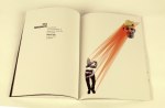
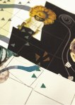
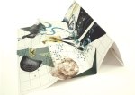
As a result, the pieces have evolved from character portraits into the format of maps.

W: Positive Extrovert

X: Positive IntrovertY: Negative IntrovertZ: Negative Extrovert

The pieces as a whole communicate the desires, aspirations, fears, limits and goals of each character, based on the desires, aspirations, fears, limits and goals of every person that took part. map3

map10

The representations of map elements are extensions of your resulting answers, transforming the images into something of an artistically representative psychological landscape in which forests, desserts, mountains and rivers must be bridged and navigated as the theoretical characters endevour to achieve.

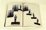
As the maps can be folded in any number of ways, new compositions and sequences are formed out of the ambiguous collage imagery, introducing the possibility of narrative-based interpretation and multiple routes through the artwork.

Based on your final answers and your choice to answer with positivity or negativity, I adapted the likely-hood of the journey’s success using the environmental features.

At times, rivers will be bridged or shattered, allowing navigation around the barriers so that the illustrations of goals can be accessed. At others, the folding will introduce increased forests and confusing, representing the journey becoming harder.map12

map17
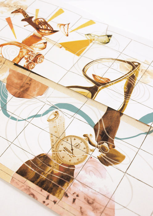
Basically, these are four artworks that beg to be played with and explored. Fold ’em up however you wish to reveal multiple artworks and new possibilities for stories.

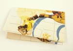
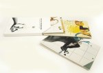
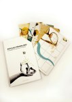
Then, obviously, cause I can’t let things lie, I wanted to make a slip case to contain them.

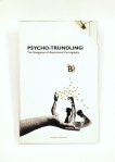
The project dictated that it needed to have a binding jacket, so, as my results had extended out of the original book format intended, I used it as an excuse to design and display the cover.

I knew the artworks were complex and involving, so did not want to drown this in the cover design. Instead I opted for a simple, systematic looking result, inspired by the design of 1970’s psychological textbooks. I wanted the notions of progression towards goals to be represented by the idea of making your way from A to B, and knew that the suggestion of maps had to be present, hence the light inclusion of the forest elements, which doubles up nicely as directional arrows.

mapcover1mapBack

There’s a very real possibility that I did forgot to spell check.

If you find anything, do me a favour and just keep it to yourself okay?

Anyway, another project down.

Thank you so much to everyone that helped, I really hope that you appreciate the results.

Cheers

B

Illustrating Science: The joy of pseudo diagrams (fig. 2)

This is Lucy.

Lucy's feedback

And this is Carl.

Carl's Brain

They like to do things. Things like moving. They’re especially good at intentional moving, unconsciously.

This was Lucy, once.

Lucy's egg legThen I got my hands on her.

And This is Proprioception.

(A project from last Christmas.)

This is Proprioception

propbook5

Inspired by the ingenuity of the pseudo-educational comedy, Look Around You, Proprioception was a mock 70’s educational manual in which I took a real life bit of, really damn interesting, biology and explained it using entirely non scientific methods. Because I am an illustrator, so cutting things up makes more sense to me than the deeply fascinating intricacies of real life biology.

FeedbackThe pseudo diagrams were designed to portray the importance of this fascinatingly vital sixth sense, so inherent in our bodies most people have never even considered a life without it (and in fact there are only 6 known cases of people having a complete lack. This is a really cool video about one man’s battle.)

The “text book” had fold out elements to reveal new tasks that got people thinking about the impact of Proprioception in their own life.

Opening page 1Opening page 2I wanted to draw people’s attention to it’s vitality to our functioning everyday and used tasks and design choices to create a style reminiscent of an 70’s school textbook/instruction manual with a playful, modern twist.

Carl dancingProprioception allows us to understand our own body’s position in relation to itself without consciously considering where each limb is. It’s why when you close your eyes, you know where both your hands are. It’s super neat and super vital and I wanted people to understand that fact using simple collage techniques and fun imagery to demonstrate the incomprehensible struggle that would be living without it.

Plus it gave me an excuse to cut up my friends faces for a few months.

Seriously, I was picking Carls head out of my carpet for weeks.

Illustrating science: The joy of pseudo diagrams (fig 1)

Hands up if you want to learn a totally amazing fact?What about something entirely controversial?

Or even just utterly trivial?

And who wants to learn them through the medium of…TYPOGRAPHY!? …no?

Well if you raised your hands to any of them you are a fool, because I can’t see you and that was very clearly a rhetorical request. So you can sit down, behave and have all three.

This was a short uni brief: 3 posters to work as a set and detail three facts that fit the above criteria.

The conception of the carbon that makes up all living things.
The atoms that form most of your body’s cells were created in the explosion of a star.
The lifespan of our cells, built from this carbon.
The maximum number of times your body’s cells can multiply and divide before they deteriorate and die.
The life form that housed the carbon is gone, yet the atoms continue.
In reality, the afterlife is nothing more than the continued existence of atoms after the death of the cell they once formed.

So here they are, three posters about the passage of time and our simple, biological place in it. An amazing beginning to the journey of carbon atoms, a trivial definition of our cells’ lifespan and the true, if not hard to swallow fact that we are nothing more beautiful than a temporary home for ongoing carbon.
Some may see this as a dark concept. I think it’s an utterly beautiful one, although the project itself is not one of my favourites.

Still, either way it’s all pretty interesting