The Ambiguity Project: Look What You Made!!

It took a while and it was stressful and incomprehensibly confusing at times but, the concluding chapter of the Ambiguity Project has finally been written. And I figure, as it was all your hard work that made it, it’s only really fair that I offer you the chance to  a little gander.Maps in Their Slip Case

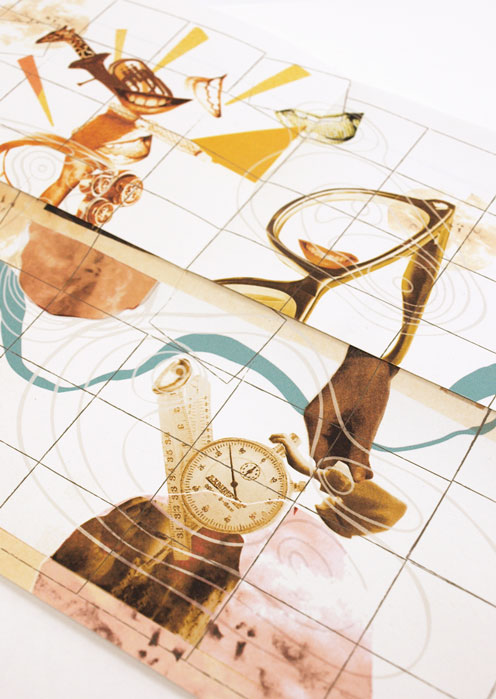
All those broad and insightful answers you sent, emailed, told and wrote to me have been gradually forming this project for a while now. The character portraits they formed have taken on a number of attributes and aspirations and finally, in your deciding of the concluding question, you’ve shaped their journeys towards aspiration progression and digression.

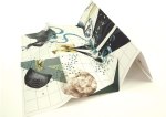
As a result, the pieces have evolved from character portraits into the format of maps.

W: Positive Extrovert

X: Positive IntrovertY: Negative IntrovertZ: Negative Extrovert

The pieces as a whole communicate the desires, aspirations, fears, limits and goals of each character, based on the desires, aspirations, fears, limits and goals of every person that took part. map3

map10

The representations of map elements are extensions of your resulting answers, transforming the images into something of an artistically representative psychological landscape in which forests, desserts, mountains and rivers must be bridged and navigated as the theoretical characters endevour to achieve.

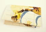
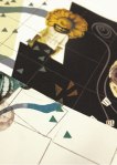
As the maps can be folded in any number of ways, new compositions and sequences are formed out of the ambiguous collage imagery, introducing the possibility of narrative-based interpretation and multiple routes through the artwork.

Based on your final answers and your choice to answer with positivity or negativity, I adapted the likely-hood of the journey’s success using the environmental features.

At times, rivers will be bridged or shattered, allowing navigation around the barriers so that the illustrations of goals can be accessed. At others, the folding will introduce increased forests and confusing, representing the journey becoming harder.map12

map17Basically, these are four artworks that beg to be played with and explored. Fold ’em up however you wish to reveal multiple artworks and new possibilities for stories.

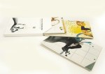
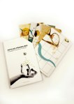
Then, obviously, cause I can’t let things lie, I wanted to make a slip case to contain them.

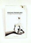
The project dictated that it needed to have a binding jacket, so, as my results had extended out of the original book format intended, I used it as an excuse to design and display the cover.

I knew the artworks were complex and involving, so did not want to drown this in the cover design. Instead I opted for a simple, systematic looking result, inspired by the design of 1970’s psychological textbooks. I wanted the notions of progression towards goals to be represented by the idea of making your way from A to B, and knew that the suggestion of maps had to be present, hence the light inclusion of the forest elements, which doubles up nicely as directional arrows.

mapcover1mapBack

There’s a very real possibility that I did forgot to spell check.

If you find anything, do me a favour and just keep it to yourself okay?

Anyway, another project down.

Thank you so much to everyone that helped, I really hope that you appreciate the results.

Cheers

B

Don’t be so Graphic…

Did you know I was actually studying a Graphics course?

I ask, only because you would, under no uncertain terms, be forgiven for thinking I was an illustration student. I think it’s something to do with the total lack of organisation, adoration for comics and drawing…”things” and my total inability to draw straight lines.

And The fact that I’m not sure I’ve mentioned the word “grid” once since setting this site up over a year ago.

Well I am. It’s a mixed course admittedly, and there is certainly a heavy emphasis on image making and illustration too, but I wanted to, very quickly, dispel any myths that I am no good for anything but the world of the wibbly.

The current project is all about layout. And I’m finding it a challenge and a half. Here is the, incredibly ugly, induction timetable for first years to my University.

Yes we are actually an arts and design school. The irony is not lost on me.

See, this what happens when you leave all the admin to the Humanities Campus.

But I digress, we’re currently taking part in a series of short exercises in redesigning the above ugly thing, into something considerably less ugly using a set of strict restrictions and rules (One typeface only, one colour only 3 type size only etc). Just to clarify, this is by no means a practice of making something “beautiful” in the traditional sense. This is about creating order, making structure and making use of positive and negative space, type weight, type size and a hell of a lot of Swiss inspired graphical magic.

So, so far these are  how I’ve gone about getting my Bauhaus on. Don’t worry about the text. This is about the overall effect of the page, the information itself is borderline irrelevant.

      Mmmmm…delicious, gridded neatness.

I have a whole bunch of these, with tweaks here and changes there. Things most people wouldn’t notice in the slightest. It’s got to the stage of adjusting it pixel by pixel in a worrying display of Design Induced OCD.

I wanted to chat about these, I suppose just to remind everyone that us people-creatures don’t have to be pigeon holed as much as we often are. Yes I know it’s all in the same sort of area of design and creativity, but I am just one little person who happens to define herself as an illustrator of sorts. That it what I love, how I make a little moolah, and what I devote a lot of time to. But there is always room in my little noggin for different things. Things that require me to think differently and consider how I see things differently, and I think it’s pretty cool that we have the capacity to do these different things at the same time. I think that I, like so many others, can lose sight of that when life gets busy and sink back into the comfort of what I know I can do.

But I’m really starting to get into these little layout majigs. They’re challenging for a messy art bug like me, and I’ve definitely not cracked it yet, but with every new design I make, I see new promise and get joy from the structure of it all. The Organisation is SO pleasing.

I’ve literally gone from a fanatic of this:

Dave Mckean; Wolves in the Walls. A STUNNING book.

To This:

Joseph Muller Brockmann: Swiss magic

Seriously!

THIS:

Shaun Tan. Cool guy and badass illustrator.

TO THIS!!:

Jan Tschichold

Learning is fun 🙂

B

x