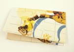
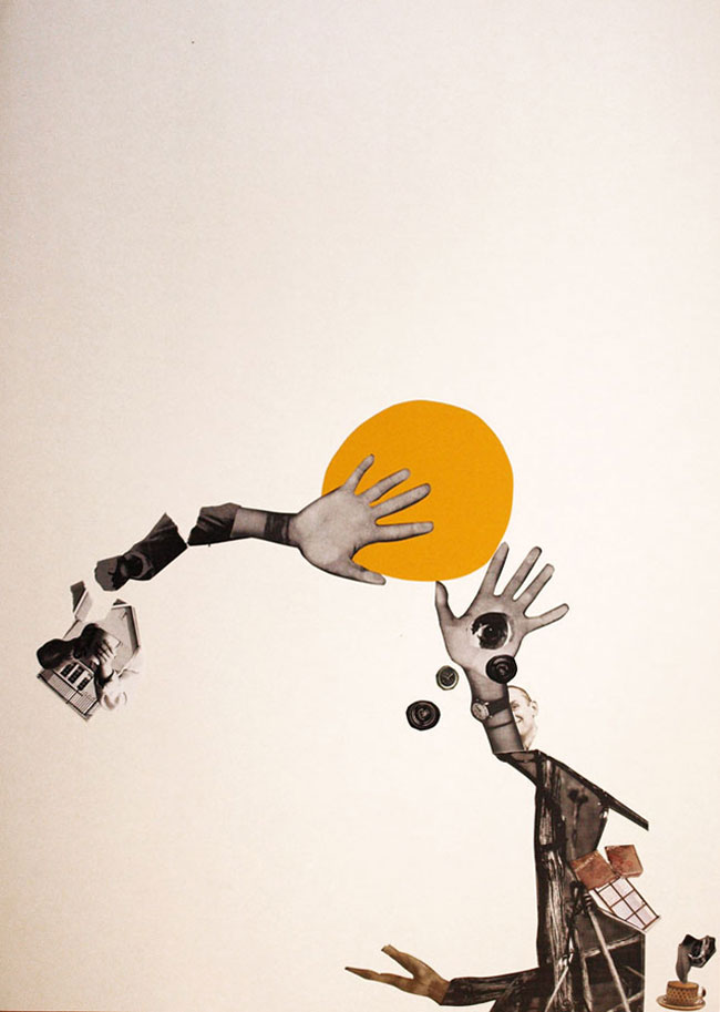
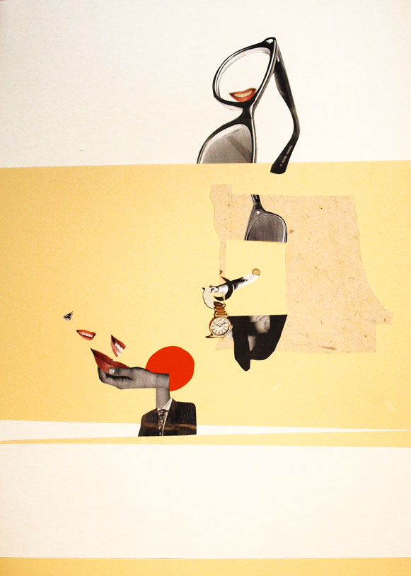
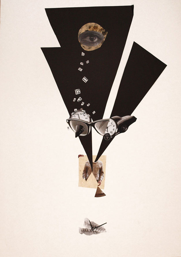
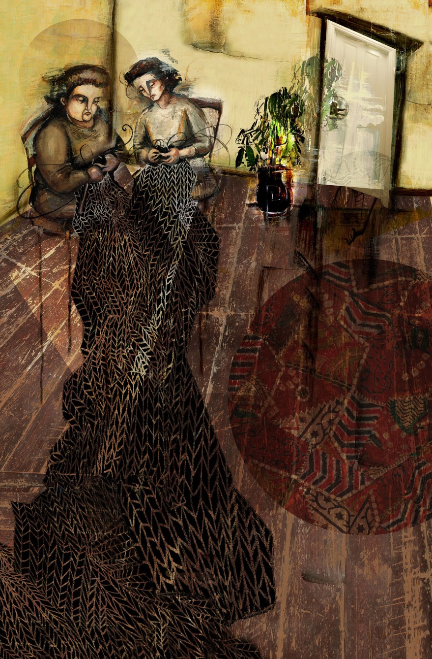
If you’ve had your ear to the ground in the world of illustration and whatnot, you may have heard that the Folio Society & House of Illustration have recently launched their 2014 competition to illustrate a classic novel. This year’s addition to their, ever growing archive of mouth-wateringly stunning books, is Joseph Conrad’s novella, Heart of Darkness.
And with a subject matter that rich, who the hell am I to say no?
So here was my entries of 3, evenly spaced illustrations to accompany the text and a graphically simple jacket design.
“Two women, one fat, the other slim sat on straw bottomed chairs, knitting black wool.”“What we could see was just the steamer we were on, her outlines blurred as though she had been on the point of dissolving, and a misty strip of water, perhaps two feet broad, around her– and that was all. The rest of the world was nowhere…”“But his soul was mad. Being alone in the wilderness, it had looked within itself, and, by heavens! I tell you, it had gone mad.”
So there we have it! It was a stunning project to work with, the text is truly deep and rich and it was a genuine challenge to provide works that didn’t sell it short. In the end, I decided to let the words do their job with the vast majority of the description and allow the imagery to focus more on communicating the themes of the scene. It’s my belief that images should, really offer something additional to the text, rather than simply supporting it.
I Can’t wait to see the winning design, I’m sure it’s going to be something quite special!
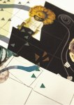
I’ve been working on a few drawings to go in the Children & Young Adult Fiction Anthology for this year’s MA Creative Writing graduates at Bath Spa University. The Anthology’s titled Where the Wild Words Are and displays cheeky snippets ad extracts from each of the novels written by this years Graduates. I was lucky enough to devise illustrations for three of the stories, all of which are Young Adult extracts with a darker tone.
I wanted to depict the extracts given without preventing any imaginative interpretation on the part of the reader, avoiding visual repetitions of the, already very powerful, writing. Instead I teased out familiar motifs and visuals from the written extract and assembled them to make suggestions about the rest of the story, encouraging further interest in the rest of the book. Although somewhat literal in conjunction with the text, the images are intended as conceptual signifiers of the direction of the story.
Although I felt the inclusion of the characters was important, I tried not to give too much visual information away here either, either abstracting their faces or simply turning them away so that they’re not fully visible and recognisable.
After all, I don’t want to remove the readers ability to make visual interpretations, reading is about imagining! Plus I don’t see why I should be the one to do all the work.
So here’s what I got. Three pictures, for three stories by three, remarkably talented writers.
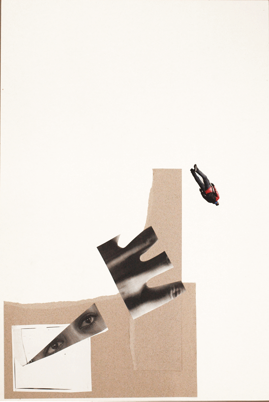
OtherWorld
Written by Lucinda Murray
A tale in which a dark, magical undercurrent lurks beneath an urban city. The extract reveals the moment this world awakens from it’s long dormancy.
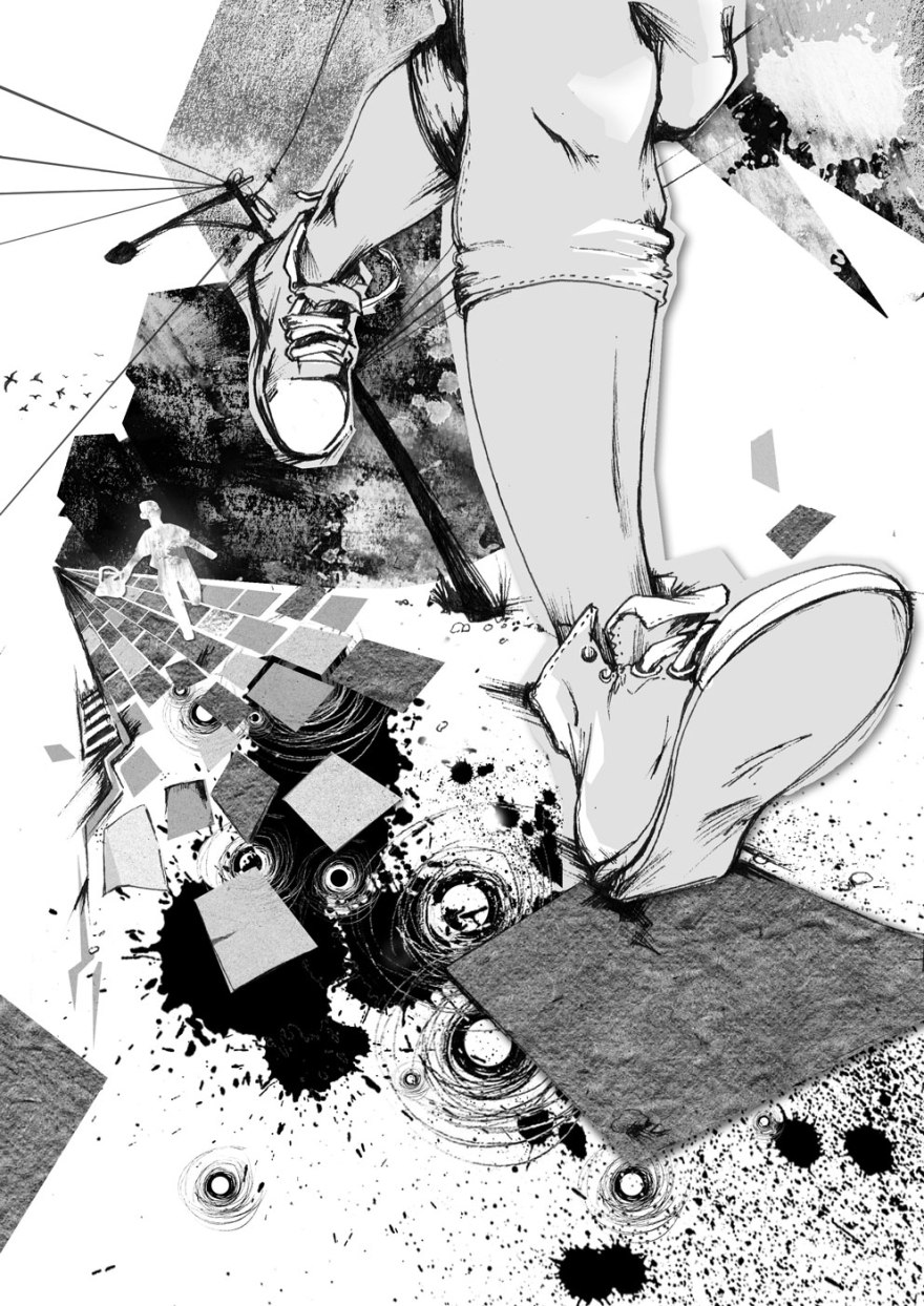
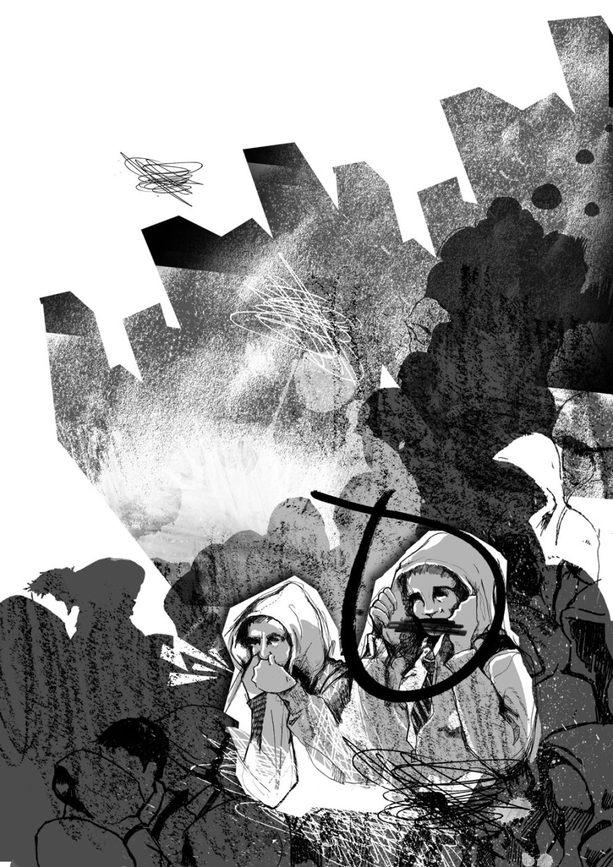
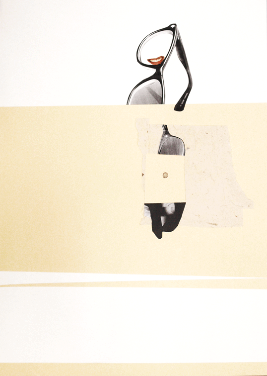
Trev
Written by Val Mote
A contemporary teenager witnesses a murder, yet is unable to confess to what he has seen. The extract details the strict rules of gangdom in an urban school and the necessity to keep your mouth shut and your hood up.
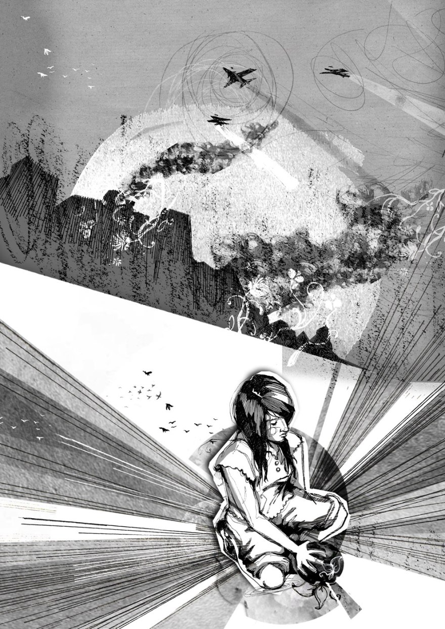
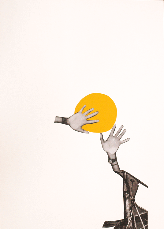
The Light in Our Hands
Written by Sarah Waterstone
A fantasy dystopian love story set in a war in the near future. The extract details the split second moment at which the protagonist is caught in the attack that changes both her life and the world.
The Anthology goes to print sometime over the next few months and contains a plethora of talent and imagination from the students of the MA. The extracts and synopses for these, as well as many, many others had an enormous amount to offer and I hope my interpretations of their work are as valued by the authors as their stories were by me.
They’re at it again! The Broken Frontier boys are gracing the internet with a wee bit of Bagley love and spreading the joy of my, and others’ short, fun and utterly FREE comic goodies.
It’s a neat little post that showcases some definite ones to pay a visit to, including the twisted and Brilliant EdieOP, Elizabeth Querstet and Team Girl Comic…as well as saying some nice things about little old me!
Check these guys out, holding the comic bok fort from the XX chromosome end of the scale!
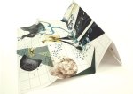
It took a while and it was stressful and incomprehensibly confusing at times but, the concluding chapter of the Ambiguity Project has finally been written. And I figure, as it was all your hard work that made it, it’s only really fair that I offer you the chance to a little gander.
All those broad and insightful answers you sent, emailed, told and wrote to me have been gradually forming this project for a while now. The character portraits they formed have taken on a number of attributes and aspirations and finally, in your deciding of the concluding question, you’ve shaped their journeys towards aspiration progression and digression.
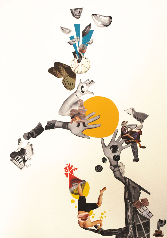
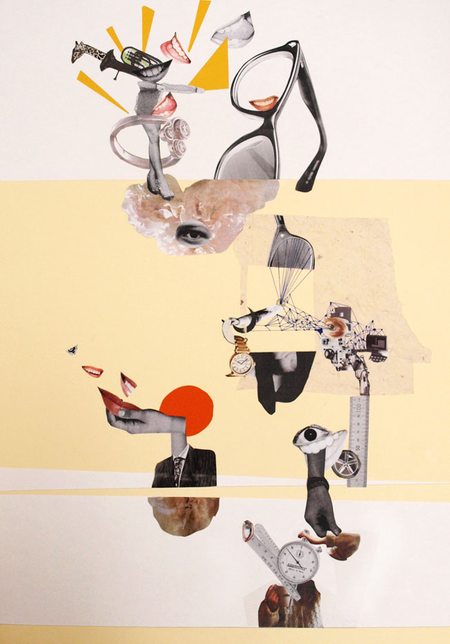
As a result, the pieces have evolved from character portraits into the format of maps.
The pieces as a whole communicate the desires, aspirations, fears, limits and goals of each character, based on the desires, aspirations, fears, limits and goals of every person that took part.
The representations of map elements are extensions of your resulting answers, transforming the images into something of an artistically representative psychological landscape in which forests, desserts, mountains and rivers must be bridged and navigated as the theoretical characters endevour to achieve.
As the maps can be folded in any number of ways, new compositions and sequences are formed out of the ambiguous collage imagery, introducing the possibility of narrative-based interpretation and multiple routes through the artwork.
Based on your final answers and your choice to answer with positivity or negativity, I adapted the likely-hood of the journey’s success using the environmental features.
At times, rivers will be bridged or shattered, allowing navigation around the barriers so that the illustrations of goals can be accessed. At others, the folding will introduce increased forests and confusing, representing the journey becoming harder.
Basically, these are four artworks that beg to be played with and explored. Fold ’em up however you wish to reveal multiple artworks and new possibilities for stories.
X: Folded
Bridge to goals formed
Short Term goals Easily obtained
W: Folded
W: FOlded
Forests obscure plans
A river shattered to allow access
Slip Case made up
X: Folded
Y: Folded
Z: Folded
Y: Forests aplenty
Y: Whole
Y: One way to unfold
Y: Folded
Z: centre
All 4 & Cover
Display
Display
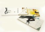
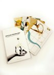
Then, obviously, cause I can’t let things lie, I wanted to make a slip case to contain them.
The project dictated that it needed to have a binding jacket, so, as my results had extended out of the original book format intended, I used it as an excuse to design and display the cover.
I knew the artworks were complex and involving, so did not want to drown this in the cover design. Instead I opted for a simple, systematic looking result, inspired by the design of 1970’s psychological textbooks. I wanted the notions of progression towards goals to be represented by the idea of making your way from A to B, and knew that the suggestion of maps had to be present, hence the light inclusion of the forest elements, which doubles up nicely as directional arrows.
There’s a very real possibility that I did forgot to spell check.
If you find anything, do me a favour and just keep it to yourself okay?
Anyway, another project down.
Thank you so much to everyone that helped, I really hope that you appreciate the results.
We are now 3/4 of the way through the journey that is the Ambiguity Project. Thanks so much for getting involved, it’s been great to have so many people interested in helping out and I really hope you’ve been enjoying the results.
Another question asked, another layer formed, the collages and (as a result) the characters are really taking shape now, so here’s what we have so far:
I asked you, WHAT IS YOUR GREATEST PRIORITY?
W: Positive Extrovert. Their priorities are to have fun and enjoy the moment, burying their head in the sand to some extent when faced with problems. Small term goals, like keeping their feet warm are fine, but larger questions remain ignored.X: A positive Introvert. Their priorities are to work towards achieving love, fun and happiness. Reflective and self questioning they’re not afraid to make changes to get to their goals.Y: Negative introvert. They prioritise happiness and making an impact on the world but suffer low confidence. They worry life will pass them by having not achieved their goals.Z: Negative extrovert. They prioritise their family and the welfare of others yet begrudge this fact. They feel held back by their sense of responsibility yet do nothing to change their scenario.
So, for our final concluding layer, I would like to put it to you people to answer ONE of the following two questions:
Okay so the project is underway and the collages are beginning to evolve. For those a wee bit lost, a full description is here.
So far, here’s how we’re looking:
W: Positive Extrovert; Would change: Taking life at home for granted; having more time; their blinds; their bum and better coffee made at UniX: Positive Introvert; Would Change: Last Night, would make people nicer to each other; would make others smile more; being a sloth.Y: Negative introvert; Would Change: Their future, Time to pass slower, more hours in the day, The speed of passing time, How long it took to decide what they wanted to do.Z: Negative Extrovert; Would change: The frequency other people think of others; summer all year round, their wardrobe, finance, change narcissism to compassion
Most of the answers worked pretty well together as a lot of them were about time and the passing of it. What was fun, was making these similar answers fit with the positive, negative character types as defined previously.
“I’d like more time.”“I’d like more hours in the day and for time to pass slower” “I regret how long it took me to decide what I wanted to do”
A thousand thank you’s to all of you getting into the spirit and lending your answers.
So, the next question that will form the next stage:
WHAT IS YOUR GREATEST PRIORITY?
I look forward to getting your answers, either on here, twitter or direct to me at bagley.becky@gmail.com
I asked a control group of people (mainly third year university students at the University of Bath Spa…go figure…) three simple yet remarkably ambiguous questions for them to answer as they wished.
1. WHAT DO YOU GET UP FOR IN THE MORNING?
2. WHAT ARE YOUR LIMITATIONS?
3. WHAT IS YOUR GOAL
I received a lot, a lot of varied answers. These results have now formed the first stage of a set of four collaged images to represent a set of character sheets.
So Far our cast consists of W,X,Y and Z: An extrovert positive character, and introvert positive character, and introvert negative character and an extrovert negative character; each one captured in an abstract collage.
Every day or so I’ll be asking a new, ambiguous question. Each answer I receive will be randomly attributed to each character and represented on their collage, forming further details and fleshing out the set until they become formed characters in the form of abstract collages.
The idea is, my control over the growth of these characters and development of the images is diminished and YOUR (yes, that’s right, YOU) will directly influence the artwork. Each stage will be posted right here so you can keep an eye on your handywork.
So, the Next question is:
WHAT ONE THING WOULD YOU CHANGE?
Submit answers either in the comments box, or email me at bagley.becky@gmail.com.
You can also tell me via twitter, all answers are welcome.
Okay so those of you that remember this one, will remember my sister went and got old in August. What you may not know, is that I also have a big brother who decided to be awkward and go and level up too, just afterwards in September. You think they’d have spread it out a bit more right? Some of us have the decency to have birthdays in January. Sheesh.
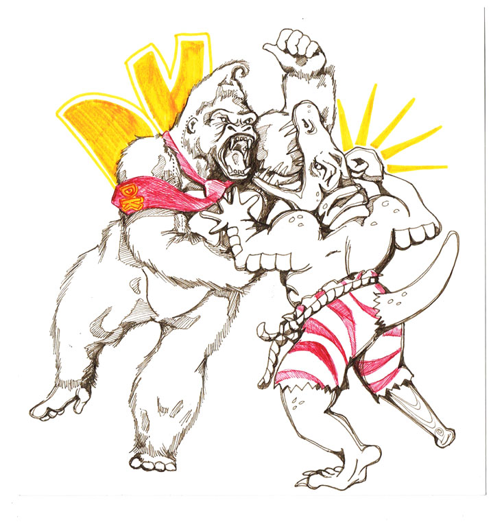
Anyway, he’s something of a creative bugger too and is currently heading into the world of indie video games following a masters in Games Design and Development. So I decided to be a good sister and put him together a package of goodies, one of which was, of course a little drawing I thought I’d share with the world. ‘Cause that’s what I do.
We grew up with Nintendo characters. And when I say that, I don’t mean it lightly. I mean we GREW UP WITH NINTENDO CHARACTERS. Seriously. How none of us have ended up following a career in becoming a plumber and/or italian is beyond me. I had my own ocarina.
Anyway I thought I’d do him a wee drawing to inspire him in the last leg of his education and the first step into his career. Take him (and myself) back to the old days of sitting on cushions on the floor to get so close to the screen you could see the colours separate into RGB and the only sound under our held breaths was the relentless tapping of desperate thumbs. The days when money meant nothing more than the chime of disappointment, because really you were desperately hoping for a mushroom. The days when clouds were solid, vines were opportunities and barrels were terrifying. The days when bananas meant so much more than a good source of potassium and even the chesnuts were against you…Actually now that I think about it, that’s all pretty batshit mental.
Anyway I drew him this:
And if you don’t know what it is, that’s probably a good thing, for all the reasons discussed.
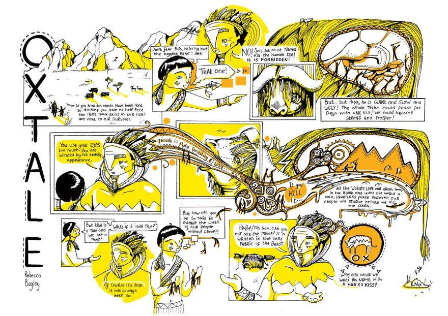
Okay, so I entered the world of comics a few years ago with the creation of Tick. It was a 40 page illustrated tale that I, then, referred to as a “short story about a robot” (I said a bit more than that actually, but that was the gist of it.)
Since then, here have been a few more additions to the comic repertoire, all of which have fallen somewhat shorter of Tick’s initial short-story-that-have-since-turned-out-to-be-quite-colossal page number credentials, mainly brought about by various competition restrictions. There have been some four page comics like this and this, a two page comic like this and now, as of yesterday, we’re really getting silly.
I’m pretty sure this is the pinnacle now of my short story shortness, at least without full on committing to the world of comic strips; a place I just don’t think I have an affinity for, given my perpetual subscription to the religion of Overkill.
Yes, yesterdays project and entry to the Thought Bubble Short Story Competition, was a one page comic. A short narrative begun, middled and ended on one single sheet of lansdcape A4, and subsequently probably my trickiest one yet.
It went against everything I know and every natural instinct I have when creating sequential pieces but I did my best and, if nothing else, feel like I learned a lot in the process.
I hope you enjoy it anyway, I’m now off to invest in some “story-grow” to help bring my poor, withering page-count back to life.


 So there we have it! It was a stunning project to work with, the text is truly deep and rich and it was a genuine challenge to provide works that didn’t sell it short. In the end, I decided to let the words do their job with the vast majority of the description and allow the imagery to focus more on communicating the themes of the scene. It’s my belief that images should, really offer something additional to the text, rather than simply supporting it.