Illustrating science: The joy of pseudo diagrams (fig 1)

Hands up if you want to learn a totally amazing fact?What about something entirely controversial?

Or even just utterly trivial?

And who wants to learn them through the medium of…TYPOGRAPHY!? …no?

Well if you raised your hands to any of them you are a fool, because I can’t see you and that was very clearly a rhetorical request. So you can sit down, behave and have all three.

This was a short uni brief: 3 posters to work as a set and detail three facts that fit the above criteria.

The conception of the carbon that makes up all living things.
The atoms that form most of your body’s cells were created in the explosion of a star.
The lifespan of our cells, built from this carbon.
The maximum number of times your body’s cells can multiply and divide before they deteriorate and die.
The life form that housed the carbon is gone, yet the atoms continue.
In reality, the afterlife is nothing more than the continued existence of atoms after the death of the cell they once formed.

So here they are, three posters about the passage of time and our simple, biological place in it. An amazing beginning to the journey of carbon atoms, a trivial definition of our cells’ lifespan and the true, if not hard to swallow fact that we are nothing more beautiful than a temporary home for ongoing carbon.
Some may see this as a dark concept. I think it’s an utterly beautiful one, although the project itself is not one of my favourites.

Still, either way it’s all pretty interesting

The Spotlight’s all on ME!

Okay, I promise you NEW work, BUT FIRST check this out!

My first ever online inteview brought to you by them clever fellas over at Broken Frontier!

Big thanks to the guys, especially Andy who saw value in my work enough to wanna know ALL ABOUT IT! And with any luck you do to! So go get an insight into my noodle and why I do the things I do and I promise I’ll reward you with shiny new things soon!

Why Words Will Never Be Enough

The art of language (and I might be biased here, but specifically the English Language) is utterly incredible.

We have perpetual potential at the end of our tongues to convey and share limitless emotion, information, opinions and experiences. It’s a wonderful gift, to have access to innumerable possibilities of communication that, with the sheer number of words and careful choice grammatical order, can convey from one human being to another, just about anything.

But we, as human beings are greedy creatures. And sometimes I feel that, despite the incredible number or words in my aresnal of communicative choice (and even the vast linguistic toolbox that is outside of my knowledge ) there couldn’t possibly be one that would ever communicate effectively the strength of feelings in certain situations. For the extent of some things, there are simply no words.

jennyNo words to accurately convey how much we love someone, the pure injustice that they, of all people, have had to suffer, the pain of their early departure from us and the sheer size of the hole the loss of their presence has formed.

No combination of words could ever accurately explain the true uniqueness of someone. The amount they made me laugh and, above all, how very, truly, incomprehensibly lucky I am to have had them for the time I did.

It is easy, when something has been taken from you, to feel a level of injustice at what you’ve lost. But I would just like to attempt, even with my lack of words to explain fully, how grateful I am to have experienced and known someone so wonderful. Especially when it turns out that their time was so much shorter than expected.

In a world without our girl, so many have never had the chance to know and love her. I am truly blessed and honored to not find myself in that category.

And I wish I could explain the extent to which I mean that, but sometimes there are just no words.

My Beautiful friend, we miss you and love you. But I could never convey how much.

x

A Festive Post of Something Different: Are we Having Cake?

One last time, HAPPY CHRISTMAS EVERYONE!

I hope you’ve all had a marvelous festive season, have had at least one gift that wasn’t socks and have sufficiently experimented with the maximum capacities of your tummies.

I’ve spent mine, as is customary, avoiding my university work by engaging in – what I can only describe as borderline dangerous –  amounts of baking for my family. And as I have no work to show for the past week of fun and festivities, I thought I’d practice my photography skills (or lack thereof) and make you all feel thoroughly sick with yet more cake.

Go on, you can fit in one more helping. It is the season, afterall.

Two cakes for Hungry tummies

Small cake

little close up

The cake is a cheats Christmas cake made with my Nan’s leftover home made mincemeat, put together by myself and my Kitchen Bitch (my sister) who was on egg cracking and gathering duty. I candied bags and bags of nuts using various methods for my family to nibble on, but kept a few over to decorate. Then whacked on a slice of clementine and a cinnamon stick to keep my mum happy. That whole, rustic farmhouse deal is kind of her thing.

cake2

cake1

We got a bit over excited with the mix, ending up with enough to fill two cake tins instead of the intended one, so I knocked up a cinnamon glaze for one to make them a little differentiation between the two.

So here you go, feel better by knowing that, no matter how little work you have done, you have probably done more than me who, once again, has earned the title of Time Waster Extraordinaire.

Ah well, tis the season to be a giant waster. That’s a classic phrase right?

B

x


‘Tick’ named one of the Top Ten Indie comics of 2012!

Do you know what you NEED to own? You NEED to own my graphic novel, Tick. This is not a suggestion or a request, it’s a fact.

I know this, because the internet told me so. The Internet, in all it’s all-knowing glory, has come down this Christmas time in the form of Comic Community site Broken Frontier, with the flattering news that my work has been included in their Top Ten List of the best indie comics of 2012.

How about THAT?

So why not just treat yourself this Christmas and check it out here. Consider it a treat for having survived the end of the world.

Festive love to all and all that jazz.

B

x

Bringing the Zine to the Screen: Limited Edition Prints!

So hands up if you like bears?

Ok now, I want you o stand up, turn around and get out, and the rest of us can appreciate how disgusting they are via the means of my little zine, Bears: Don’t Like ’em! This came about last Easter, and since then has been a consistently strong seller at arts fairs and conventions, to men, women and bear haters everywhere. And actually, one or two intrigued bear lovers too.

Having witnessed it’s popularity, I thought I’d bring it to life with a little splash of colour and returned to my usual haunt, the print rooms, to create these three sets of limited edition screen prints from the zine.

I Don't Like Bears

beartea-print


tea-print

And a fox in a tie. That one was really just for giggles though.

foxprint

So that’s all quite nice.

Now let’s all go have a cup of tea.

B

x

Second Year Frollicks! The End of Term Catch up Part 2: Card Deck

Anyone ever read/ watch Cardcaptors? Not to sound like a little fangirl, but it was pretty rad. No joke.

I bring it up only because it had some attractive examples of interesting, illustrated card decks, which happens to be the brief of my most recent illustration project, which I am lovingly bringing to you today as part two of the Second Year Catch Up sesh.

We were asked to create a set of nine cards in the style of Edward Gorey’s Fantod deck of alternative Tarot. And my eyes immediately turned into little dollar bill signs, as this was in November, just prior to Comiket. And card decks are a pretty sell-able deal.

I turned to my interests in media theory for inspiration, choosing to illustrate Vladmir Propp’s theory of set character types. With creepy puppets. Because if a project of mine needs one thing, it’s definitely an air of macabre. (There was research and reasoning to back this up by the way, but, who am I kidding? You don’t care about that! You’re probably going to sneak past the text, straight to the pictures anyway, you cheeky little blog ninja.)

So here it is, The Propp-Up Theatre Deck.

the-deck

So we have The fist 7 from Propp’s character theory (I chose to omit the Father as a separate character, merging him with the Dispatcher as is often the case with folklore anyway.) Then made up the full nine with the Bottler and Punchman, the traditional workers of the Punch an Judy show.

the-collectionWe had to design the nine cards themselves, then a back for them as well as a Key Guide to reading them, tarot style. I went a step further (in the name of making moolah) and turned my key into a small booklet with information about the concept as well as the cards themselves, as well as handprinting candy bags to echo the punch and Judy, disturbing British seaside vibe.

key

key-inside

And did the punters at Comiket appreciate all the hardwork? Damn tootin they did! They were the first thing of mine to go and by the end of the day I only had about 2 sets left. Not bad for a school project/money making combo.PC168167

B

x

Second Year Frollicks! The End of Term Catch up Part 1: Chickens.

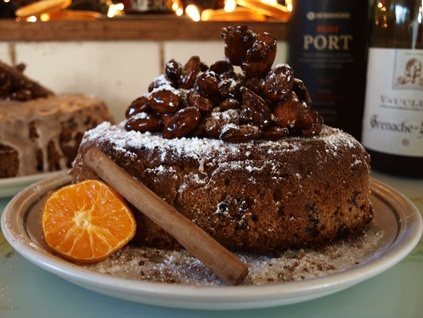
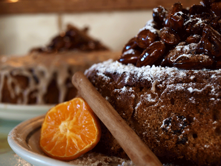
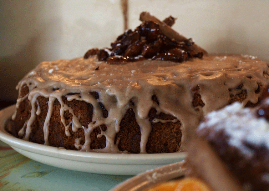
And thus begins the mammoth job that is the catch up posts from the past term. I’m not sure exactly when it happened, but life definitely got frighteningly busy over the past 3 months and, as a result, my little interweb based snippets of work became a little sparse. For those of you that noticed and, more to the point, those of you that cared, I apologise for this, get on my little, metaphorical, digital knees and beg your forgiveness.

You know, in the spirit of Christmas and all that.

Not that I have any Seasonal based works for you, because I’VE BEEN BUSY. So Uni work it is.

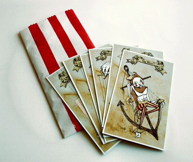
So let’s kick start with a bit of printmaking shall we? For no other reason than it makes me happy. And I’m in charge.

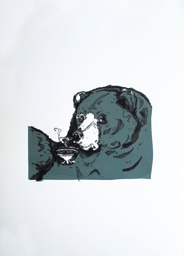
The brief was…well just that. Very simply to create a screen printed poster selling our favorite fast food restaurant.

This is all very well and good, except I happen to be a proud, longstanding member of  the societal subculture of “students who cook” and, therefore have something of an aversion to fast food. Actually, that’s putting it quite lightly. What I mean is, generally and on the whole, I really bloody hate it.

“Not to worry!” My tutor insisted, “You may employ a use of irony!”

So I did. I employed a use of irony. Actually, I employed a really bloody heavy use of irony and drew, what probably turned out to be the single, most disturbing thing that’s ever been dredged from the depths of my skull, in the name of promoting Yicken, a Chinese take out back where I grew up. You know the kind: greasy walls, tiled floors, an inescapable use of that classic yellow and red colour scheme that desperately attempts to suggest some element of culture.

Actually, if I’m entirely honest, as far as nasty Chinese’s go, Yicken isn’t the worst. It just happens to have a heinously playful name that I thought might be handy in the creation of the poster.

yicken
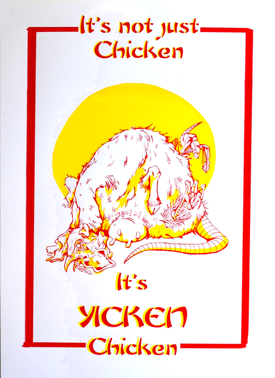
There it is. A vile, possibility regarding the identification of the mystery meat found in that greasy tub of yours.

An Ebook for You

So, following on from the last post, I’ve been drawing inspirational ladies for an inspirational lady.

If you’d like to learn more about the achievements of some truly incredible people, or simply need an antidote to the head-in-palms inducing presentation of us double X chromosome owners available in magazine racks, check out this charming little ebook.

The pictures ain’t half bad either.

B

x