Book Club Review – Footpath Flowers

swf_cvr01

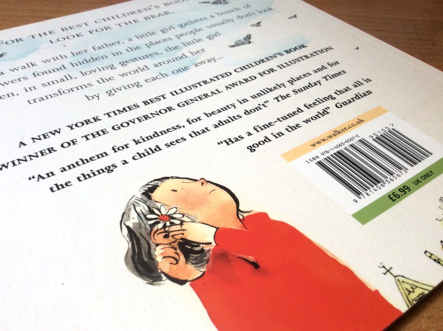
Author: JonArno Lawson

Illustrator: Sydney Smith

Publisher: Walker Books

Those of you who have touched base on this blog before, may remember my comparatively recent, tentative steps into social media and the resulting fun I was having finding my feet on Twitter. Well this weeks review is a refreshing wildcard, courtesy of this digital exploration. Basically I won a thing! Horray!

Yep the Gods of the internet randomiser were kind to me, and have landed me (via the very good -incredibly generous- people at the review site; PictureBooksBlogger) today’s lovely little number from Jon Arno Lawson and Sydney Smith; Footpath Flowers.

I was delighted to win, having spied the quirky, inked artwork somewhere on the web before and found then that I was immediately drawn to it’s comic-book esque format.

swf_inn07

A keen observer and participant of both the indie comic and picture book scenes myself, I’m always intrigued to see the style of comics that make it into the hands of the mainstream UK publishers. In recent years comics have well and truly risen from niche market or weekly funnies, right up to the ranks of ‘established art form’ and I’m delighted to see how often they’re now employed within the children’s market to tell all manner of stories; not simply those featuring pants and tights.

swf_cvr02

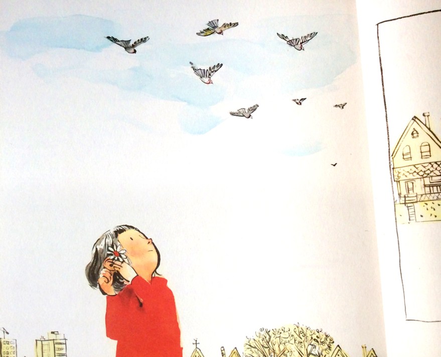
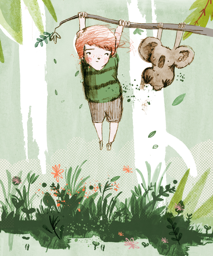
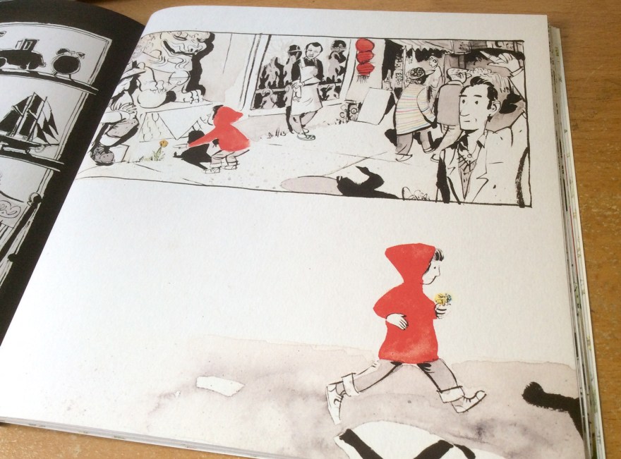
Sidewalk Flowers is a perfect tale to utalise the format of sequential art. Wordless and serene, the book follows a simple journey of a girl and her father. Narration without the fall back of words is no mean feat, yet the simplicity of the tale allows the little nuances and characterisation of Smith’s artwork to really shine, bringing the subtle beauty of Lawson’s tale to life.

swf_inn02

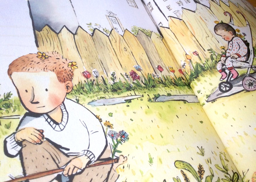
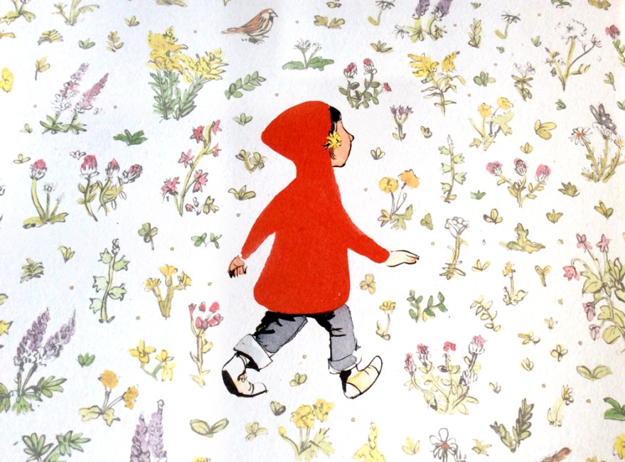
During their stroll, as Dad goes about his business, we see our own Little Red Riding Hood gathering flowers and weeds from all the available avenues of the city setting, distributing them as she deems fit.

swf_inn04

It feels wonderfully reminiscent of my own, and – no doubt – many other, past and present, childhoods; gathering sticks on walks with the family and finding hidden games and treasures in between the act of walking. It captures that childlike focus on the minutia and their, often surprising attentiveness to their surroundings.

swf_inn09


The joy of this childhood freedom is highlighted by the father, who is unaware of his daughter’s growing treasure trove and little acts of kindness; he sees only the tasks at hand – caught up in the world of adult errands and the day to day.


swf_inn03

Smith’s art is beautiful. Full stop.

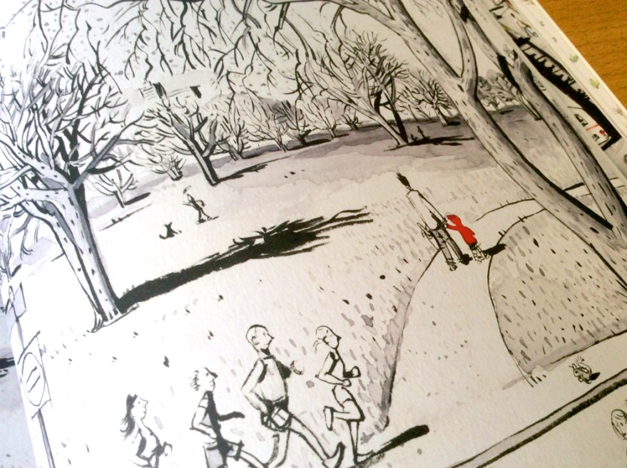
Told from the eye level of our keen-eyed protagonist, the story captures the land of a child’s city through cropped compositions. We don’t know what dad is up to particularly – that’s just boring adult stuff, the real joy is way below eye level.

swf_inn05

This monotone, city setting is a stunning visual juxtaposition to the wild garden Little Red builds as she unearths her surprising bouquet from all around her. The urban palette of black and white with the splash of vibrancy from our little gardener’s jacket begins to fill with the whole inky, spectrum as the bouquet grows and the innocent delight of childhood generosity is distributed around the city.

swf_inn08
The joy of giving breathes life into the monotone city.
swf_inn10
Lucky recipients of the wild flowers of Red’s gatherings. The joy of giving has spread into a full colour world by the time she returns to her own, warm garden.

Now I’ve said it before that I am in no way adverse to the use of digital means in creating children’s books; and art in general. However, I am more than happy to admit that there is something refreshing in Smith’s seemingly unedited art style. Ordinarily a fan of collage and texture, here is nothing but ink, and the scanned traces of the watercolour blotting paper beneath it. It has a traditional charm as a result and feels almost vintage; perhaps in part due to the subject matter causing me to reminisce so much about my own errand-adventures!

swf_ends
The story is enclosed by a set of beautiful, garden end papers.

Either way, it’s a good reminder of the increasingly artistically-inclusive picture book market. Both traditional and contemporary approaches to art are finding their way into our children’s hands, offering more and more of a comprehensive understanding of imagery. For little eyes still making sense of things, this access to such a expansive and varied gallery within the bookshelf seems pretty exciting to me.

Print is dead? Give over.

But the joy of this book, certainly for me, isn’t as shallow as pretty pictures. As ever in picturebooks, the narrative within the image is the battery of it all and Sidewalk Flowers is a beautiful celebration of discovering just that: the narratives and hidden joys found within the little things.

swf_inn06

For little kids it’s a reaffirmation of the world’s hidden games, and for us, older kids, it’s a reminder to stay observant. Errands are boring. But they don’t have to be, I for one would like to spread a little bit of colour.

swf_inn11


Book Club Review – Kiss it Better

bearkiss_cvr_03

Author: Smriti Prasadam-Halls

Illustrator: Sarah Massini

Publisher: Bloomsbury


I think it’s important to begin here by noting that a book with the word ‘kiss’ in the titles, adorned with hearts and cuddly bears is not my usual choice when browsing the shelves of the kids section.

It’s pretty fair to say I am not the saccharine type, and tend to learn towards picture books that come with a sense of quirk, adventure, humour or, dare I say it, even a touch of darkness?

That said, I was drawn to this one initially by the beautiful, elegantly drawn characters on the cover. The quality finish on the thick, textured paperback, coupled with the tasteful touch of the title foil, made it feel like a product of real quality when I then came to pick it up. I was sold on the cover, and began to flick through it.

bearkiss_inn10

Kiss it Better is exactly book you expect it to be. Classically inoffensive, tender, loving and heart warming throughout, its what I tend to think of as the perfect grandparent book. Prasadam-Hall’s cutesy poem, champions the power of  family and love in conquering the day to day perils of young childhood in a series uplifting and feel-good couplets. From bruises and bumps to the fears of leaving mum and the playground gates, Prasadam-Halls  captures a number of common fears for little ones, reassuring readers that strength and comfort is always found the family unit.

bearkiss_inn01bearkiss_inn08

Geared up towards the 2-4 age bracket, I think Prasadam-Halls does a great job at tackling the most relevant problems for children of this age, taking the first steps towards independence. Personally, I’m not quite sold on the use of poetry, catching one or two slightly forced rhymes that, for me push the limits of sweetness just a little too far into the diabetic danger zone. It’s, naturally, a thing of taste, but I can’t help but think of the parents reading this one at bedtimes, and feel it could be something of a one sided relationship. Completely relevant for the child, yet potentially not quite such a pleasure for the adult of the bedtime routine.

But of course, heartwarming tales of reassurance ARE most necessary for children who do worry, and Kiss it Better  does a great job at preemptively tackling young-perils with Mumma bear’s aresenal of types of kisses for every occasion.

bearkiss_inn07

Its also important to note that, while a touch on the ‘safe’ end of things, I enjoy this book. I really enjoy it, for the very same reasons I picked it up that afternoon in that bookshop in Bath, against all my cynicism.

Massini’s illustrations are utterly delightful. Her anthropomorphised characters are charmingly animated protagonists, filled with character. Their faces are simple, yet so elegantly drawn that they effortlessly communicate all the genuine love of Prasadam-Halls’s tale. In a book where the poem gives nothing away as to the character specifics, Massini’s interpretations seem to perfectly capture the heart of the story.

bearkiss_inn04

Their charmingly vintage wardrobe and soft palette gives a real personality to the book that elevates it visually to something a little more interesting than classical cuteness. Or I’m just a sucker for a bear in a hat.

bearkiss_inn02

Similarly, texture and rough painterly marks give the images a real depth and bite that set them aside from the more classical, painterly illustrations you may associate with a traditional children’s book. The rough and ready touches add a quirky, offbeat life to the pages and the clearly considered-to-look-unconsidered scatterings of hearts bring it all together into an image that’s contemporary while still drawing from suitably, classic influences, all in the soft, pastel palette.

The location of our story are also moved along within the visuals, as we follow our family from the fairy tale, forested home, to the schoolyard to family holidays away at the beach. This seems a really strong visual device for the book, not only to allow for Massini to emphasise her retro styling (these bears know how to ROCK that rockabilly bathing suit look) but more importantly to allow the strength of the family unit to shine. Childhood woes can appear anywhere, but wherever they may be, a kiss from Mum, a hug from Dad or a bit of generosity from your sister will save the day.

bearkiss_inn06bearkiss_inn05

On top of the strength of the illustrations, I think the design overall is equally well executed, with a good combination of full page imagery interspersed with spot, sequential images. The flow of the book is kept well without pages becoming too samey and the fluid layout of the text gives creates a real movement in the reading that carries you through the poem with ease and grace.

bearkiss_inn09

Sure, Kiss it Better may not be my cup of tea entirely, but it’s a beautiful and heart warming read without a doubt. The prefect ‘safe’ book for the picture book traditionalists and romantics among us, this title knows it’s audience and I think the dependence on family values is something we can all appreciate.

bearkiss_inn03

While there are increasing numbers of boundary-pushing, quirky and, dare I say, post modernist picture books gracing the contemporary market, I think it’s really important that more classic, uplifting reads like this one remain on our shelves. The world of the picture book market is vibrant and versatile and it’s vital it continues to offer something for every taste. Especially when the quality it this high.

Well I’m suitably warm and fuzzy, who’s for a hug?


Kidding Around: Work for Picturebooks

I want this post to do two things.

A) share some things I’ve made recently

B) Muse a little bit about things. I just feel like we never talk anymore. The blogosphere can be a lonely place.

So first up, here are some pieces I’ve been working on this past week. They’re not projects as such, simply drawings and characters I’ve had kicking about in my head for a while. Glorified doodles.

A Koala is Not a Bear

Bears aren't good petsWashing  Day

Night Shift

If anyone is familiar with the work I’ve been making over the past few years, you may have noticed a shift in the nature of some of the more recent bits. (If you have, seriously big old kudos heading your way! I owe you a cookie.)

Firstly, I think the art is beginning to be a little more consistent. That battle I’d been having before and right the way through university to develop a “style” is finally being won. And, while I thought that would feel stifling or limiting when I did eventually settle into it, it’s actually feeling pretty happy. I feel a bit safer almost. Comfortable. Yet I’m also confident with it, because I know that other styles and ways of working to me are possible should a given brief call for it.

Secondly I think my characterisation has been coming together into a different direction recently. The work I make is usually figurative in some manner, but I’ve definitely been inspired in recent months to approach this a little differently when it comes to transcribing the characters I’ve seen/ invented onto the page.

The reason for these changes, I think, it simply that life has changed. As it does.

Making pictures is, like any form of creativity or visual media. It’s a snapshot of your life; a representation of the way you see the world, the things you know and the lessons you’ve learned at any given point in your existence. Mine has changed dramatically over the past nine months and is, now, once again on the verge of changing again.

Firstly, university and the life and structure I had while I was there, ended. My friends moved away, the rigorous and consistent marking system ceased and regular access to tutors, mentors and facilities went with it. Since then, I moved back in with my partner and invested in one of those full time job deals, working as a designer in children’s publishing.

I can’t put into words how much I have learned. Nine months in the exact field I had wanted to be in (albeit a slightly left of field job) taught me more about myself, my work and (dare I say it)  the market that governs it all, than three years of formal university education even touched on. And now, as my contract with the publishers finally winds up to a conclusion and I prepare to push on into that expansive gulf of possibility, instability and fear that everyone else met with some time ago, I have never felt more confident.

Somehow, it turns out, working a full time job and having the time to devote to your work torn out form under your feet, made me even more determined to find the time to devote time to my work. I draw more now than I think I ever have and every image feels like it has a real purpose or audience. I’m no longer jumping through hoops and making work for marks, but making work for me and it feels easier than it every has.

That’s not to say I begrudge uni anything. I loved being at school, but it’s only now that I realise how much of it I wasted worrying about making the right work instead of just making the work that works!

The job I’ve had has been doing all the background research for me, and is one of the reasons I’ve loved it so much. I love the world of picture book publishing and, actually, I really loved being a designer. But as the contract nears its end and the job winds up, I feel like it’s time to get it together and start approaching the industry from a different direction. The right direction. I am an illustrator at heart, I always was. Now I’ve had the good fortune to be afforded an insight into how to be the best illustrator I can be. I’ve seen behind the scenes, I’ve got to grips with the structure of it all and I know for sure it’s publishing I want to work in.

So, nerve wracking as it is, let’s give it a go. Let’s make pictures. After all, the worst case scenario is that it doesn’t work out. To me, that is a thousand times better than wondering “what if.”