The power of pictures was strong in these ones…

This week, I took a trip to the capital again. It was for illustrative purposes though so it doesn’t count as a holiday.

As we all know, the best kind of procrastination is the kind we can pretend is work 🙂

So this, definitely-work-related trip involved spending many, MANY hours in laughably enormous London bookshops (for work. Of course.)

I will say, central London definitely doesn’t do things by halves. The Picadilly Waterstones has become a frequent haunt for me on recent visits and still has yet to fail to astound me with its vastness, it is simply a Goliath! I get serious thigh burn every visit from just meandering from section to section (because, you know, book shop work out right? I ain’t usin’ no lift!)

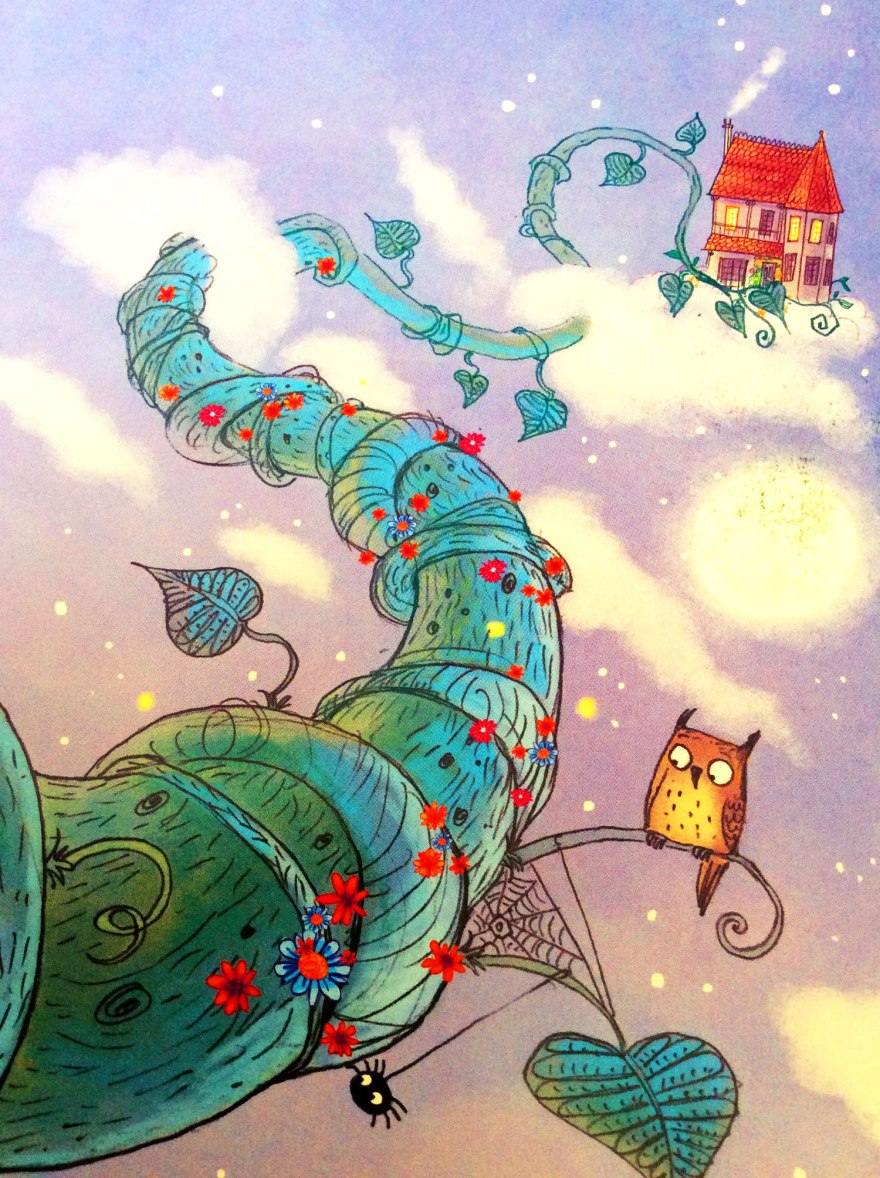
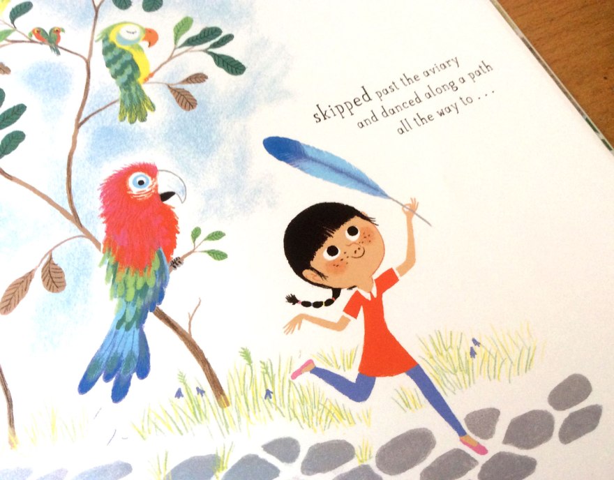
The reason I thought I’d mention this week’s visit to this literary colloseum, was because of a current, lovely little surprise I’d happened across that I think needs a little shout out. Naturally, my feet had auto-piloted to the children’s floor (not department, floor. A WHOLE FLOOR) where I discovered the most beautifully displayed arrangement of sketchbook and back up work from Nobrow’s ever talented, William Grill.

will_gril_01

will_gril_02

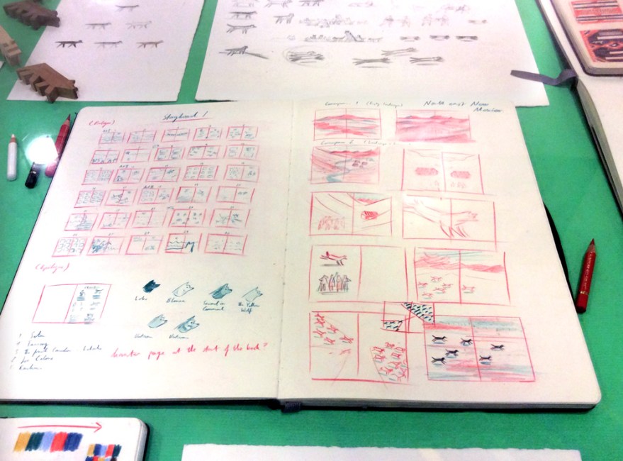
Now on his second publication with Flying Eye, Grill’s backup work astounded me by it’s sheer elegance. I’m not really a gallery guy, I don’t think illustration should be kept on white walls or in glass cases, but this small collection, was just enough and was displayed perfectly to give insight into the adoration of drawing that’s so apparent in his books, without any pretension or grandia. Grill’s doodlings and planning were methodical and detailed, speaking with the same delicacy as his finished penciled books and is painfully neat and organised.

will_gril_03

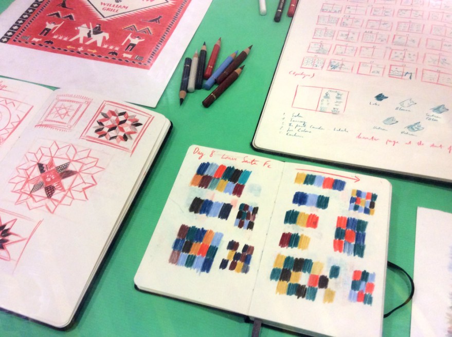
If the exhibit hadn’t been so carefully designed; the tools of his trade and collected samples of inspiration scattered amongst his working pages, I’d probably have had some kind of breakdown at the lacking visual power of my own, heinous behind-the-scenes. But I digress, if you are in the area (or lost/ following a trail of thread in the labyrinthine bookshop) I highly recommend checking out these snippets of genius. It will make you sick with envy, but such is the nature of Nobrow’s artistic catalogue.

will_gril_05

So, having spent several hours browsing, drooling and drawing a yak in a hat in Waterstones, I thought it was probably the wise move for my wallet to move on.  So I did. Right into multistory bookshop numero deux: Foyles. Which actually brings us to the main purpose of my London exercise in bookstore-navigation.

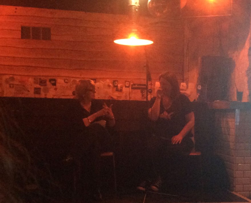
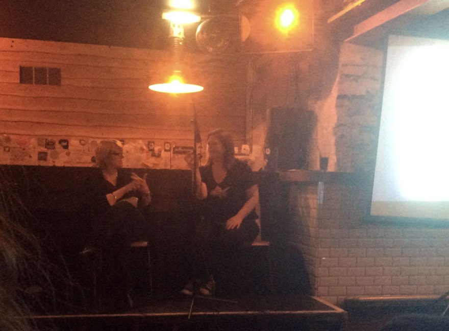
The good people Foyles had been illustrator collecting, and kindly (and reasonably, at only a mere £5 per ticket!) thrown together a lineup of top quality talent for a panel discussion event: The Power of Pictures. It was little wonder that the event was packed up to the rafters with an all start cast of Benji Davies, Jean Jullien, Marion Deuchars and Oliver Jeffers. Those of you who are familiar with the works of these contemporary picture book giants, will understand what a fab mix of approaches this panel represented and there was no way I was going to miss out on this, simply because I happen to live three hours away. Oh no.

POP_01

I’ve attended a lot of talks and lectures from talents within the arts, and panel events are by far the most successful in my opinion. Lectures can easily fall into an overview of one career, which while interesting on a personal level, they can fail to get into the meat of what is IS to make successful commercial art.

Yet this event did just that. Featuring talents from all over the spectrum of the, once shamefully named ‘commercial’ arts, these four powerhouses of creativity have all ended up in the field of picture books and each spoke with a unique voice (both visual and literal) that channels the experience of their past works.

Yes, of course the basics were covered. The topics of ‘style’ and the questions of best visual mediums; the digital means vs traditional debate, yet with a string of different opinions and experiences involved, The Power of Pictures was able to extend further than the realms of an ordinary lecture may allow.

“For me, it’s not so much a strategic decision, but more of a guttural reaction to what is suitable”

– Davies on artistic material

The insightful discussion branched into all aspects of the picture book field, from creation through the publishing process to the more practical aspects of the market and its constant progression. Each members’ approach to the field seemed to tether their visual styles to them and, in analysis of their thought process, they all offered insight into the vital hows and whys their work has reached the artistic notoriety that they all respectively have.

The art of storytelling has truly ceased to be about simply nice pictures to accompany authored words, and become about the artists’ personal approach to storytelling. Traditional artist, Jeffers insisted that book illustrators are trying to “buy immortality”, as it allows their own ideas to exist instead of working to illustrate a company’s brief in a manner akin to the fine artist. The, previously editorial, Deuchars saw all commercial arts as a form of selling, it was simply the content that changed: “…[ book illustration] is not selling a product; you’re selling a story,” And unsurprisingly, the very graphic Jullien spoke in the true voice of a designer, assessing any story as an exercise in “problem solving.”

POP_04

“Obviously you don’t have to illustrate the words.”- Deuchars

Clearly, there is no particular correct channel here, as all four approaches have lead to beautiful, successful children’s books; each with its own unique credit. What became clear was that all four artists did agree on one vital point: that their book work was in no way tailored to the audience in a way that compromised themselves. While there were little guidelines in creating for children (Davies’s shared anecdote of being encouraged by publishers to lose reality’s logical whale size for the sake of the story’s progression in his beautiful The Storm Whale) each member of the panel never felt they were trying to reach into an unfamiliar head space. Far from it. While their books are all enjoyed by children, none considered this a particular driver in the execution of such works. In fact, there was an agreement that it would be counterproductive to attempt to enter the mind of a child, as it brings restrictions to your readership.

“Writing stories for children, you really have to switch the left brain off.” – Deuchars

POP_02

Jeffers refuses to acknowledge his works as children’s books at all, instead plumping for the term ‘picture book’ so that there can be no division; he makes his books because he wants to, which differentiates such works from his previous commercial endeavors. Jullien too, asserted that to try and artificially enter the head space of a child would be to talk down to them, creating a dividing and inauthentic story, a point seconded by Davies.

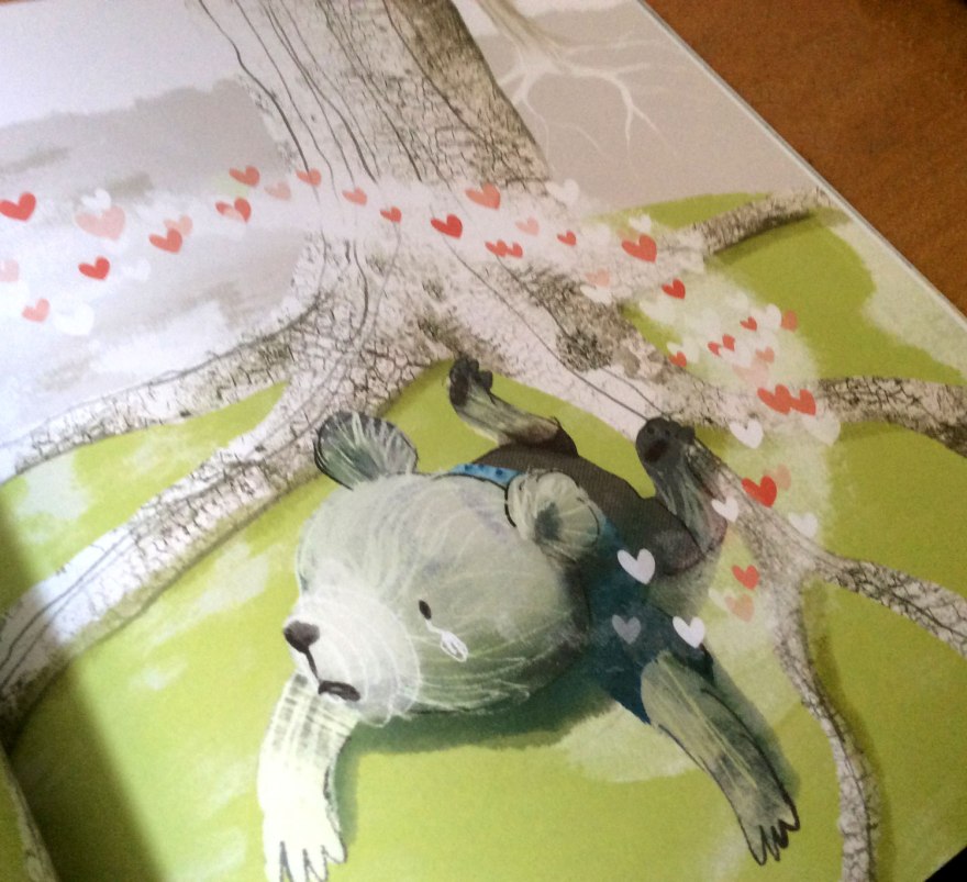
It was , for me, Deuchars who hit the jackpot regarding this question of readership, with an assertion that stuck with me throughout the rest of the night. She claimed that in creating a story, the key is conveying emotion; and if that has been done correctly, the age of the viewer is irrelevant. As a constant analyser of my own visual narratives with a view to assess where their strengths and weaknesses may lie and why, I found myself unintentionally nodding along like a plastic bulldog in a shopping trolley. In my experience, social understanding and emotional empathy is something people almost always have a handle on, regardless of age, knowledge or experience. I believe that to tap into that IS to communicate, and in my practice I think I will always drive to do this as successfully as the current market’s dream team that sat before me.

From here, the discussion traveled through question’s of collaboration in storytelling and the pros, cons and preferences of working with authors and other creatives. The self-assured Oliver Jeffers seemingly adored the exclusivity of indulging in his own, unique creations, yet positively acknowledged the impact of working alongside a good editor. Often considered a lonely practice, analogies were flying as the illustrators attempted to verbalise their feelings towards collaboration. Davies likening it to creating a film in which “you have to play all the roles” and Deuchars, considered it the chemistry of a marriage. Jullien, as one might expect from a designer, wholly relished the practice of bouncing off of other practitioners as it “pushes [him] to forget [his] own uncertainties.”

“It takes the right people to show you the way”- Jullien

POP_06
My own rushed,half-baked attempts to capture my heroes, while wildly scrawling to capture their wisdom. Massive apologies to Benji Davies. You don’t really look like Brian Blessed.

The closing topic of the night, was another that seemed to bring unanimity to the diverse opinions of the panel. I was surprised and overjoyed, that it was a feeling that I had come to hold very strongly myself in critiquing my own work: that the designing of a character held the key to any story.

It sounds so self explanatory, yet in a sea of beautiful artists making beautiful books, it’s easy to forget the basics in lieu of making a more expansive, original or beautiful image. While many discussed elements of the panel’s practices had depended on individual preference, this really seemed to be a non negotiable. To have a character was to have a story. The team were all in agreement that they had labored over getting the look of their protagonists right. From Deuchars demandingly ‘drawing a bird doing yoga’ to ensure she had the movement right, to Davies laboring over each pixel to ensure the eyes were in exactly the right place, the look and feel of a character is the key to that vital emotional engagement. Jeffers and Jullien were in agreement that in removing facial details, character simplicity can bring you the freedom to create the emotions you need to evoke and I was reminded of Alexis Deacon’s similar assertions at masterclass event I attended a year or so ago.

“One Pixel makes ALL the difference.”- Davies

POP_03

Ultimately, I left London that night buzzing with inspiration. The panel had all shared their plethora of approaches to the same practice with honesty and analytical insight that I felt truly engaged in the life of picture book illustration. Each practitioner stepped to a different tune, yet each had developed a unique and curious visual distinction to call theirs.

“Illustration is about what you, the illustrator, choose to focus on.”- Jullien

Their paths had been carved from confidence in their own convictions and an understanding of their visual language. Instinct undoubtedly plays a role, but they had not simply drawn things to be pretty, instead analysing and laboring over what they had wanted their images to convey. The world of words is a separate beast to the language of pictures and the work of each of the panel artists is a perfect illustration of the vitality of combining the two with intelligence and intent. For me, Deuchars had summarised the secret to story telling in picture books with a comment on character, accurately asserting that ‘without a character you can make a beautiful book, but you don’t emotionally engage in the story.”

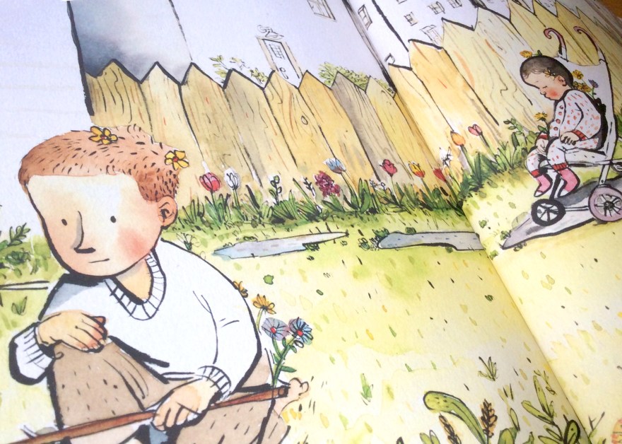
I thought back to Grill’s wonderful pencil landscapes in Waterstones, and had wanted to disagree. But while Grill’s landscapes ARE utterly beautiful, they are just that – beautiful imagery. It could be the biases and figurative subject of my own work talking, but for me, the work that sang in that glass cabinet (and indeed the pages of the finished article) were his working sketches of the dogs, his loose depictions of the people, his developments of the characters.

will_gril_04The landscapes were made MORE beautiful by the figure of a husky gazing out towards them, because suddenly, I was engaged. The involvement of character invites narrative to a scene; it asks for emotive understanding. Characters make a book a book. Without them, Grill’s could have been very attractive non-fiction. A quirky, historical workbook. With them, it is an engaging, contemporary retelling of historical tales.

Not that, I hasten to add, beautiful workbooks would be anything to sniff at, of course. Non-fiction in it’s original, un-narrated form is still a valued and important member of the bookshelf, but it is a separate beast from a story book. And it was just that: the passion for story books; for narratives and characters that packed out the Foyles auditorium with people from all around the country that evening.

POP_05
The obligatory book signing 🙂
POP_08
My new book adds Benji Davies to the list of illustrators whose signed works I own 🙂 Review will no doubt be on the way soon.
POP_07
I own signings by Jeffers and Davies, but noticing them on a quiet spell I nabbed Jullien and Deuchars to ask if they’d like to deface Davies’s book. They said they would 😀

Once more, I am reminded how wonderfully diverse this picture book bag is. All approaches are entirely different and equally valued. There is space and place for every kind of book these days and the vast shelves of these wondrous bookstores are brimming with talent and creative magic. You don’t have to draw the words. You don’t have to have words. There are no hard rules, aside from simply caring and investing in the subject.

POP_09
Deuchars magnificent approach to character development-make Bob do yoga, and Davies’s perfectly aligned eyes to capture the right expression

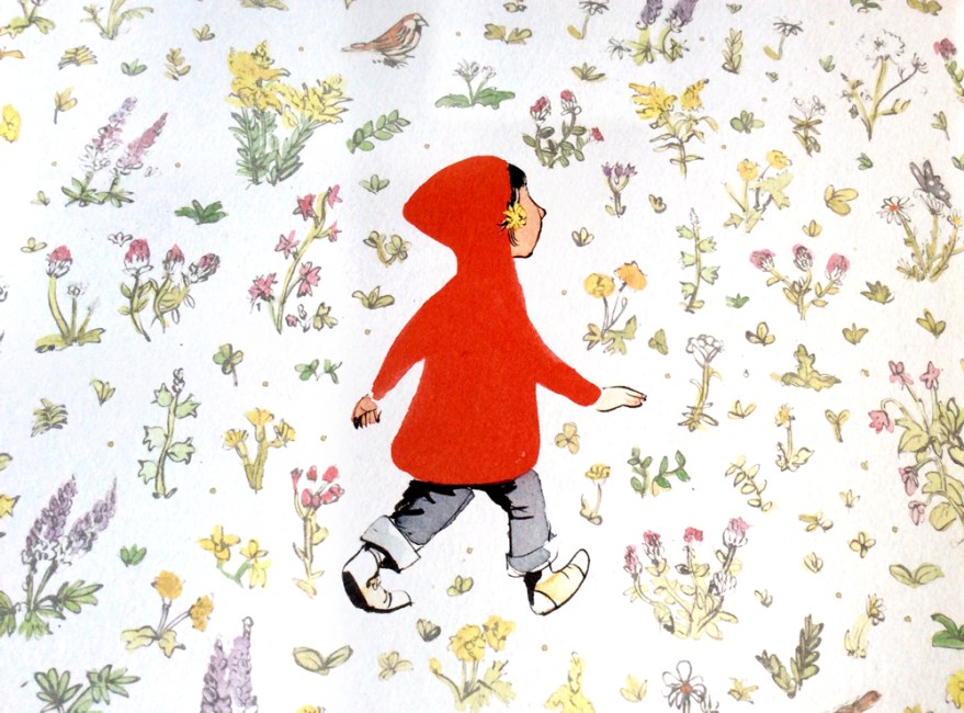
And the results are numerous, surprising and precious. There is emotion, there is character, there is always narrative. This week I have again been reminded of the real power of pictures. In all their glorious forms.


Book Club Review – Footpath Flowers

swf_cvr01

Author: JonArno Lawson

Illustrator: Sydney Smith

Publisher: Walker Books

Those of you who have touched base on this blog before, may remember my comparatively recent, tentative steps into social media and the resulting fun I was having finding my feet on Twitter. Well this weeks review is a refreshing wildcard, courtesy of this digital exploration. Basically I won a thing! Horray!

Yep the Gods of the internet randomiser were kind to me, and have landed me (via the very good -incredibly generous- people at the review site; PictureBooksBlogger) today’s lovely little number from Jon Arno Lawson and Sydney Smith; Footpath Flowers.

I was delighted to win, having spied the quirky, inked artwork somewhere on the web before and found then that I was immediately drawn to it’s comic-book esque format.

swf_inn07

A keen observer and participant of both the indie comic and picture book scenes myself, I’m always intrigued to see the style of comics that make it into the hands of the mainstream UK publishers. In recent years comics have well and truly risen from niche market or weekly funnies, right up to the ranks of ‘established art form’ and I’m delighted to see how often they’re now employed within the children’s market to tell all manner of stories; not simply those featuring pants and tights.

swf_cvr02

Sidewalk Flowers is a perfect tale to utalise the format of sequential art. Wordless and serene, the book follows a simple journey of a girl and her father. Narration without the fall back of words is no mean feat, yet the simplicity of the tale allows the little nuances and characterisation of Smith’s artwork to really shine, bringing the subtle beauty of Lawson’s tale to life.

swf_inn02

During their stroll, as Dad goes about his business, we see our own Little Red Riding Hood gathering flowers and weeds from all the available avenues of the city setting, distributing them as she deems fit.

swf_inn04

It feels wonderfully reminiscent of my own, and – no doubt – many other, past and present, childhoods; gathering sticks on walks with the family and finding hidden games and treasures in between the act of walking. It captures that childlike focus on the minutia and their, often surprising attentiveness to their surroundings.

swf_inn09


The joy of this childhood freedom is highlighted by the father, who is unaware of his daughter’s growing treasure trove and little acts of kindness; he sees only the tasks at hand – caught up in the world of adult errands and the day to day.


swf_inn03

Smith’s art is beautiful. Full stop.

Told from the eye level of our keen-eyed protagonist, the story captures the land of a child’s city through cropped compositions. We don’t know what dad is up to particularly – that’s just boring adult stuff, the real joy is way below eye level.

swf_inn05

This monotone, city setting is a stunning visual juxtaposition to the wild garden Little Red builds as she unearths her surprising bouquet from all around her. The urban palette of black and white with the splash of vibrancy from our little gardener’s jacket begins to fill with the whole inky, spectrum as the bouquet grows and the innocent delight of childhood generosity is distributed around the city.

swf_inn08
The joy of giving breathes life into the monotone city.
swf_inn10
Lucky recipients of the wild flowers of Red’s gatherings. The joy of giving has spread into a full colour world by the time she returns to her own, warm garden.

Now I’ve said it before that I am in no way adverse to the use of digital means in creating children’s books; and art in general. However, I am more than happy to admit that there is something refreshing in Smith’s seemingly unedited art style. Ordinarily a fan of collage and texture, here is nothing but ink, and the scanned traces of the watercolour blotting paper beneath it. It has a traditional charm as a result and feels almost vintage; perhaps in part due to the subject matter causing me to reminisce so much about my own errand-adventures!

swf_ends
The story is enclosed by a set of beautiful, garden end papers.

Either way, it’s a good reminder of the increasingly artistically-inclusive picture book market. Both traditional and contemporary approaches to art are finding their way into our children’s hands, offering more and more of a comprehensive understanding of imagery. For little eyes still making sense of things, this access to such a expansive and varied gallery within the bookshelf seems pretty exciting to me.

Print is dead? Give over.

But the joy of this book, certainly for me, isn’t as shallow as pretty pictures. As ever in picturebooks, the narrative within the image is the battery of it all and Sidewalk Flowers is a beautiful celebration of discovering just that: the narratives and hidden joys found within the little things.

swf_inn06

For little kids it’s a reaffirmation of the world’s hidden games, and for us, older kids, it’s a reminder to stay observant. Errands are boring. But they don’t have to be, I for one would like to spread a little bit of colour.

swf_inn11


Book Club Review – Never Tickle a Tiger


Welcome back to book Club! And by book club, I mean let’s-all-listen-to-what-I-have-to-say Club!

With books!

But seriously, if anyone has any comments on any of these reviews, be it agreements, disagreements, analyses of their own, or criticisms of my thoughts, I’d really, seriously love to hear them. You can leave a comment below, or you’re welcome to contact me via email, twitter or facebook.

tigertickle_cvr01

Author: Pamela Buchart

Illustrator: Marc Boutavant

Publisher: Bloomsbury


So, this time we have the colourful cautionary tale from Pamela Buchart and Marc Boutavant: Never Tickle a Tiger. I’m really not trying to play favourites here, but this is yet another gem brought to you buy Bloomsbury. Hat’s off to those guys who have been really busting out a cracking number of great titles in the past few years that are clearly right up my street! I promise to diversify more in the future, but this one really does need a mention!

A charming and vibrant cautionary tale, Never Tickle a Tiger opens with our introduction to Izzy; a fidgeting, wiggling, jiggling little girl who just CAN’T sit still! Warned and chided by jut about everybody around her, Izzy is that well-meaning but incomprehensibly over excitable little person we are ALL only too familiar with.

tigertickle_inn11

Her character is brilliantly identifiable to children and parents alike, brought to life with Buchart’s lyrical and whimsical writing style.

Cascading lists of alliterative, onomatopoeic adverbs capture the bounding lightness of our little protagonist, the text and images dotted around the page in an erratic layout that brings movement and life to the spread.

tigertickle_inn09

tigertickle_inn13

So what’s a girl to do when she simply can NOT sit still, no matter how many times she’s told? The story explores the angel and devil complex in near-on every kid’s head. The trained desire to be good and do as you’re told, VS the often much stronger curious NEED to explore the scenario in question yourself, learning your own lessons – for better or for worse – first hand. Because would it REALLY be so bad…to tickle a tiger…?

tigertickle_inn08

What’s so wrong with fidgeting anyway?

The page design of the pivotal moment is inspired. Short, snappy lines of text and sequential images capture and build Izzy’s sneaky, creeping movement to the forbidden enclosure, only to stop it dead with one full spread on her arrival.

tigertickle_inn07tigertickle_inn06

Boutavant’s illustration here is perfect. The drama of discovery is communicated through the uncharacteristically bare enclosure, the focus being on the majestic, sleeping beast within. Izzy is poised mid-movement in a comically ‘rabbit in headlight’ pose as she gazes up, feather in hand at the forbidden tiger.

tigertickle_inn01

As in all good cautionary tales, the fallout from Izzy’s failure to heed her warnings is rewarded with a hilarious domino effect of chaos; throwing the entire zoo into utter disarray.  The pull out, quadruple spread format here echoes the expansive explosion of madness and offers a great bit of novelty tactility and you open out the full extent of Izzy’s mistake.

tigertickle_inn04tigertickle_inn03

The vibrancy of character we’ve come to expect from Boutavant’s work really emphasises the fun of this bright and whimsical tale. Although less neon in palette than previous illustrations we’ve known him for, each animal in the zoo has a real attitude and life that compliments and enhances the madness.

tigertickle_inn05tigertickle_inn12tigertickle_inn02

Their reactions to Izzy’s unquenchable curiosity are delightfully humorous and  cheeky details such as a little, hidden hedgehog give every scene a little added magic, independent of the main story.

tigertickle_inn10
Small and adorable, find the hedgehog adds an additional game to the reading experience.

Ultimately, Never Tickle a Tiger is a great bit of fun. I love Buchart’s lyrical text and the life and hart it brings to such simple narrative format and Boutavant’s bright and playful illustrations really capture the sense of quirky madness. A brilliant cautionary tale for all those little Izzys thinking of embarking on some tiger tickling any time soon.

… not that they’ll listen anyway, of course.


The Anatomy of a Piano: A historical dissection

Good news! I have friends!

Yes, after the sorry state of affairs that was being a little lone larry back in December of last year, things looked like they were getting pretty desperate. BUT NOT SO! Disparaging loneliness aside, I couldn’t deny how much I had enjoyed my little flirt with the universe of children’s theatre, and this week, I was offered (yes offered, by real-life friend people!) the chance to step back into the stalls in the Bath Egg for the curiously enigmatic The Anatomy of a Piano.

anatomy_piano_03

My favourite way to approach any piece of dramatic or performance media, is to do so with absolutely no preconceptions. If I can avoid it, I do no research and I enter with the glorious naivety of an open mind, before it can be sullied by any further knowledge or expectation. I think this approach is probably even more poignant for a children’s production. It’s my, uncompromisingly adult, attempt to revisit the limitless possibility of the imagination of a little one; exploring everything for the first time with no prior understanding of what it might or should be.

So, armed with nothing more than the title and the knowledge it had made a solid debut at the Edinburgh fringe, my companions and I settled with absolutely no understanding or expectation.

When I was a boy, I wanted to be a Space man.


While a bit of a veteran with children’s media, theatre is very much a new frontier for me. I honestly did not know what to expect, but I certainly think I was surprised by what I found. It was a performance, certainly. A wonderful performance from a remarkably talented pianist (go figure), Will Pickvance. But, as the boundaries between contemporary media continue to merge in increasingly surprising manners, it’s entirely unfair to think of The Anatomy of a Piano as mere recital. However brilliant a recital it may have been.

An educational piece? Yep, it certainly ticked that box, our one man band managed a concise tour through the historical landscape of the piano, from it’s earliest ancestry to more familiar ground, stopping off on the way to acknowledge the fathers of piano musical development as he did so. Accompanying the history were simply scrawled, projected slides and a biological script that introduced the title’s scientific dissection into the mix. A faux lesson in which historical development was explored through the anthropomorphism of the instrument.

anatomy_piano_01
Evolution. You know, in pianos and giraffes.

Unsurprisingly, the score was a sensational accompaniment, bringing each era to life with a rich journey through their musical trends and the key developments brought about by a small number of the most pioneering of composers. In caves.

Obviously.

But no, it wasn’t really a ‘history lesson via recital’ kind of deal either. Pickvance’s curious, autobiographical opening set the conversational tone that escaped the traditional educational shackles too. Confiding in the audience his young disappointment at Father Christmas’s inability to provide a spaceship as requested, Pickvance quickly formed a relationship with his audience, inviting the playful interactivity of audience participation. From counting down his attempted piano take off, to desperately trying to answer questions to the frustratingly teasing responses, The Anatomy of a Piano engaged children with the effortless humor and fun of your favourite, silly uncle.

I don’t like instructions.

But naturally, I couldn’t comment on the engaging, delivery prowess of Pickvance, without giving equal praise to his counterpart. With the guidance of the, self titled instruction manual, Pickvance accessed the piano’s wide range of audible possibility, creating the emotional and dramatic emphasis to the performance. From the building quibbles of the early take off, to an immediately understood representation of ice cream, the piano set every stage of our journey entirely through sound. I found it reminiscent of the televised version of Rayman Brigg’s The Snowman, in which the perfect score does to much of the talking.

But for all the musical talent, for all the engaging history, for all the cleverly devised musical drama, I think what struck me the most, was the entirely played down, simplistic and mature nature of the play.

I reckon it’s a common assumption that in order keep a child’s attention for 55 minutes, there’s a requirement for bright colours, over enthusiastic tones and bouncing presentation. The low budget charm of an empty stage, a man in a jacket and his upright piano seems a thousand miles away from the vibrant, Ceebeebies presentation you may expect.

anatomy_piano_02

Well, that and the piano disco at he end. But you can’t deny the magic of a closing piano disco. Who doesn’t want to go out with a bang?

But surprising or not, the delightfully mature and simple presentation was all that was needed. Admittedly there was a few minutes or so towards the middle when my fellow audience members started getting a little fidgety and I thought that perhaps the simplicity of the show may have run it’s course.

But I was entirely wrong. A little humour, a sing song to flawless music and the perfect touch of just enough ridicule of outdated yet familiar methods of teaching, and the kids were back in the palm of his hand. The littlest loved the silliness, entranced by the cunning, often comical use of piano to develop a sense of place, and their eagerness to participate. The bigger ones identified with observations of boring, forced piano lessons, threatening all the life the show had brought to the instrument and reveled in the off-beat, biological retelling of historical development.

I don’t how to classify The Anatomy of a Piano as anything other than pure performance. It was talent, it was humour, it was fun, it was learning. It was everything it should have been, whether I knew what that was or not.

Curious and simple, it’s a tale of love and talent and has absolutely convinced me that a piano is light years better than a spaceship.

Book Club Review – Have you seen Elephant?

seenelephant_cvr_05

Author & Illustrator: David Barrow

Publisher: Gecko Press


I happened across this little number while meandering through the web on an unrelated mission. I was drawn in to the, seemingly quite small, release by the curious nature of Barrow’s illustrations. He too has joined the ranks of the dirty digital army, utalising thick and organic looking textures and splatters into a digital landscape.

seenelephant_cvr01

As I’ve said in previous posts, purists flying the flag of ‘authenticity’ may scoff at this process, but let’s get real. The results are still beautiful and times have changed. FOR THE BETTER.

The illustrative possibilities are endless with the mouse at your fingertips, and I think Barrow has done a cracking job of proving that the digital pencil case is more than capable of capturing the heart, charm and ‘happy accidents’ (however contrived) of any paintbox.

seenelephant_inn11

In it’s entirety, Have you seen Elephant is a story about finding elephant. Job done.

‘Would you like to play hide and seek?’

In the enigmatic manner we expect and embrace from children’s tales, Barrow makes no attempts to establish or formulate the origins of our curious playmate’s visit. And rightly so, the logic and reason behind why or how is joyfully irrelevant. This is about a game, be it real or imaginary…or even somewhere in the middle.

All that matters is that we, alongside our un-named seeker, have been very kindly invited to play in the very first spread. So who are we to decline?

seenelephant_inn04

Singing to the same tune as the talented  and oh so trendy Klassen et al, Barrow’s approach to narrative is one of ‘less is more’. The short narrative follows a classically simple procedure as our seeker explores room to room of his house, hunting desperately for the cunning elephant, eluded by the creature’s hide-and-seek prowess.

‘Not under here…’

As ever, the richness of humor is what keeps this simplicity fresh, and Barrow keeps the hand-scrawled text sparse, instead building our little character’s personality visually, with the pleasing offset of image against word.

Offering a delightful frustration for readers, the incompetence of our seeking protagonist is developed through his mutterings of clueless asides, establishing his oblivion to the, very clearly positioned, elephant in the room.

seenelephant_inn03
Our dear little seeker searches in entertainingly improbable places. There’s a really innocent charm about searching for a large elephant in a small plant pot. Not sure I could get away with it though.

The addition of a silent, clued in mutt, the classic device of the underappreciated sidekick, emphasises our protagonist’s inability even more, boosting the funnies through a little sub narrative for the keen eyed reader to decipher. Similarly, the latter introduction of animals, hidden in the minutia of the environment deliver more seeking opportunities for readers.

seenelephant_inno5

‘I can’t find elephant’

I would have loved to have seen this quality developed further, with background creatures and interactions turning each page into it’s own game of hide and seek. As it stands, a lot of the spreads push the less is more approach a little too far, with only the base components of our hider and seeker and simple environmental touches.

For me, this dilutes the humor of the search when little more other than the core joke is offered from spread to spread, again and again.

seenelephant_inn10
The invitation spread is a favourite of mine. I love the little, background  suggestions of family life that set the scene perfectly, while offering snippets of detail about our seeker’s life.

seenelephant_inn06

That said, the art IS beautiful. Those textures bring a coarse, accidentally-on-purpose mess to the environments and an inspiring set of sunset colour palettes that don’t fail to delight as every page turn reveals a new one.

While the palettes are vibrant, the simplicity of content in every spread create a quietness that carries through the book. Environmental calmness is not at all a bad thing, although here there’s almost an overarching feeling of darkness within the artwork that seems to lean towards lonesome.

seenelephant_inn08seenelephant_inn01

The scenes feel quiet, almost a tad morose and there’s a suggested lack of interest from our seekers family in him or his activities. Heavy lighting in the artwork create dark, almost sinister shadow work which, while beautiful, seem to extract the ‘fun’ from the game.

Even the opening invitation from the elephant, drawn with a   very close positioning of elephant’s face as he warns us ‘[he’s] very good’, does have an almost cautionary air to it.

seenelephant_inn09

‘I must warn you though, I’m VERY good.’

Don’t get me wrong, I’m in no way against a darker quirk in children’s books.

My position is that children are pretty hardy and more than capable of deciphering and enjoying more ‘grown up’ looking art styles, a bracket in which I would place Barrow’s work .My only concern in the context of this book, is that I can’t tell if it’s supposed to feel quite so lonely or if the heavy colours and sombre emptiness are simply a slight misjudgement.

seenelephant_inn07

Either way, it is still a joy to look at. And any sense of the macabre are certainly circumvented by the book’s delightful close. Elephant is a gracious playmate and and the tale remains a great example of good, clean fun of children’s games.

seenelephant_inn02

Perhaps if you were desperate to attribute a deeper moral to the tale, you could expand on the lonesome family unit. The lack of human companionship that drives you towards animals.

You could spend your time getting caught up in the perception of elephant’s surprising, opening boast that ‘[he] is very good’. You could assert not to judge a book by it’s cover, that even thought he is large, perhaps he IS good at hiding.

You could say a lot of things.

You, know. If you wanted to.

Personally, I wouldn’t trouble yourself with it. For me I can’t find Elephant is most enjoyable when seen as exactly what it should be. A  good bit of old fashioned, nonsensical fun.

And isn’t that what being a kid is about?

Book Club Review – Kiss it Better

bearkiss_cvr_03

Author: Smriti Prasadam-Halls

Illustrator: Sarah Massini

Publisher: Bloomsbury


I think it’s important to begin here by noting that a book with the word ‘kiss’ in the titles, adorned with hearts and cuddly bears is not my usual choice when browsing the shelves of the kids section.

It’s pretty fair to say I am not the saccharine type, and tend to learn towards picture books that come with a sense of quirk, adventure, humour or, dare I say it, even a touch of darkness?

That said, I was drawn to this one initially by the beautiful, elegantly drawn characters on the cover. The quality finish on the thick, textured paperback, coupled with the tasteful touch of the title foil, made it feel like a product of real quality when I then came to pick it up. I was sold on the cover, and began to flick through it.

bearkiss_inn10

Kiss it Better is exactly book you expect it to be. Classically inoffensive, tender, loving and heart warming throughout, its what I tend to think of as the perfect grandparent book. Prasadam-Hall’s cutesy poem, champions the power of  family and love in conquering the day to day perils of young childhood in a series uplifting and feel-good couplets. From bruises and bumps to the fears of leaving mum and the playground gates, Prasadam-Halls  captures a number of common fears for little ones, reassuring readers that strength and comfort is always found the family unit.

bearkiss_inn01bearkiss_inn08

Geared up towards the 2-4 age bracket, I think Prasadam-Halls does a great job at tackling the most relevant problems for children of this age, taking the first steps towards independence. Personally, I’m not quite sold on the use of poetry, catching one or two slightly forced rhymes that, for me push the limits of sweetness just a little too far into the diabetic danger zone. It’s, naturally, a thing of taste, but I can’t help but think of the parents reading this one at bedtimes, and feel it could be something of a one sided relationship. Completely relevant for the child, yet potentially not quite such a pleasure for the adult of the bedtime routine.

But of course, heartwarming tales of reassurance ARE most necessary for children who do worry, and Kiss it Better  does a great job at preemptively tackling young-perils with Mumma bear’s aresenal of types of kisses for every occasion.

bearkiss_inn07

Its also important to note that, while a touch on the ‘safe’ end of things, I enjoy this book. I really enjoy it, for the very same reasons I picked it up that afternoon in that bookshop in Bath, against all my cynicism.

Massini’s illustrations are utterly delightful. Her anthropomorphised characters are charmingly animated protagonists, filled with character. Their faces are simple, yet so elegantly drawn that they effortlessly communicate all the genuine love of Prasadam-Halls’s tale. In a book where the poem gives nothing away as to the character specifics, Massini’s interpretations seem to perfectly capture the heart of the story.

bearkiss_inn04

Their charmingly vintage wardrobe and soft palette gives a real personality to the book that elevates it visually to something a little more interesting than classical cuteness. Or I’m just a sucker for a bear in a hat.

bearkiss_inn02

Similarly, texture and rough painterly marks give the images a real depth and bite that set them aside from the more classical, painterly illustrations you may associate with a traditional children’s book. The rough and ready touches add a quirky, offbeat life to the pages and the clearly considered-to-look-unconsidered scatterings of hearts bring it all together into an image that’s contemporary while still drawing from suitably, classic influences, all in the soft, pastel palette.

The location of our story are also moved along within the visuals, as we follow our family from the fairy tale, forested home, to the schoolyard to family holidays away at the beach. This seems a really strong visual device for the book, not only to allow for Massini to emphasise her retro styling (these bears know how to ROCK that rockabilly bathing suit look) but more importantly to allow the strength of the family unit to shine. Childhood woes can appear anywhere, but wherever they may be, a kiss from Mum, a hug from Dad or a bit of generosity from your sister will save the day.

bearkiss_inn06bearkiss_inn05

On top of the strength of the illustrations, I think the design overall is equally well executed, with a good combination of full page imagery interspersed with spot, sequential images. The flow of the book is kept well without pages becoming too samey and the fluid layout of the text gives creates a real movement in the reading that carries you through the poem with ease and grace.

bearkiss_inn09

Sure, Kiss it Better may not be my cup of tea entirely, but it’s a beautiful and heart warming read without a doubt. The prefect ‘safe’ book for the picture book traditionalists and romantics among us, this title knows it’s audience and I think the dependence on family values is something we can all appreciate.

bearkiss_inn03

While there are increasing numbers of boundary-pushing, quirky and, dare I say, post modernist picture books gracing the contemporary market, I think it’s really important that more classic, uplifting reads like this one remain on our shelves. The world of the picture book market is vibrant and versatile and it’s vital it continues to offer something for every taste. Especially when the quality it this high.

Well I’m suitably warm and fuzzy, who’s for a hug?


Book Club Review – A Beginners Guide to Bear Spotting

bearspot_cvr

Author: Michelle Robinson

Illustrator: David Roberts

Publisher: Bloomsbury


Planning on going for a walk in bear country?

Well, Michelle Robinson and David Roberts have it covered. And frankly, if I’ve taken one thing from this entrancing Bloomsbury number, it’s that I probably wouldn’t recommend it!

bearspot_inn2

With the guidance of the unseen narrator’s reassuringly authoritative instruction, our silent, somewhat gormless, protagonist is led on his safe and correctly passage through the obstacles of bear country.bearspot_inn11

Er…or that is until the bears get in the way.

As the sorry little blighter walks further into increasing peril, Robinson’s narrator enthusiastically observes the scenario unfold alongside the reader, instructing accordingly based on the, ever so helpful bear spotting guide.

bearspot_inn6


What’s so charming about the tone of this book for me, is that it somehow seems to harbor a really classic British-ness. Not only is it impossible to read the text in ANYTHING but the most polished of Queen’s English (the narrator, for me, was undoubtedly voiced by Stephen Fry. Maybe Attenborough at a push) but the humorous, narrative voice hints towards that mocking depreciation of authority that is somehow unique to British humor. The subsequent disasters our unprepared hero befalls, at the hand of the useless instructions relayed by an, apparently knowledgeable authority, are somehow utterly delightful.

bearspot_inn9bearspot_inn8

Let’s face it, us Brits just revel in the shortcomings of others. It’s those cringe-making social failings in Gervais’s The Office; the deepening escalation of Black Adder’s wry truth embellishing, even the incrementally increasing fallout of Mr Bean’s slapstick clumsiness. Bear Spotting’s dry humour is a charming nod to the oh-so-British black comedy. (Or perhaps that’s brown comedy…)

bearspot_inn1
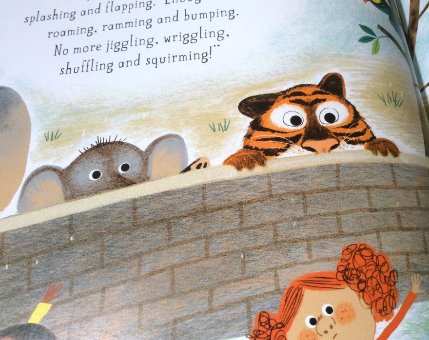
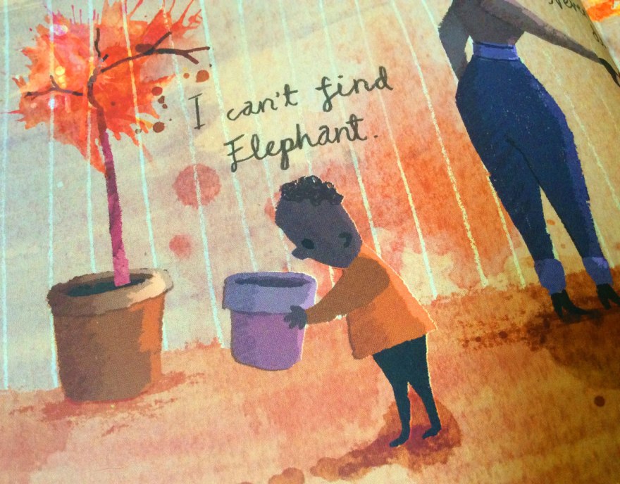
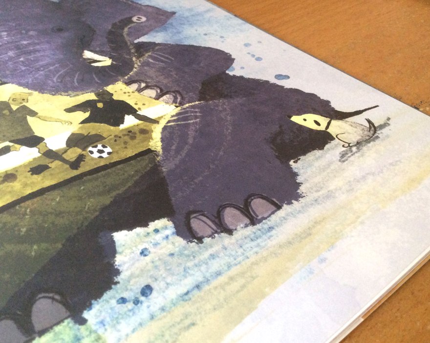
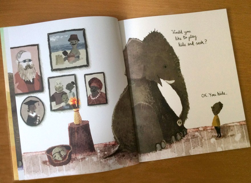
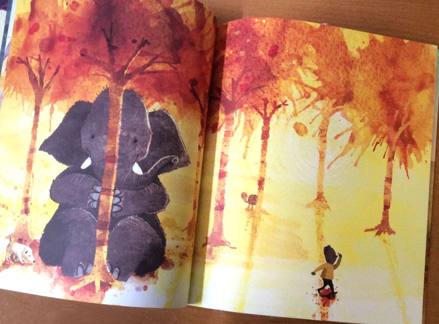
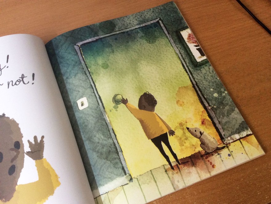
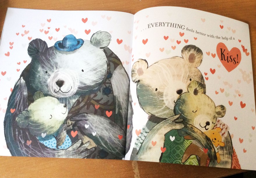
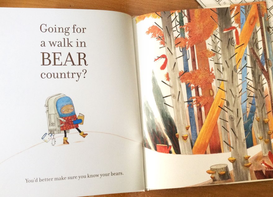
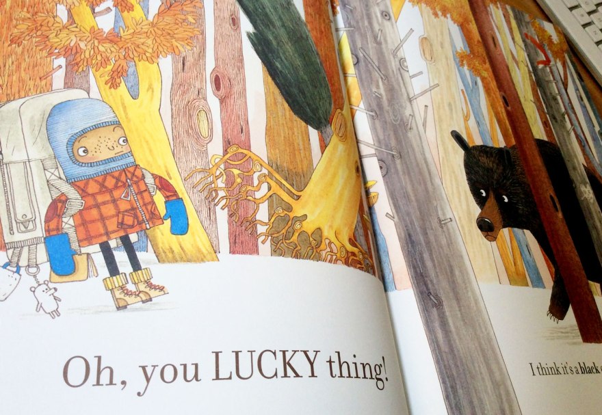
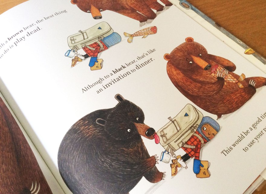
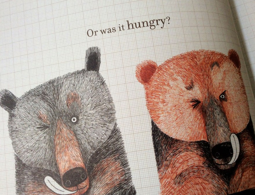
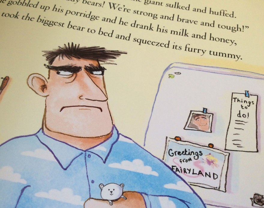
But, as ever, in a picture books the legwork is only in part down to the written content. While Robinson’s text is, frankly, inspired, the true, laugh-out-loud effect is only achieved with its application to Roberts’s exquisite illustrations. Pleasingly sparse pages, and a rich, autumnal colour palette allow our character and those bothersome, suitably menacing, bears are left to speak for themselves against the minimalist environment. Earthy tones and tiny, quirky details all come together in the formation of a weird and wonderful world where oven glove mittens are the obvious choice for an excursion.

bearspot_inn5Only the simplest components of a human face are visible under our hero’s inspired, vintage-look balaclava, yet the expressive power in accordance with our narrators exclamations are simply divine. Robert’s facial drawings are spot on, ensuring instantaneous recognition as to the feelings of our silent protagonist. Its a delightful excuse for little-uns to strengthen understandings of empathy and for us bigger ones, it’s really just very funny.

bearspot_inn12

As much as the absurdity is pleasing, I think there are a lot of reasons that Bear Spotting is actually a pretty intelligent children’s book. Not only does the silent figure demand a level of emotive analysis, but the format of the book as a whole is pleasingly subversive from the picture book status quo.

Once upon a time, books were words. Then pictures joined the party as the supportive side kick, echoing the text to reinforce the imagining in the readers mind. Then practitioners got clever. Imagery started to work together with the text providing additional details, or even showing a different reality to that of the words. Picture books subsequently became rich with narrative.

Bear Spotting is taking the next leap in the evolution of visual storytelling. Today, an all singing, all dancing new breed of pictorial-textual relationship has been emerging. Robinson and Roberts separate voices neither repeat nor subvert each other; instead they are two sides of the same dialogue. A reactionary book, if you like.


A short time ago, panicked traditionalists foresaw the death of books in place of the, more adaptive, games, films and apps. But seemingly picture books weren’t willing to give up so easily and new structural shifts have allowed for them to compete on the dynamic and reactionary plane. Our written narrator says jump, and our visual lead responds…rarely asking ‘how high’. Both have their own agenda and this interplay is the crux of the humour of this triumphantly absurd and delightful tale.

bearspot_inn7

bearspot_inn3
I love the text hidden under the ‘folded page’ of the guide.
bearspot_inn10
Creative use of capitals, bold and direction of the font throughout really gives the narrator a distinctive voice.

The simple conversation of the story is executed perfectly, without the book becoming long winded or overdrawn. The design faculty at Bloomsbury have masterfully laid out the pages into a perfectly paced and well balanced number and their exquisite use of typographic play really brings a life and enthusiasm to Robinson’s narrative voice.


In a time when picture books are offering as much ingenuity as the current market suggests, it is no mean feat when I say that Bear Spotting has probably been one of my favourite releases this year. I congratulate every single person who had a hand in this delight, and I look forward to seeing where we end up next on this path through the children’s industry.

But be sure to pack your teddy and a stick of gum, and never rely on Stephen Fry as an authority to guide you through Bear Country.

Book Club Review- The Princess and the Giant

Welcome everyone, to the very first of a BRAND NEW series to the blog! Woop Woop!

I make no secrets of the fact I am an ENORMOUS picture book nerd. I draw write, read, study and live them and you’re either lucky or lying if you say you’ve ever attempted a conversation with me and I’ve not slipped off into the realms of an illustration related ramble. My bookshelves are booming with all things pictures, so I’ve decided to introduce to the blog a new series of reviews based around the contents of my studio! Welcome to the Bagley Book Club, kick starting this week with The Princess and the Giant.

I mentioned in my last post, that I recently attended a very lovely book event in London, hosted by the indie publishers, Nosy Crow. Here I purchased a (signed, natch) copy of the next installment of the Princess and the.. Series. And yeah okay, I am cheating a little here, as the talk did allow insight into the creation of the book, but it’s my first review so I trust you all to forgive me.

warbie_5Author: Caryl Hart

Illustrator: Sarah Warburton

Publisher: Nosy Crow


So, let’s get to it! Following two already successful titles in the series, The Princess and the Giant sings to the same, whimsical tune. Our feisty, heroine princess – suitably cute, of course- is ever strong, albeit less comically obnoxious than that of the Princess and the Presents title, yet still brimming with life and charm. Her stoic determination to quell the furiously, grumbling giant above them using the home comforts of her own night time routine is bloomin’ adorable, offset with a hefty dose of humor and feist for a pleasingly full-bodied tale.

BR_inn_02

The fearsome, yet not really so monstrous, giant’s ferocious, tired tantrums are no doubt a familiar tale to countless parents and can only to be conquered by pragmatic Princess Sophie’s application of all the proper elements of bedtime. Empathetic and stubborn, her repeated efforts to comfort the frustrated beast are depicted through rich spreads that all conceal extra layers of visual delight.

BR_inn_08
Cracking pajamas.


BR_inn_04

In conjunction with endearing, curious characters, Hart’s poetry is frankly, a delight. It seems to me that rhymes in kids’ books fell out of fashion for a while, I would guess due to the eye-roll inducing forced couplets that had become oh-too familiar. But this looks set to change as Hart, and an increasing number of writers like her, have proved that they’re more than capable of restoring rhyme back into the limelight. The poetic trick is particularly relevant to the fairy tale setting, drawing on conventions and speaking in the language of all that lovely, sweet and wholesome tradition!

BR_inn_05

BR_inn_01
Warburton’s varied of composition keeps every spread fresh and intriguing. I love this crop of the soldiers as we view the world at Sophie’s level.

Who am I kidding? Modern readers are more demanding than that! Kids books got smart and one dimensional, conventional tales just won’t cut it. Been there, done that, worn the somewhat tatty t-shirt.

Instead, Hart and Warburton expertly exploit the classic, folklore elements to subvert all the expectations into a fresh and funny result. Hart’s assertion that princesses should all ride bikes, and kings and queens would, naturally, perform the simple daily tasks of making porridge and chopping wood, ensures that any preconceived ideas of grandia are well and truly usurped by a more down to earth, accessible breed of royalty.

BR_inn_03BR_inn_07

Hats (and crowns!) off too to Warburton, whose ability to take Hart’s quickest of throw away lines and develop them into full blown sub-narratives breathes fresh, secondary stories into every spread. From humorous costume choices of the fluffy, cable knit clad ‘villain’ of the tale to the casual, checked-shirt donning Queen, Warburton takes the written cues and creates full, delightfully quirky characters that add depth and even more personality to the tale. The growth of the mouse butler from one line into an expressive and visually essential sidekick seems an ingenious touch that adds further narrative to every page for children, parents and enthusiast (AKA-nerds like me) to get lost in. The days of illustration’s role being limited to repeating the hard work of the text are well and truly over. Contemporary practitioners speak in their own voice that operates alongside that of the author, and the results seem to only be getting richer.

BR_inn_06
Warburton’s beautifully hand rendered type also adds a comic-style movement and fun to split spreads.

BR_cvr_03

Let’s face it, the quality of kids books in recent years has been leaping into entirely new realms. From insane print quality values (may the designers among us take a moment to drool over the delicate cover foil here) to cunning split narratives that speak to the big-uns just as much as the little-uns, Warburton and Hart are far from sole talents in pioneering this comically subversive, contemporary and reactionary tone. But what they’ve done, they’ve done pretty darn well. No doubt with careful guidance from Nosy Crow, the Princess and the… series has been a delight and the empathetic Princess Sophie and her devotion to bedtime is another champion of this popular breed of contemporary fairy tale.


Illustrator natter and why we suck at Photoshop

I, generally speaking, shouldn’t be allowed in Shoreditch. There are a handful of reasons why I tend to visit London and rarely do they involve being anywhere near East London. I get unspeakably disorientated each time I step off the overground and I swear every time I do, every other building has decided to transform into something else. It’s the land that can’t sit still where every business and every building is aspiring to be the wandering shop from Disc World.

And true, unfamiliarity  is, of course, only conquered by more frequent visitation. But the REAL reason I should not be allowed in Shoreditch, is that quite simply I am not trendy enough. Everyone is cool. Everyone wears hats. Every business is some rule breaking, frontier breaching venture and I feel like the ultimate hip black hole every time I turn a corner, catch my shoes out of the corner of my eye and realise I forgot to commit to being stylish when I dressed myself that day. Or any day.

But I digress. Sometimes there are good reasons why I should risk the danger of polluting the exceptionally well maintained stylish status quo and venture. This Monday was a prime example.

warbie_6


warbie_7
Seriously, the whole ceiling. Must be so awkward to clean! :-/

I found myself in a pub so cool it had light bulbs for a ceiling (not all functioning, of course, more like the interior design equivalent of ready-ripped jeans) for the an event hosted by the independent children’s publisher, Nosy Crow. An Illustrator Salon, with the ever-charming Sarah Warburton.

Gloriously casual, the talk was a delight. Sarah Warburton, illustrator of the fabulously sassy ‘Princess and the…’ series (written by Caryl Hart- who unbeknownst to me I was sat next to-the SHAME) was as bubbly as they come, nattering through the progression of her work from the early days to it’s modern success. I was enchanted by her sketchbook snapshots and delighted to hear it’s not unheard of to role the eyes at the thought of  drafting a scene separately. Kate Wilson, NC managing director’s, questions successfully drew an in depth and raw insight into the gritty of Warburton’s process and its development over the years. From the organic changes of her personal artistic ‘style’ to the influence of technology and visual movement of the British illustration market over her 22 year career span (I couldn’t believe it either.)

Having begun in traditional methods, I was glad to see that her passage into the digital age had brought with it the energy and life of her watercolour beginnings, but now using the computer as an extension of her pencil case. Even these days, too frequently you hear of the traditionalists, or certainly the stubborn amongst them, spitting the words ‘Digital’ with a sneer, as though – Warburton asserted – the magic of creation was lost to string of binary that popped out an image at the end. Not so, having a plethora of her works (as well as innumerable others) happily sat on my bookshelf, I can assure said critics that the magic is ever present – perhaps even more so in this digital age where minor colour corrections and post production can draw a viewer from part way to fully invested in a scene.

warbie_4warbie_1

Warburton actually sits in the same camp as I do when it comes to technological intervention, I discovered. We both begin old school, with real life drawings from real life hands that are then scanned and altered digitally as appropriate. We both have struggled, so far, with the full plunge into drawing on screen, sticking instead with the tips and tricks we’ve picked up en route and failing miserably to invest too much further once a happy plateau has been found. While I  I question her assertion that she is “rubbish at Photoshop” on looking at her high quality illustrations of quirk and fun in front of me (arguably tweaked by talented designers too of course) I do recognise with a touch of shameful embarrassment, the threat of an technical-artistic rut of sorts, in which you sit, comfortable on your plateau until a problem arises that FORCES you to invest in learning a new skill to add to the bank.

It was reassuring, as it always is when I listen to admired practitioners, to draw similarities between our working processes. I felt, as she walked us through her career that I could peg myself onto a similar string behind her, acknowledging each of her early struggles and achievements in my own path. Even more so in a chat afterwards when she, somewhat apologetically,  assured me that the insecurities of an illustrator are suffered regardless of your successes. And I certainly wasn’t alone, noting all the times myself and the rest of the audience nodded enthusiastically along to her experiences, like an enlightened audition line up for the Churchill ad. It’s essential, when your work is based outside of a collaborative office space, that events like this that link you back into a shared world. It can assure you that you’re treading correctly, or even make you reassess your current position. Either way, the outcome is similar; a development towards better, more informed working practice.

warbie_9
Unfortunately, my poor camera was not trendy enough for Shoreditch lighting.
warbie_8
My limited Photoshop skills could not salvage my terrible attempt to combat trendy low lighting 😦

I left Shoreditch still entirely uncool. I was and still am little more than a children’s book nerd, no matter how many light bulbs I stand under. But I was also inspired, assured and had a brand new, signed book under my arm. Events like this by companies like Nosy Crow are a little lifeboat of sanity and vital to the development and improvement of the world of books.

While still comparatively small, Nosy Crow have been climbing the ranks at a rate of knots in their five years of life and I think events like this are seemingly a testament to everything they stand for. Routinely holding events in which their nurtured artists take the floor to share their inner workings, their commitment to fostering talent,  sparking and engaging in public discussions about the current and future role of the picture book has signified a real love and involvement in the industry that has not gone unnoticed. With awards coming out of their ears, and numerous professionals working wit them again and again, the quality of Nosy Crow’s output is climbing from strength to strength, and for picture book enthusiasts like me, accessible and invested publishers like this are a real gem.

warbie_2

warbie_5

So, HUGE thank you to NC for setting it up and an enormous cheers to Sarah Warburton for sharing her own behind the scenes. Inspirational and charming, I only hope one day I too can be such an expert I do not need to pull the faces when I draw them. Even if I am still pants at Photoshop.


Eggs, buns and public holidays!

Happy Easter weekend you lovely little lot!

I know it’s a bit of a funny one for those of us not particularly into the whole ‘religion thing’, but I can’t help but have a lot of love for Easter. Not only does it come armed with TWO bank holiday weekends, but it’s at that lovely time of year when, in Britain at least, life finally decides to stop looking quite so darn depressing.

I genuinely felt the joy of spring this morning, on my errand to replenish milk, wandering through the gently warming sunshine, surrounded but the hints of greenery breaking through the wintry drabness of everything. The air was cool, but it felt like Life was really beginning to drag itself out of the winter slump.

Of course, the magic was somewhat broken when I got to the store and remembered it was a bank holiday so everything was shut, but still, for a moment it was all rather lovely.

Anyway, I haven’t had a whole lot of time to do a big, Easter thing, but here are some rabbits out of my sketchbook I’ve quickly coloured to celebrate the Easter weekend. Whatever religion you do or don’t subscribe to and regardless of what you’re up to, I wish you all a lovely weekend.


rab_parade

I probably would have had more time if I didn’t decide to spend all of the weekend baking copious amounts of hot cross buns, but such is life.

Sometimes life just has to have a back seat for yeast you know?

buns_1buns_2

Happy Easter! Nom nom nom