Book Club Review- The Princess and the Giant

Welcome everyone, to the very first of a BRAND NEW series to the blog! Woop Woop!

I make no secrets of the fact I am an ENORMOUS picture book nerd. I draw write, read, study and live them and you’re either lucky or lying if you say you’ve ever attempted a conversation with me and I’ve not slipped off into the realms of an illustration related ramble. My bookshelves are booming with all things pictures, so I’ve decided to introduce to the blog a new series of reviews based around the contents of my studio! Welcome to the Bagley Book Club, kick starting this week with The Princess and the Giant.

I mentioned in my last post, that I recently attended a very lovely book event in London, hosted by the indie publishers, Nosy Crow. Here I purchased a (signed, natch) copy of the next installment of the Princess and the.. Series. And yeah okay, I am cheating a little here, as the talk did allow insight into the creation of the book, but it’s my first review so I trust you all to forgive me.

warbie_5Author: Caryl Hart

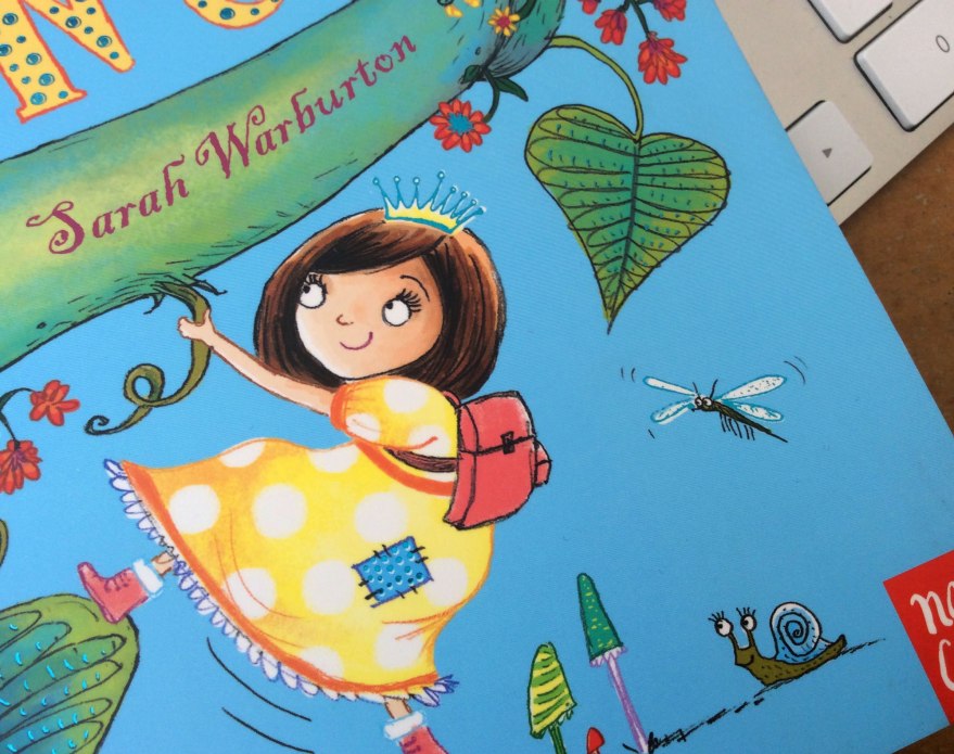
Illustrator: Sarah Warburton

Publisher: Nosy Crow


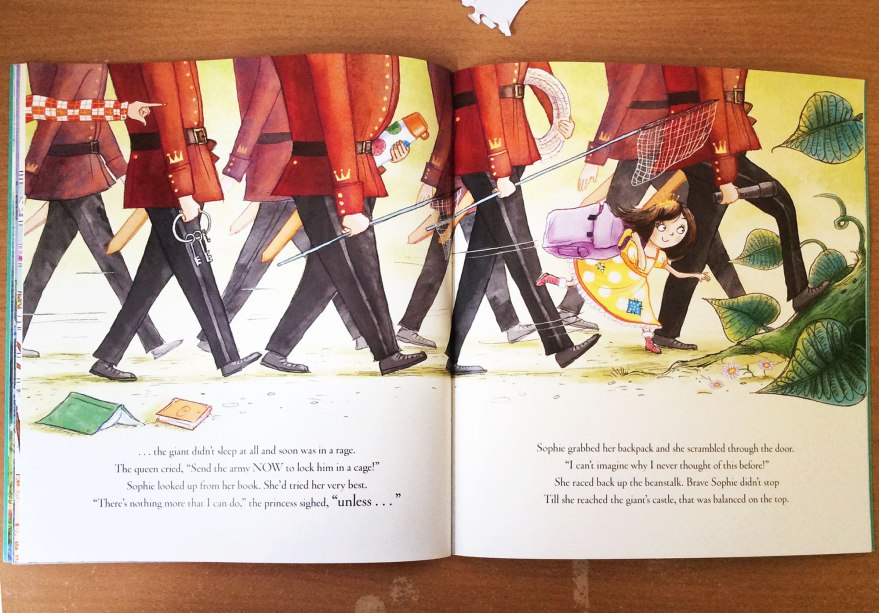
So, let’s get to it! Following two already successful titles in the series, The Princess and the Giant sings to the same, whimsical tune. Our feisty, heroine princess – suitably cute, of course- is ever strong, albeit less comically obnoxious than that of the Princess and the Presents title, yet still brimming with life and charm. Her stoic determination to quell the furiously, grumbling giant above them using the home comforts of her own night time routine is bloomin’ adorable, offset with a hefty dose of humor and feist for a pleasingly full-bodied tale.

BR_inn_02

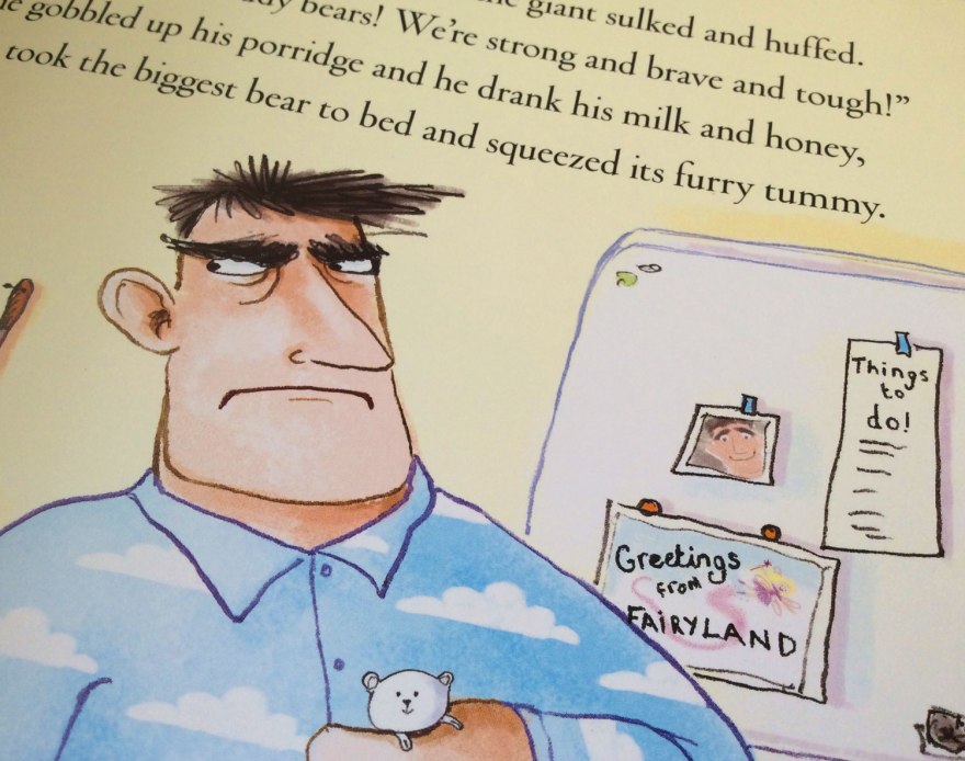
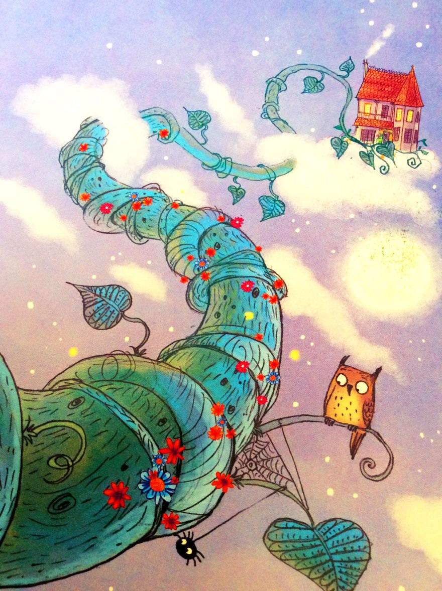
The fearsome, yet not really so monstrous, giant’s ferocious, tired tantrums are no doubt a familiar tale to countless parents and can only to be conquered by pragmatic Princess Sophie’s application of all the proper elements of bedtime. Empathetic and stubborn, her repeated efforts to comfort the frustrated beast are depicted through rich spreads that all conceal extra layers of visual delight.

BR_inn_08
Cracking pajamas.


BR_inn_04

In conjunction with endearing, curious characters, Hart’s poetry is frankly, a delight. It seems to me that rhymes in kids’ books fell out of fashion for a while, I would guess due to the eye-roll inducing forced couplets that had become oh-too familiar. But this looks set to change as Hart, and an increasing number of writers like her, have proved that they’re more than capable of restoring rhyme back into the limelight. The poetic trick is particularly relevant to the fairy tale setting, drawing on conventions and speaking in the language of all that lovely, sweet and wholesome tradition!

BR_inn_05

BR_inn_01
Warburton’s varied of composition keeps every spread fresh and intriguing. I love this crop of the soldiers as we view the world at Sophie’s level.

Who am I kidding? Modern readers are more demanding than that! Kids books got smart and one dimensional, conventional tales just won’t cut it. Been there, done that, worn the somewhat tatty t-shirt.

Instead, Hart and Warburton expertly exploit the classic, folklore elements to subvert all the expectations into a fresh and funny result. Hart’s assertion that princesses should all ride bikes, and kings and queens would, naturally, perform the simple daily tasks of making porridge and chopping wood, ensures that any preconceived ideas of grandia are well and truly usurped by a more down to earth, accessible breed of royalty.

BR_inn_03BR_inn_07

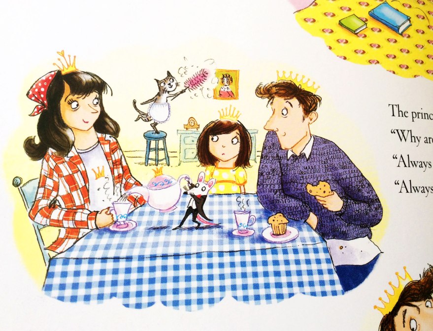
Hats (and crowns!) off too to Warburton, whose ability to take Hart’s quickest of throw away lines and develop them into full blown sub-narratives breathes fresh, secondary stories into every spread. From humorous costume choices of the fluffy, cable knit clad ‘villain’ of the tale to the casual, checked-shirt donning Queen, Warburton takes the written cues and creates full, delightfully quirky characters that add depth and even more personality to the tale. The growth of the mouse butler from one line into an expressive and visually essential sidekick seems an ingenious touch that adds further narrative to every page for children, parents and enthusiast (AKA-nerds like me) to get lost in. The days of illustration’s role being limited to repeating the hard work of the text are well and truly over. Contemporary practitioners speak in their own voice that operates alongside that of the author, and the results seem to only be getting richer.

BR_inn_06
Warburton’s beautifully hand rendered type also adds a comic-style movement and fun to split spreads.

BR_cvr_03

Let’s face it, the quality of kids books in recent years has been leaping into entirely new realms. From insane print quality values (may the designers among us take a moment to drool over the delicate cover foil here) to cunning split narratives that speak to the big-uns just as much as the little-uns, Warburton and Hart are far from sole talents in pioneering this comically subversive, contemporary and reactionary tone. But what they’ve done, they’ve done pretty darn well. No doubt with careful guidance from Nosy Crow, the Princess and the… series has been a delight and the empathetic Princess Sophie and her devotion to bedtime is another champion of this popular breed of contemporary fairy tale.


Illustrator natter and why we suck at Photoshop

I, generally speaking, shouldn’t be allowed in Shoreditch. There are a handful of reasons why I tend to visit London and rarely do they involve being anywhere near East London. I get unspeakably disorientated each time I step off the overground and I swear every time I do, every other building has decided to transform into something else. It’s the land that can’t sit still where every business and every building is aspiring to be the wandering shop from Disc World.

And true, unfamiliarity  is, of course, only conquered by more frequent visitation. But the REAL reason I should not be allowed in Shoreditch, is that quite simply I am not trendy enough. Everyone is cool. Everyone wears hats. Every business is some rule breaking, frontier breaching venture and I feel like the ultimate hip black hole every time I turn a corner, catch my shoes out of the corner of my eye and realise I forgot to commit to being stylish when I dressed myself that day. Or any day.

But I digress. Sometimes there are good reasons why I should risk the danger of polluting the exceptionally well maintained stylish status quo and venture. This Monday was a prime example.

warbie_6


warbie_7
Seriously, the whole ceiling. Must be so awkward to clean! :-/

I found myself in a pub so cool it had light bulbs for a ceiling (not all functioning, of course, more like the interior design equivalent of ready-ripped jeans) for the an event hosted by the independent children’s publisher, Nosy Crow. An Illustrator Salon, with the ever-charming Sarah Warburton.

Gloriously casual, the talk was a delight. Sarah Warburton, illustrator of the fabulously sassy ‘Princess and the…’ series (written by Caryl Hart- who unbeknownst to me I was sat next to-the SHAME) was as bubbly as they come, nattering through the progression of her work from the early days to it’s modern success. I was enchanted by her sketchbook snapshots and delighted to hear it’s not unheard of to role the eyes at the thought of  drafting a scene separately. Kate Wilson, NC managing director’s, questions successfully drew an in depth and raw insight into the gritty of Warburton’s process and its development over the years. From the organic changes of her personal artistic ‘style’ to the influence of technology and visual movement of the British illustration market over her 22 year career span (I couldn’t believe it either.)

Having begun in traditional methods, I was glad to see that her passage into the digital age had brought with it the energy and life of her watercolour beginnings, but now using the computer as an extension of her pencil case. Even these days, too frequently you hear of the traditionalists, or certainly the stubborn amongst them, spitting the words ‘Digital’ with a sneer, as though – Warburton asserted – the magic of creation was lost to string of binary that popped out an image at the end. Not so, having a plethora of her works (as well as innumerable others) happily sat on my bookshelf, I can assure said critics that the magic is ever present – perhaps even more so in this digital age where minor colour corrections and post production can draw a viewer from part way to fully invested in a scene.

warbie_4warbie_1

Warburton actually sits in the same camp as I do when it comes to technological intervention, I discovered. We both begin old school, with real life drawings from real life hands that are then scanned and altered digitally as appropriate. We both have struggled, so far, with the full plunge into drawing on screen, sticking instead with the tips and tricks we’ve picked up en route and failing miserably to invest too much further once a happy plateau has been found. While I  I question her assertion that she is “rubbish at Photoshop” on looking at her high quality illustrations of quirk and fun in front of me (arguably tweaked by talented designers too of course) I do recognise with a touch of shameful embarrassment, the threat of an technical-artistic rut of sorts, in which you sit, comfortable on your plateau until a problem arises that FORCES you to invest in learning a new skill to add to the bank.

It was reassuring, as it always is when I listen to admired practitioners, to draw similarities between our working processes. I felt, as she walked us through her career that I could peg myself onto a similar string behind her, acknowledging each of her early struggles and achievements in my own path. Even more so in a chat afterwards when she, somewhat apologetically,  assured me that the insecurities of an illustrator are suffered regardless of your successes. And I certainly wasn’t alone, noting all the times myself and the rest of the audience nodded enthusiastically along to her experiences, like an enlightened audition line up for the Churchill ad. It’s essential, when your work is based outside of a collaborative office space, that events like this that link you back into a shared world. It can assure you that you’re treading correctly, or even make you reassess your current position. Either way, the outcome is similar; a development towards better, more informed working practice.

warbie_9
Unfortunately, my poor camera was not trendy enough for Shoreditch lighting.
warbie_8
My limited Photoshop skills could not salvage my terrible attempt to combat trendy low lighting 😦

I left Shoreditch still entirely uncool. I was and still am little more than a children’s book nerd, no matter how many light bulbs I stand under. But I was also inspired, assured and had a brand new, signed book under my arm. Events like this by companies like Nosy Crow are a little lifeboat of sanity and vital to the development and improvement of the world of books.

While still comparatively small, Nosy Crow have been climbing the ranks at a rate of knots in their five years of life and I think events like this are seemingly a testament to everything they stand for. Routinely holding events in which their nurtured artists take the floor to share their inner workings, their commitment to fostering talent,  sparking and engaging in public discussions about the current and future role of the picture book has signified a real love and involvement in the industry that has not gone unnoticed. With awards coming out of their ears, and numerous professionals working wit them again and again, the quality of Nosy Crow’s output is climbing from strength to strength, and for picture book enthusiasts like me, accessible and invested publishers like this are a real gem.

warbie_2

warbie_5

So, HUGE thank you to NC for setting it up and an enormous cheers to Sarah Warburton for sharing her own behind the scenes. Inspirational and charming, I only hope one day I too can be such an expert I do not need to pull the faces when I draw them. Even if I am still pants at Photoshop.