A Little Bit of Typography!

Okay, this one goes out to all the cool kids from Canterbury who’ll remember the Amsterdam times.

So, this is one of our first Type projects of the Degree. The aim of this one was to get us to familiarise ourselves with the form of a certain typeface and understand the rules and structural relationships within any given type.

The fellas in the limelight were Baskerville and Gill Sans.

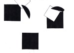
Using the method of blipping, we were to perform a kind of sick, font surgery and splice bits and pieces from pre existing letters and numbers into a Frankenstein form.

The form could be an already existing letter (from any language), a dipthon or ligature, a symbol or anything else. It was literally just an exercise in form.

As it was a no computers allowed kind of deal (gotta love first year), we then were to photocopy large versions of the letters and cut and stick them together into our desired forms so we could fix any discovered sections that didn’t obey the rules of Baskerville and Gill Sans.

This slideshow requires JavaScript.

And thus finished pieces.

B

x

Tele

A Cautionary Tale

Did you get it??

This was a one day project we did. Construct a narrative of 8 parts using only the circle and square templates.

It was a cut and stick exercise, no computers allowed but we were free to use the photocopier (they love it)  to enlarge and reduce accordingly.

The  irony was listening to my class chat about X-Factor while I was doing it haha.

Still, the moral stands true (if you can work it out!)

B

x

Once, Monday Happened.

Last week on Monday it was Halloween (and yeah okay, it was a week ago, but I’ve been busy with BOOK SIGNINGS and things.) So when we got set our M(one)day project, I thought I’d enter into the spirit and encourage this special time of shameless commercialism, legal begging and overplanned and usually overated parties…with a bit of decapitation!

Our brief was simple: Draw around a part or parts of your body and use the inside to present your personality, however it was stressed that we shouldn’t over-think it. It was supposed to be a simple, spontaneous piece (I think) that was achievable within the time restraints of one day that shouldn’t be too bogged down with “being too clever” (for realz).

So there I am. A severed head full of lots of little bits of stuff that I like to spend my time obsessing over (with a decent emphasis on robotics). I thought about going down the route of conveying all aspects of myself and focusing on emotion and all that jazz but plain and simple “things I like” was way more fun to draw and to be honest, a damn sight more cheerful. And let’s face it, I’ve already cut my own head off, I don’t really want to drag things any further down depression alley.

Originally there was going to be some colour, but the whole time thing got in the way so it ended up in good old fashioned B and W.  Still, something to consider for later.

Not the deepest piece of work in the world, but still pretty fun and a welcome return to drawing little things you want to draw as opposed to photographing drains.

(Yuh.)

B

What’s this? You’ve actually DONE Something at University???

Hands up if you want to see what I’ve been working on at Uni so far?

 Screen Printing Induction Tuesdays ended today with the completion of my first set of prints as a Bath Spa student.

They’re not the most complex or intricate works in the world, but I’ve been out of the game for a little while and they served pretty well as some basic experiments to get me back into the swing of things.

I decided not to mix my own ink in the end and instead made use of the left over pots people hadn’t finished in the print room. The choice of colour was an attempt to echo the yellows of Bath stone while suggesting the giant park and golf course I walk through on my daily route with green.

The prints are made up of 3-4 elements: Two hand rendered parts (the squirrel and text) and two photographs (the leaves taken in Royal Victoria Park and the Sion Hill sign at the top of the road).

I made a total of 12 prints, all a little bit different as I was playing with layout and inks as I went. They’re all hand printed onto Imagine Print paper at 28x28cm.

Not bad as testers, now let the real work commence.

B

x

Thanks Photocopier; Thotocopier

If you’re cool, you’ll appreciate that photocopiers are the best.

Here are some reasons why.

See, see?! I took some boring ol’ uni work and I made it WIGGLY!

What’s that? You can do that kind of thing on photoshop?

In colour?

Well see, you’re kind of missing the point of these genius experiments here.

Yeah okay, there might well be modern ways to reproduce these effects without an enormous copying machine, but then how would I make the most of my £140 studio fee if not for the free black and white photocopier in my classroom?

Totally money well spent.

B

x