Anyone ever read/ watch Cardcaptors? Not to sound like a little fangirl, but it was pretty rad. No joke.
I bring it up only because it had some attractive examples of interesting, illustrated card decks, which happens to be the brief of my most recent illustration project, which I am lovingly bringing to you today as part two of the Second Year Catch Up sesh.
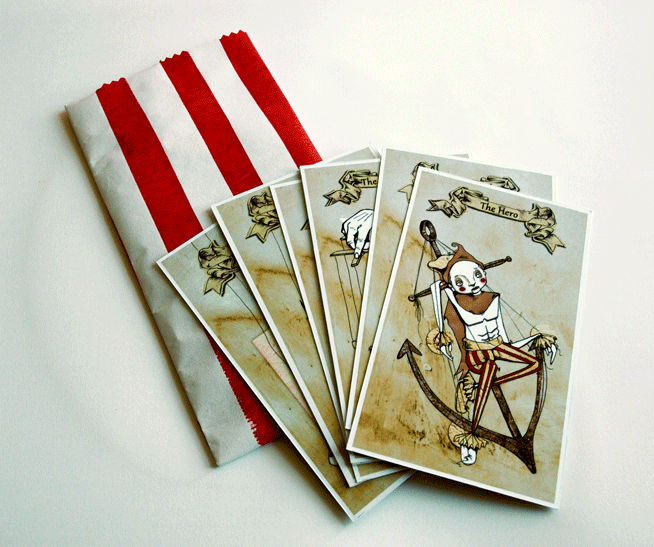
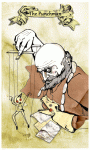
We were asked to create a set of nine cards in the style of Edward Gorey’s Fantod deck of alternative Tarot. And my eyes immediately turned into little dollar bill signs, as this was in November, just prior to Comiket. And card decks are a pretty sell-able deal.
I turned to my interests in media theory for inspiration, choosing to illustrate Vladmir Propp’s theory of set character types. With creepy puppets. Because if a project of mine needs one thing, it’s definitely an air of macabre. (There was research and reasoning to back this up by the way, but, who am I kidding? You don’t care about that! You’re probably going to sneak past the text, straight to the pictures anyway, you cheeky little blog ninja.)
So here it is, The Propp-Up Theatre Deck.
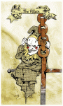
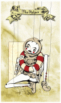
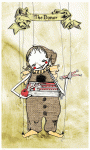
So we have The fist 7 from Propp’s character theory (I chose to omit the Father as a separate character, merging him with the Dispatcher as is often the case with folklore anyway.) Then made up the full nine with the Bottler and Punchman, the traditional workers of the Punch an Judy show.
We had to design the nine cards themselves, then a back for them as well as a Key Guide to reading them, tarot style. I went a step further (in the name of making moolah) and turned my key into a small booklet with information about the concept as well as the cards themselves, as well as handprinting candy bags to echo the punch and Judy, disturbing British seaside vibe.
And did the punters at Comiket appreciate all the hardwork? Damn tootin they did! They were the first thing of mine to go and by the end of the day I only had about 2 sets left. Not bad for a school project/money making combo.
I haven’t really talked about it too much, or in fact at all,but I’ve been working, this summer, on a job for a man.
Yes, that’s right. A job for a man. And if that’s not an award winning feat of description there, then I just don’t know what is.
It’s been a really nice project actually, he wrote thirteen short stories for his great grand daughter to be presented to her, one a year, as she grows up. I think the idea is that as he won’t be around for all of her growing life, he wanted her to have an artefact from him that would remind her how loved she was.
Sweet isn’t it? A little gift from beyond the grave.
…
No, okay that made it sound creepy. Sorry, I might have ruined that.
But commission me he did for the project, to do one colour painting per story. And that’s what I’ve been up to these past few summer months.
I have since handed them over and, I’m pleased to say, he seemed really chuffed with the results, but I thought I’d shove a few up on here, to remind myself if nothing else, that I have actually done SOME work this summer and not just spent the whole think baking pies.
I did thirteen for him, but I’ll just whack up a few examples. Just so you get the gist.
An illustration for the opening poem.A tale about the power of little girls’ tears. It’s not actually as morose as I just made that sound. I’m not doing well today.He devised and detailed this character to me. I wan’t just being racially assuming.A tale within a tale about a pie and an orange. Amongst other things.The sorrowful tale of a missing, beloved family pet. (The dog, not the child HA!)A humerous story of magical mishaps.A light, carefree painting to go with the summery tale.
Like I said, a nice project to work on. A much more traditional style of illustration than my usual bag, hence my cracking out the watercolours , but it’s nice to have a change every now and then. And he seemed pretty happy with them so I think I made the right choice in doing so.
I enjoy writing my own work, but it’s definitely a nice change to collaborate with someone else’s words sometimes. Yes, there is less control but that’s almost part of the fun, bringing in your own creativity within the constraints of someone else’s vision.
Not the case with my current project though, speaking of which, I’d better get back to it.
I’m back with a new post! Yes I know it’s terribly late, I am oh-so-sorry, but you see, there was a dragon.
No?
Not buying it?
Yeah well that’s because it’s a lie. There was no dragon, I’ve just been rubbish (again) and have failed at bringing you any kind of news in favour of sleeping. However, those lazy days are now gone! Banished! And I hereby solemnly swear to be much, much better at this blog fandango. Frealz.
So here it goes. Last time I did a post, I was just about to embark on a big old silly printing experiment that did, in the true nature of experimentation, fail horrendously. Yes, you heard, printing finally turned on me. Screen Printing as well, that dirty dog. After all the nice things I said about it. Needless to say, it put me a little bit (a lot) down in the dumps, I don’t like doing bad work. Especially not bad prints.
But such is the nature of trying new things and not leaving yourself enough time to properly get to grips with it.
Basically what happened, was that I wanted to do a print for the End of Year Show, and my tutor talked me into doing it GIANT (A1), as opposed to the comfort zone of A6-A3 size range I tend to aim for, less than a week before the exhibition was due to open. Actually, now that I think about it, this is the same tutor who was to blame for the up-all-night-due-to-lack-of-preparation-2-page-comic shebang. Must investigate the possibility of a single-handed conspiracy against me there.
But I digress, “a big print…ha!” you may claim, “doesn’t sound like such a big deal to me!”
Well, metaphorical voice of imaginary rhetoric reader, you’re right, you wouldn’t think a big print WOULD be such a nightmare, however this one decided it would be due to the following limitations.
I only had one screen. This meant that, in order to achieve the 3 colour print I was aiming for, I had to only expose ONE layer onto the screen (due to time limitations) – the most complex one was naturally the best choice, but this meant the starting two had to be hand cut newsprint cut outs which I would have to use as stencils with the blank screen, then expose the 3rd layer on afterwards. I hate cutting newsprint. It’s delicate and awkward and a pain in the arse to transport. I especially hate cutting newsprint when the newsprint itself is bigger than A1 and I only have an A3 cutting mat and, due to the end-of-year-run-down-of-materials, comparatively blunt utensils.
I also couldn’t afford, due to the end-of-year-run-down-of-funds, to digitally scan and print my exposable design onto a giant acetate in order to expose it, so it had to be hand traced from the original sketch, using special ink (FROM A POT WITH A BRUSH! Not even pens) onto a cheaper, transparent, special-ink-from-a-pot friendly material. This ate one full day of my already very tight schedule.
Due to the size of the print and, by comparison, the size of me, I was encouraged not to print the organic way; hand+squeegie=lovely print, but instead to use THE ARM. Now this was really where my downfall lay. In theory, THE ARM is a great idea. It’s a bit mechanical arm that holds the big squeegees and spreads the ink over large surface areas my own little limbs would struggle to cover. All I had to do was push the handle of THE ARM along with the correct pressure to get a nice, flat, even coverage.
Unfortunately, as I only had, in the end, one day in which I could print, I didn’t really get the time necessary to be able to master the art of THE ARM. In fact, I think it’s fair to say I was actually pretty shit at it. I’m not sure if it was due to my size and weight (or lack thereof) but I just couldn’t seem to put enough pressure on the damn thing to get an even coverage of ink. I tried thousands of variants of amounts of ink, I tried adjusting the bed, adjusting the screen, the suction, I tried more paint in the mix, more solution, harder squeegees, softer squeegees, literally everything I could in the very limited timescale I had.
But in the end, with time ticking by, I had to just go for it. And 3 colours, 5 prints, about 60 newsprint tests and a grump to end all grumps later, was left with a pretty damn substandard print as a result.
Muchos Disappointingos.
As you can see, the colour is not at all flat and the black’s not come through at all clearly. I think had the lines been printed perfectly, it may have tied any issues with the stenciled colour together. Might even have looked better, given the grimy nature of the subject matter. But unfortunately the lines are just as problematic as the other two colours. Which really meant the image lost out in areas of detail like these.
The brief for the exhibition was 1912: Go make something! So I chose to focus on the death of Bram Stoker; author of Dracula, theatre owner and all-round pretty clever guy. From here, I subsequently, invented an “alternative reality” in which Dracula‘s success above all his other works was attributed to the fact that it was not from Stoker’s imagination, but based on true events. I wanted to suggest that his death in 1912, officially regarded as “a series of strokes” was actually caused via the paranormal attack of a vampire.
I chose to do it in the form of a single image narrative. This was actually a bit of a leap for me who is, as you may be aware from my other work (and if you’re not I think you’d better have a look in the shop don’t you?) predominantly a sequential art sort of gal. This whole, summarising in one image was quite the challenge, which is why it was so disappointing to have overcome one hurdle to fail at another.
Anyway, It’s big, it’s a print and you can see what it is, so in many ways, I achieved what I set out to. It’s just a shame the craft is so poor. But we live, we learn and sometimes, we screw up screen printing.
I think that’s definitely what Sinatra was singing about in That’s Life: Screen printing giant images of deceased writers.
What an epiphany.
B
x
Poor Ink coverage could have looked ghostly and haunting, had the black been a little crisper.


 We had to design the nine cards themselves, then a back for them as well as a Key Guide to reading them, tarot style. I went a step further (in the name of making moolah) and turned my key into a small booklet with information about the concept as well as the cards themselves, as well as handprinting candy bags to echo the punch and Judy, disturbing British seaside vibe.


