Illustration for Union Magazine!

Ahoy chaps!

A little while ago I was approached by the fine people at Union Magazine. A new start up men’s lifestyle magazine, the aim of the game was to get a publication underway that combined intelligent articles, incredible photography and generally interesting stuff that extended out of the usual men’s magazine remit of boobs and sports.

A few months and a lot of hard work later and TaDa! We have Union magazine, and I have to say, when my contributor copy landed through my letterbox I was immediately impressed at the tasty little number. Not to get all design-geek on you all, but the use of Spot UV on the cover is seriously tasty. I mean it, the production quality on this thing is truly beastly.

Anyway, the main deal of the mag is photography, some of which is truly stunning, however if you look hard you may well find this little fellow tucked away in the thick of it.

image4 2

image1

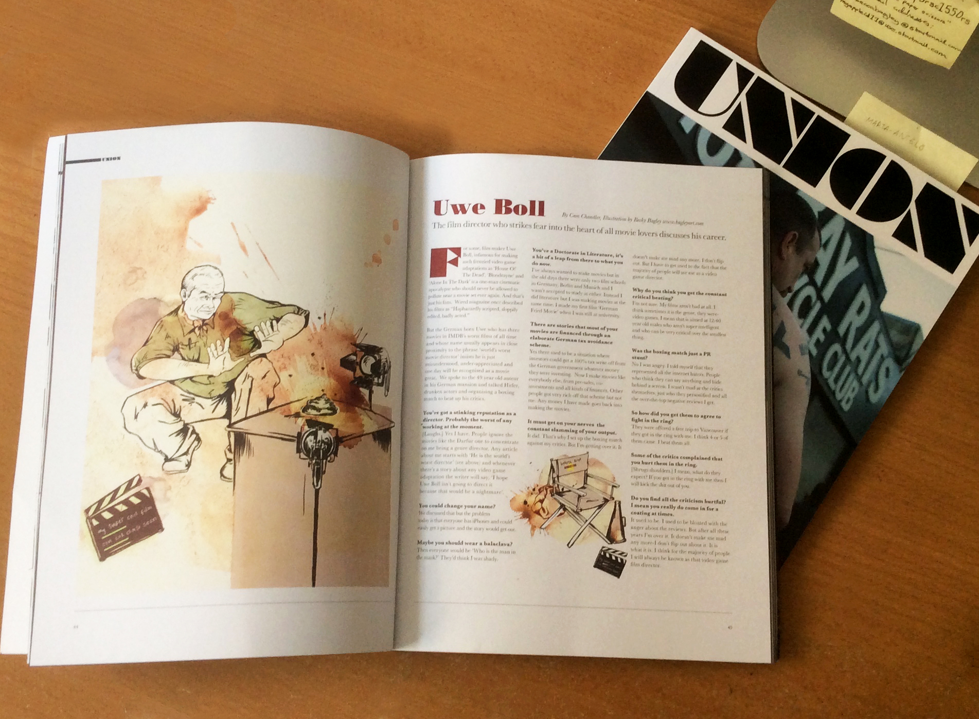
Horray! Yeah I got to illustrate a neat little interview with the notorious director of questionable taste, Uwe Boll. For those of you who recall my boxing fascination and are aware of the rumors surrounding this guy and his answer to critics, I couldn’t really have asked for too much more.

As I said, the mag is a new start up and definitely worth a peek if you’re in the market for something a bit different. It’s available at a number of places in and around London and more information can be found here.

And if you manage to get your hands on it, seriously do pay attention to the Spot UV varnish.

So nice.

Union mens lifestyle magazine

Editorial Things

I have a riddle for you.

What do Amir Kahn, a bowl of oats and a gravitionally challenged housewife in Bristol have in common?

Okay, absolutely nothing, but they’re two examples of some works I did recently based on some editorial articles.

Amir Kahn editorial illustration

The Amir Kahn one is primarily just a bit of portraiture, because I haven’t done any in a long time. That and I’ve got a bit of boxing THING where I just like drawing characters who are potentially going to punch things in the face.

It was a really short piece on how he’d “vowed [he’d] earn” a fight with Floyd Mayweather after he canned him off following Kahn’s meeting with Collazo. The language of it all made it sound kind of like he was following a code of honor, so I dragged in some imagery reminiscent of Japanese/ samurai bent to give it a bit of a vibe.

kahnI’m undecided at the minute, but I think I might can the bag. It works just as a nice bit of portraiture. The text can fill in the blanks.

Then there was a piece I found in Bristol Magazine, the local lifestyle glossy.

It was an advertisement for oats, “The Superfood of the Kitchen” and just said how good they are for you. There was a lot of mention of health and lifestyle “balance” and Bristolians love a good bit of hippy culture, so here’s what I got.

Oats editorial illustrationJust another excuse to draw some nice things really.

But, of course, regardless of all this silly picture stuff, the question remains…

Why IS a raven like a writing desk?

No, okay I’ll stop that now.

Peace out.